The original iPhone came out in 2007, but I received mine in 2008 as a birthday gift. Not only was it my first iPhone, but it was also my very first Apple product. But my clumsy little self had a case of the butterfingers one day, and I ended up dropping it on concrete — resulting in a shattered screen. This was just a few weeks before the iPhone 3G was coming out, so instead of just getting the screen replaced, I decided I would upgrade my phone instead.
Thus began a new tradition I set for myself — upgrading my iPhone every year. I’ve had at least one iPhone from every generation that has come out so far, with my latest being the iPhone 14 Pro.
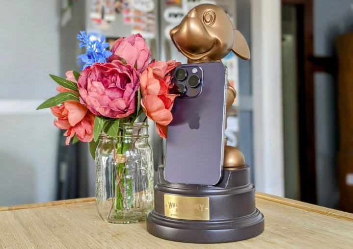
I’ve continued to purchase iPhones over the years because they’ve always been easy choices, with reliable software (for the most part) and great cameras. For most people, I would recommend iPhones because Android was a whole other can of worms that you’d really have to get into the ins and outs of.
But lately, I’ve been feeling that Apple’s hardware hasn’t been up to par with previous years, and the software just feels like it’s on a steady decline. I was excited about the iPhone 14 Pro when it was announced, but now, about eight months later, I am falling out of love with the iPhone — especially after checking out more Android phones these days. Suffice it to say, I’m starting to wish I never bought my iPhone 14 Pro.
Looking for another story of smartphone regret? See why my colleague Mark Jansen wishes he never bought his Pixel 7 Pro.
Apple’s losing the camera game
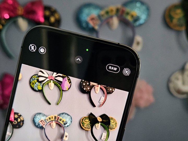
One of the reasons I like to upgrade my iPhone every year is because of the camera. My only cameras nowadays are my smartphones because I can capture any moment without having to lug around a separate camera. And each year, I’ve always been impressed with the iPhone’s camera hardware upgrades. But all of that is for nothing now because of the computational photography and postprocessing that ruins most of my images — and there is literally no way to turn it off.
I noticed that this started with the iPhone 13 lineup, when Apple began to emphasize its computational photography processes and capabilities with the A-series Bionic chips. It introduced Smart HDR in 2018, now in its fourth iteration with the iPhone 14. Smart HDR basically snaps multiple photos of a scene with different settings, then combines the “best” elements of all those images into a single photo. The result is often over-sharpened, over-processed, and just does not look great.
Take a photo with your iPhone 13 or iPhone 14 device, then tap that thumbnail immediately and watch as the processor does its “magic.” You’ll see an image at first that looks like what you saw in the viewfinder, but then a few moments pass, and the image will change into what Apple deems as “good.”
There’s no toggle to turn off this computational photography, and more often than not, I dislike the final image and much prefer what I saw before the image was finished processing. Colors end up looking too harsh or washed-ut compared to what you see in reality, and skin tones may not be accurate as a result. Night mode images sometimes don’t even look like they were taken at night because things are overly bright, making it look like twilight.
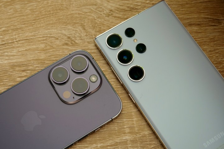
I had the iPhone 12 Pro and don’t remember noticing my images looking so badly processed after I shot them. I also believe my lowlight selfies looked better on older iPhone models, going back to the iPhone XS and iPhone 11 Pro specifically, as they are clear and sharp. I hate taking selfies in low light on my iPhone 14 Pro because they never seem to come out well — it always looks like a bad watercolor painting.
I really should just give up trying to get a decent lowlight selfie, because it just seems impossible with the iPhone 14 Pro. I get better results with the Samsung Galaxy S23 and the midrange Galaxy A54. The iPhone 14 Pro versions look so bad that I delete them immediately.
Apple isn’t the only one that does computational photography — Google touts the Pixel 7 as having some fantastic computational photography abilities with its Tensor G2 chip. However, the difference is that Google actually does it well, unlike Apple. Samsung and Google phones do the postprocessing thing too, but the end results on those devices are usually much more palatable than what I get on my iPhone 14 Pro. The image doesn’t look overly sharp, colors can be more realistic, and lowlight selfies don’t look like terrible watercolor paintings.
If Apple wants to keep doing the computational photo stuff, fine, but at least do it better — or let people turn it off completely. The 48MP main camera just seems wasted right now, because unless you’re shooting in ProRaw, which takes up a ton of space for each image, your photos will not always look great due to uncontrollable software “features.”
It’s lonely on the Dynamic Island
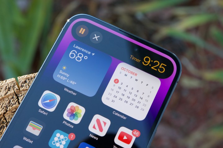
One of the big reasons I was interested in the iPhone 14 Pro is the Dynamic Island. I was never a big fan of the notch that started with the iPhone X because it was unsightly and took up space without giving us something useful. The Dynamic Island replaced the notch on the iPhone 14 Pro, and though it does take up space at the top, the seamless integration with the software looked delightful while giving us some practical use.
But eight months later, I have barely gotten much out of the Dynamic Island. For me, the Dynamic Island is only “dynamic” mostly when I’m using Apple’s native apps, like Music, Wallet for Apple Pay, Face ID, timers, and more. But when it comes to third-party apps, it’s like a ghost town. The only app I use regularly that utilizes the Dynamic Island is Apollo, and that’s just for a cute little pixel pet, which is a novelty and not anything actually useful.
I was really hoping to get more use out of the Dynamic Island because it was such a huge deal when the iPhone 14 Pro was released. But for me and all the third-party apps I use regularly, the Dynamic Island has just been sitting there with digital tumbleweeds rolling through. The Dynamic Island may finally be working out for some people, but not me.
I still prefer the Dynamic Island over the notch, but there’s not much else for me to love about it right now. With the Dynamic Island coming to all of the iPhone 15 lineup this year, I hope that more developers make some use of it. Otherwise, who cares?
Where are my Live Activities?
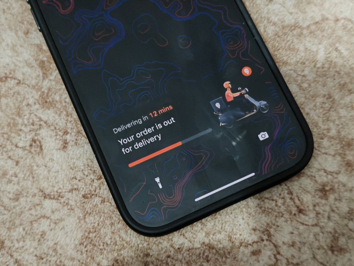
Another feature in iOS 16 that I was looking forward to was Live Activities — notifications that look and act like widgets, providing real-time updates. Apple showed off Live Activities during its keynote presentation with the Music app’s Now Playing, as well as an interactive timer.
But since iOS 16.1, it’s been up to developers to implement Live Activities into their own apps. Live Activities is great for staying up-to-date on sports scores, getting precipitation alerts, seeing where your Uber is, tracking flights, and more. However, similarly to the Dynamic Island, the apps I use daily don’t seem to support this feature either.
I occasionally order food through DoorDash. Uber and Uber Eats just recently added Live Activities support, but the problem is I don’t need Uber when I’m not traveling (hard to do that when you have a toddler), and I don’t use Uber Eats since I prefer DoorDash. Some apps take advantage of Live Activities, but you’ll be lucky if it’s an app you use with any regularity.
iOS keeps taking steps backward
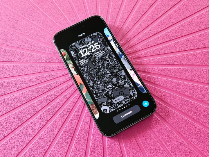
I used to get excited about major iOS updates. But since iOS 16, I’ve been getting more frustrated with what Apple offers on the software front.
A big headline feature in iOS 16 was lock screen customization. Cool, right? Except that Apple made the overall process of customizing your lock screen tedious and cumbersome. I’m often activating the lock screen switcher by accident because it works similarly to the Apple Watch, where you press and hold on the screen to invoke it, and this happens a lot when I don’t intend to do it (taking it out of a pocket or bag, for example).
Oh, and don’t forget that you can now no longer apply a wallpaper to your home screen from the Photos app. If you select a photo to use as a wallpaper from the Photos app, it will automatically be set for the lock screen, with no option to change that. If you want to change your home screen wallpaper, you do it from the Settings app or by picking one to go with your lock screen when customizing it. It’s a very unintuitive way of changing wallpapers. I used to change my wallpaper much more frequently, but it’s become too much of a pain now.
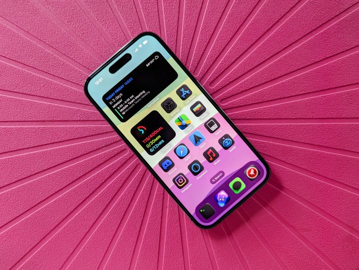
Despite Apple bringing us home screen customization in iOS 14, it has done nothing to streamline the process since then. We still have to change custom app icons one by one through the Shortcuts app, which takes forever, and widgets are really nothing more than glorified app icons (though this may hopefully change in iOS 17).
Focus modes on Smart Activation sometimes don’t make sense when they activate, the Control Center is still lacking, and iOS notifications are the worst. And we still don’t have individual volume controls like on Android.
I also experience some bugs occasionally on iOS, like my Activity widget not showing up on my home screen, so there’s a blank space until I turn the screen off and back on. I know that iOS 16 works on more than just the iPhone 14 Pro, but you’d think that on the latest and greatest hardware, there would be fewer problems. That’s not the case, though, and these software problems just lead to more frustration with my iPhone 14 Pro.
Can Apple please do better?

I really was excited when I bought my iPhone 14 Pro last September, but it’s been a lackluster eight months with it so far. The 48MP main camera upgrade is nice, but it’s ruined by over-sharpening and over-processing if I’m not shooting in ProRaw. It can’t take decent selfies in lowlight environments. The Dynamic Island and Live Activities are almost nonexistent with third-party apps. Changing up my wallpapers is a total pain in the butt. And Apple still falls way short compared to Android in terms of simple, basic features like notifications, volume controls, customization, and more.
I also am surprised that the Deep Purple color turned out the way it did. Sure, it looks purple in certain lighting or when you look at it from specific angles, but most of the time, it’s like a gray purple.
I’m hoping that Apple can fix some of these problems with the iPhone 15 Pro and iOS 17, but at this point, I won’t hold my breath.


