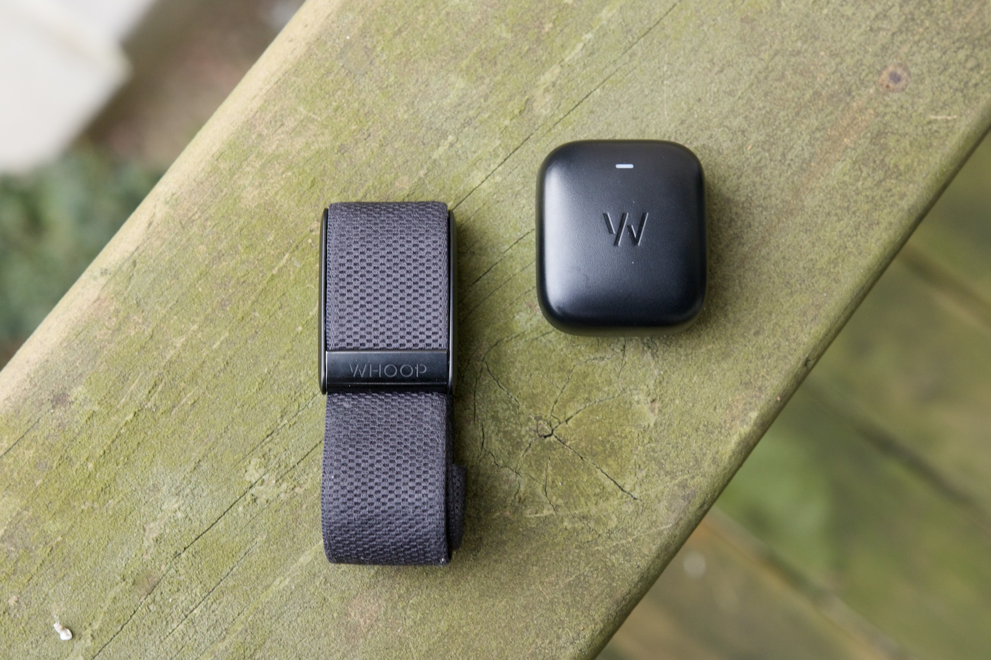
Over the past year, I’ve developed an obsession with health/fitness trackers. Previously a longtime and dedicated Apple Watch user, my wrist (and fingers) has been home to a myriad of competing wearables — including ones from Garmin, Samsung, Google, Oura, and others.
One fitness tracker that really caught my eye last year is the Whoop 4.0. It tracks your daily activity, workouts, sleep, recovery, and a mountain of other health data. On paper, it looked like exactly the type of health wearable I’ve been searching for.
I wore the Whoop 4.0 for myself for about a month and a half to see if it was for me, and while there’s a lot about the tracker I like, there’s one big drawback that’s caused me to end my time with it.
Everything I love about the Whoop 4.0
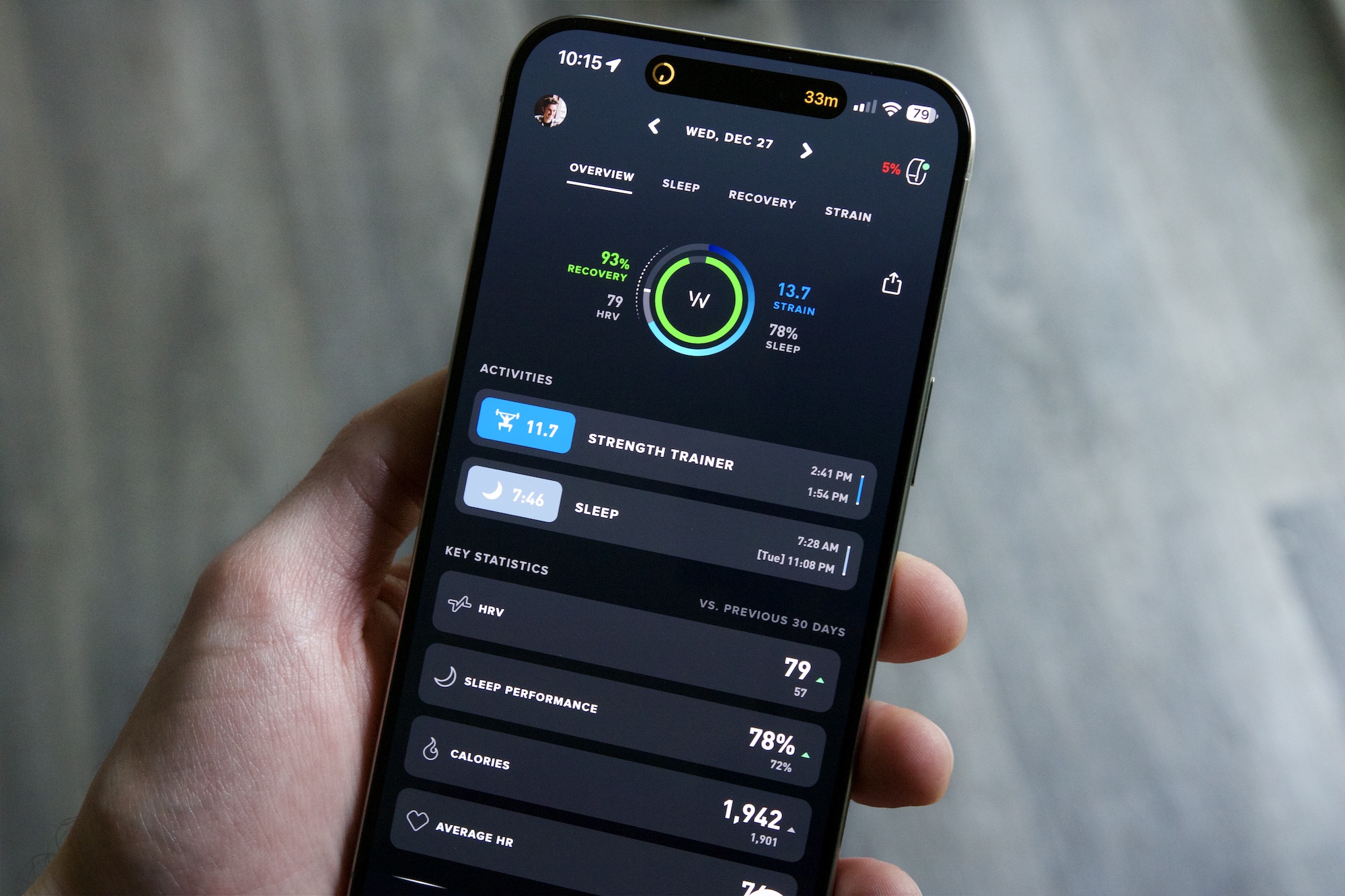
So much about the Whoop experience is fantastic — and all of it boils down to the Whoop app and the data it collects about you.
Like any fitness tracker, the Whoop 4.0 needs an initialization period to get a baseline for your health before you get anything of real value out of it. That means your first week or so may feel a bit awkward as the app isn’t able to tell you very much about your body – at least not right from the get-go. Unlike some other wearables, though, the Whoop app does a great job of guiding you through your first month wearing the Whoop 4.0.
Periodically throughout your first month, the Whoop app prompts you to watch check-in videos and perform certain tasks to help you get the best start possible. The videos talk about what your Whoop is doing during that month, while some of the tasks prompt you to track your first activity, set up your daily journal, check in on your first week of progress, etc. It’s much more guidance than you’ll find when you strap on an Apple Watch or Galaxy Watch for the first time, and I really appreciate this whole onboarding experience.
As time goes on, the insights the Whoop 4.0 can provide about your body are fantastic.
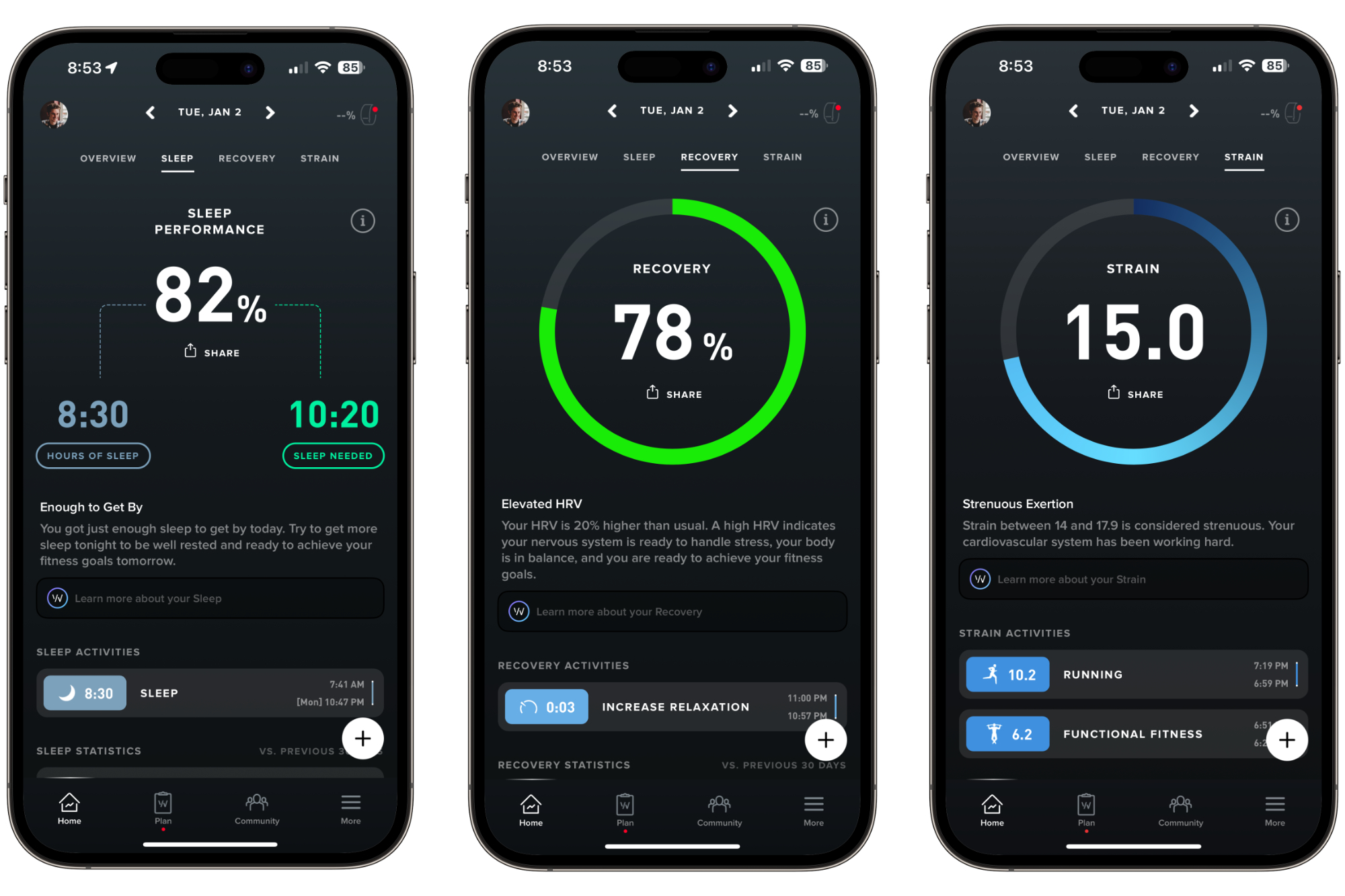
There are three main goals you focus on with the Whoop platform: Strain, Sleep, and Recovery. Strain indicates how much strain your body is under during a given day, whether that’s physical strain from exercising or mental strain from stress or other factors. Sleep calculates your night’s sleep using a score up to 100 to indicate the quality of your sleep, while Recovery also uses a 1-100 scale to show how much work your body is able to handle at the start of each day.
I love this methodology of tracking my body’s health. Your Strain score isn’t calculated on a 1 to 100 scale the way your Sleep and Recovery are. Instead, it’s an open goal left for you to decide how much you want to work each day. Based on your Sleep and Recovery, the Whoop app recommends a Strain goal for you to reach.
This is a lot to take in at first, but as you continue to use the Whoop app and see how various exercises and everyday activities impact your Strain, it quickly becomes an easy metric to follow. Furthermore, Whoop provides guidance in the app to let you know if a particular day was strenuous on your body, or if it had a moderate impact, etc.
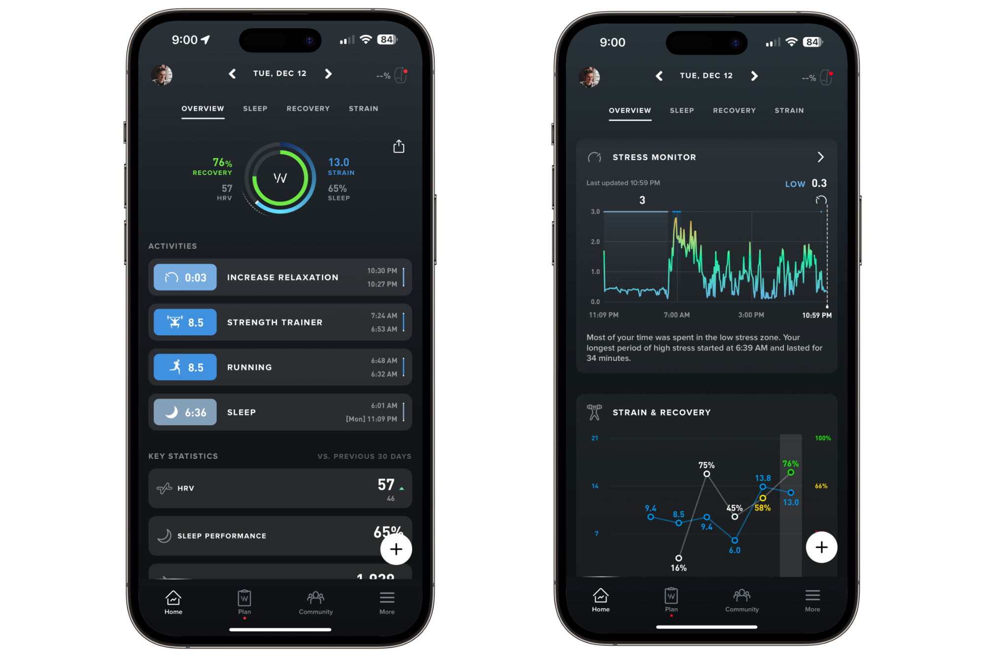
I’ll be the first to admit that this isn’t nearly as easy as closing your three rings on an Apple Watch. It takes time to understand these three metrics and know what they mean. But if you put in the work and make an effort to read through all of the data, I think it’s a lot more valuable.
I closed my Activity ring on my Apple Watch? Great! But how much strain does a 3-mile run put my body under compared to a 30-minute strength training session? And if I really focus on getting a good night’s sleep, how much more capable does that make my body the next day? Those aren’t things I can easily glean from most smartwatches, but the Whoop 4.0 makes it relatively easy.
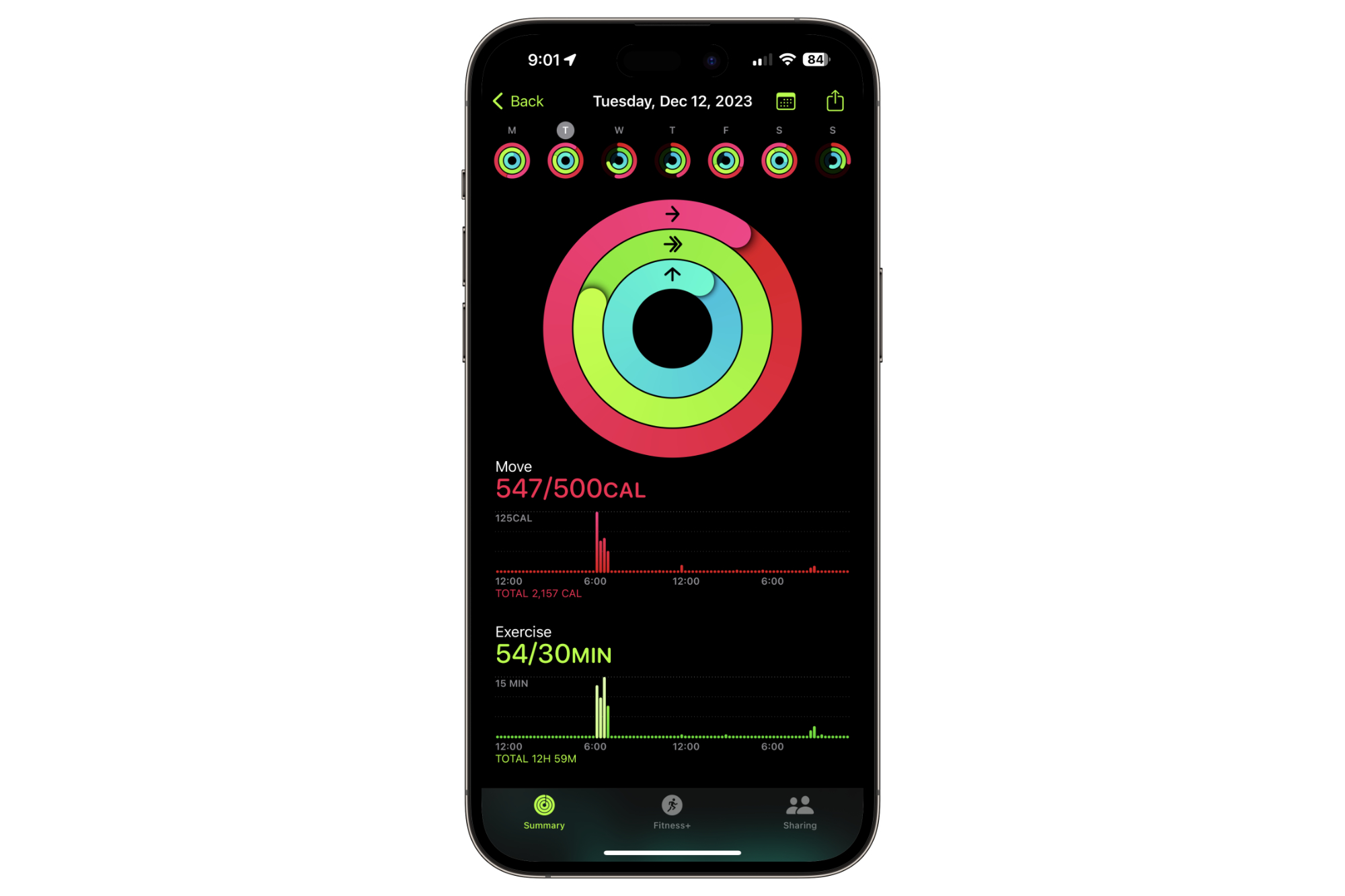
Beyond sleep and exercise, the Whoop 4.0 can also show you how other daily activities help or hurt your body. When you open the app at the start of each day, you’re prompted to fill out your journal. Your journal is used to keep tabs on various activities you did or didn’t partake in each day — such as if you consumed any alcohol, if you had any caffeine, if you used your phone in bed, if you took various types of medication, etc.
You can customize what items you want in your journal, and then each morning, confirm if you did or didn’t do that thing. After you’ve completed enough entries, your Whoop 4.0 looks at your answers and compares them with your health data to let you know how a certain thing impacts your body. We all know that alcohol is bad for you, but exactly how much does it worsen your body’s performance? If you regularly fill out your journal to let Whoop know when you do and don’t have a drink, you can see that impact clear as day.
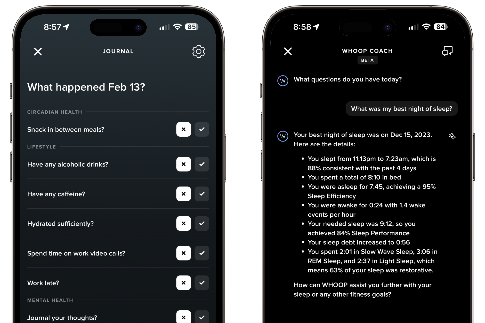
There’s another element of the Whoop app I love, and that’s the Whoop Coach. Powered by OpenAI’s GPT-4 platform, Whoop Coach is a chatbot that you can ask about virtually anything relating to your Whoop health data. You can ask it about your sleep, exercise performance, data from your journal, etc. I was apprehensive at first, initially inclined to brush it off as another AI gimmick. But it’s actually quite helpful.
How did a certain run impact my body? What was my best night of sleep? What’s my average heart rate during strength training workouts? I could find all of this data if I dug around in the Whoop app enough myself, but being able to ask very specific questions about my health and get a natural, written response is kind of amazing.
Getting the most out of the Whoop experience depends on you wearing the tracker 24/7 and updating the journal every day with as much information as possible. That’s not going to work for everyone, and that’s completely fine. But if you have the discipline to put in the effort to make Whoop work, the data you get from it is well worth it.
The hardware is the problem
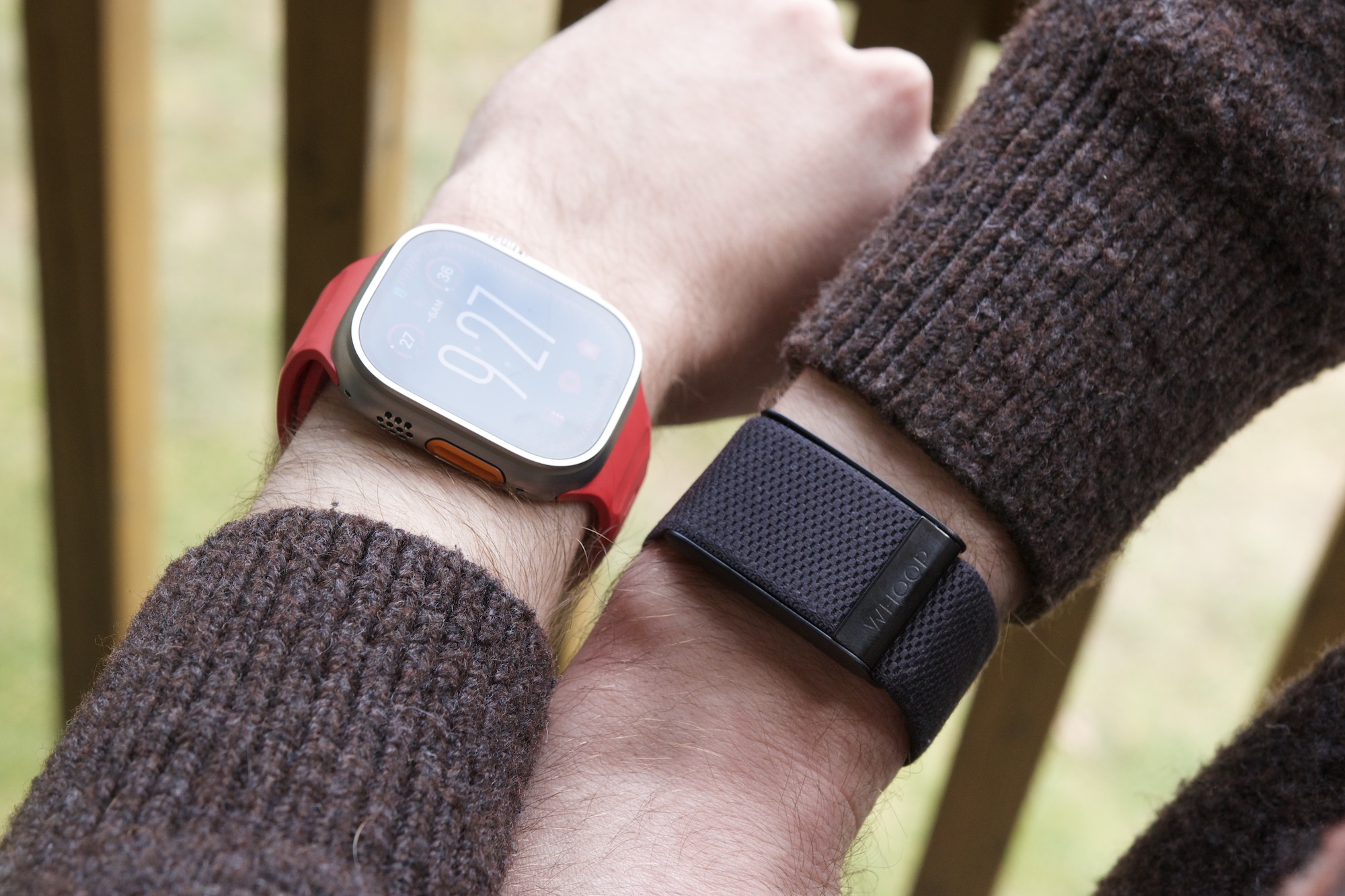
If Whoop is so great, why am I no longer wearing it? It has nothing to do with the Whoop app or anything I just talked about. My dealbreaker with the Whoop 4.0 is its hardware.
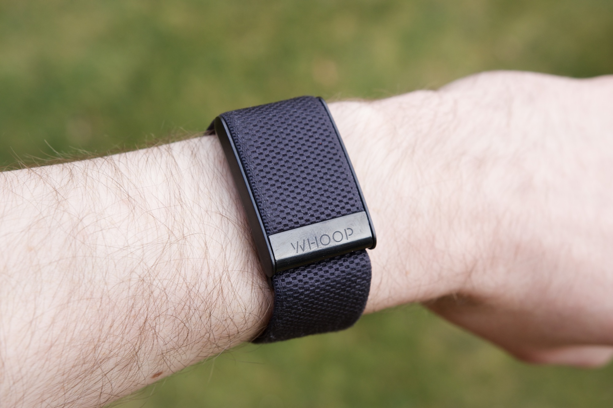
As you’ve probably seen by now, there’s no screen on the Whoop 4.0. You wear it on your wrist like a Fitbit, but there’s virtually nothing to do with the tracker itself. Beyond having it vibrate you awake with an alarm and double-tapping it to silence said alarm, that’s the only interaction you have with the Whoop 4.0 as a wearable. And that’s a problem.
I’m always wearing a smartwatch on my left wrist. For the past few months, it’s been the Apple Watch Ultra 2. I don’t want to stop wearing a smartwatch, so that means having to wear the Whoop 4.0 on my right wrist while still wearing the Apple Watch on my left one. I didn’t think I’d mind this, and at first, I didn’t.
However, after a month and a half of wearing an Apple Watch on one wrist and the Whoop on my other, I couldn’t do it anymore.
My dealbreaker with the Whoop 4.0 is its hardware.
Wearing something on each wrist requires commitment. Some people can pull it off, even with a smartwatch and a regular watch on each wrist. But I’m not one of those people. It becomes irritating, you get bad tan lines on both wrists, and the Whoop 4.0 can be weirdly uncomfortable at times — occasionally pinching the hairs on my wrist much more often than any other wearable I’ve tried.
If the Whoop 4.0 was a smartwatch and let me interact with my notifications, music, etc., I’d be inclined to replace my Apple Watch with it. But given its current hardware, it’s not something I can live with.
A brilliant (but flawed) charging system
There is another hardware issue with the Whoop 4.0, and that’s the way it charges.
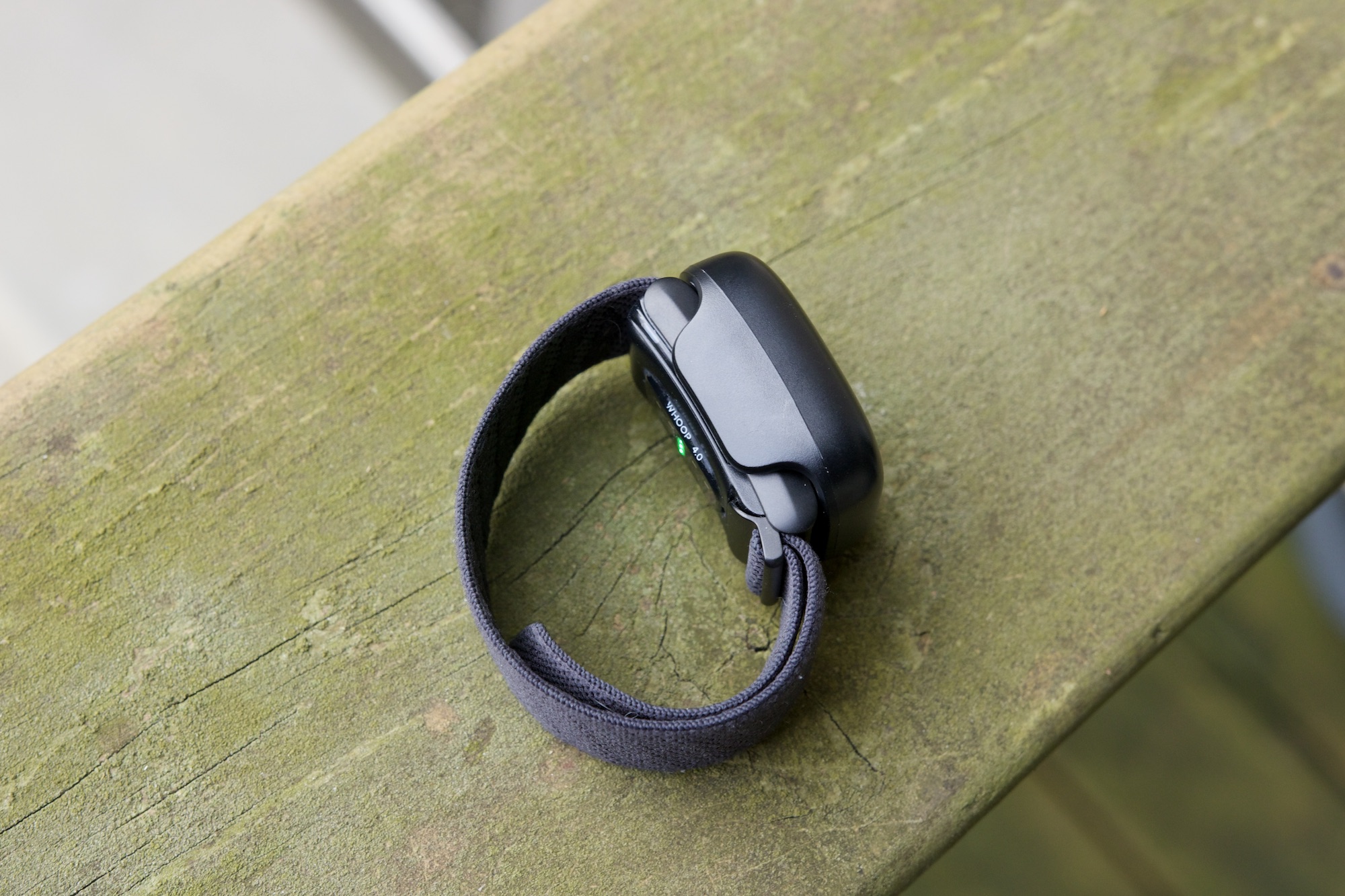
The Whoop 4.0 comes with the Whoop Battery Pack. When your Whoop’s battery starts to run low, you don’t plug in a cable or place it on a charging puck. Instead, you slide the Battery Pack onto the wearable. This is a cool idea. When your battery life gets low, just slide the Battery Pack onto your Whoop 4.0 and keep going about your day. You still get to wear the tracker while the Battery Pack juices it up, meaning you charge the wearable without having to pause tracking any of your health data.
As inventive as this system is, it’s also incredibly awkward. The Battery Pack is capable of one full recharge for your Whoop 4.0 tracker. Once your Whoop 4.0 battery is back to 100%, you need to take off the Battery Pack and then plug it in with a USB-C cable so it’s ready to go the next time you need it. This may not sound difficult on paper, but it effectively means you have to regularly track the battery life for two things instead of just one. In a world where we all already have numerous gadgets we have to charge regularly, remembering to plug in your tiny Whoop Battery Pack is a pretty easy thing to forget.
No more Whoop for me
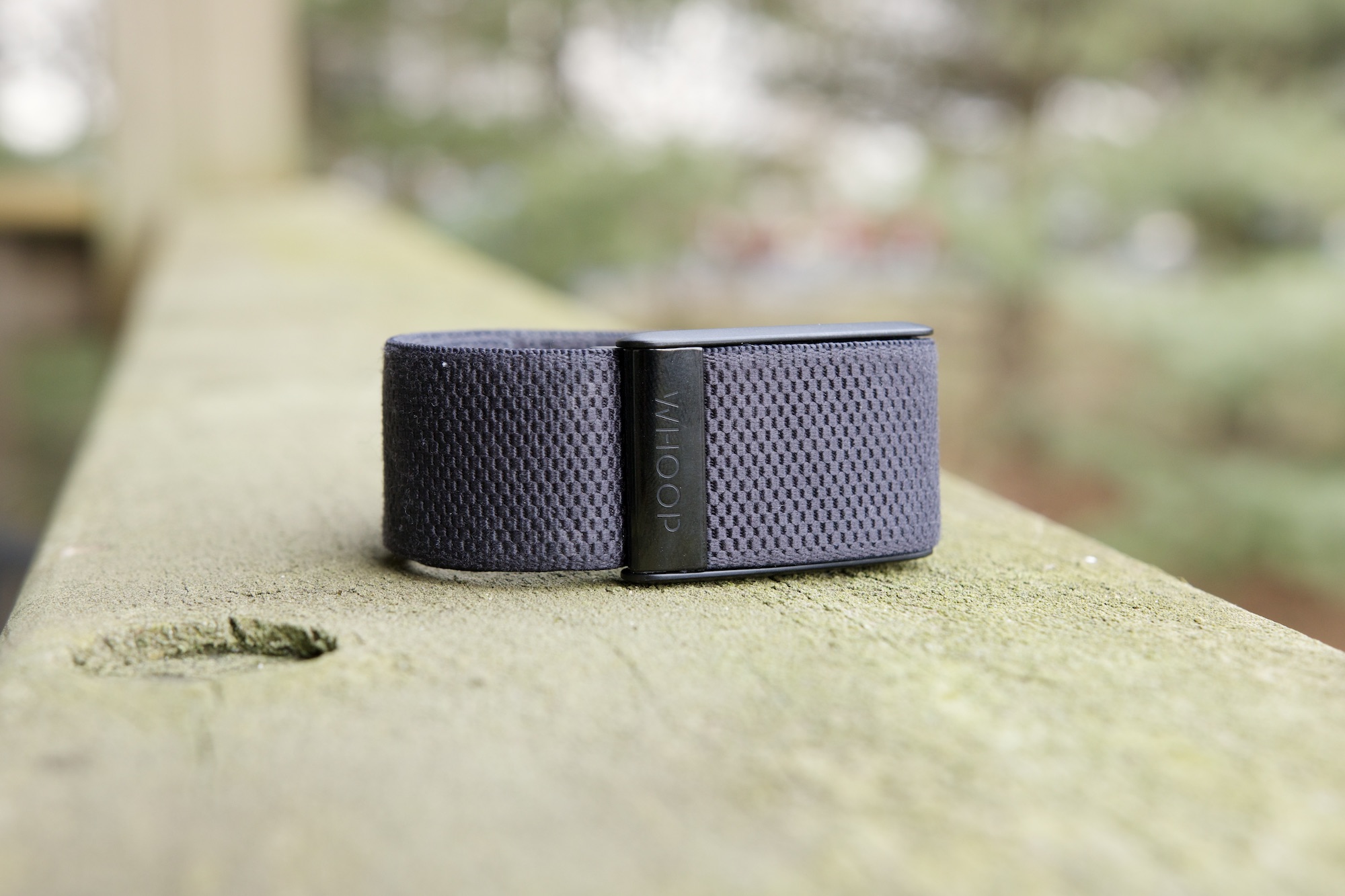
The Whoop 4.0 isn’t like any other wearable I’ve used in recent years — from the ridiculously in-depth software to the annoying flawed hardware. It’s a frustrating product because there are so many aspects I truly love, so much so that I’d be inclined to pay the incredibly high $30/month subscription required to use it. But one of the most fundamental things about it can’t be fixed (at least not in this current iteration).
I’m disappointed that I can’t make the Whoop 4.0 fit into my life, but I’m also excited to see what the inevitable Whoop 5.0 and Whoop 6.0 look like. I’m not sure if a proper smartwatch is on Whoop’s roadmap, but if the company ever decides to head in that direction, I’ll be the first one in line, eager to slap it on my wrist.
Until that day, though, I’m going back to my one-wrist wearable life.
