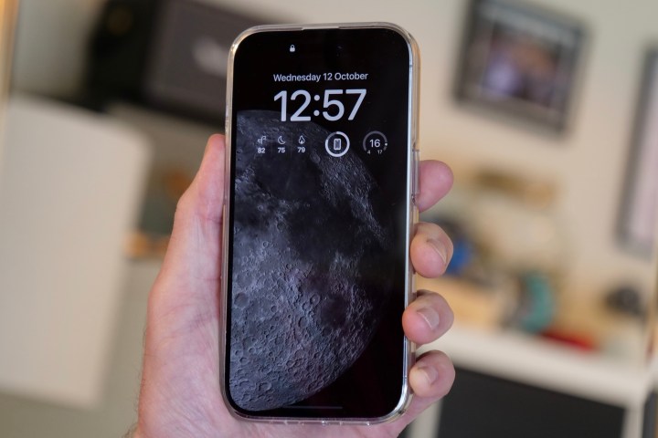
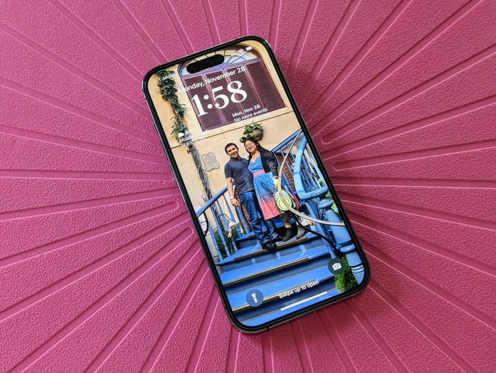
When Apple announced the iPhone 14 and iPhone 14 Pro devices, one of the big differences that set them apart was the display. The standard iPhone 14 wasn’t much different from the iPhone 13 before it, but the iPhone 14 Pro has the new Dynamic Island and an always-on display (AOD) feature.
For some of us, myself included, the AOD was a huge deal because Android phones have been doing it for a while now — Apple just finally joined the party.

But Apple implemented the AOD in a way that made it different from Android. Basically, it dims the wallpaper to the lowest brightness possible, and you can still see your notifications. But this was a divisive feature, and quite a few people preferred the minimaistl way Android did it: a black screen with just the date and time.
Apple dropped iOS 16.2 recently, and in doing so, included some settings for the always-on display on the iPhone 14 Pro. The settings let you disable the wallpaper and notifications, making it much more similar to AODs you see on Android phones.
I’ve spent the past few days with this “newiand-improved” always-on display setting, and honestly, I don’t like it one bit.
My iPhone 14 Pro is no longer unique

Why? Perhaps it’s because I didn’t use Android phones for the past several years, but I found Apple’s implementation of the always-on display to be beautiful and unique. It’s very similar to how the AOD works on Apple’s watches ever since the Apple Watch Series 5, just on a larger screen. The default Apple iPhone 14 Pro is an extension of your lock screen (and home screen, if you use the same wallpaper), and it should be treated as such. If you use one of Apple’s default wallpapers, there are also extra little details that are simply fascinating, like the Earth astronomy wallpapers that show your real-time location.
Like many people, I spend most of my day at a desk for work. Ever since I got my iPhone 14 Pro, I’ve loved just placing it on my phone stand and using my iPhone as my clock. I love being able to just glance over to my iPhone to see the time, but I also just like seeing my wallpaper, as well as my widgets and any notifications, if any. It’s like a personal dashboard for me with glanceable bits of information, and I like seeing my favorite photos of my husband and me.
Turning off both the wallpaper and notifications has taken away the personality of the always-on display. When I look at my iPhone 14 Pro this way, it serves its purpose by telling me the time, but it no longer invokes any feelings from me when I do so.
Battery life is negligible

I’ve had my always-on display enabled since I got my iPhone 14 Pro, and I really didn’t notice a lot of battery drain with it on. This was a concern for some people, though, which is why some just turned it off completely. I’ll admit, my iPhone 14 Pro battery life felt worse than my old iPhone 13 Pro when I first got it, but it has since improved with the numerous iOS 16 updates.
Now that we have the new AOD settings, I haven’t noticed much of a difference with battery life. When I have the wallpaper and notifications on, my iPhone 14 Pro would last through the entire day, with maybe around 20% to 30% left by the time I go to bed. I’m getting maybe a teensy bit more with the wallpaper and notifications off, but I’m the kind of person who charges my phone overnight anyway, and I’m never without a portable battery pack either, so the little savings is negligible.
It’s not like turning off the wallpaper and notifications will get you an entire half a day’s worth more of juice. If that’s what you’re looking for, then this isn’t the way to go about it.
Don’t ruin your iPhone 14 Pro’s AOD

Andy Boxall, Digital Trends’ senior mobile writer, said it best: “You’re ruining your iPhone 14 Pro if you turn off the always-on screen.” I completely agree, and while these new settings aren’t the same as turning it off completely, it still taints the delightful AOD experience that Apple originally created.
People asked for this, and Apple surprisingly gave in to the demands of the people. I’ve tried these settings, and they’re just not for me. If you want to have a boring and minimalistic always-on display, then more power to you — I prefer to see my wallpaper and select notifications each time I glance over to my iPhone 14 Pro.
Apple made something wonderful with the AOD, and simply put, I don’t want to ruin it.


