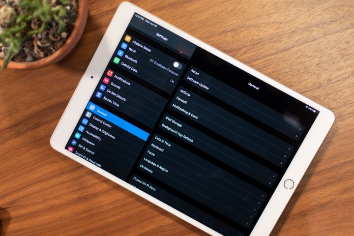
iPadOS is reshaping mobile computing.
Highs
- Floating keyboard with swipe typing is excellent
- Multiple apps in Slide Over drastically improves workflow
- Can have several instances of the same app
- Support for USB flash drives
- Desktop browsing is fantastic
Lows
- Three finger gestures are clunky
- Lacks full mouse support
The iPad is finally free from the iPhone’s chains.
This fall, iOS — the operating system on Apple’s iPhones — will no longer be the same as the operating system on iPads. Apple’s popular tablets will run iPadOS, instead. At the moment, the two systems are similar because most iPadOS features are the same as what’s in the forthcoming iOS 13 update. But it’s easy to see change is afoot.
With iPadOS, the iPad is even more powerful, and while it still has a way to go to replace your laptop, its improved versatility has already refined my workflow. There’s native support for USB flash drives, you can have several apps on the screen at the same time, and several instances of the same app. There’s also an improved home screen that makes use of the larger screen. iPadOS isn’t a small update. It’s paving the way for a better future for tablets.
Standard disclaimer: I don’t recommend you install the public beta of iPadOS. It’s in beta, and that means bugs. If you still want to try it, however, our guide on how to download and install iPadOS has you covered.
Multi-window means multi-functional
The most impactful change in iPadOS is the option to have multiple instances of the same app, as well as multiple apps in Slide Over view. These terms can become confusing, so let’s break them down.
Slide Over is the feature that lets you have iPad apps hover over other apps. It’s restricted to portrait view, so it looks like a phone screen. You can hide these Slide Over apps to focus on the main, full screen app, but a simple swipe in on the right side of the screen will bring them back. You can have multiple apps open in Slide Over, which takes multi-tasking to new levels.
Just drag an app from the dock or home screen into the Slide Over view, and it will replace it. Don’t worry, the previous Slide Over app won’t disappear. Like on an iPhone, a quick slide to the right on the bar on the bottom will swap to the previous Slide Over app, and you can swipe up on the bar and hold to see all the Slide Over apps you currently have open.
iPadOS packs a lot of other nice touches that add to day-to-day usability.
I wrote this story in the Notes app on the iPad Pro. I also had Slack open in the Slide Over view, as well as a Safari webpage, and email. I could dismiss these apps easily, and just as easily bring them back. Having them at the ready while I’m writing did wonders for my workflow.
Having the same app open in multiple instances is something we take for granted on desktops, but it’s finally a feature now on iPads. You can do that in iPadOS by just clicking and dragging a note, email, or file and opening it in Split View. Being able to reference content from the same app is another godsend for speeding up my workflow. And if you’re ever confused about how many instances you have open, you can see them all in App Expose.

Apple is pushing the idea that anything you can drag can be opened as an instance in Split View, but it’s not quite there. Many apps don’t work with Split View yet. Apple is requiring that all iPad apps support Slide Over and Split View going forward, however, so support should expand in the coming year.
Other usability improvements
iPadOS packs a lot of other nice touches that add to day-to-day usability. For example, the Files app has a column view and supports USB flash drives. It takes a few seconds for it to identify them, but it works seamlessly — no eject button necessary. In the fall, you’ll be able to connect an iPad on iPadOS straight to your camera and transfer files into Adobe Lightroom.
Apple has finally added mouse support for the iPad, but there’s a catch. It’s an accessibility feature. The cursor is extremely large and only supports a single click. It’s not the same experience as using a mouse on the laptop or desktop. I’m happy to see Apple has added Bluetooth mouse support for those that need it, but I want it to add full support, or at least a trackpad, for the next iPad Pro.

Another accessibility feature is Voice Control, which lets you control the iPad with just your voice. It works remarkably well. You can just say, “Open Photos,” and the app will open. If you say, “Show numbers,” the interface will assign a number for every tappable item on the screen, so you can just say the number to select.
iPadOS claims to improve performance, but I haven’t seen much difference. It’s likely you’ll see a bump if you’re using an older iPad. The Apple Pencil also claims lower latency
A mini keyboard, swipe to type, and changes to text editing
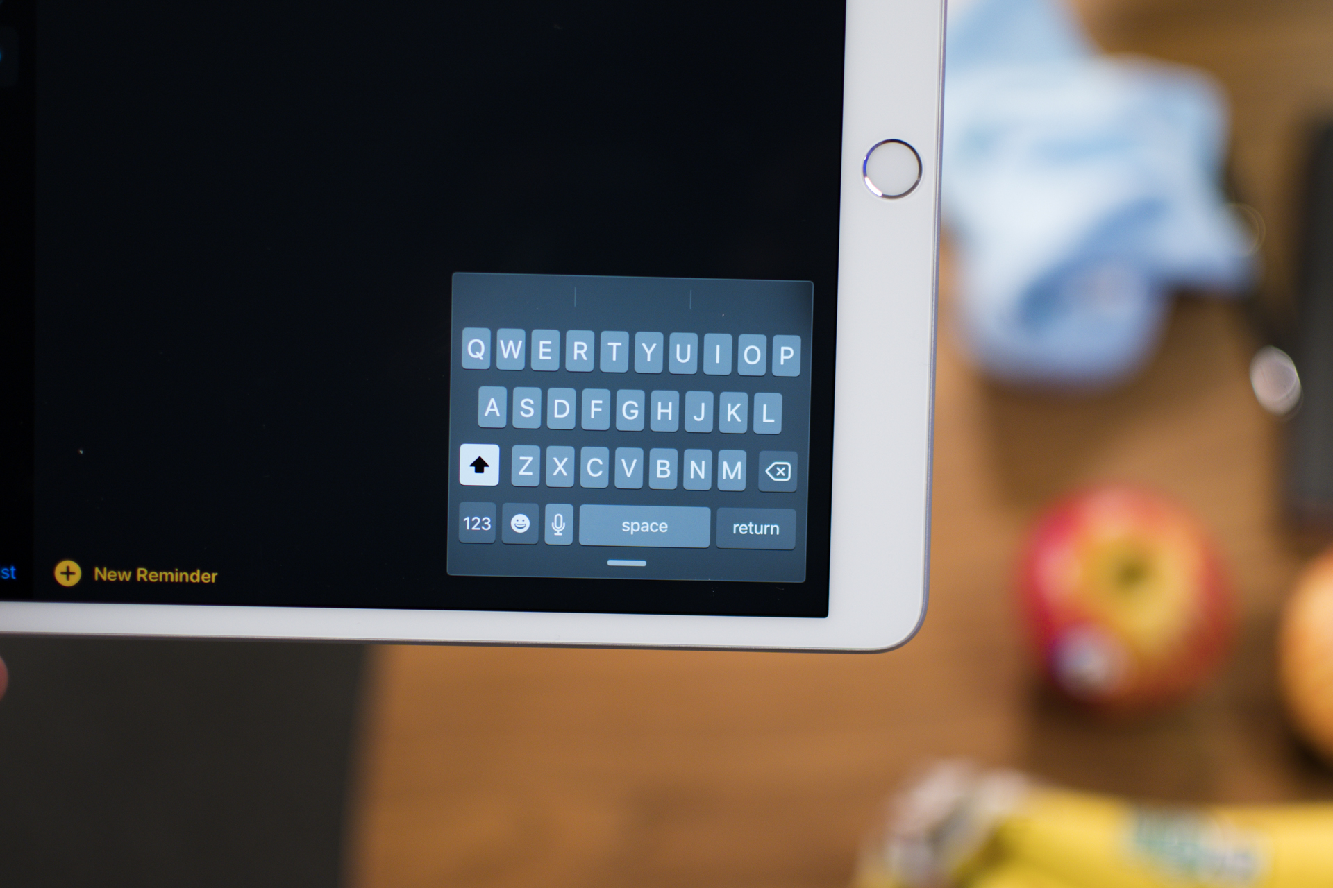
Typing on the virtual keyboard of a tablet sucks. It’s just clunky, frustrating, and I always connect the iPad to a keyboard to type out anything longer than, “Hello.” iPadOS has changed that, thanks to the ability to make keyboard small and have it float around the screen. Even better, it supports swipe typing, so if you’re a connoisseur of the art of gesture typing, you’ll be able to type out full sentences with minimal effort. It’s excellent.
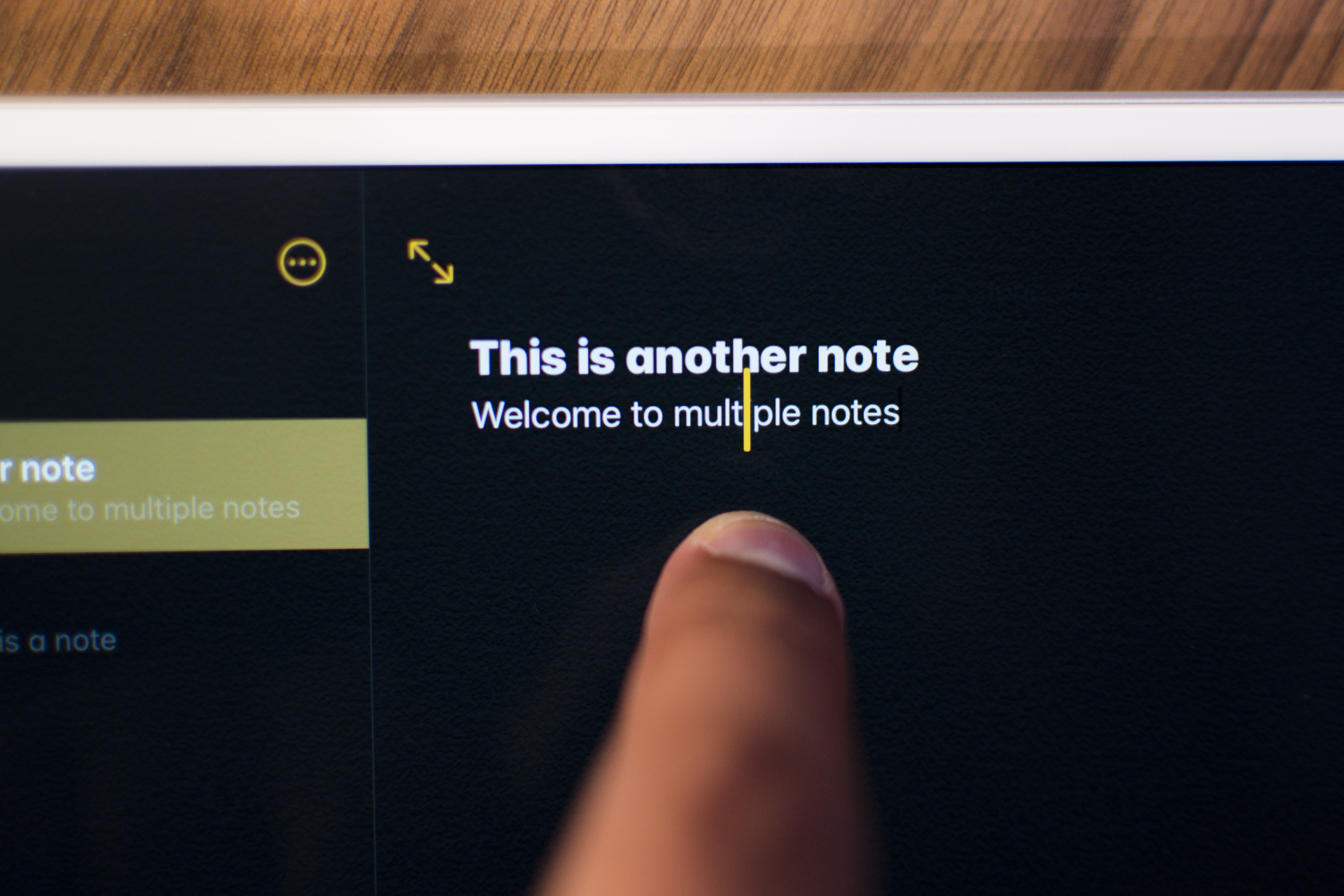
There are some changes to text editing, but I’m not a fan of all of them. First up, it’s dead simple to move the cursor when typing. Just drag it around and it will precisely move where you want it to. I do wish Apple magnified the cursor, as it’s easy to block it from view with my finger.
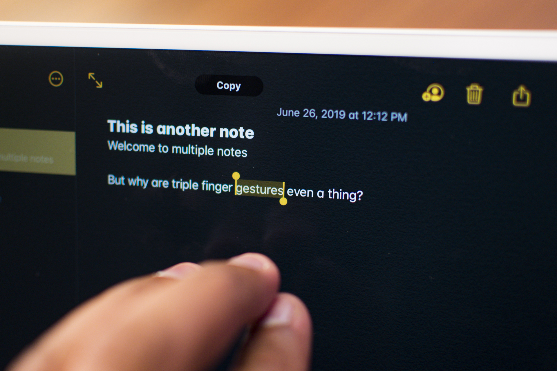
You can double tap a word to highlight it, and triple tap to highlight a whole sentence (a quadruple tap will select the whole paragraph). Now comes the confusing part: triple finger gestures. If you tap with three fingers, you’ll undo the last action. You can also swipe left with three fingers for undo, or swipe right with three fingers to redo it. Pinch in with three fingers to copy highlighted text, and pinch out to paste them somewhere else.
I don’t mind the undo and redo gestures, but I don’t like copy and paste. Those gestures feel clunky and difficult to use. I’ll stick to the formatting bar that pops up and just tap on Copy.
Refreshed Home screen
Apple hasn’t changed the look of its home screen on iPhones or iPads in, well, almost forever. And not much has changed in iPadOS. You still have access to the classic grid of apps, though you can squeeze in more icons. More importantly, you can bring the Today widgets screen over to the main home page. Widgets are awesome — Android has had them for years — and having them this accessible and a glance away on the iPad is great. Hopefully it means more apps will have better widgets so they can live on your home screen.
While we’re on design, there are a few other welcome user interface tweaks. The pop-up volume change interface no longer takes up the center of the screen and is more discreet. You can also directly see Wi-Fi networks to connect to and Bluetooth devices to pair with from the Control Center, a welcome convenience.
Desktop-grade browsing
Using Safari on an iPad often pulled the mobile site instead of the desktop version, which can be annoying as desktop sites are often better overall. With iPadOS, Safari will request the desktop version of websites, and Apple routes mouse inputs to touch inputs. Sites like Google Docs work well (though you probably still want to use the app).

You’ll also be happy to hear Safari now has a downloads manager, so you can download more than just photos through the browser.
Improved photo and video editing
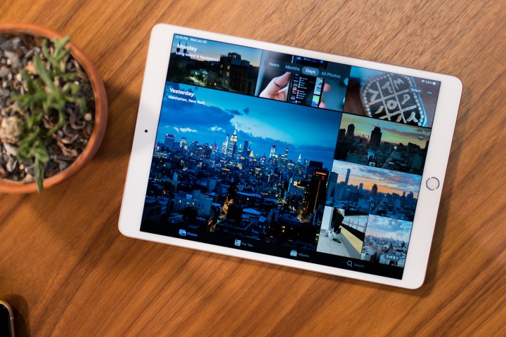
The photos app has been redesigned. It now lets you categorize your photos by Day, Month, or Year. It uses on-device machine learning to choose the best photos and hide the clutter (though you can still see all your photos if you want). It can even identify relevant events and show you a comparative history if you’re on the Year view and have similar photos from years prior, for example. It looks so much better, and the app feels faster, too.
I’m a big fan of the new photo editing tools. There’s a lot more of them, from Sharpness and Definition to Noise Reduction and Tint. It’s easy to see the changes you’ve made to the original, too. All of these apply when editing videos as well, and you can finally rotate a video. Professionals will still use Lightroom or another app, but it’s great to have more robust tools available for the average person.
And a whole lot more
This is just a small selection of features that are new in iPadOS. There’s dark mode, which turns all your apps into a darker theme that’s easier on the eyes. The Share sheet that pops up when you share something is smarter now, as it does a good job of guessing where or to whom you want to send content.
You also get a more natural-sounding Siri, support for third-party fonts, a revamped Health app, and Sidecar, which lets you use an iPad as a second screen when connected to a Mac. We’ve gone over several of these features in our iOS 13 hands-on review, so be sure to check it out.
Apple has laid a strong foundation for the future of iPads with iPadOS, and I can’t wait to see it diverge further from iOS next year to offer better tools suited to tablets.


