The iPhone 11 Pro is one of the most perfectly proportioned, delightfully curvy, and exceptionally pleasing-to-hold smartphones ever made. I’ve used it every day since it was released in 2019, and have compared it to the majority of other big-name phones released since then. Although some have come very close to matching it — the Huawei P40 Pro springs to mind — nothing has beat it.
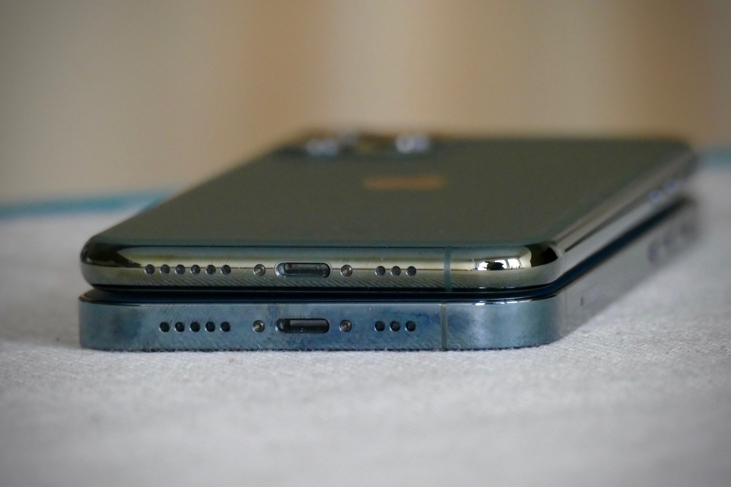
Apple’s new iPhone 12 Pro doesn’t look like the 11 Pro. It looks more like the iPhone 4 and iPhone 5, with its squared-off sides and slablike design. There’s no question it’s a pretty phone. Good-looking even. But is it an improvement? I don’t believe so.
New design surprises
As sure as night follows day, an S version has followed every iPhone since the iPhone 3G, yet the iPhone 11 series’ look was retired after a single year, despite it being significantly different from the iPhone XS before it. The real reason behind the decision will probably never be known, but it may have been a combination of things including increased competition, a plethora of similarly curvy phones available, a desire to change the design to interest new buyers, and technical requirements for integrating 5G antennas and other technology.

I’m not going to argue about the design’s success and quality with our mobile editor Andrew Martonik, who, in his iPhone 12 Pro review, said: “As an overall object to feast your eyes on, it’s as gorgeous as you’d expect from an Apple product. Lines, tolerances, and overall execution are perfect.”
It’s highly unlikely anyone is sad about not getting an iPhone “11S” in 2020, and there will be many who are excited that the new design pays homage to some of its older, arguably best-loved devices. But as someone who adores the iPhone 11 Pro’s shape, does the design callback of the iPhone 12 Pro come with any unwelcome retro downsides?
Comfort worries eased
I worried that after a year of the iPhone 11 Pro, the sharp-lined 12 Pro would feel akin to tightly holding a razor blade. Apple’s switch of the iPhone SE 2020’s design from the distinctly iPhone 12-like iPhone 5 to the curvier iPhone 11-like iPhone 6 already suggested it didn’t think the sharp-line look worked today. But that’s apparently not the case.

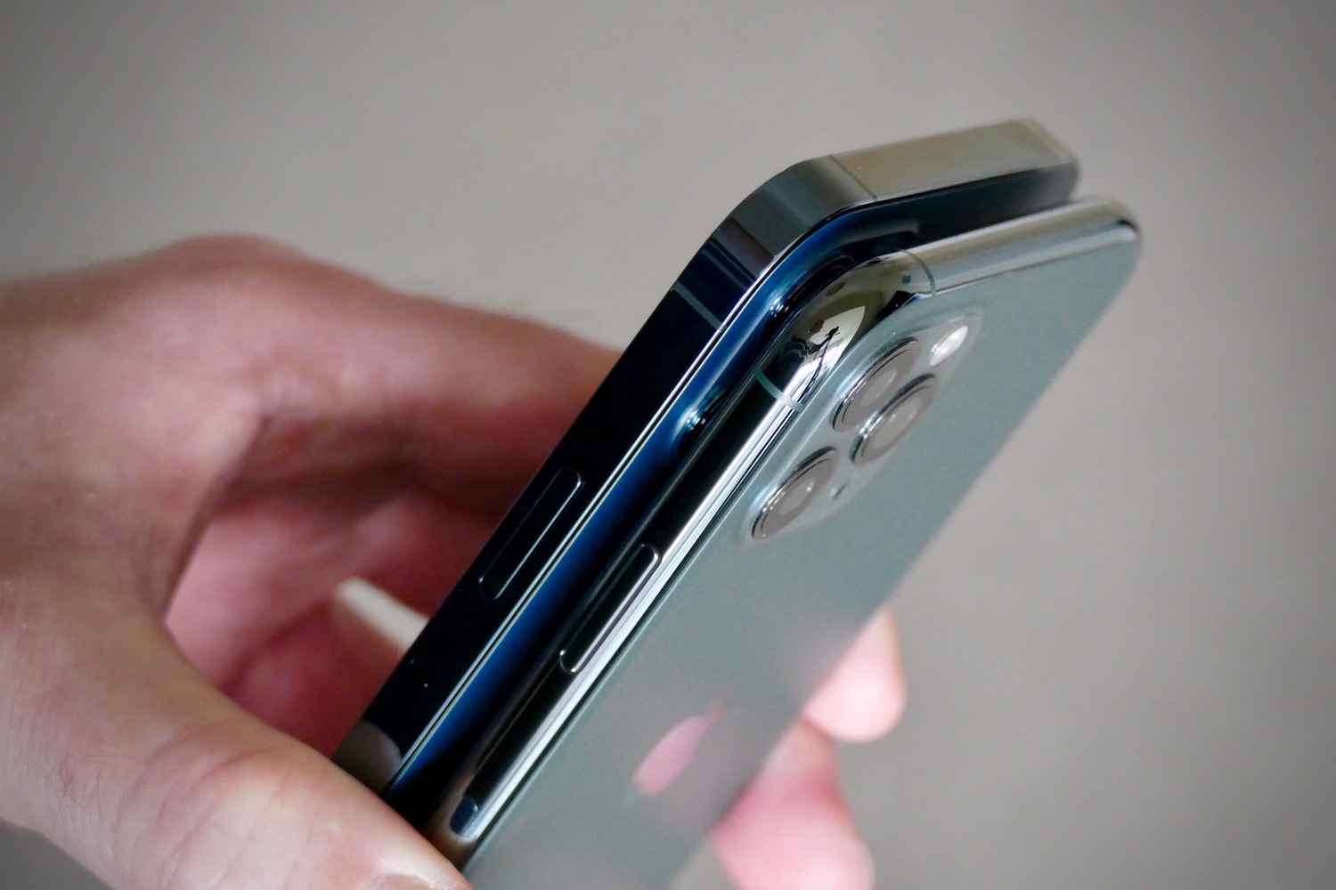
After a few days with the new phone, I’ve found that although it’s obviously very different, it’s not the disaster I initially feared. In some ways, it’s better than the 11 Pro. Better? Yes, and here’s an example. When you hold the 12 Pro normally in your hand, the corner that rests in your palm is “softer” and doesn’t cause the slight dig the 11 Pro’s super-rounded corners do after a while. It’s likely to do with the additional real estate provided by the flat sides.
The iPhone 12 Pro also feels slimmer, despite essentially having the same dimensions, and this improves one-handed use. I can stretch my thumb across the screen a little further on the 12 Pro compared to the 11 Pro without having to adjust my grip, and again, those flat sides mean a greater contact patch against my hand. so it’s even more secure than the 11 Pro.

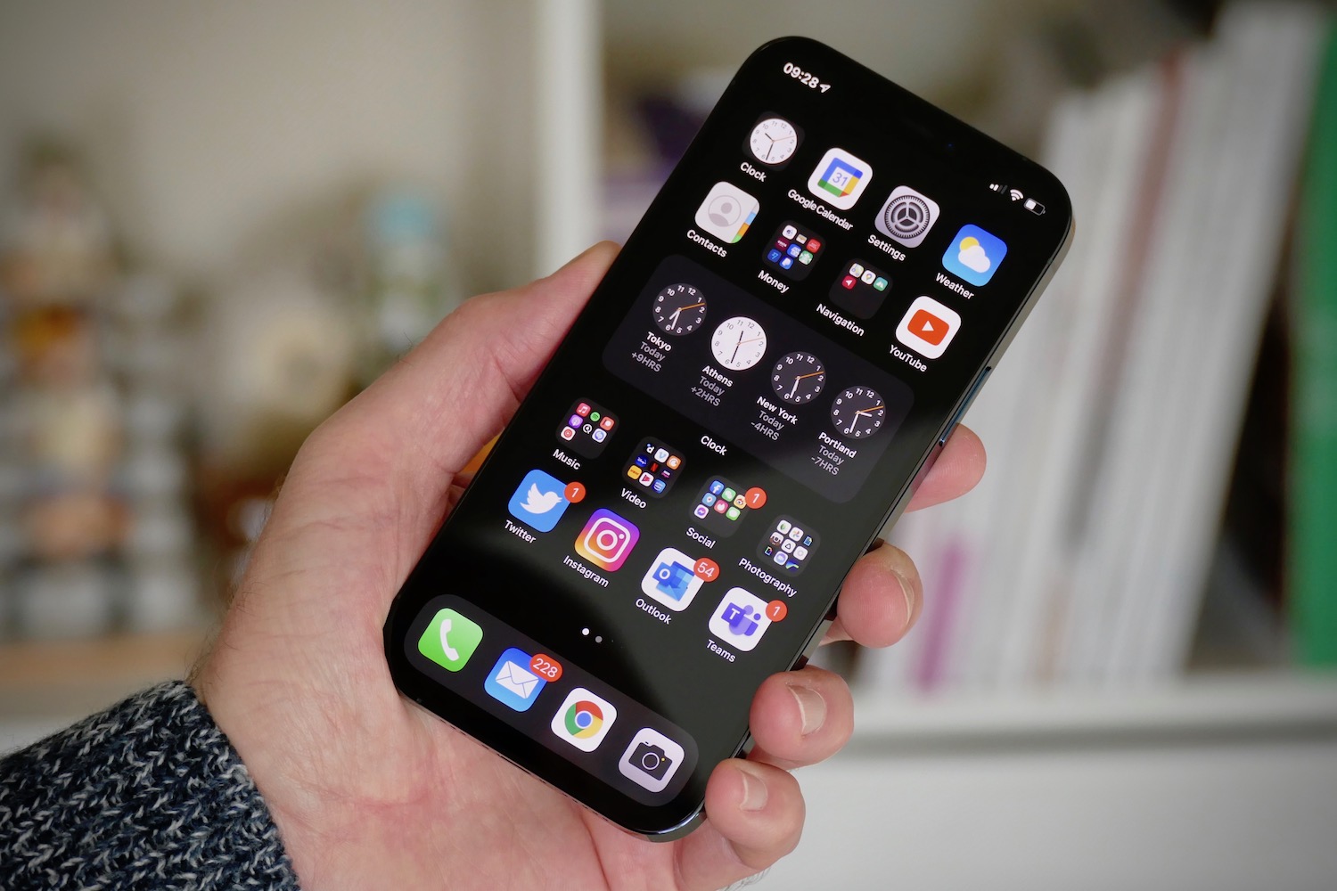
These are pleasant surprises, and while getting a flat, squared-off, sharp-edged design like this right is hard, it doesn’t make the 12 Pro better to hold than the 11 Pro. I still prefer the smoothness of the old phone, as well as its 2.5D curved screen to the 12 Pro’s flat screen, even if it is a little larger this time. And I don’t think the sharp-edged buttons are very nice either. That said, the iPhone 12 Pro is a much more confident design that will attract far more admiring glances.
Forget Apple’s clear case
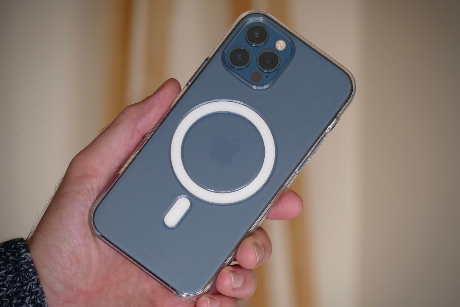
My iPhone 11 Pro spends a lot of time inside Apple’s own clear case. It shows off the Midnight Green color, and keeps the finish looking new. It also complements the design very well, simply feeling like a thicker iPhone 11 Pro in my hand. Thinking the same thing about the 12 Pro, I purchased Apple’s MagSafe-equipped clear case at launch. At $50, it was an expensive addition, and I couldn’t have been more disappointed. It highlights the delicate, millimeter-precise balancing act Apple must have pulled off in getting the 12 Pro’s design to feel right.

I don’t mind the look. The oversized power symbol to denote the MagSafe charging ring is no different than having a case manufacturer’s name, or some other equally meaningless design, on a case. What I do mind is the slippery, almost greasy finish of the clear case, and how it robs the phone of comfort.
The extra size added by the case and the overall lack of grip make the phone much less comfortable in the palm of your hand. You may wonder why this matters, but we hold these devices for hours each day, and it shouldn’t feel awkward. It should feel natural, and getting it right is where designers earn their money.
I’ve not tried any other cases for the iPhone 12 Pro yet, including Apple’s silicone case, and it could be that this situation is unique to the clear case. It’s so much of a disappointment, I’ve removed it from my iPhone 12 Pro and am using it without a case at all. This has at least given me more time to appreciate the phone’s new shape, but I’m not keen to check the true strength of the Ceramic Shield glass in person, so I’ll be auditioning case alternatives soon.
The iPhone 11 Pro’s departure hurts
Once I’ve wrapped up this article, I’ll say goodbye to my iPhone 11 Pro. I used it as a trade-in against the iPhone 12 Pro, so it needs to be reset, packaged up, and returned, presumably to be refurbished and sold to a new owner. I’ll be sad to see it go. The iPhone 12 Pro’s new design makes me happy, as it could have so easily not existed until next year if Apple stuck to its previously rigid release structure, but I think it’s a sideways step in comfort-first design, rather than a step forward. No worse, but no better.
What this means is if you’re looking at refurbished or old stock iPhone 11 Pro models, don’t hold back because it doesn’t look the same as this year’s phone. You’re getting an incredibly ergonomic, thoughtfully designed smartphone that holds its own against the device that has replaced it, and this in turn puts it ahead of most other phones out there at the moment.
As for the iPhone 12 Pro, while its shape doesn’t quite surpass the 11 Pro for me, the beautiful Pacific Blue color beats Midnight Green every time.


