“It runs well, the interface is well done, and there aren't any limits on the apps and media you can load on it. The Kobo Arc is a good value for the price and worthy competition for the Nook HD, Kindle HD, and even the Google Nexus 7.”
- Tapestries provide a novel way to interact with a tablet
- Smooth, speedy performance
- Good display with wide viewing angles
- Pre-loaded apps are well curated
- No Bluetooth or HD output
- Display attracts smudges
- Running Android 4.0, not latest version
- No microSD slot
In the world of e-readers, Canadian company Kobo is a perennial also-ran in the U.S., coming in behind Amazon and Barnes & Noble even when it innovates ahead of both of its higher-ranking rivals. Kobo took its time getting into the low-cost tablet for readers market, perhaps in an effort to see what the big players did well and what they got wrong. The result of this watching and waiting is the Kobo Arc tablet.
At $200, it’s the same price as the Nook HD and Kindle Fire HD and is looking to serve much the same purpose: a tablet experience for Kobo e-reader customers. However, the Arc goes farther than that. Instead of locking owners to Kobo-only books, media, and apps, it runs Android without blocks or limitations. It’s heavily skinned like the Nook and Kindle Fire and is all about getting you to buy more Kobo books, but gives access to the Google Play Store and all the Google core apps.
Does this approach make for a tablet worth owning? Yep.
Look and Feel
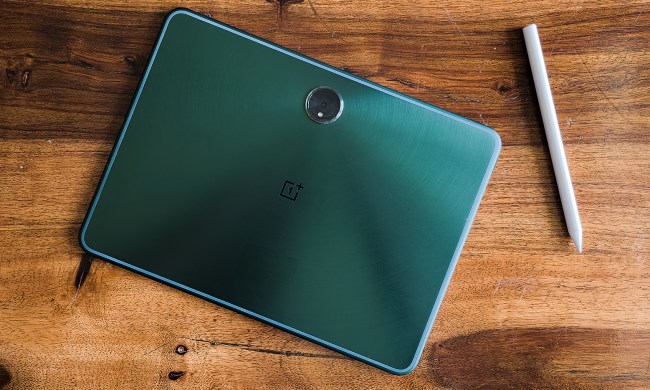
The Arc’s outer design looks a lot like its e-readers. It looks like the company took the Kobo Touch and put an LCD in it instead of an E Ink screen. The design is functional even if it’s not the slickest and it has a balanced feel. We also like the soft touch back, which tapers to the edges for a comfortable hold. At 7.4 x 4.7 x 0.5 inches and 12.8 ounces, it’s a good size and weight for a 7-inch tablet.
The Arc is a proper Android 4.0 Ice Cream Sandwich device in that it has no buttons beyond Power on top and a Volume toggle on the upper right side.
The 7-inch, 1280 x 800 pixel resolution IPS (LCD) display doesn’t have the pixel density of the Nook HD or the iPad 4, but it makes up for it with bright colors, good contrast, and wide viewing angles. The only thing about the display that really bothered us during testing is how quickly smudges collect on it. When dirty, the screen is a little less responsive, so keep a cloth handy.
We like that the screen doesn’t sit flush with the plastic case, providing owners with a little protection from drops. The bezel isn’t as wide as the Nook HD’s, but is still a nice resting place for the thumbs when reading.
Two speaker grills sit under the display and face out, so audio doesn’t get muffled if you set the tablet on a table. The quality of said audio isn’t great – it sounds flat and lacks bass. But at least there’s plenty of volume. However, plug in a good pair of headphones to the jack on the upper right edge and you’ll find the audio much more pleasant.
Tapestry Interface
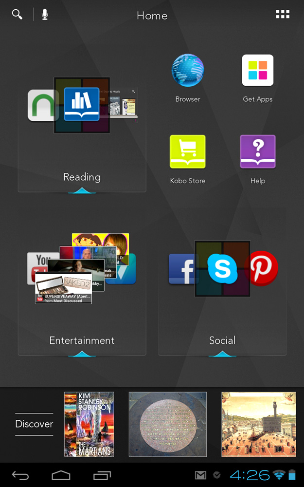
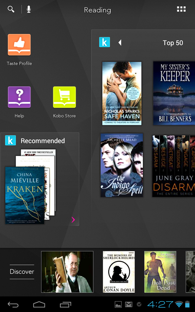
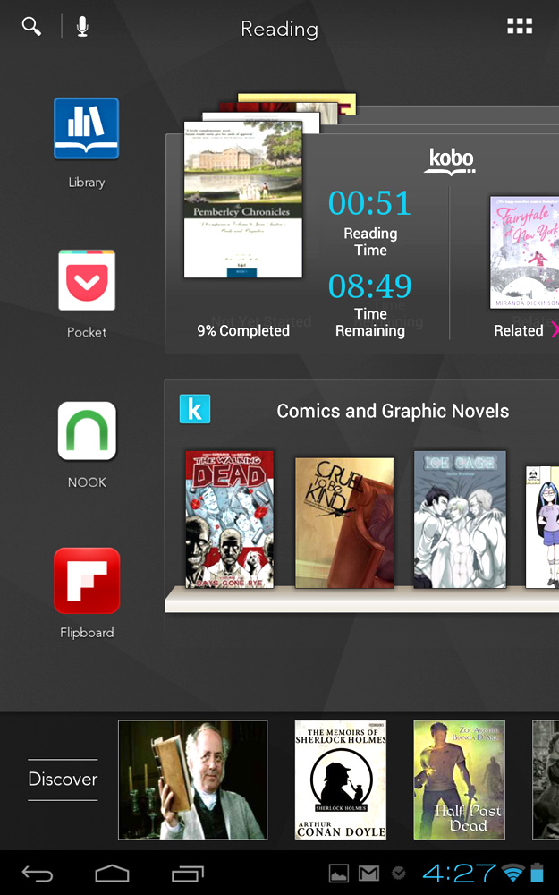
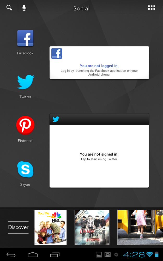
Kobo hopes to set itself apart from Amazon and B&N and other Android tablets with its interface. The “Tapestry” interface is just like the skins found on popular Android phones from Samsung, HTC, LG, etc. Unlike most UI tweaks, Tapestry adds some fundamental changes to how users interact with Android, at least on the Homescreen.
Kobo is more invested in getting you to talk about your books and share the reading experience.
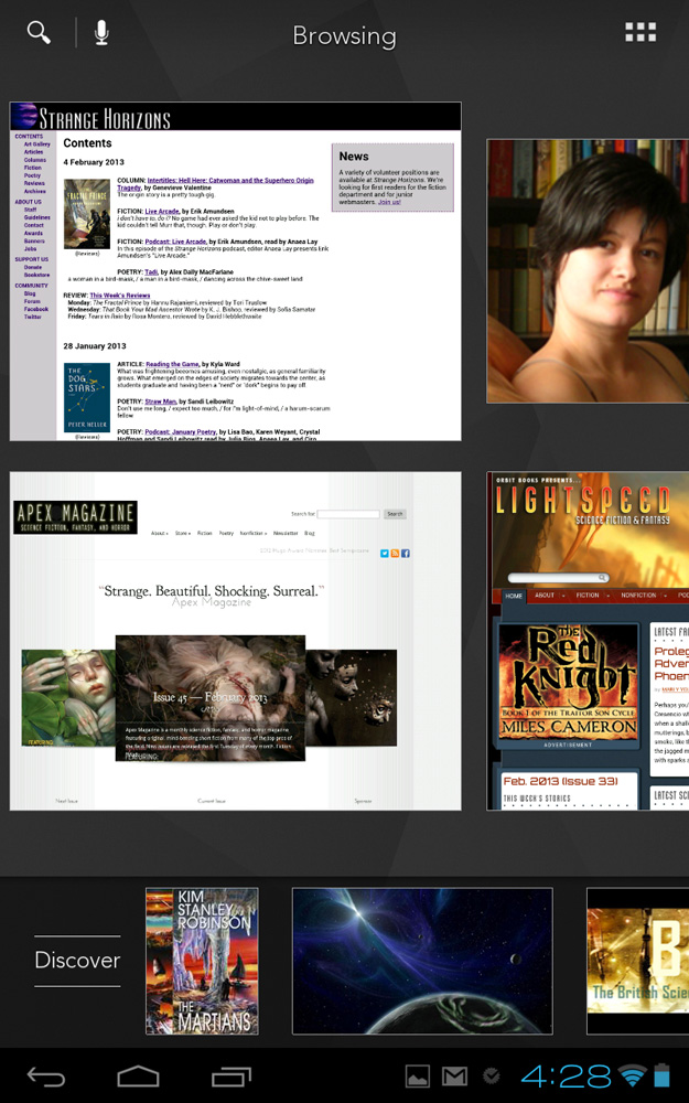
Tapestries are great for people who are into mind mapping, Pinterest pinning, scrapbooking, or just enjoy gathering content in interesting ways. Though there are pre-made Tapestries on launch, they are completely customizable and owners can create more. You can even create a sub-Tapestry inside another one.
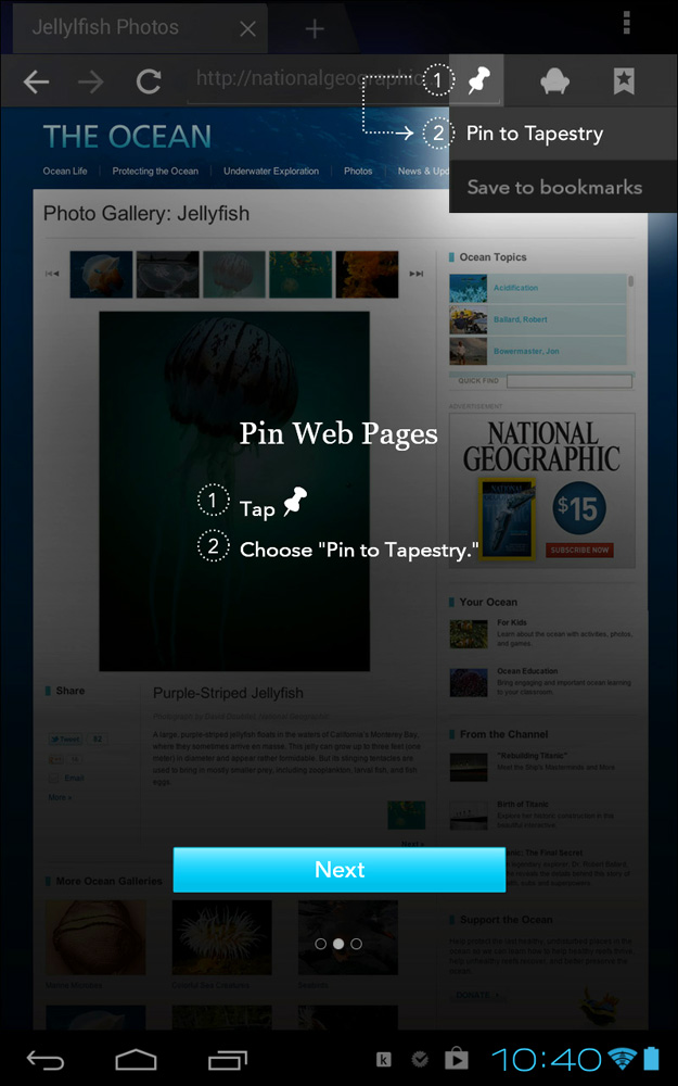
Pinning is easy. Inside many of the apps Kobo pre-loads there is a pin icon or menu choice. In most other apps “Pin to Tapestry” shows up under the Share option, where applicable.
We’re not only fans of the overall concept of Tapestry, but also how smooth the eye-candy animations are. Tap one to open and it expands out, then swipe to the end of the Homescreen and the icons and other elements wobble and bend. The graphic design is attractive but not overly flashy, and the interface gives the impression of being clean and well thought out.
Initially, the Arc connects you to your Kobo account or prompts you to create one. You’re not limited to that app for reading or any app for anything. Tap Get Apps and you go right to the Google Play Store, just like a normal Android tablet. Any app you download can be pinned as well. Kobo doesn’t have a special app store of its own or even a music or video store, so owners aren’t locked into a single store to buy content like Amazon’s Kindle Fire or the Nook HD. This freedom puts the Arc on par with the Nexus 7 tablet from Google.
The Discover bar that runs along the bottom of the Home screens is where Kobo’s hand is most evident. As you add apps and other content to your Tapestries, the Arc will suggest websites, books, and other media that relates. For us, reading bad Pride & Prejudice fan fiction led to suggestions for Jane Austen books (in Kobo’s store), Austen-related websites, and other lame fan fiction. Creating a folder of online science fiction and fantasy magazines led to suggestions of genre books (again, in the bookstore) and blogs by or about science fiction and fantasy authors. The sources the Discover bar pulls from aren’t likely to be far out of the mainstream, but in our testing most of them were relevant and on point.
This approach is less aggressive and intrusive than what Amazon does with the Kindle Fire HD. Yes, tapping on the suggested books takes you to Kobo, but nothing forces you to buy said books in the company’s store. And since not every suggestion has to do with Kobo specifically, owners won’t necessarily feel like they’re being advertised to all the time.
This interface provides an interesting way to interact with and use a tablet that is different enough from other Android devices without being so different that it’s confusing or puts potential buyers off.
Apps and Kobo e-reading
The main audience for the Kobo Arc is likely to be people who like to read, and the pre-loaded apps speak to this bias. In addition to Kobo’s app there’s also Press Reader (Newspaper Direct), Zinio, and Readability (similar to Pocket/Instapaper). Rdio and 7Digital are also on board for music lovers.
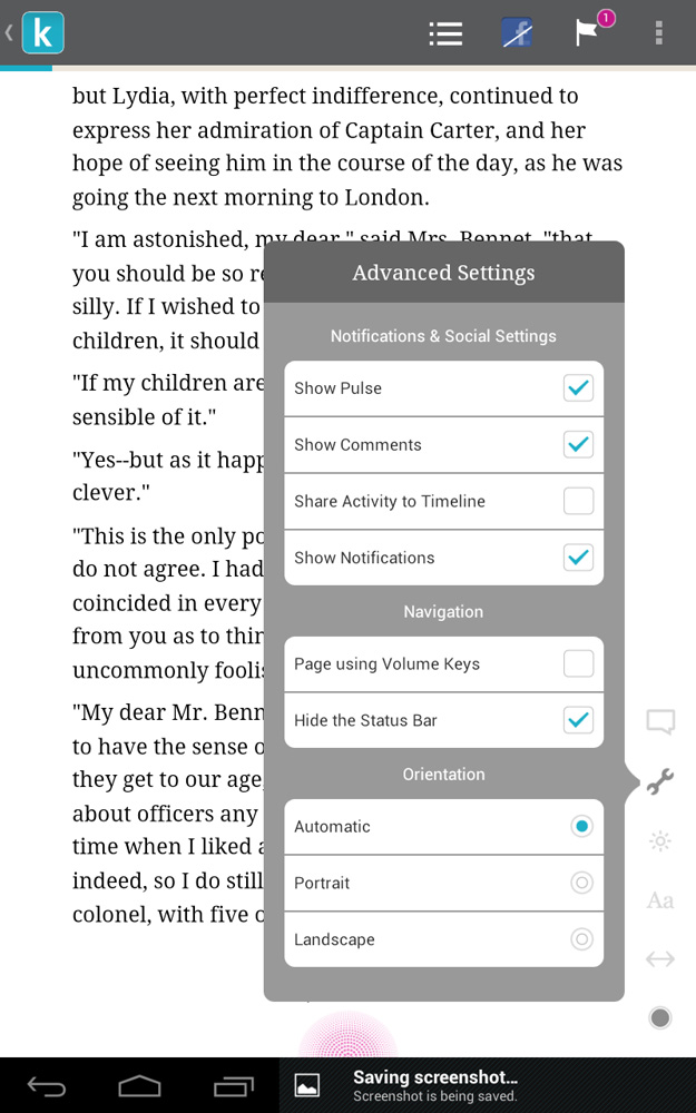
Kobo’s reading app is similar to the one available in the Google Play store for other tablets. There aren’t as many options for changing the way the inside of books look as you’ll find on the Nook HD, though there are a few themes, fonts, and text size options at least. Kobo is more invested in getting you to talk about your books and share the reading experience. There are multiple options for sharing to social networks and even having conversations about the book inside of the book with other Kobo customers reading that same book.
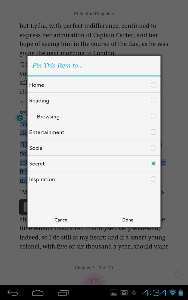
The standard notes, highlights, bookmarks triad is here as well. A nice addition is that owners can pin a passage from a book to a Tapestry as well as the book itself. Notes don’t sync to other Kobo devices, but books do.
Hardware specs and performance
On a software level, the Kobo Arc is more open than the Nook HD and Kindle Fire HD, but on the hardware side, the three tablets are a lot more similar. The Arc is powered by a 1.5GHz dual-core TI OMAP 4470 processor backed by 1GB of RAM, and its dual-core graphics card can handle 1080p video playback. Internal storage is available in 16GB, 32GB, and 64GB amounts. There’s no microSD card slot for expending memory, so get the size you need when you buy. Wireless connectivity is via b/g/n Wi-Fi only, no cellular data or Bluetooth. The Micro USB port for charging and connection to a computer is not MHL-capable, so users can’t output to an HDTV. The front-facing, 1.3 megapixel camera is capable of 720p video capture and is certified for Skype chats. Put all that together and you have a basic tablet for a good price.
Even games like Fruit Ninja and Temple Run 2 played well.
We encountered one persistent problem with the Arc’s performance: every now and then when tapping in a text field, bringing up the keyboard would cause the app to freeze for a few seconds. Otherwise, everything worked well. Even games like Fruit Ninja and Temple Run 2 played well.
Kobo promises up to 10 hours of reading time for the Arc. In our tests we were able to get more than a full day of juice use on one charge while using it off and on for long stretches for reading, games, web surfing, etc., leaving the screen brightness on auto.
Camera
The 1.3 megapixel camera is only slightly better than the average front shooter available on tablets and most smartphones. During video chats over Google+ it streamed a decent picture in low light, and in better light our chat companions said that colors came through fairly true. It won’t make you YouTube star, but will allow you to Skype without looking like a dark blob.

Conclusion
The Kobo Arc tablet straddles two Android tablet personality types. It’s a basic, $200 tablet with a friendly user interface meant to be easily grasped by less tech-savvy users. But it also offers the openness and full access to the Google Play app store, like a standard Android tablet.
The in-between-two-world’s nature of the Arc could throw some potential customers off, but here’s what you need to know: It runs well, the interface is well done, and there aren’t any limits on the apps and media you can load on it. The Kobo Arc is a good value for the price and worthy competition for the Nook HD, Kindle HD, and even the Google Nexus 7.
Highs
- Tapestries provide a novel way to interact with a tablet
- Smooth, speedy performance
- Good display with wide viewing angles
- Pre-loaded apps are well curated
Lows
- No Bluetooth or HD output
- Display attracts smudges
- Running Android 4.0, not latest version
- No microSD slot

