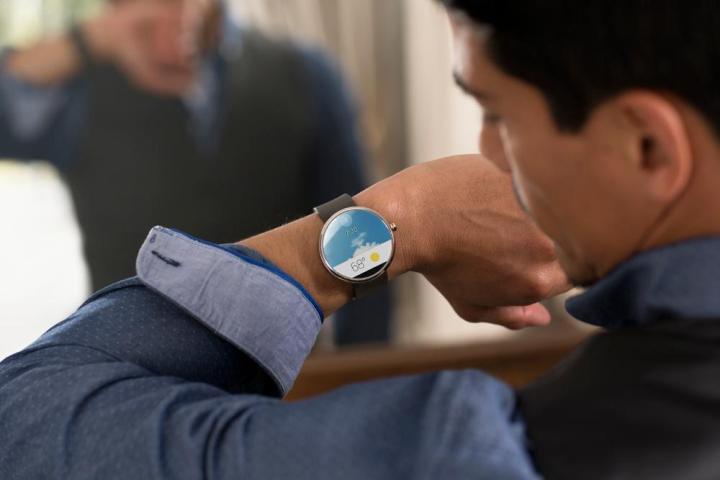

In advance of Google I/O 2014, Google is showing off sneak peeks of Android Wear. Just last week, A Google developer advocate leaked pictures of Android Wear notifications. Now, a post on the Android Developers blog shows Android Wear at work on the Moto 360 and the LG G Watch.
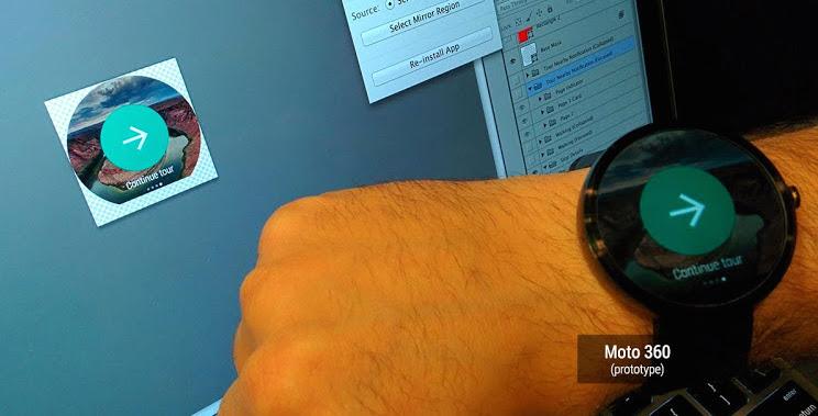
The blog post walks the reader through the developers’ journey with Android Wear and the unique challenges presented by the smartwatches’ small screens. Although most smartwatches feature a square face, Android Wear developers also had to design for a round-faced smartwatch like the Moto 360. To make the most out of the limited screen real estate available, the developers optimized their notifications and apps for both shapes.
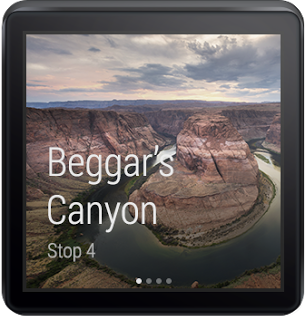
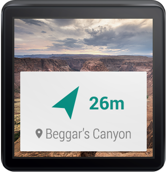
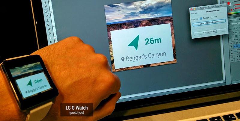
Most of the notifications appear as white or translucent squares, centered in the middle of each smartwatch’s face. Others are circular or rectangular. The circular notifications and apps appear in the center, but some of the rectangular ones rest in the lower third of the watch face. On the square LG G Watch, it looks like a rectangle, meanwhile on the circular Moto 360, these rectangles make a semi circle.
The apps shown in the post mostly have to do with traveling to a new location for a hike. A few different notifications show how geofencing and GPS data will appear as directions on Android Wear devices. The app also offers a waking tour for those who want to know what they are looking at.
- 1. Android Wear on Moto 360
- 2. Android Wear Notifications
- 3. Android Wear on LG G Watch
Everything looks easy to read and very simple on Android Wear. There are no distractions or ads floating around to clutter up the small display, either. Since a lot of functions on smartwatches are voice activated using Google Now, there’s really no need for tons of buttons in the apps on the touchscreen. This also helps keep the UI simple.
It’s also fun to see the Moto 360 and LG G Watch on the wrists of actual people who aren’t models. The G Watch looks like your typical square smartwatch, but the Moto 360 looks almost like a normal watch. The display is just a tad too big to look like an old-school watch, though.
