
Software plays a crucial role in any device, but it becomes even more important when you have a limited amount of screen space to interact with the user interface. The Motorola Razr series has always been better than the Galaxy Z Flip lineup in terms of usability when folded. This year, Samsung’s Galaxy Z Flip 5 closes the gap between the two clamshell foldables by offering a big cover screen.
But sporting a big outer display doesn’t immediately make a flip phone foldable a whole lot more useful; case in point – the Oppo Find N2 Flip, where Oppo gave us six widgets (and added a couple more later) to play around with and called it a day. While Samsung brings 13 widgets to the table, the cover screen software is still not on par with the Motorola Razr Plus.
I’ve waited for years to get a big cover display on a Galaxy Z Flip phone for two reasons. One, I prefer Samsung’s cameras over Motorola’s for reliability and color tuning. Second, I like One UI and had high expectations of how it would make the cover screen more useful than ever. But after spending a couple of hours with the Galaxy Z Flip 5 in Seoul, I can confidently say that the Motorola Razr Plus’ cover screen software is more intuitive and useful than its Samsung counterpart.
Motorola’s cover screen experience is perfect
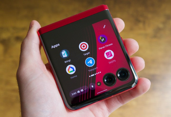
The Galaxy Z Flip 5 features a 3.4-inch cover screen, while the Razr Plus offers a 3.6-inch outer display with space for the two main cameras. In terms of usability, both displays are very close to the same size. Samsung offers gestures and widgets, while the Razr Plus brings a fully-fledged user interface. To simplify, the Galaxy Z Flip 5 feels like a smartwatch on the outside that unfolds to become a phone, whereas the Razr Plus is a small phone that unfolds to give you a regular-sized phone.
I prefer Motorola’s take on the cover screen – I have for a long time, and it’s sad that Samsung hasn’t been able to match it yet. The Razr Plus has been in my pocket for over three weeks, and it’s the most intuitive cover screen on any flip phone I’ve used to date.
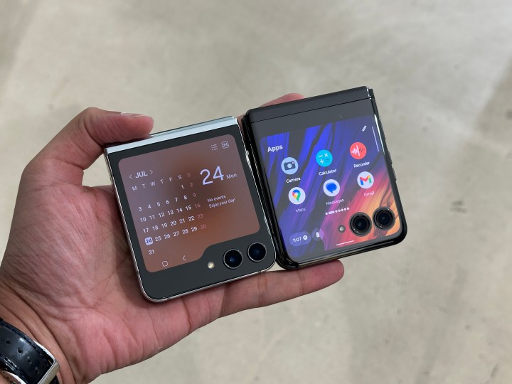
Samsung now offers a full-size keyboard to let you type messages from the cover screen to reply to notifications without unfolding the phone. It’s great to type on and doesn’t feel cramped. But the problem arises when you want to interact with the app instead of the notification.
For instance, you can’t open WhatsApp from the get-go and message your friends. To run apps on the Z Flip 5 cover screen, you have to go to Samsung Labs in Settings and toggle an option to access apps on the 3.4-inch display. And even then, you’re only able to access six apps Samsung has chosen for the cover screen. If you want to run any app, it’s an even more laborious process of messing with the company’s Good Lock app. It’s a hacky way to do something that should be present by default.
On the other hand, Motorola lets you use any app on the cover screen. I can open WhatsApp and send a quick message to my friend without flipping the phone open. Some people may not use the cover screen this way, but I do, and it makes the experience so much better. I’m glad that I can finally interact with notifications on the Galaxy Z Flip 5, but Motorola has a more polished version here.
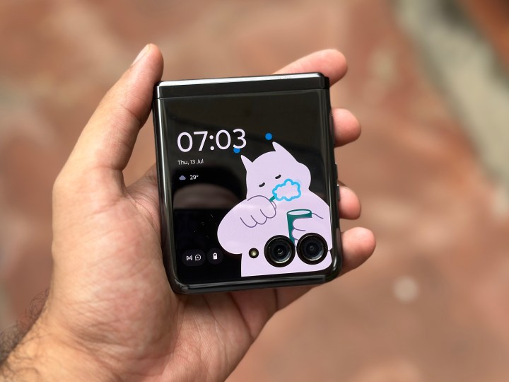
Then there’s my favorite thing: Moo Time. It’s silly but fantastic. Moo Time is a clock style on the Razr Plus. “Moo” is the name of a character, which is interactive and reacts to your taps. Depending on the time of the day, it’s doing something or the other.
For example, Moon brushes its teeth at 7 a.m. and blows a kiss when you tap on it. Moo is working on a laptop during the day and looks at you annoyingly when you tap on it. In the middle of the day, it’s also having coffee. You can see it returning from work in a subway at around 7 p.m. and find it sleeping at night. You’ll never get bored of having your flip phone closed. By contrast, the Galaxy Z Flip 5 offers a few characters as well, but they aren’t nearly as charming. This is the best addition to a Motorola Razr phone, at least for me.
The last bit of Motorola goodness that makes it so much more useful when closed is Moto Actions. Admittedly, I haven’t used these much on other Motorola phones, but it’s a different story on the Razr Plus. They’ve been there for all the Razr foldables in recent years, but I’ve been using these actions more now than ever.
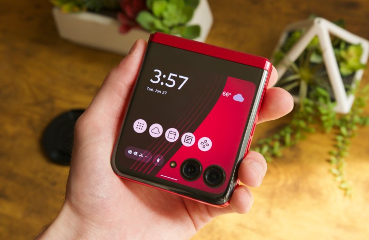
Usually, when I need to trigger the flashlight, I have to interact with the cover screen widget – the same goes for the camera. But on the Razr Plus, I can shake the phone or twist it to trigger the flashlight or open the camera, respectively. On the Galaxy Z Flip 5, you can press the side button two times to open the camera, but you have to interact with the display to trigger the flashlight, which isn’t ideal.
That being said, Samsung has been smart with its software on the Galaxy Z Flip 5. You don’t need to swipe countless times to find all of your widgets – you can use a pinch-in gesture on the cover screen to bring all the widgets on your display in rows and columns. You can then tap on the one you need to interact with.
Samsung still has one big advantage
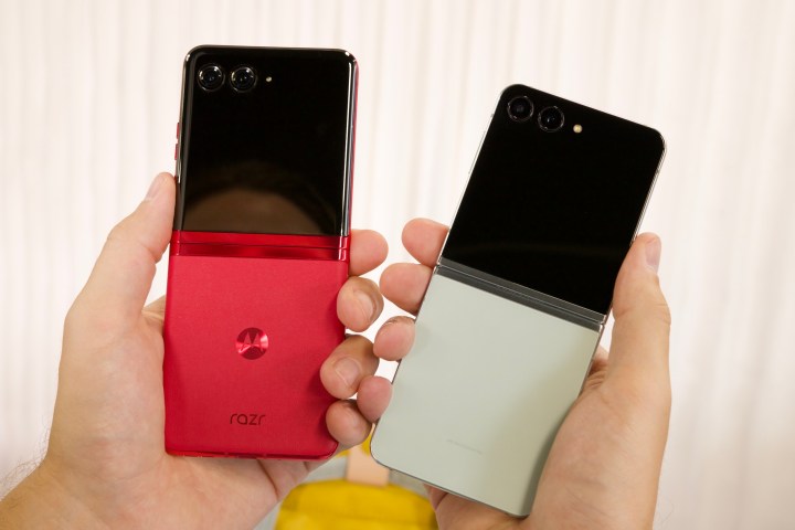
In my limited time with the Galaxy Z Flip 5, I noticed that the phone feels more premium than the Motorola Razr Plus — in two ways.
First, the hinge is better on the Samsung clamshell foldable. Specifically, it feels more solid. When you rub the two folded sides against each other, the Razr Plus moves and creeks a bit but the Galaxy Z Flip 5 doesn’t. Second, it feels better in the hand when compared to the Razr Plus. The Flip 5 feels more sturdy, solid, and premium when you hold it side by side with the Razr Plus.
I’m still getting used to the Galaxy Z Flip 5, and I’m sure the Qualcomm Snapdragon 8 Gen 2 chipset makes a lot of difference with efficiency and imaging capabilities. But the cover screen implementation stands out for me. While the Galaxy Z Flip 5 has a better hinge and more premium design, the Motorola Razr Plus offers a more intuitive cover screen. And depending on where your priorities lie, that could leave the Razr Plus with a significant advantage over its Samsung competition.


