“The Neptune Pine may combine the functionality of an (old) Android smartphone into a smartwatch, but it’s flaws outweigh any positives. It’s too big, too heavy, and too ugly.”
- A whole smartphone on your wrist
- Bluetooth calling works well
- A geeky Android fan’s dream
- No Google Play Store access
- Awkward, heavy, and large
- Unattractive design
- Touchscreen not responsive enough
- Difficult to remove the body from the strap
Smartwatches, as we know them, are all about connecting to our smartphones then delivering notifications, emails, GPS directions, and other tidbits of info to our wrists. The idea is to cut down the times we need to check the phone itself, ensuring it safely stays in a bag or pocket.
Neptune Pine has a different mission. It’s hoped to replace your phone entirely since it began life on Kickstarter at the end of 2013, when it went on to raise eight times its $100,000 goal.
So, is it a great idea or an ambitious, but flawed project that’s best left to the geeks?
Looks and design
The way the Neptune Pine looks is probably its greatest weakness. It’s big, heavy, annoyingly ungainly, and often uncomfortable. The dimensions of the face come in at 6.5cm wide, 5cm tall, and 1.5cm deep. Even the strap is massive, at nearly 3.5cm wide. If you called the Neptune Pine ‘subtle’ in any way, you’d be lying.
If you called the Neptune Pine ‘subtle’ in any way, you’d be lying.
The Neptune Pine is the first wearable device where I’ve had to consider what I wear with it. Because it’s so giant, it doesn’t fit underneath some shirt sleeves unless you leave them open and flapping in the breeze. This presented another issue. It’s comically massive, and I felt very self-conscious with it on. It’s not look-at-me geeky cool like Google Glass, but look-at-me-aren’t-I-sad instead.
This made me want to cover it up, except it protrudes through most items of clothing like a bulbous, unsightly wart. I’m someone who likes wearable tech, so it’s hard to see how the Neptune Pine could appeal to anyone who is still on the fence.
Software and apps
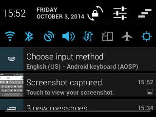
Android 4.1.2 is installed on the Pine, but it’s a non-Google approved version, which means you don’t get the Play Store, or any other Google services. Now, this isn’t the end of the world, and most things can be side-loaded. We put the Play Store, Hangouts, and Google Play Services on the review unit, and after a little fiddling around, they worked. Most of the time.
Using Android Jelly Bean is like stepping into a time machine, but not in a fun retro way. It only serves as a reminder of how much Android has improved over the past few years, and using an old version is often painful. There’s no Google Now, the icons are blocky and ugly, and everything feels a bit low-tech and messy.
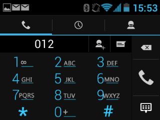
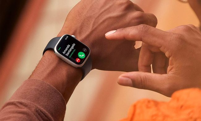
However, this is the same Android 4.1.2 you would have used on an actual smartphone, which means the Pine can make and receive calls, just like a regular phone. This is where the Pine does shine. It has everything you’d normally do with your phone, just on your wrist. Link it up to a Bluetooth headset, and the call quality is great. Remember, making calls on the Neptune Pine without a headset just makes you look like a dick, not Dick Tracy.
Get past the ancient version of Android, and the Pine performs well, but the touchscreen can be slow to respond, and there’s a definite knack to getting it to unlock with a swipe. Some of the smaller buttons are also awkward to press, and often take several stabs to activate. It’s responsive and large enough to handle a pattern unlock code though, which is a good thing because the PIN security screen is too small.
Some of the problems encountered trying to use Android on the Pine can be countered by removing the body from the strap, and using it like a tiny phone. It certainly makes it quicker to perform some tasks, and much easier to play games, but it does defeat the object of it being a watch. If I want to hold something, why wouldn’t I just use a proper phone?
The watch comes with eight non-standard apps installed, including Facebook, WhatsApp, Angry Birds, Fruit Ninja, and Skype. There’s 2GB of internal memory, and a MicroSD card slot.
Processing and specs
A 2.4-inch, 320 x 240 pixel touchscreen is fitted to the front of the Pine, and it’s driven by a 1.2GHz dual-core Snapdragon S4 processor, with 512MB of RAM. It connects to 3G and 4G LTE networks, comes with Bluetooth 4.0 (which made syncing with accessories a pleasure), and takes a regular Micro SIM card.

Performance is surprisingly good, despite the lowly specs, and it handles the built-in games — Angry Birds and Fruit Ninja — without a fuss. Even Minion Rush is playable, although the loading times are slow. It’s the size of the screen which makes everything from typing in usernames and passwords, to making a well-timed jump in the aforementioned Minion Rush a pain.
Camera
Provided you don’t expect anything amazing, the Pine’s 5-megapixel camera is acceptable for a smartwatch. If you think you’ll get anything like the performance from a similar camera on a phone — like the Moto G, for example — you’ll be disappointed. It can’t deal with anything other than optimum light conditions. I took two images from both sides of a motorway bridge, and the difference between the two perfectly illustrates how the Pine suffers.
The low resolution screen doesn’t help matters, because even if the picture you’d just taken was a masterpiece, it looks like a muddy, low-res monstrosity on the display. Due to the placement of the lens, the rear camera can’t be used when the Pine’s body is clipped to the wrist strap, but there is a front facing cam for video calls.
Battery
The battery could have been the Neptune Pine’s ultimate downfall, but it’s not terrible, depending on use. In standby, with a few messages, a call, and some camera usage, the Pine easily lasted the day. However, start doing anything more complicated, such as using Google Maps, playing a game, or leaving Bluetooth connected, and a day is about all you’ll get.

It’s not really a smartwatch, it’s a smartphone, therefore you get smartphone battery life. It’ll need a visit to the charger every couple of days, provided you don’t go mad with heavy usage. Full cellular reception made more of a difference here than it does under normal circumstances, and with one or two bars, the Pine’s battery did suffer.
Conclusion
Ugly, heavy, and a lot of the time, rather annoying to use: that sums up the Neptune Pine. However, it’s not without a certain charm, and when paired with a Bluetooth headset worked really well as an actual phone. It’s just the effort needed to wear it around all day, everyday, is off-putting.
Squeezing an entire smartphone into a wrist-worn device isn’t an easy task. The Pine puts in a valiant effort, but there are too many compromises for it to appeal to regular people. Like many Kickstarter projects, the Neptune Pine is for geeks who’re happy to tinker around with it, and willing to put up with its idiosyncrasies. There’s no denying it stands out though. Whether that’s a good thing or not, depends on your opinion of the design.
Highs
- A whole smartphone on your wrist
- Bluetooth calling works well
- A geeky Android fan’s dream
Lows
- No Google Play Store access
- Awkward, heavy, and large
- Unattractive design
- Touchscreen not responsive enough
- Difficult to remove the body from the strap


