“The Nokia Lumia 635 may not have all the latest hardware or the most attractive design, but it certainly works well. It’s proof that smartphones don’t have to be all-powerful to get the job done.”
- Great, low price
- Cortana helps get things done
- Comfortable to hold
- Boring design
- Low-resolution screen
- No front-facing camera
- Poor battery life on LTE
Nokia’s Windows Phones run the gamut from premium devices to low-end handsets, but they typically come at a good price, regardless of hardware. At just $100 unsubsidized, the Lumia 635 is one of the cheapest smartphones with decent specs that you’ll find anywhere, whether you’re looking at Windows Phones or Android devices.
Of course, to get the 635 down to that price, Nokia had to make a few sacrifices. The question is: are the concessions worth the price, or is the Lumia 635 too basic for you?
Bland design, but it feels good to hold
The Nokia Lumia 635 is the ultimate minimalist smartphone. It’s as basic as they come. The 635 has a plain, plastic back, no design elements to speak of, and very few buttons.
The Nokia Lumia 635 is the ultimate minimalist smartphone. It’s as basic as they come.
There’s a headphone jack at the top of the device, a Micro USB port on the bottom, and a volume rocker right above the power button on the right hand side. These two buttons are glossy and smooth, while the white back of our review unit had a nice, matte finish.
Nokia offers the 635 in yellow, orange, and black, with the option to change covers at will. The plastic seems strong, but the white shell gets dirty quickly and easily picks up random streaks of dirt, ink from pens, and other materials it encounters during the day.
The 635 has a Gorilla Glass 3 screen with a somewhat wide bezel. The Windows button, back, and search keys are located on the screen itself, detracting from the overall display size. That said, the Lumia 635 is comfortable to hold and easy to navigate with one hand. It may not be flashy or beautiful, but at least it feels good in your hand.
Cortana shines, but Windows Phone 8.1 lacks apps
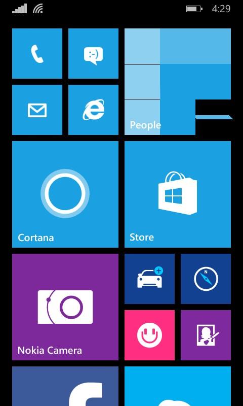
Windows Phone 8.1 takes some getting used to. Microsoft’s aesthetics aren’t for everyone and unfortunately, there’s very little you can do to change the overall look of the operating system. It was jarring at first to see all the little tiles and squares on the Lumia 635’s screen, instead of app icons.
However, once we got used to it and learned that we could alter the color scheme, things got better. You could argue that Windows Phone is the boldest and most colorful mobile OS out there, and you’d be right. It’s different.
You can still rearrange apps, remove the ones you don’t use from the home screen, and pin new ones to it.
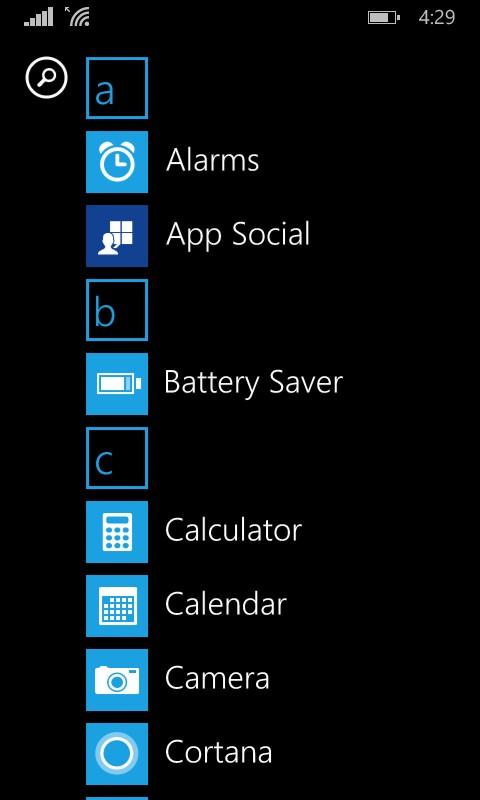
Once we adjusted to Windows Phone 8.1 we took a look at the Windows app store. Needless to say, it’s still pretty limited. Although big-name apps like Facebook, Netflix, and Pandora are available, most new apps take much longer to appear on Windows Phone than they do on iOS or even Android.
That great new app your iPhone-using friend just downloaded? Yeah, it’s not on Windows Phone and unless the fledgling OS picks up more users, it may never be. That’s the downside to Microsoft’s mobile OS, but luckily, more apps are arriving in the store every day.
Windows Phone is the boldest and most colorful mobile OS out there.
Although Microsoft doesn’t let users install third-party keyboard apps just yet, Windows Phone 8.1 has a great Swype-like keyboard that lets you type like normal or skim over keys in a swiping motion. It also gives mostly accurate suggestions and makes typing a breeze on the Lumia 635.
The Windows Phone 8.1 update also added the Action Center, which is reminiscent of the Control Center on iOS devices. In addition to listing all your notifications, the Action Center has shortcuts for Wi-Fi, Bluetooth, brightness, camera, airplane mode, rotation lock, and more. You can decide which controls you want to have access to at all times in the settings menu.
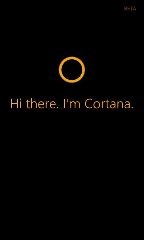
The best part about Windows Phone 8.1 is Cortana, Microsoft’s voice assistant. Cortana is smart and can even recognize context, location, and relationships. She can also do all the Internet searches and appointment scheduling you ask of her. In our tests, we found Cortana to be more useful than Apple’s Siri and Google Now.
Low-end specs offer acceptable performance
Like most budget smartphones, the Lumia 635 doesn’t exactly shine when it comes to specs. The 635 has a 4.5-inch screen with a pitiful 854 x 480 pixel resolution. It’s not HD and it’s certainly not high-end, but as far as budget phones go, the 635’s screen is A-okay. The screen looks fuzzy and dim occasionally, though.
The other downside to the screen is its size. Even though it measures 4.7-inches diagonally, the navigation buttons eat up some screen real estate, as do the navigation bars when you’re using Internet Explorer. The resulting effect is that the display seems smaller than it actually is and feels almost as cramped as the iPhone 5S’s 4-inch screen.
Just like the previous model, the Lumia 630, the 635 is powered by a quad-core Qualcomm Snapdragon 400 processor, running at 1.2GHz, and has 512MB of RAM. In the AnTuTu benchmark test, the Lumia 635 scored 11802, which is lower than the 12492 fellow budget phone Moto E scored. Still, it’s not a terrible score for a low-end smartphone.
Nonetheless, the Lumia 635 is great for everyday Internet searches, Facebook viewing, tweeting, and email. Most apps and webpages loaded quickly and downloads from the app store didn’t take too much time.
It comes with only 8GB of storage, but you can store all your photos and music on a MicroSD card.
No front-facing camera and a mediocre back shooter
Perhaps the saddest thing about the Lumia 635 is the complete lack of a front-facing camera. That means no selfies, no video chats, and no using your phone as a mirror. It’s a great loss, even on a budget phone.
Luckily, the back camera isn’t terrible. The 635 has a 5-megapixel sensor centered in the back of the phone that takes okay pictures. Of course, you won’t win any awards for the photos you shoot with this camera.
Colors look bleached in bright sunlight and focusing in on small details leaves objects in the background blurry. The camera is better at taking landscape shots than close ups, but even those aren’t the best. If you zoom in at all, the image quality depreciates quickly.
Calling, data, and battery life
Call quality and data speed were normal. We experienced no hiccups during this part of the testing, though we did notice that LTE cuts down on battery life, though.
Nokia gave the Lumia 635 a 1,830mAh battery, which is decent for a phone of its size. After a full day’s use, the 635 was still going strong and we found that it could last up to 12 hours on a single charge with mild use.

However, if you’re going to take advantage of your LTE data plan, the battery will drain remarkably fast. Listening to music from Spotify over LTE decimates the battery in less than three hours, and watching video cuts it down to about four hours.
Conclusion
The Nokia Lumia 635 may not have all the latest hardware or the most attractive design, but it certainly works well. It’s proof that smartphones don’t have to be all-powerful to get the job done. If you’re looking for a budget smartphone and don’t mind learning the ins and outs of Windows Phone 8.1, the Lumia 635 might just be the phone for you.
Highs:
- Great, low price
- Cortana helps get things done
- Comfortable to hold
Lows:
- Boring design
- Low-resolution screen
- No front-facing camera
- Poor battery life on LTE


