“Even a hotshot camera can’t save Nokia’s N8 from a warmed-over OS, uncharacteristically cheap build quality and slow processor.”
- Vivid 3.5 inch AMOLED touchscreen
- 720p video capture with HDMI output
- 12-megapixel camera is fantastic
- 16GB internal memory
- $500 price tag
- No battery access
- Slow processor lags sometimes
- Symbian v3 OS can't compete with Android or iOS
- Poor built-in Web browser
- No vertical QWERTY keyboard

 Design
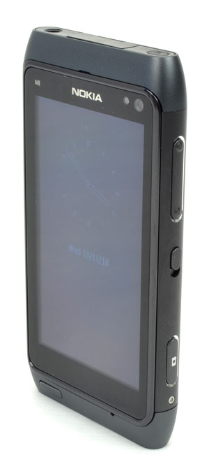
The N8 looks like a solid touch device, albeit smaller than some of the more recent Android devices. A single button sits at the bottom of a 3.5-inch AMOLED multi-touch screen and a front-facing camera and light sensor sit up top. Surrounding the screen is a thin, raised border and a gray casing with silver end pieces on the top and bottom of the phone. On the left is a microUSB charge slot, and covered slots for a microSD card and SIM card for GSM carriers (the phone also supports CDMA). On the right side is a volume toggle, camera button, and an unlocking slider – a feature common to Nokia devices, allowing the user to wake the phone up from sleep by pulling down on a spring-loaded switch.
Like the iPhone, the N8 has a unibody shell that doesn’t allow access to the battery. You would think that such a shell would make for a better product, but the phone didn’t feel particularly solid in our hands. The abundance of plastic and metal that feels like plastic is a downer, and the seams in the plastic suggest sliding parts that don’t actually slide.
Bottom line, the N8 does not feel as solid as other devices in its category, or look as sexy as the iPhone 4 or many Android devices. Despite Nokia’s best attempt to streamline its design, the N8 does not stand out from the competition.
Features
The N8 is loaded with great features: It has 720p HD video recording, a mini HDMI slot, 5-band global 3G, Assisted GPS navigation, HSPA 10.1 data speeds, Bluetooth 3.0, 16GB of internal memory, a microSD expansion slot so you can add up to 32GB more, and support for fast 802.11n Wi-Fi networks.
Unfortunately, two things make all these fancy features next to worthless: a slow 680MHz processor and Symbian v3, the archaic operating system Nokia refuses to abandon. The processor should be a snappier 1 GHz chip and the OS should be something that modern phone users will understand how to use.
Stuck on Symbian
Recently, Nokia announced that it is sticking by Symbian, but we can find few reasons why it should. Symbian v3 is outdated, clunky, and overly complicated. The Finnish company wants its OS to look different than the competition, but such a wish is only worthwhile if Symbian looks and works better. It fails on both accounts.

Downloading apps isn’t particularly difficult, but finding them on your phone might be a challenge. Unlike Android, there is no on-screen place to find apps. Instead, you must press the physical wonder-button underneath the N8’s screen. This button performs a lot of functions. Often, we used it to escape back to the main screen when we were in an app or menu that has no visible escape. However, from the home screen, pressing this button will open up a three-by-four grid of hand-picked applications on a black background. To reach apps that don’t appear you’ve installed, you must click on the ‘applications’ icon. Inside ‘applications,’ there are more folders to dig into, only they don’t look like folders; they look like apps. Basically, your apps are split between multiple levels and folders of app pages. It’s the Inception of app screens — you have to keep digging deeper to find the app you’re looking for. Some may even appear in the “tools” subfolder, which has an icon confusingly similar to settings.
Eventually, you’ll figure out how to move apps between these folder levels, but the confusion is unnecessary. Why not let users make their own folders, should they desire? Like many aspects of the Symbian, it is possible to do what you want, but it isn’t intuitive. Before the iPhone, Symbian started the smartphone revolution, but more than three years into the touchscreen movement, it just can’t compete with Google and Apple. Devotees will likely love it, but Nokia won’t win many new fans.
Besides the glut of third-party Symbian apps, many built-in features don’t stand up to peers. For instance, Nokia has turn-by-turn ‘Ovi’ navigation, but it doesn’t feature actual maps, and often misses turns, its performance is almost pathetic compared to Google Navigation on Android devices and paid apps on the iPhone. We cannot recommend it.
 Multimedia
The N8 has a beautiful 360 x 640 AMOLED multi-touch display. Video is gorgeous playing on the device and the mini HDMI slot easily lets you hook the phone straight into an HDTV. Even better, a full-size HDMI adapter is included in the box.
Finding content to play on this powerful phone is more difficult. There is a YouTube app, and the radio works well enough, but Nokia’s Ovi Store has a limited selection of videos and podcasts to download. The phone comes with Web TV, but its selection is also painfully limited. Our device came loaded with CNN, E! Online, National Geographic, and Paramount movie trailers. On the Ovi Store, you can download a few more channels like Al Jazeera, Bollywood, and India Today. Clips in available channels are low resolution, and choppy. Hopefully these issues will be ironed out in the coming months.
Sound Quality
Since the Ovi Music Store is not yet open, we connected the phone via USB to Windows 7, which recognized the phone instantly and allowed us to load songs with the Windows Media Player – a nice touch, though not everything transferred with correct album info or art, which could be a Windows or Nokia problem, perhaps both. Sound quality from the one speaker on the back of the N8 is pretty standard. Few phones offer great external sound, but Nokia didn’t skimp.
Call quality is solid with earphones and without. We had no trouble adjusting the volume of calls or hearing others, who all reported that voices came in quite clearly on T-Mobile’s network.
 Phone Functionality
The bottom of the home screen has a dedicated call bumper button. On the calling page, the number pad is smaller than many phones, which is odd since about a third of the screen up top is unused black space, but it works well enough. Texting is not so fun. The vertical keyboard is not QWERTY like most phones of this type. Instead, it has a telephone keypad, meaning that you’ll be back texting much like you did on your flip phone some years back. The horizontal keyboard is QWERTY, luckily, though the buttons are on the small side. Recent calls and contacts have their own apps and can be found on the default home screen. They are also buried somewhere in the apps menu, should you care to hunt them down.
Web
With Symbian comes Symbian’s web browser. Not only is it difficult and inconsistent to use, it doesn’t load pages well, either. Many Websites with mobile-optimized versions (like Digital Trends) did not load correctly in the N8 browser. Other sites would not load at all, or stopped midway through the process. Typing URLs using a vertical telephone keypad was also a tedious exercise. If you have the N8, we recommend downloading Opera Mobile from the Ovi App Store. It is a night and day improvement over the built-in browser. Opera also includes its own vertical QWERTY keyboard. Problems solved.
Web-based widgets were also sluggish to update their stats. Sometimes, we would have to enter a widget to get it to display fresh tweets or stories. This is likely an OS issue, not a Web issue, but it is annoying.
Camera
The N8 comes equipped with some fancy camera technology. At 12 megapixels, it’s a step above the 5-to-8-megapixels that most current smartphones offer, but that’s not all it has cooking. The phone has a second, front-facing VGA camera, auto-focus, a xenon flash, and Carl Zeiss optics. Carl Zeiss AG is a German optical company that is mostly associated with high-end optical lenses. Nokia signed a deal with the optics company in 2005.
The camera handles most lighting conditions well, and takes crisp, clear photos. The flash is also one of, if not the best, flashes on a mobile phone, meaning that it actually does its job. (Using the flash does tend to wash out the image a bit, but not badly.) Without the flash, the camera does a great job reducing graininess in poorly lit areas. Outdoors, it works wonderfully. The only trouble we had was with two different kinds of light sources in the same room, but multiple light sources still pose a problem for the best cameras. Sometimes the little things count, too: Nokia’s camera “snap” sound is, by far, our favorite of any handset manufacturer.
Video quality is equally good for a smartphone. The phone can record at 720p and videos look good displaying at 720p. No complaints.
Battery Life
The N8 has average battery life. Call time on a single charge is a little over five hours and standby time is supposedly up to 17 days. With moderate use, you’ll have to charge the phone every night, but it shouldn’t drain before the day is up. Our device did seem to discharge faster than expected on standby. Without interruption, it died after about a week, though it wasn’t quite at full charge when we left it.
Conclusion
We often root for the underdog, and hoped Nokia was ready to re-enter the big leagues, but the N8 isn’t the device that will help the Finnish handset maker stand up to the Android invasion or Apple’s persistent threat from the iPhone. Four years ago, the N8 would have been a game changer. Today, even though features like its camera are amazing, it’s still a relic of the past. At $500, it’s an expensive relic at that.
Highs:
- Vivid 3.5 inch AMOLED touchscreen
- 720p video capture with HDMI output
- 12-megapixel camera is fantastic
- 16GB internal memory
Lows:
- $500 price tag
- No battery access
- Slow processor lags sometimes
- Symbian v3 OS can’t compete with Android or iOS
- Poor built-in Web browser
- No vertical QWERTY keyboard


