Nokia Taps into Mapping, Recycling

Nokia has said it plans to add a mapping capability to its Ovi online service that will synchronize with Nokia smartphones. With the mapping service, users will be able to plan a route using the Web portal and have that route information automatically synced with their mobile phone when it connects to the Internet. The company also plans to introduce a 2.0 version of its Nokia Maps subscription service which will offer routing information for walkers and bike riders (not just cars) and include realtime traffic information. Nokia Maps 2.0 will begin rolling out in May, with the service debuting in different regions as map information becomes available.

The new mapping capabilities are tied to Nokia’s pending acquisition of digital mapping company Navteq, which still has to be approved by the European Commission. Nokia is confident the deal will go through.

Recommended Videos

Adding improved mapping capabilities and navigation services to Nokia mobile devices (a growing number of which are equipped with GPS receivers) helps Nokia compete with not only stand-alone GPS device manufacturers like Garmin and TomTom, but also with Internet-based mapping services offered by the likes of Google, Microsoft, and Yahoo—most of which can be accessed via Web-capable mobile phones. Nokia hopes that by tightly integrating its services with its devices, it will create a best-of-class solutions Nokia phone owners will preferentially use in favor of competing services…thereby bolstering Nokia’s efforts to built up its digital services business rather than being tied to the design and manufacture of hardware.

Speaking of hardware, Nokia has also launched a free recycling program for unwanted mobile phones. Owners of older Nokia phones can drop off the unneeded handsets at Nokia’s Chicago or New York flagship stores, or print a free shipping label that can be used to send an unneeded handset to Nokia for recycling. Nokia asks that batteries be completely discharged before shipping, and needs users to sign a statement saying they’re returning the phone for recycling and give up ownership of the handset. But other than that, the recycling service is free, and a far better alternative to throwing old phones into the trash.
Geoff Duncan
Former Digital Trends Contributor
Geoff Duncan writes, programs, edits, plays music, and delights in making software misbehave. He's probably the only member…
Google is bringing Chrome browser to cars, even more EV features to Maps
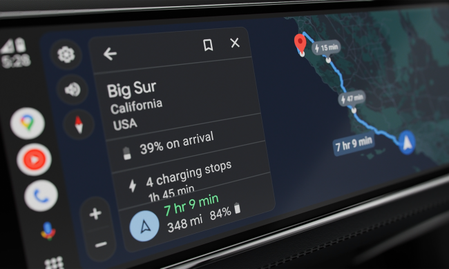
Android Auto interface showing EV charging times.

Google is bringing a great combination of features to Android Auto and cars with Google built-in, particularly for those who drive an EV.

Google Maps is adding more EV-centric features for those who use Android Auto from their connected phone. Starting with the Ford F-150 Lightning and Mach-E, you'll now see information on expected state of charge on arrival to your destination, as well as charging station locations and expected charging times for longer trips. This is a feature that's been available for EVs running Google built-in (aka Android Automotive), and in my experience, it's extremely helpful and helps alleviate charging anxiety. It's wonderful to see this brought to the much wider-reaching Android Auto version of Maps, and I hope it expands to more cars soon.

Read more
Google Maps got a major update, and people hate it
Google Maps running on a Pixel 8 Pro, showing the new colors as of November 2023.

Over the past few weeks, Google has been quietly rolling out a fresh coat of paint for its popular Google Maps app — and it’s been creating havoc over the holiday travel season.

While some people may understandably be frustrated at any changes made to such an established and widely used app, there seems to be more to this than just people being put off by unfamiliar colors. The many folks taking to social media to voice their displeasure with the redesign have been joined by professional user interface (UI) designers expressing similar, but more nuanced observations. Even a designer who once worked on Google Maps is pillorying the new design as a backward step for the service’s usability.

Read more
Double Tap is the coolest Apple Watch feature I’ve used in ages
A person using Double Tap on the Apple Watch Series 9.

Double Tap is one of the coolest features I’ve used on the Apple Watch in a long time. It’s not the most useful, and I don’t find myself using it that often, but when I do have a need to tap my fingers together to activate a function, I’m still at the stage where I think, “Wow, this is a really impressive thing.”

Here’s why it’s an example of what Apple does best — and why there’s so much potential for the future in it.
I was worried about Double Tap
Apple Watch Series 9 Andy Boxall / Digital Trends

Read more