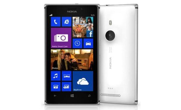
 Check out our review of Nokia Lumia 925 smart phone.
By now, you’ve probably had a good look at the latest Lumia smartphone’s svelte new design, and been pleased to see it matches its codename (“Catwalk”). We hope you weren’t waiting for much more than a fresh look, though. The Lumia 925 may sound like a completely new phone, but it’s almost exactly the same as Nokia’s other Lumia 92x phones: the Lumia 920 and Lumia 928.
Despite release schedules separated by six months, the three phones could have all launched at exactly the same time. They’re nearly identical. Nokia may claim the Lumia 925 has a more advanced camera lens (apparently it has a sixth glass lens for improved daylight performance), but it pretty much has the same 8.7-megapixel sensor as the Lumia 920 and Lumia 928.
Of course, there are subtle differences between all three, for example the Lumia 928 has a xenon flash, the Lumia 920 has 32GB of storage, and the Lumia 925 has that flashy metal design. The elements are there, but they need to be incorporated into one phone, and not three separate models. A Lumia 929 Ultimate, bringing all these features together, with a whole suite of new apps, would feel like a worthwhile upgrade, instead of a series of carrier-specific special editions.
 More phones doesn’t mean more sales

The Lumia 925‘s design though, looks like a winner, and sees Nokia take on the beautiful metal body shells encasing the HTC One and the Apple iPhone 5, and the glass panel design used by Sony for the Xperia Z. Samsung stands almost alone in its use of plastic throughout its flagship phone. But let’s be honest here, the Lumia 925 has a metal band around its chassis, but it still retains a polycarbonate rear panel. Yes it’s lighter and slimmer, but it’s hardly in the same league as the HTC One’s gorgeous metal unibody.
When comparing the Lumia 925 to the competition this way, it only serves as a reminder how Windows Phone hardware is lagging behind the Android-based competition in the spec sheet war. I mean, as silly as numbers can be, there’s no 1080p screen or quad-core processor here. So, while the Lumia 925’s $600ish price (exact price hasn’t been confirmed) is very competitive when compared to the Galaxy S4, the Xperia Z and the HTC One, it needs to be, as on paper it’s a, “lesser” phone.
Where’s the excitement?
The Lumia 920, Lumia 925, and Lumia 928 run on Microsoft’s Windows Phone 8 operating system, and although it’s powerful, useable, and rather attractive, it’s not exciting. This is a problem for Nokia and it’s Lumia 92x family. Because it’s not desirable, we naturally turn to the hardware for excitement. And though it looks good, the 925 is an updated version of a phone we saw last November – almost the same screen, identical processor, less storage, and silly wireless charging case. Nokia is in danger of being ignored by the masses. Again.
When we began to hear about the Lumia 928 and the Lumia 925, we questioned why Nokia would risk alienating its customers by releasing a new version of a six-month old phone, and now we’ve got our answer. It’s because it’s not really new at all. Cool looks aside, if the Lumia 920 didn’t do it for you, then the Lumia 925 and Lumia 928 probably won’t either.


