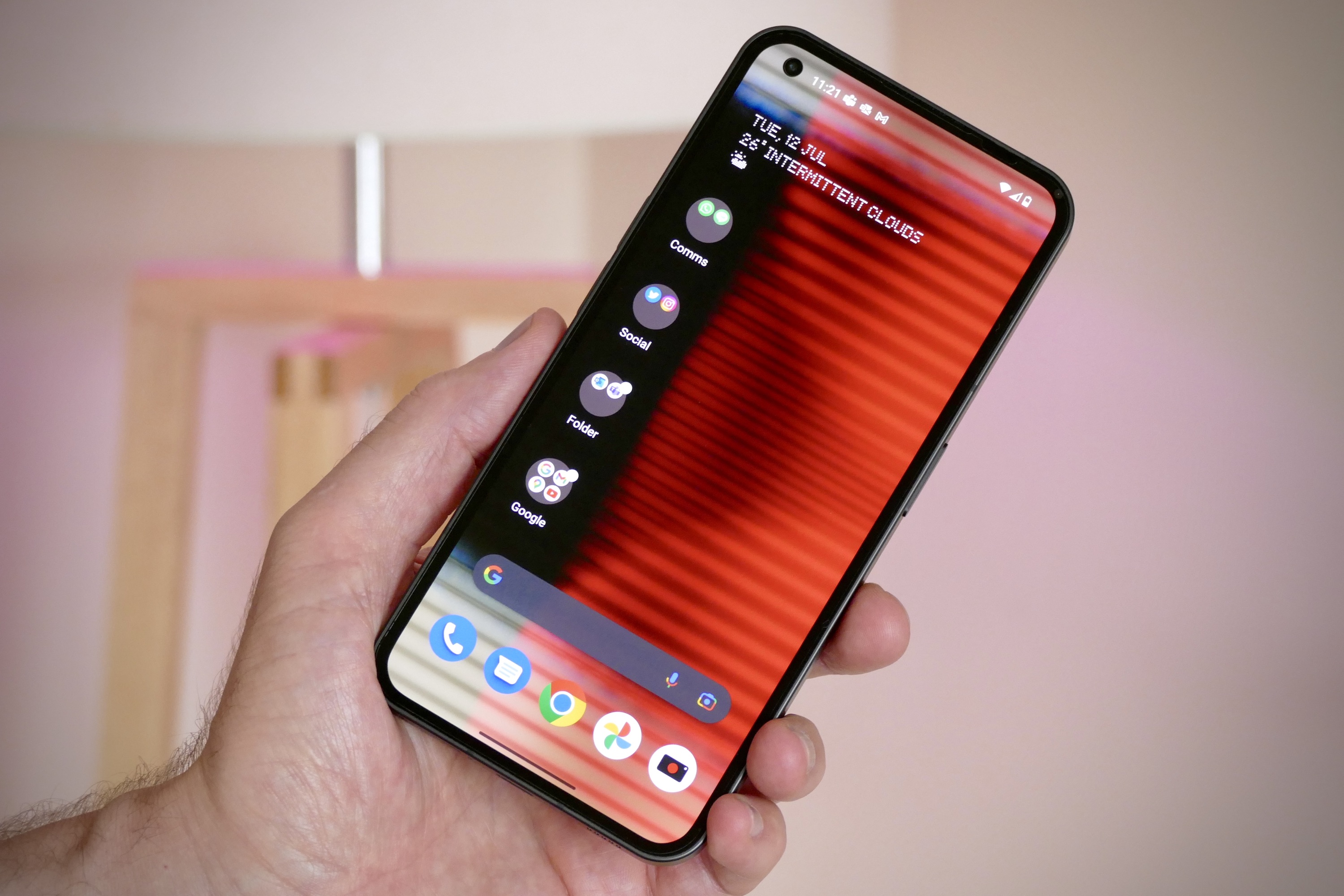
The Nothing Phone 1 is easily one of the most anticipated smartphones of the past few years, a combination of some serious hype, the presence of OnePlus co-founder Carl Pei, and for it having flashing lights on the back. There’s also the promise of unique software, a disruptive effect on the world of smartphones, and plenty of savvy marketing, too. Did I mention the hype? Well, it’s worth mentioning again, as there has been a lot.
There’s consequently a lot to say about the Nothing Phone 1, but you’ll have to wait until the full review to learn about things like the camera performance and battery. In the meantime, we’re going to talk about the design, the software, and — of course — those bright flashing lights. But as I discovered, behind the garish illuminations hides an unpretentious, handsome, and highly usable everyday smartphone.
Nothing Phone 1 specs
Let’s start out with what you need to know about the Nothing Phone 1’s specifications. It has Gorilla Glass on both the front and the back of the phone, the chassis is made from 100% recycled aluminum, and it’s 8.3mm thick and 193 grams heavy. The flexible OLED screen measures 6.5-inches and has a 2400 x 1080 pixel resolution, HDR10+ certification, 10-bit color, and a 120Hz refresh rate.

The processor is a Qualcomm Snapdragon 778G+ and it comes with either 8GB or 12GB RAM, plus 128GB or 256GB storage space. On the back is a 50-megapixel Sony IMX766 main camera with optical image stabilization (OIS), electronic image stabilization (EIS), and an f/1.88 aperture. There’s also a 50MP Samsung JN1 wide-angle camera with EIS and an f/2.2 aperture. Finally on the camera side is a 16MP selfie camera in a hole-punch cutout on the screen. There’s a fingerprint sensor under the screen, a 4,500mAh battery with support for Quick Charge 4.0, 15W wireless charging, plus a 5W reverse charging system for compatible devices.
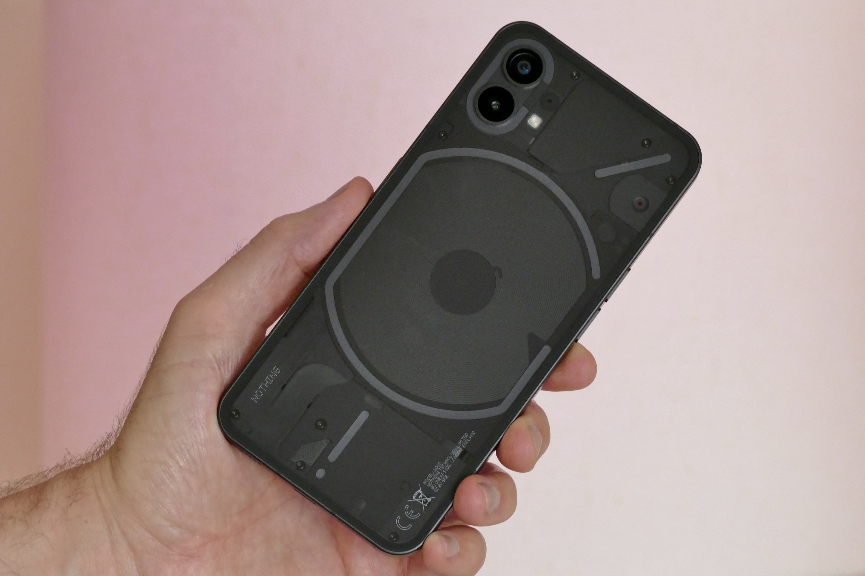
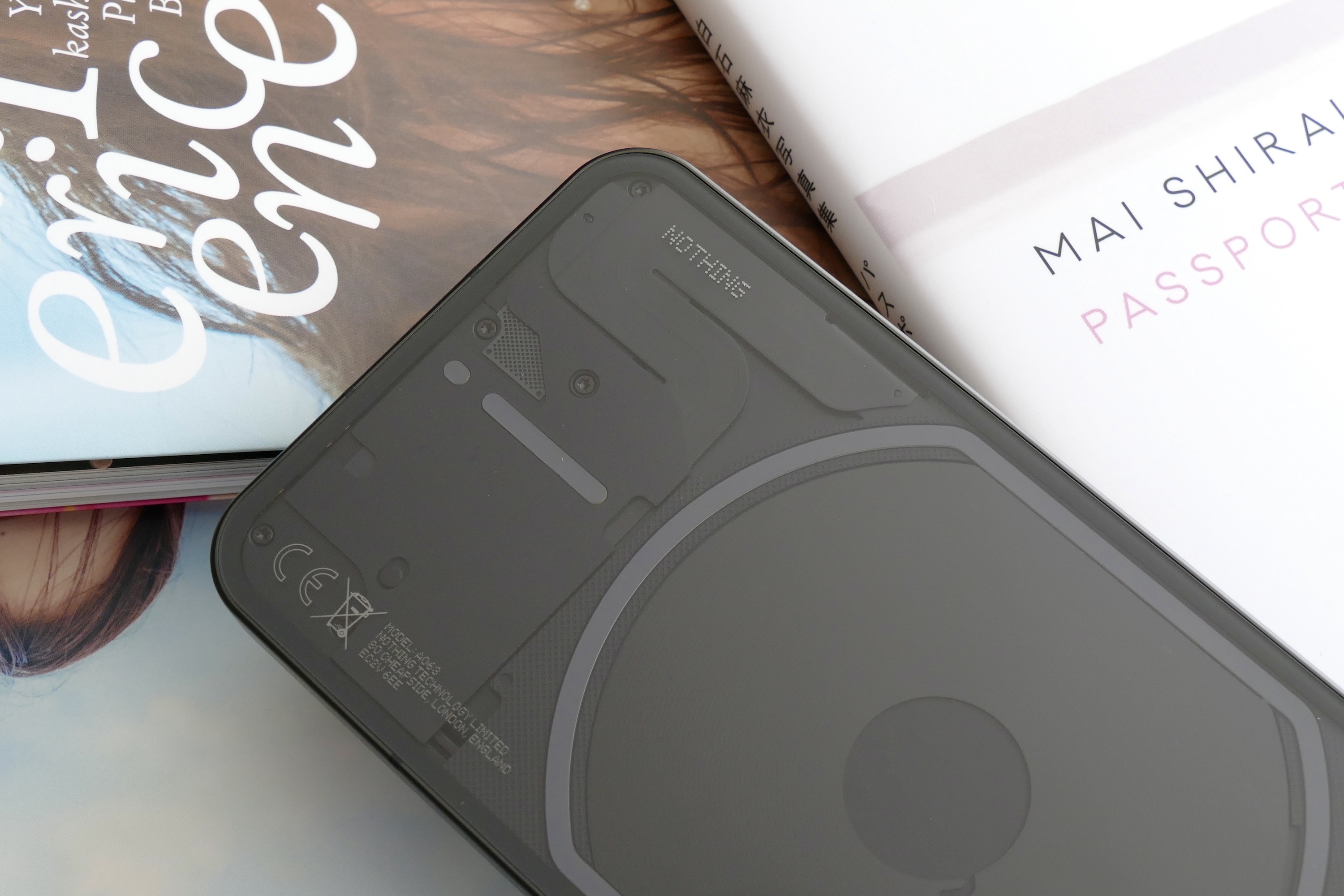
All this is wrapped up in an eye-catching transparent design, complete with the Glyph Interface, which is Nothing’s name for the LED lights that flash on the back of the phone. The light show is the focal point of Nothing OS, the software installed on the Phone 1. It’s based on Android 12 and Nothing promises three years of Android updates and four years of bi-monthly security updates.
Flat sides and that transparent back
At this point, I can’t tell you much about the Nothing Phone 1 due to embargo restrictions. But I have been using the phone for a few days, and have a feel for what it’s going to be like to live with both it and the Glyph Interface. Nothing is certainly pushing the transparent design and the bright lights as a reason to buy it over any other Android phone or even an iPhone. So what’s it all like?
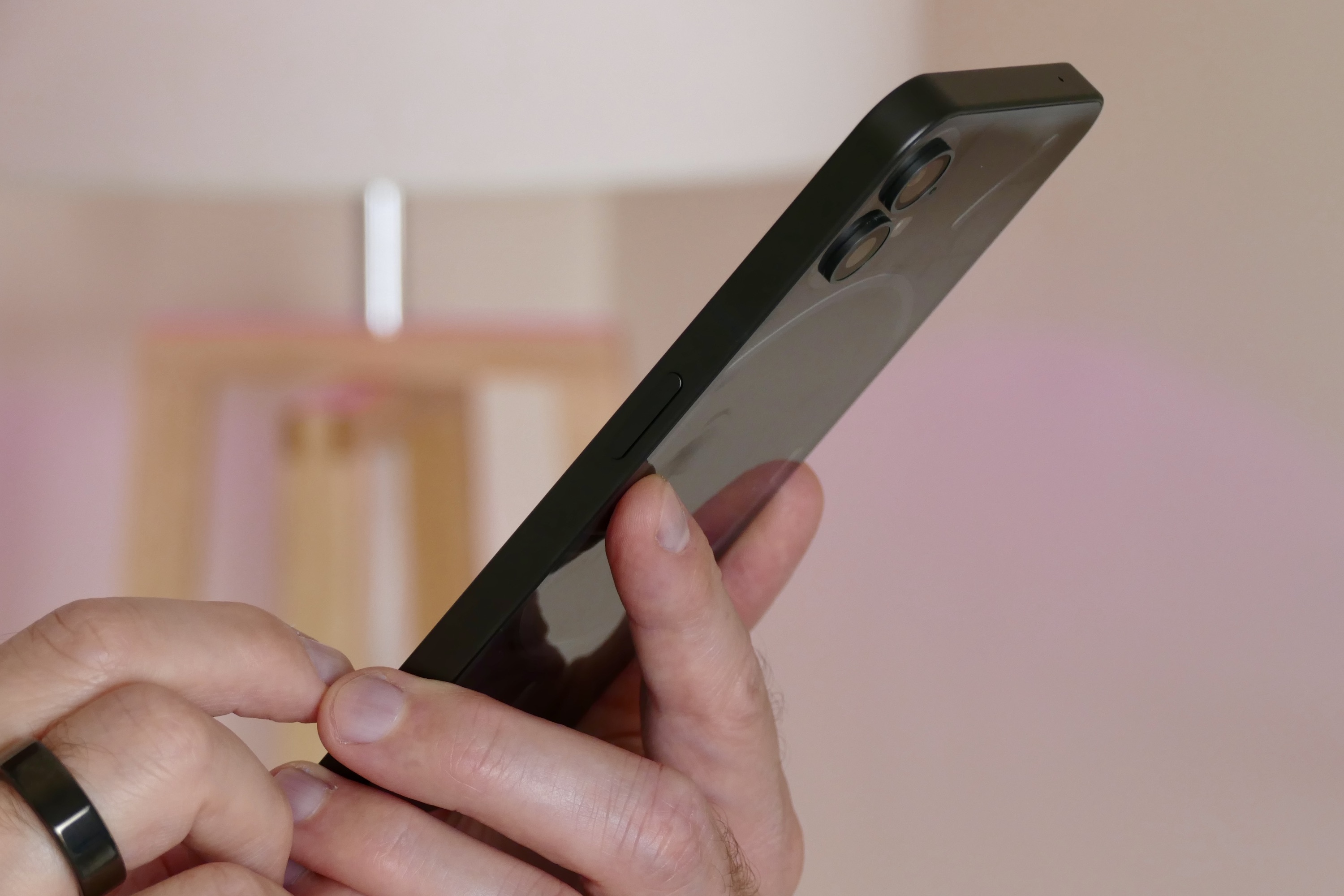
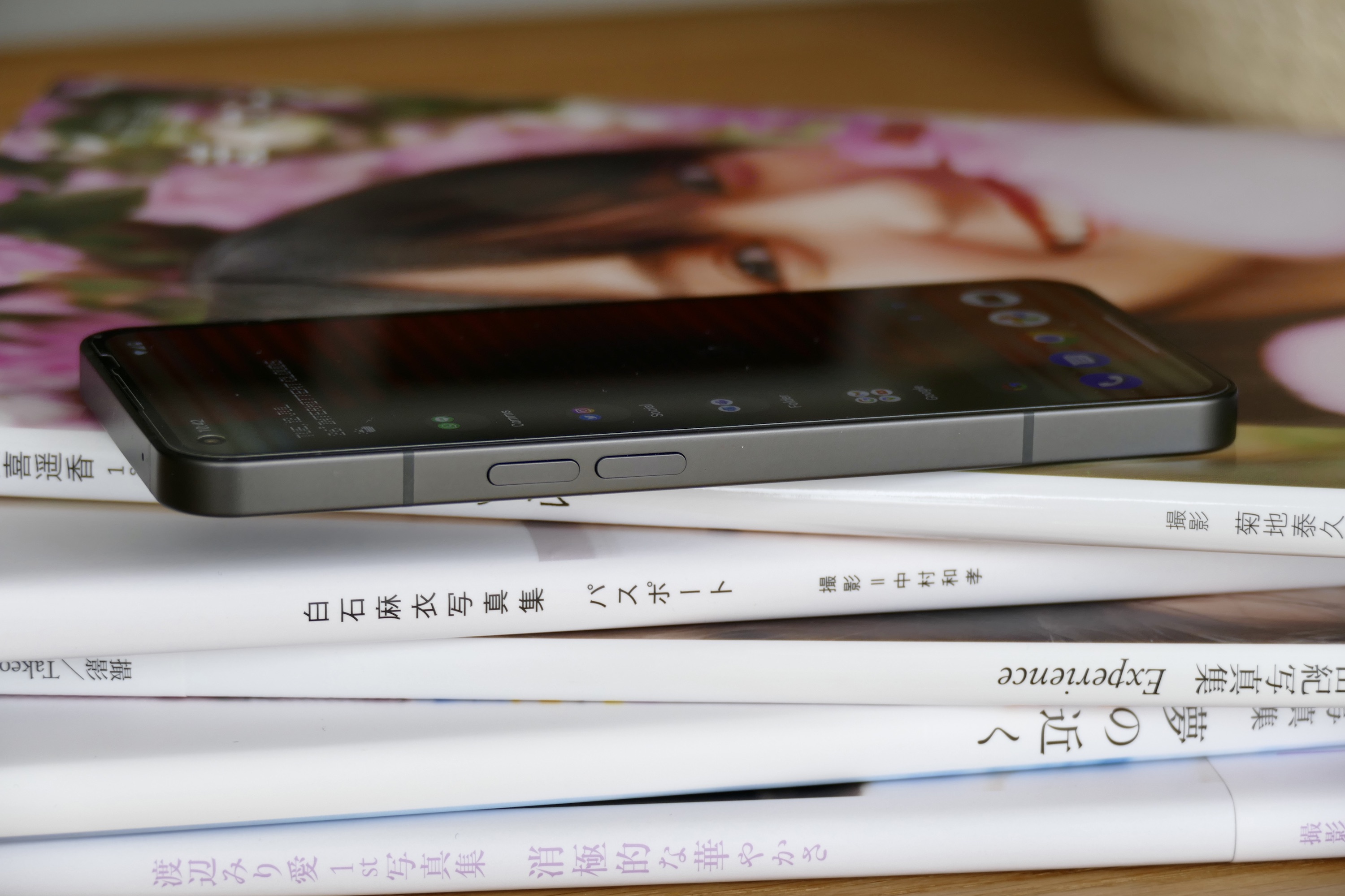
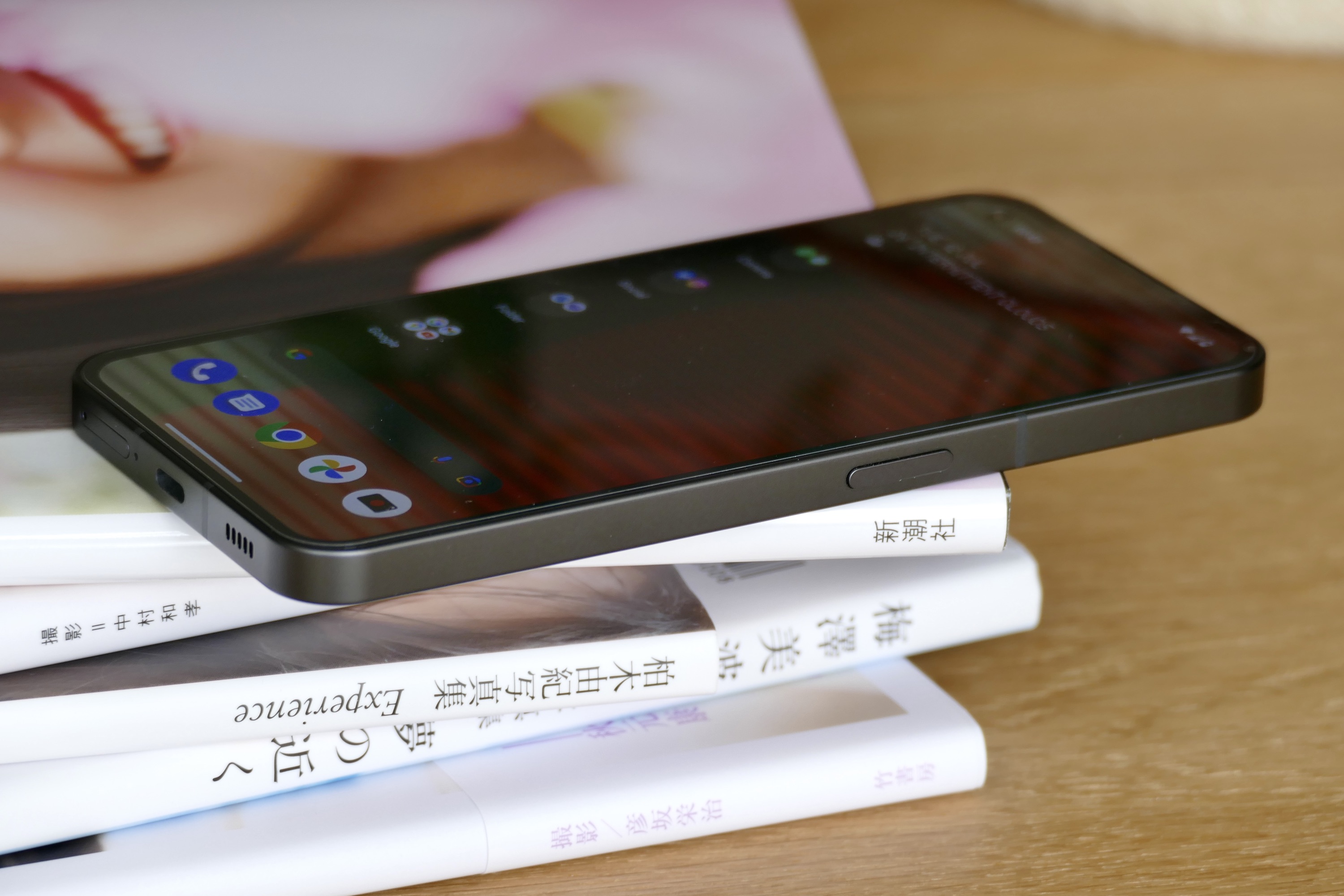
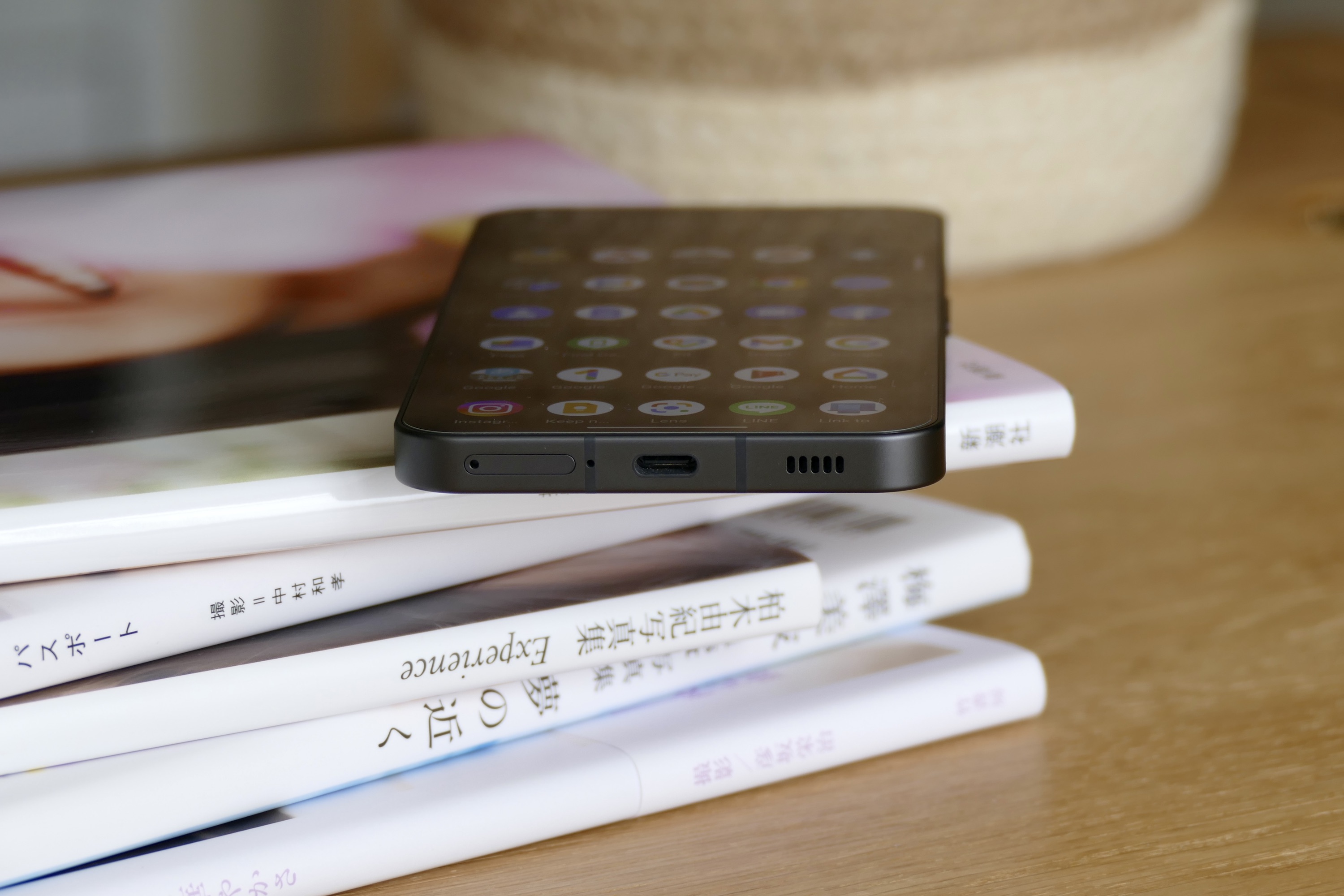
The flat-sided metal body looks very slick and is exceptionally well made. The buttons have a pleasing motion with a solid click, the I think the transparent back of the phone looks ace. All the phone’s guts are actually covered up, leaving the wireless charging coil as the only naked component on display. That may disappoint some at first, but in reality, is a good thing. Components are usually ugly and aesthetics aren’t taken into account when laying out the inside of a phone. In my opinion, covering them up with different shaped panels under the glass gives the phone a cool, sci-fi look.
Unfortunately, the flat, angled sides mean the Nothing Phone 1 isn’t that comfortable to hold for extended periods, much like the iPhone 12 and iPhone 13 it’s so clearly imitating. There is a hint of a chamfered edge, but it’s not enough to make the phone as comfortable to hold as the Xiaomi 12 Lite, which shares a similar design. The phone’s 193-gram weight is just right though, making it pocketable and never fatiguing to hold. I was sent a transparent case for the Nothing Phone 1, which I’ve found reduces the way the phone digs into your palm.
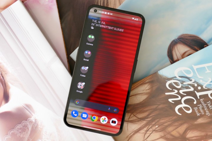
What else? The flexible OLED screen has been mounted right up against the glass, the viewing angles are wide, and the uniform bezel around the edge makes the phone look ultra modern and really neatly designed. The fingerprint sensor is lightning fast and has so far performed faultlessly. In the black color seen in our photos, the Glyph lights really stand out when they flash, but at all other times, it’s fairly anonymous. There’s a white model if you prefer a less stealthy approach.
Flashing lights, unusual sounds
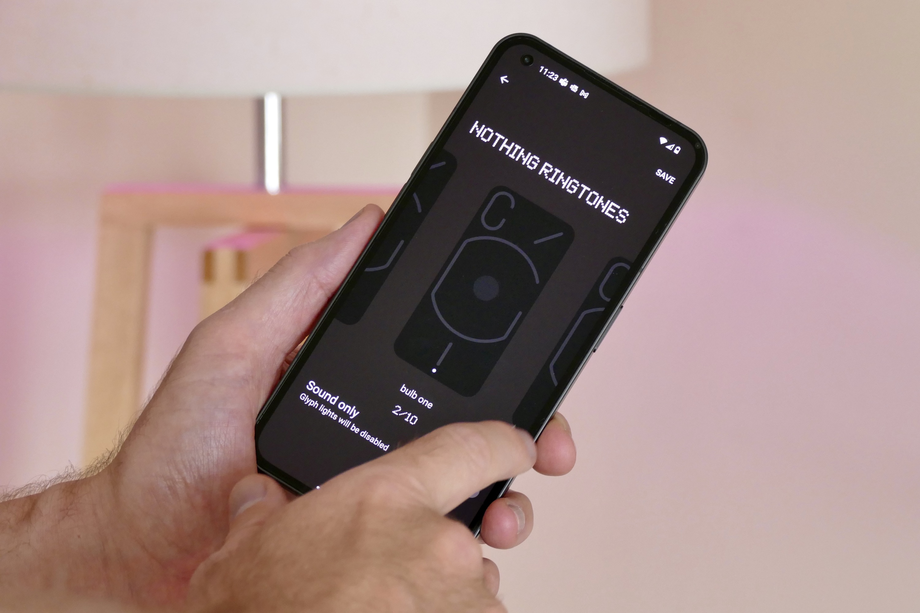
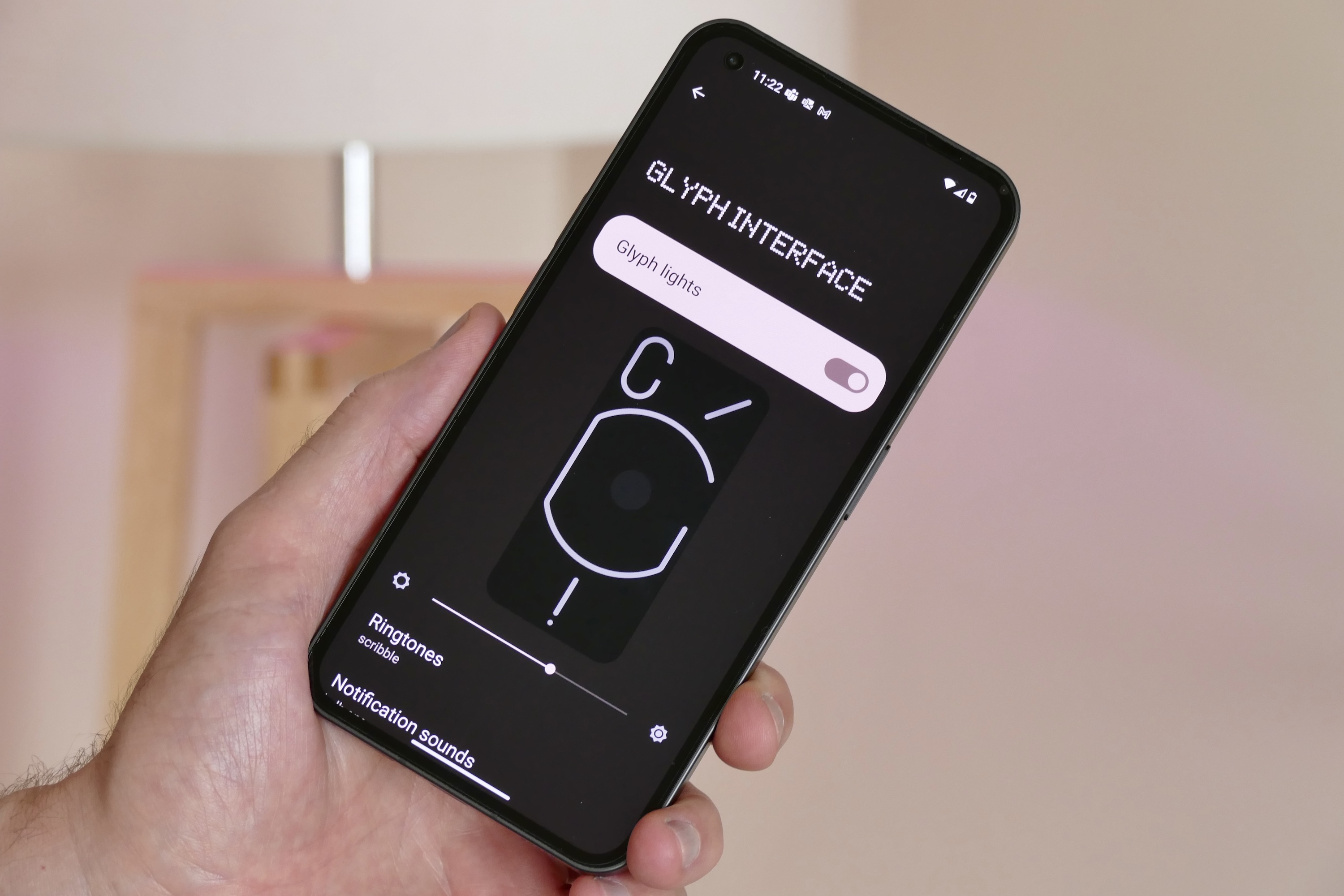
Let’s talk more about the Glyph lights. There’s a dedicated section under the Settings menu for the Glyph Interface and the various options, and the show is mostly activated when the phone rings or a notification comes in. There are 10 different special ringtones and notification alerts, all of which flash the lights in different patterns, vibrate the phone in different ways, and make different sounds when something happens. Otherwise, the LEDs come to life to show charging status, when Google Assistant is listening, and can be used as an alternative to the flash in the camera app.

On the positive side, Nothing has got the combination of lights, haptics, and sound just right. They’re distinctive and unique, and the way the phone illuminates and vibrates means there’s no mistaking it for any other phone. It definitely has its own characteristic, just don’t expect the Glyph to give the Nothing Phone 1 a personality. The Glyph Interface is also very bright, and even at 75% brightness some of the sharper notification alerts look like a flash of lightning in a dark room. It’s a good thing you can set a Do Not Disturb schedule.
https://twitter.com/AndyBoxall/status/1546880799005343747
Now the downside. The Nothing Phone 1 has to be face down to see the Glyph Interface’s flashy light show, and that’s just not very convenient. This is how my time with it went: I put the phone face down so I could see the cool lights, then when a notification arrived I picked the phone up to see what it was. After a few times doing this, I left the phone face up so I could either see the always-on screen when the notification came in or tap it to instantly see what was new. I just don’t know how often I’d realistically keep the phone face down, and that means missing out on one of the things that makes the Nothing Phone 1 special.
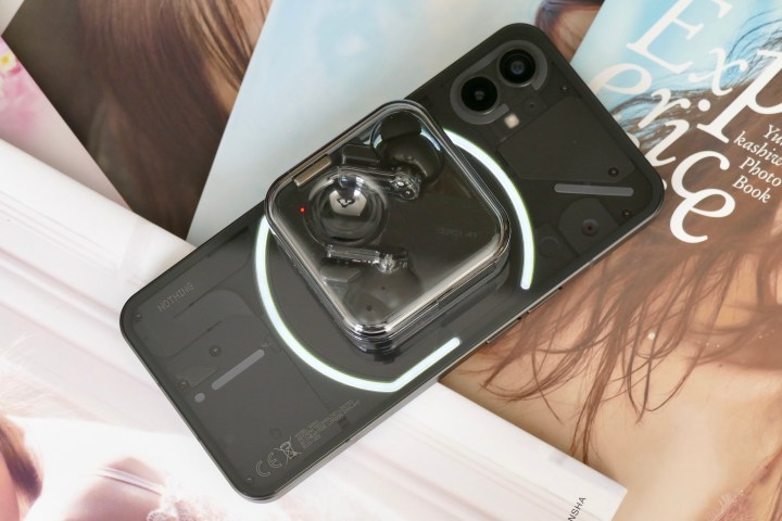
The haptics are very noticeable and nicely engineered, and the sounds they accompany are a great mix of cute (the “Oi!” And Tennis sounds), nostalgic (either of the bulb sounds), and weird (the excitable Scribble and Squirrels). However, these face the same problem as the lights. I don’t mind having the sounds active at home but would turn them off in public — and I’d probably soon just not remember to turn the volume back up again.
Everyone will take to the Nothing Phone 1’s attempt to bring sound and light back to phones differently, and some may deliberately adjust their lifestyle to suit the phone. Personally, I suspect the novelty will wear off and I’ll go back to the most convenient and established way of a phone alerting me of calls and notifications — a haptic-generated buzz and the always-on screen.
What is NothingOS like?
What about the rest of the software? I’ll have deeper insights for the full review, but if you’ve tried the Nothing Launcher on a phone already, that’s what NothingOS is like on the Phone 1. There have been some negative comments about the launcher experience and Nothing’s design choices, but I don’t think they’re warranted as there’s absolutely nothing obnoxious or overtly stylized about it at all. It’s generally neat, swift, clean, and in places even borders on anodyne.
I was expecting it to have more personality than the Nothing Launcher, but no, the experience is broadly identical. If you’ve used and enjoyed a Google Pixel 6’s software, and fondly remember OnePlus’s OxygenOS before it was assimilated, you’ll like NothingOS on the Phone 1. It has the speed of a Pixel and the quirks of OxygenOS before it became a facsimile of ColorOS, plus some very odd UI decisions (such as a shortcut to Google Pay on the lock screen where you may expect a shortcut to the camera app to be found).
For a deeper discussion of the software, you’ll have to wait for the review, at which time we’ll be able to give our verdict on the camera and battery life, too. So far the camera is good, but you’d expect that from a fairly simple two-camera layout, while the battery — despite the small capacity — has coped with normal use admirably.
The hype around the Nothing Phone 1, especially related to the software and Glyph Interface, has built the phone up to be something truly incredible, but that has overshadowed the phone’s welcome simpleness. For all its showiness, the Nothing Phone 1 is actually refreshingly spartan, something people won’t expect from the marketing or breathless online expectation.
It’s not a criticism at all. Nothing could have really ruined the phone by pushing its pixel-art font and going all-out with a minimalist approach. While I’ve had some fun with the lights and sounds, when I got into using the phone as a phone, I found the gimmicks were hiding what’s shaping up to be a very well-made, friendly, and pleasant to use Android phone at an excellent price.
Price and availability
The Nothing Phone 1 won’t be released in the U.S. but will be available in the U.K., India, and Japan. Nothing says this is due to it being a new brand, and entering into relationships with carriers in the U.S. isn’t realistic at this stage. However, it does want to release a phone in the U.S. in the future.
In the U.K. the Phone 1 starts at 399 British pounds/$473 for the 8GB/128GB, 449 pounds/$533 for the 8GB/256GB model, and later this summer there will be a 12GB/256GB version for 499 pounds/$592. Nothing will sell the phone through its own online store, through the O2 network, and retail partners including Selfridges.
