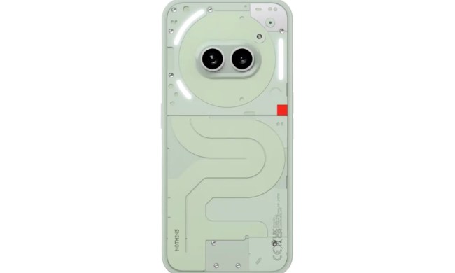
The Nothing Phone 1’s Glyph Interface — what Nothing calls the system of lights, sounds, and vibrations that make the Phone 1 unique — is controversial enough that it has already received some hate. Some people can’t see the point of it. They think it’s a gimmick, ugly, or simply sneer and consider it a transparent (sorry) marketing ploy to attract those who will gladly hand over money in exchange for shiny things.
While true to a certain extent, it’s a bit of an overreaction, and the Glyph Interface has more depth to its features than one would expect. The thing is, having now used the Nothing Phone 1 for a while, there is a hint of a far more impactful problem with the phone, but it has nothing (sorry again) to do with the lights on the back. Instead, it’s to do with the software inside.
Great software … right now
At the moment, the Nothing Phone 1’s software is delightfully clean, with no Nothing-specific email app or browser app to hide in a folder, no dubious in-your-face “features” that only appeal to a tiny percentage of owners, and very little in the way of frustrating design. It makes the phone enjoyable to use. It runs so smoothly you almost glide through the menus, which is absurdly satisfying.

NothingOS gets a very big tick in our review, and that effortless, uncluttered nature is a big part of the reason why. It’s particularly refreshing when competing operating systems — including the one from Nothing founder Carl Pei’s former company, OnePlus — are only becoming more complex, messy, and frustrating to use. Phones shouldn’t be like that, and happily, it goes against Nothing’s ethos of “making tech feel like nothing.”
The company is paying attention, too. In the latest software update, Nothing made it so the Google search bar on the home screen can be deleted, a change from its earlier version and a correction of a frustration noted in our review, as well as by Nothing beta testers. Well, we’re hoping it’s also listening now, because there’s some evidence Nothing isn’t absolutely committed to keeping NothingOS as a clean, fuss-free operating system.
Teslas, NFTs, oh my!
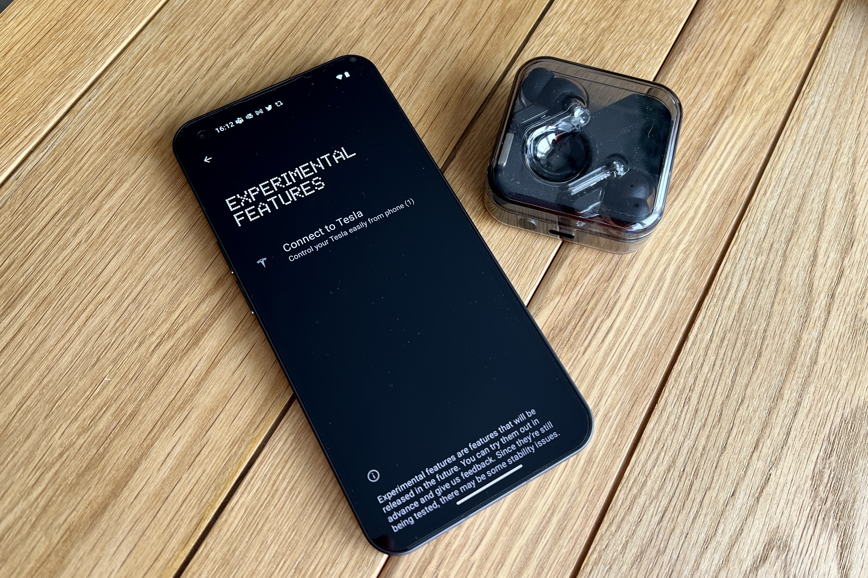
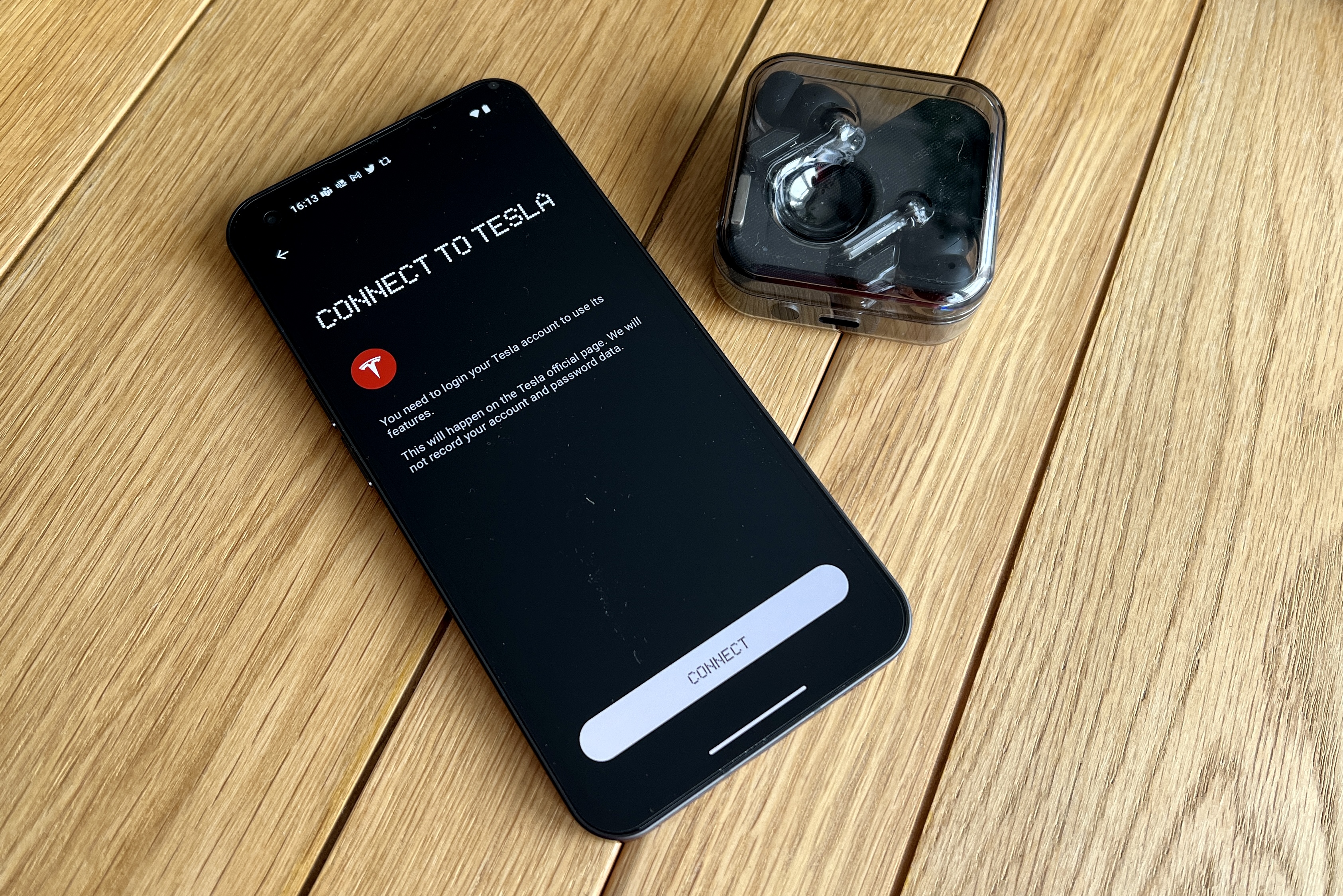
So what’s the problem? Listed under Experimental Features in the Phone 1’s Settings menu is “Connect to Tesla,” where you can apparently control your Tesla car from the Phone 1. Its presence is very concerning. Why is it there? Isn’t there an app for this already, and what benefit would there be for a Tesla owner to use the Nothing phone instead of it? What percentage of Nothing Phone 1 owners have a Tesla, or what percentage of Tesla owners plan to buy a Phone 1? Or, for that matter, what percentage of Tesla owners would consider a midrange phone at all?
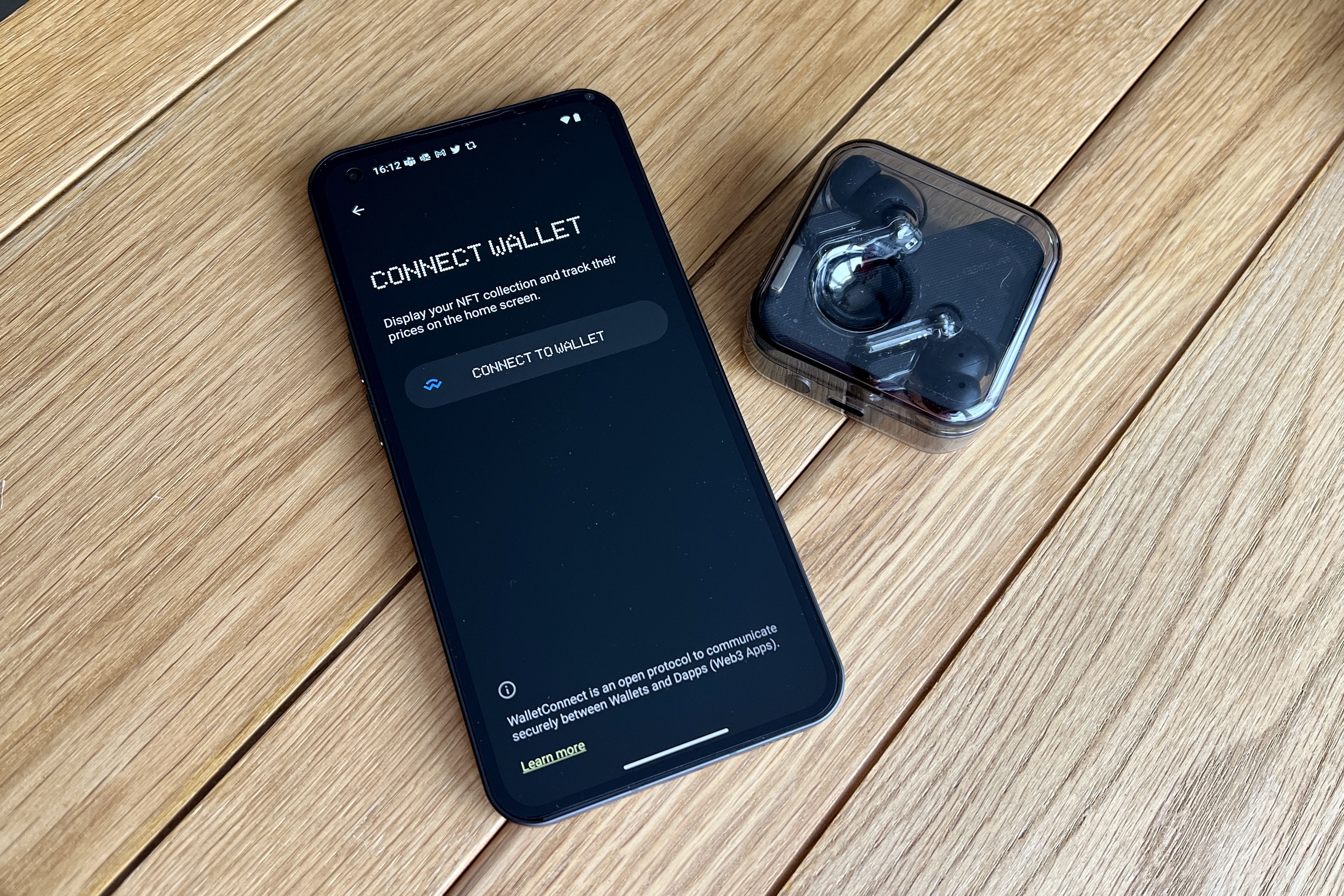
For most Nothing Phone 1 owners, it’s a pointless baked-in feature that can be ignored, but it’s one of two new “features” that threaten to take the Phone 1’s software away from simplicity and toward hateful complication. It’s joined by a new NFT Gallery widget, where you can proudly show your NFTs on the home screen and track prices too. Admittedly, anything overtly promoting NFTs instantly puts me off, but again, like the Tesla app, is there really any real demand for this kind of widget or feature?
Both of these feel like marketing exercises, created to grab headlines because they mention hot topics connected to loud fan bases — not real features that will ever appeal to the masses. They certainly don’t offer anything you can’t get from a third-party, optional app already. Nothing’s software is currently very pleasant to use, and thankfully, neither of these “bonuses” are intrusive right now. But they could be the beginnings of niche feature creep for Nothing, and that’s a step in the wrong direction that could lead it down a path that eventually ruins NothingOS.
Don’t ruin this, Nothing
We’ve seen it many times before, but OnePlus’ OxygenOS is probably the best and most relevant example of what not to do. OxygenOS was once like NothingOS, a flowing operating system that held its own against Android on a Google Pixel phone, but today is a shadow of its former self due to it becoming a facsimile of Oppo’s ColorOS. No one wants endless interruptions, duplicate apps, or dubiously named tools thought up by a marketing team, because they slow everything down.
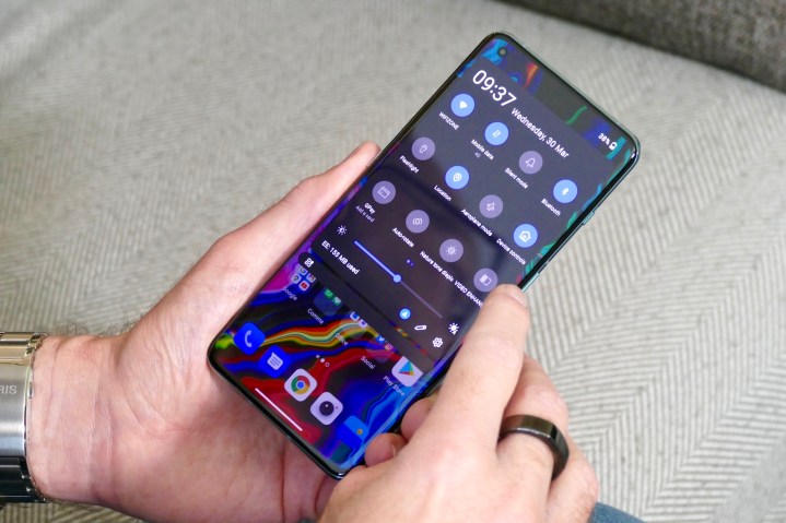
NothingOS today is not like that, and for a debut phone from a relatively new company, it shows impressive restraint. At least I hope it’s restraint, and not either an inability to have any software fluff ready at launch, or a tempting blank canvas over which it now intends to scribble digital graffiti.
Anyone thinking the Glyph Interface lights are “what’s wrong with the Nothing Phone 1” are sorely mistaken. There’s actually not much wrong with the phone at all, especially for its very competitive price. It’s the threat of pointless non-features being gradually introduced that could become far more of an issue for the Phone 1. Nothing needs to tread carefully as it balances a keenness to leap aboard any hype train with keeping what makes the Nothing Phone 1 so good to use at the moment.
