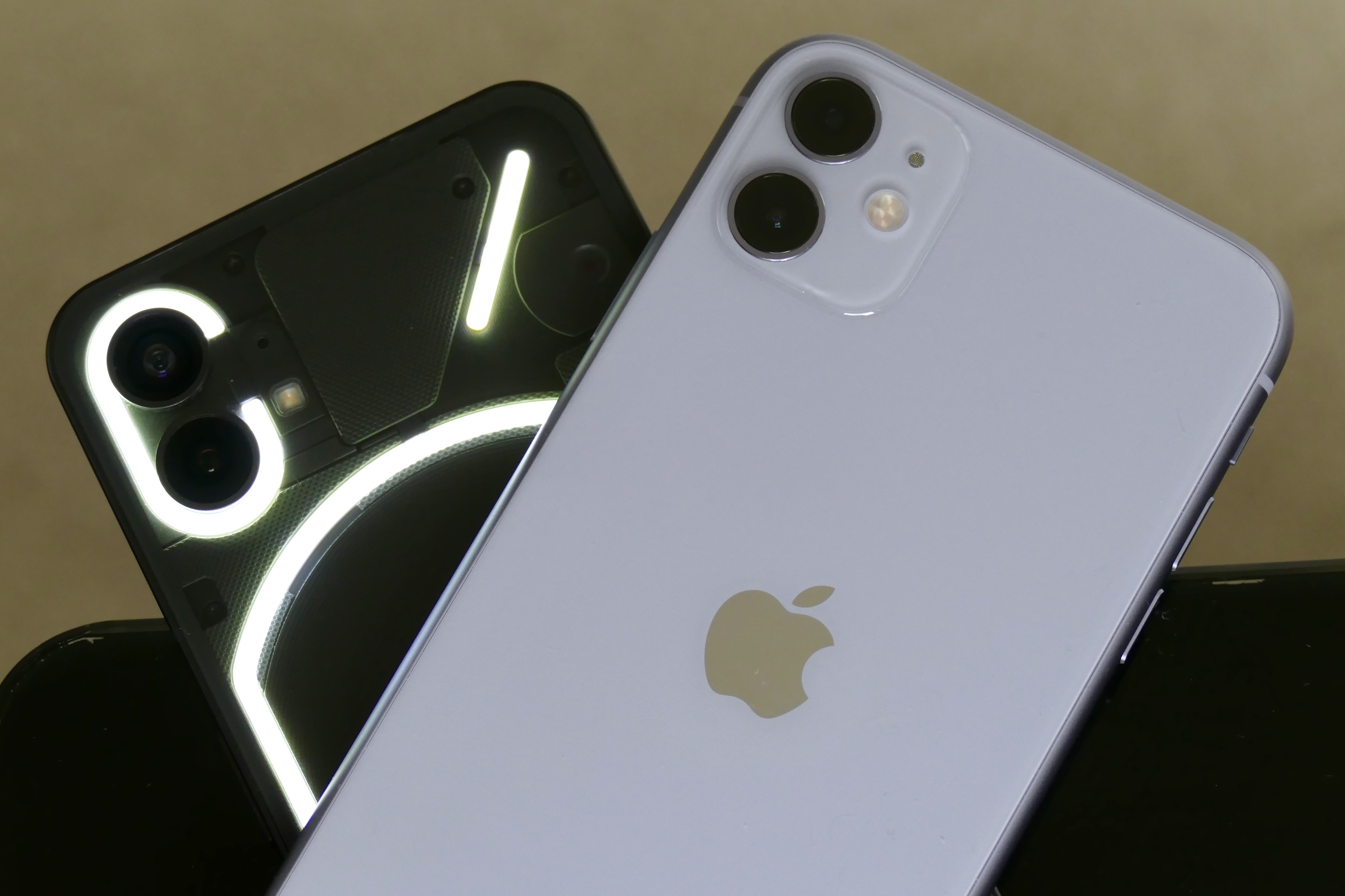
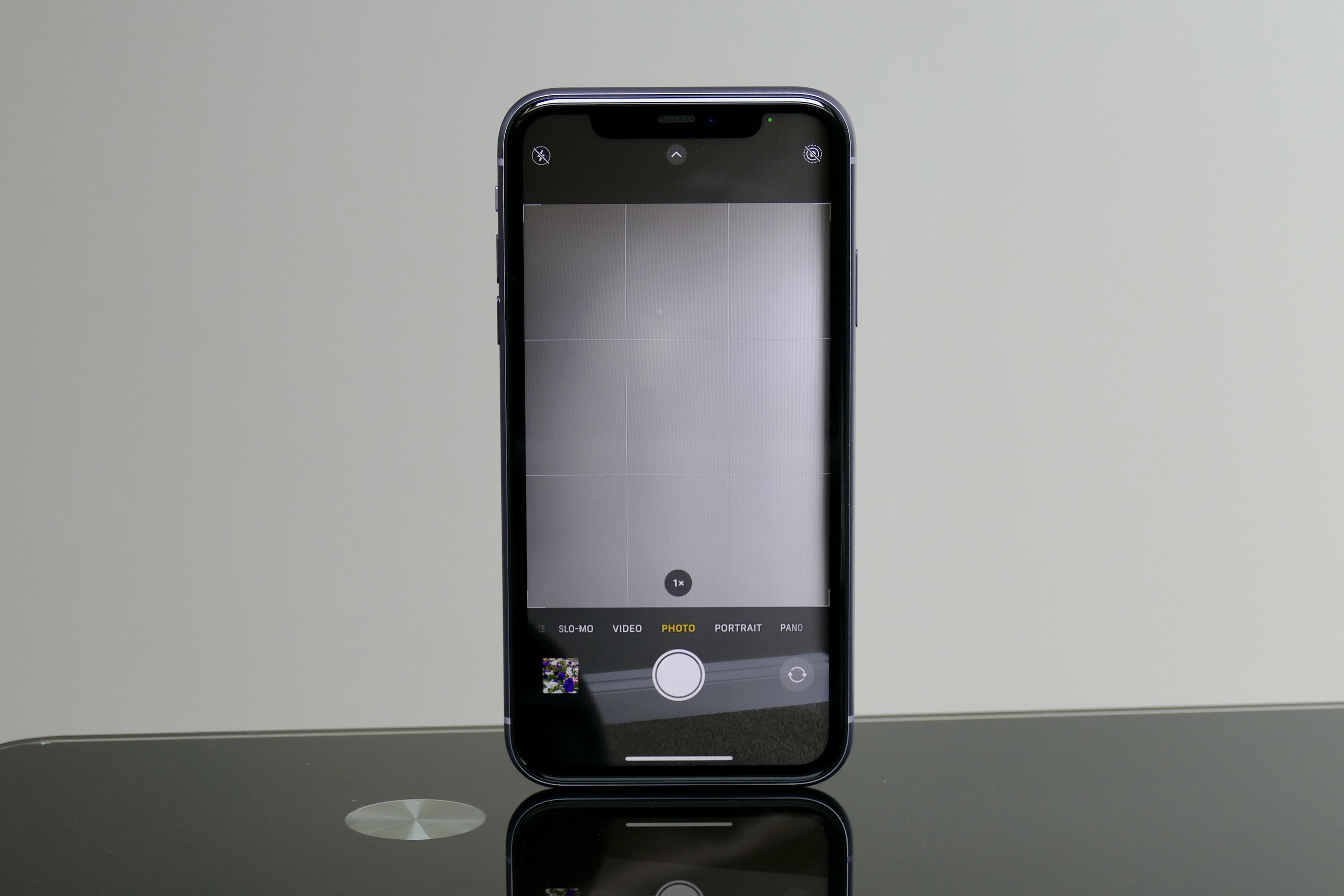
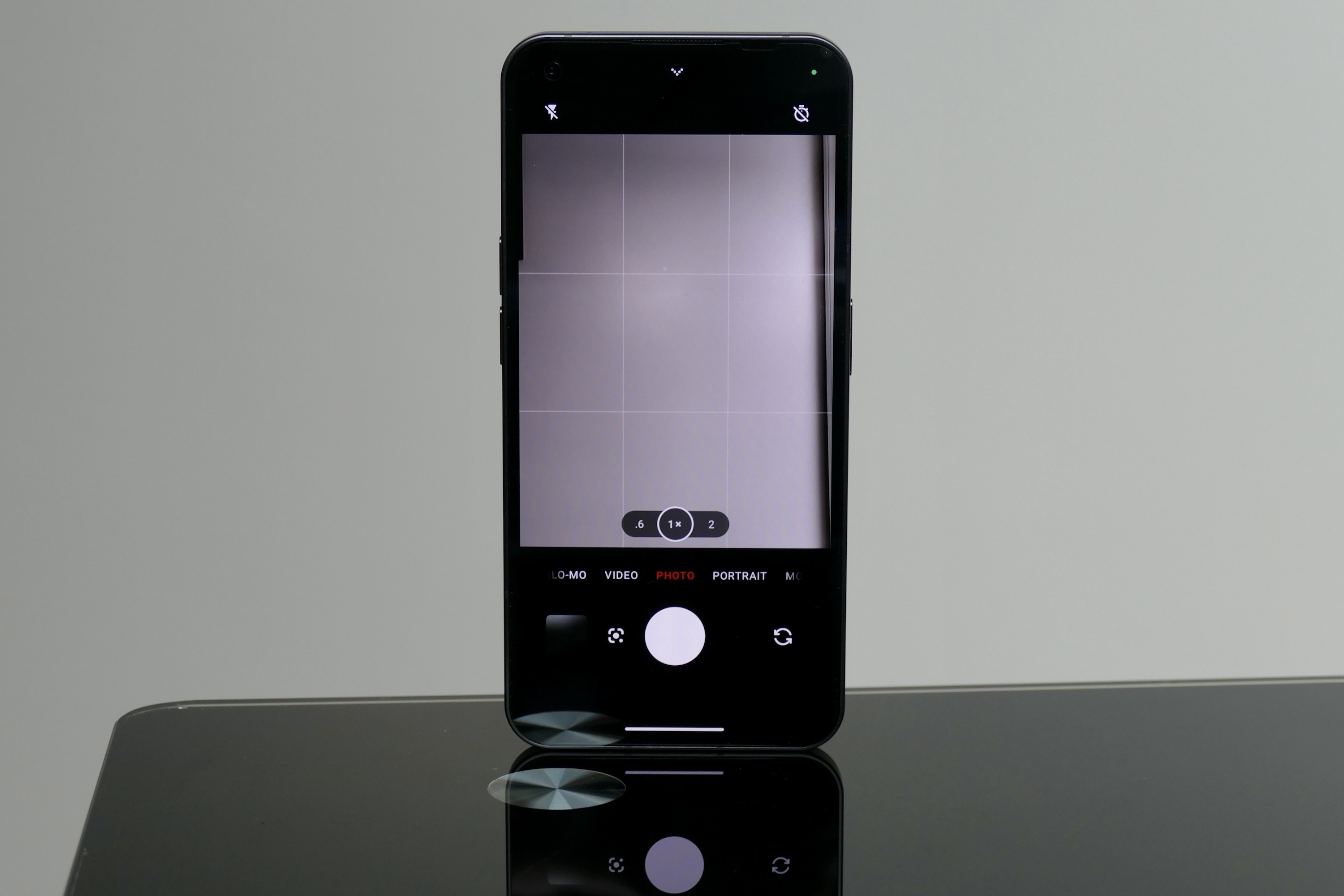
It’s not that much of a stretch to see the Nothing Phone 1 would like to be the iPhone of the Android world, with its flat-sided design, clean software, a growing ecosystem of similar products, and the dual-camera layout on the back. But can it win over potential iPhone buyers, or steal them away from a reasonably priced iPhone? To find out, we put the Nothing Phone 1 against the most affordable competing iPhone Apple still sells, the iPhone 11.
The phones and cameras
Before we get into the photos, let’s talk about the choice of iPhone. The Nothing Phone 1 starts at 400 British pounds, or about $480. For this, it has a midrange processor, a large 6.55-inch screen, and a dual camera on the back. While the iPhone SE (2022) comes in around the same price, it’s not exactly comparable in specification, and the latest iPhone 13 costs $800 or 780 pounds. While it’s closer in spec, it’s considerably more money to buy.

To get the equivalent modern iPhone that’s sold brand-new, we need to go back in time a little. Apple still sells the iPhone 12 new for $599 or 679 pounds, which is still a little too expensive, but at $499 or 489 pounds, the iPhone 11 is just about right. After all, the top Nothing Phone 1 with 12GB RAM and 256GB storage space costs 499 pounds, or about $590. If you’ve got $500 maximum to spend on a big-screen smartphone, the iPhone 11 is probably going to be on the list alongside the Nothing Phone 1.
The Nothing Phone 1 has a 50-megapixel main camera with optical and electronic stabilization (OIS and EIS), plus a 50MP wide-angle camera with EIS. On the front is a 16MP selfie camera. The iPhone 11, which was released in 2019, has a 12MP main camera and a 12MP wide-angle camera, both with OIS, and 2x optical zoom. The selfie camera also has 12 megapixels. Is a fight between a two-and-a-half-year-old phone with twin 12MP cameras and a brand-new phone with twin 50MP cameras even fair?
For the test where we find out, both phones were used in auto mode, photos were taken across different days in different lighting conditions, examined on a color-calibrated monitor, and finally resized before publishing here for friendlier online viewing.
Main camera
Perhaps you expect there to be a big difference between the two main cameras, as, on paper, the divide between 12MP and 50MP is significant. It turns out it’s very difficult to split the Nothing Phone 1 and iPhone 11’s main cameras, as both have similar tuning and performance. We’ll begin with the photo of a park.
The sky in the Nothing Phone 1’s photo is slightly less saturated than the iPhone 11’s, but the green has a little more vibrance, while the iPhone 11’s exposure works to show the water and its depth more clearly. The detail in both photos is very similar, although there is a hint of noticeable blur in the corners from the Phone 1. The iPhone 11’s improved exposure helps show the texture of the path, the column, and the stepping stones.
- 1. Nothing Phone 1
- 2. Apple iPhone 11
- 3. Nothing Phone 1
- 4. Apple iPhone 11
Moving on to an overcast day, and at first glance, the pair again take very similar photos. But it’s when you look more closely that the differences appear. Look at the lamppost, and you can see the ridges in the metal and the inside of the lamp itself in the iPhone 11’s photo, but none of the detail appears in the Phone 1’s image. The better exposure helps show detail in the trees in the background too, which are partially lost in the Phone 1’s photo.
Now, look at two close-up photos taken with the main camera, beginning with a white flower. As we saw with the photo of the park, the Phone 1 emphasizes the green more than the iPhone 11, and the stark white of the flower really stands out. The iPhone 11’s photo is better balanced, and when you zoom in to look at the petals, there’s more detail in the petals, but a little more noise in the background. Both have lovely natural bokeh and are photos I really like.
Finally, how about getting really close? The photo of the bumblebee was shot using the main camera at 1x zoom and tapping on the screen to ensure the camera focused on the insect and not something else. I took multiple images with both cameras, because photos of insects are difficult to take, and these two are the best examples from both cameras.
- 1. Nothing Phone 1
- 2. Apple iPhone 11
- 3. Nothing Phone 1
- 4. Apple iPhone 11
The Nothing Phone 1 does a good job, showing off the bumblebee’s furry body and the delicacy of its wings (and isolating it from the background too). But it can’t quite match the iPhone 11, which shows more detail, less noise or obvious edge enhancement, and better color balance. It’s extremely good for a smartphone, and perhaps even better considering the iPhone 11 is more than two years old.
Overall, the two main cameras took very similar photos, and it does appear the Nothing Phone 1 has been tuned to compete with the iPhone more than a camera like the Samsung Galaxy A53. However, it can’t quite match the detail, exposure, or ability of the iPhone 11.
Winner: Apple iPhone 11
Wide-angle camera
The wide-angle camera performance differs a lot more than the main cameras across the two phones. This time the iPhone 11 delivers the more saturated photo, while the Nothing Phone 1 tends to under-expose and has less defined colors. Starting with the photo of the field and tree, the iPhone 11’s photo has a lot more life and vibrancy, while the Nothing Phone 1’s photo is colder.
- 1. Nothing Phone 1
- 2. Apple iPhone 11
- 3. Nothing Phone 1
- 4. Apple iPhone 11
Zoom in, and neither excels in terms of detail, with the iPhone 11 smoothing the image more compared to the Phone 1. But this treatment results in less jagged textures and a far prettier photo when you look closely. The iPhone 11’s photo is far more accurate in terms of realism and with the scene I saw with my own eyes.
The same problem with the Nothing Phone 1’s wide-angle camera shows up in the shot of the cliffs and sea, where the water and rocks on the shore are jagged and rough, compared to the smoother and more visually appealing photo from the iPhone. I like the green and blue water in the iPhone’s photo too, and the deep blue of the sky. Once again, the Phone 1 has a colder image, and there’s noticeable noise on the horizon.
- 1. Nothing Phone 1 wide angle
- 2. Apple iPhone 11
Finally, a challenging photo looking into the sun as it went down. The iPhone 11 captures the color of the sky and the clouds more effectively, and the reflection on the water has a brighter, more atmospheric glow. The brighter deck of the ship in the Nothing Phone 1’s photo carries across to the sky, and although it’s arguably more accurate, it’s not as pretty. Neither phone excels in any of these photos, but the iPhone 11’s images are less noisy and more instantly attractive than the Phone 1’s, which would benefit from editing.
Winner: Apple iPhone 11
2x zoom
The iPhone 11 does not have a shortcut to a 2x zoom in its camera app, so you have to select it manually, yet Apple claims a 2x optical zoom capability. The Nothing Phone 1 has a shortcut to a 2x zoom, but does not have an optical zoom capability. It’s the first time in this test that the two phones return drastically different results from each other.
- 1. Nothing Phone 1
- 2. Apple iPhone 11
- 3. Nothing Phone 1
- 4. Apple iPhone 11
Neither phone takes great 2x photos. The close-up shot of the monument shows how the Apple phone prioritizes the texture and color, while the Nothing Phone 1 smoothes everything out more. But when you zoom in, the text and details are clearer. It’s the same when you look farther into the photo, too, with the license plate on the Hyundai i10 appearing less pixelated in the Nothing phone’s photo, for example. That said, the iPhone 11’s photo is more atmospheric in general, despite not picking up as much detail.
The photo of the driveway is difficult to judge, as the Phone 1 over exposes for an overly bright image, while the iPhone 11 goes in the opposite direction for a moodier, but less detailed photo. Zoom in, and the trees on the right of the image are smoothed out too much in the Nothing Phone 1’s photo, and the individual leaves are more obvious in the iPhone 11’s photo. Neither looks that great.
- 1. Nothing Phone 1
- 2. Apple iPhone 11
Finally, the photo of the pub suffers from the same problems, and while the details are more obvious in the brighter Phone 1 photo, the edge enhancement visible around the chimney ruins the picture. The iPhone’s image obscures the beauty of the walls, the flowers, and even the texture of the tiles in shadow.
Despite claiming a 2x optical zoom, it’s probably a good thing Apple doesn’t give you quick access to it on the iPhone 11, as the results are disappointing. Not that the Nothing Phone 1 does anything better. Its photos lack finesse, and the digital enhancements are far too obvious. Neither wins here, so the category is a draw with both being as bad as each other.
Winner: Draw
Night mode
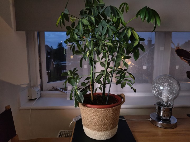
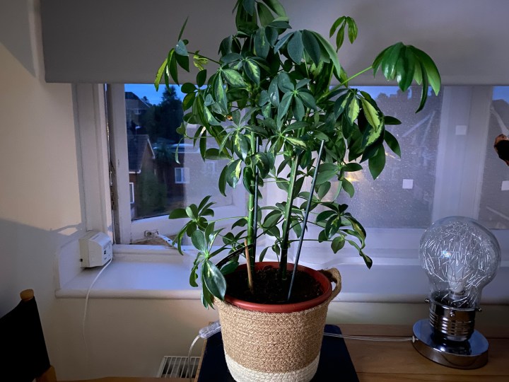
The Nothing Phone 1’s night mode must be manually activated, while the iPhone 11 assesses lighting conditions and sets the exposure itself. The photo of the plant was taken in a dark room, backlit by a streetlight. In normal mode, the plant was barely visible to either camera, giving you an indication of how dark the environment was. Both cameras brighten the scene considerably, and I saw the same differences between the two in all Night mode photos I took with the phones.
- 1. Nothing Phone 1
- 2. Apple iPhone 11
The photo taken with the iPhone 11 has a better color balance, showing the whites more effectively and realistically compared to the Phone 1, and there’s generally less noise in the background (see the partially lowered blind for evidence), but the plant is noisier in the iPhone’s photo when you zoom in.
The overall tone of the Nothing Phone 1’s photo is pleasant, and I like the way it has captured the chrome on the light bulb-shaped lamp. That said, the iPhone’s photo is less noisy in general, and the colors are more true-to-life. It’s a very close thing, and some may prefer the atmosphere in the Nothing Phone 1’s image, but the iPhone 11’s photo is more realistic. Looking at other Night mode images, neither ever produces a really winning image, with the same pros and cons in each.
Winner: Draw
Portrait mode
Across multiple portrait photos shot with the two phones, the same problems showed up each time. The photo of the sign shows them all off in one image. I tapped on the screen to make sure the cameras focused on the sign itself, and the text in both is sharp, the texture of the board is natural, and the colors in each image are eye-catching and attractive.
- 1. Nothing Phone 1
- 2. Apple iPhone 11
Where the Nothing Phone 1 falls down is in its depth recognition. It consistently failed to separate the focal point from the background as effectively as the iPhone 11. You can read the “100 Years” flag in the Phone 1’s photo, but it’s correctly blurred in the iPhone 11’s image, while the bush on the left is mostly in focus too. The iPhone doesn’t get that part completely correct either, but it’s better than the Phone 1.
The iPhone 11 produces a stronger blur effect in general, while the Nothing Phone 1’s less obvious background blur doesn’t make the effect look more natural due to the confused focal points. The iPhone 11 isn’t perfect, but it gets the photo right more often than the Phone 1, and takes another win here.
Winner: Apple iPhone 11
Portrait selfie
Switching to the front camera and using Portrait mode, both phones take decent portrait selfies, with a strong background blur, good color balance, and natural textures. However, the iPhone 11 produces a vastly more realistic photo, with accurate tones that are more representative of real life.
- 1. Nothing Phone 1
- 2. Apple iPhone 11
The Nothing Phone 1’s selfie camera smooths my skin out a little too much, despite not changing the camera from its default setting. I don’t have a problem with the look, but the adjustments won’t be to everyone’s taste, and the iPhone’s preference for recreating your actual look is likely to be preferable.
Edge recognition is similar in both photos, with neither really getting my cap right, and both getting the side of my glasses mixed up with the background, although the iPhone correctly blurred the background in the lens. This improved accuracy, fewer jagged edges on my cheek, and more natural tones make it the winner in this category.
Winner: Apple iPhone 11
Conclusion
The Apple iPhone 11 has won four out of the six categories, and the pair drew in the other two categories, leaving the Nothing Phone 1 without a category win. It’s an overwhelming win for the phone released in 2019, then, and although that’s the big takeaway here, it should be noted how close the Nothing Phone 1’s main camera tuning is to the iPhone. I took dozens of photos with both main cameras, and sometimes finding anything to split them was a bit of a challenge. If the Phone 1’s general design reminds you of the iPhone, then the camera performance will too.
One thing to note is Nothing has promised to update its camera, and during my tests, a software update did arrive but didn’t affect performance dramatically. The majority of images here were taken after the software update.
So, what’s the final verdict? Are we recommending you buy the iPhone 11 over the Nothing Phone 1? It’s an interesting dilemma, as suggesting to buy a 2019 phone over a 2022 phone goes against our usual advice, which is to buy the latest tech you can afford. However, Apple still sells and supports the iPhone 11, so it’s still technically current, and won’t be out of date for several years yet. There are far worse ways to spend $500.
Where does this leave the Nothing Phone 1? The phone is competitively priced, I find the Glyph Interface and its lights surprisingly useful, the design is unique, and the software is currently great to use. It’s a good smartphone, but this test shows the camera still needs work.
