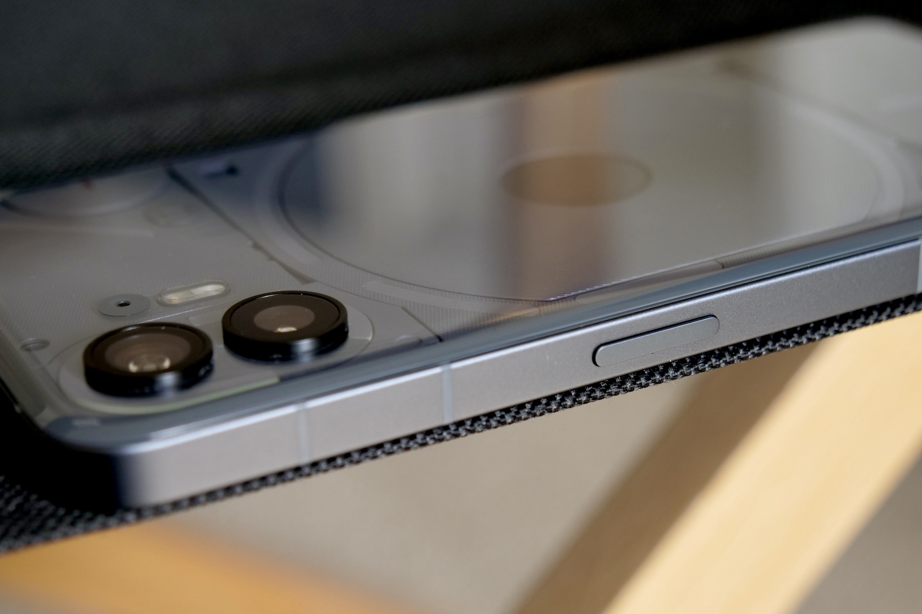
“The Nothing Phone 2's eye-catching design and cool Glyph lights are just the beginning, as the screen, performance, and camera all impress too.”
- Great, modern design
- Glyph lights are cool and useful
- Clean, yet customizable software
- Excellent daytime camera
- Colorful screen
- Only IP54 water resistance
- Poor lowlight camera performance
The tech brand Nothing arrived in the U.S. in 2023, and to attract attention, it came armed with the Nothing Phone 2 — a smartphone that looks unlike any other phone available. Is it ready to challenge the establishment and pull sales away from the likes of Google, OnePlus, and Samsung?
Yes, it absolutely is. And if you’re reading this wondering if you should buy it, then I’ve got plenty of very good news for you about this truly special smartphone.
About our Nothing Phone 2 review
I reviewed the Nothing Phone 2 in July 2023 and revisited it at the end of the year. The review has been updated throughout, and a new section has been added right below to include my opinion of the phone six months after its release. Our overall score has not changed, and the Nothing Phone 2 is still a great smartphone to buy.
Nothing Phone 2: six months later
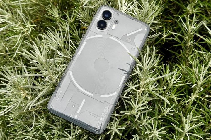
It’s not always good to return to a smartphone months after the launch and find nothing has really changed, but for the Nothing Phone 2, it’s a positive thing because it remains a brilliant phone. I’ve been using it for more than a week now, and it has impressed me every day with its performance, simplicity, style, and sense of fun.
Few other phones manage to do this, and it’s up there with the Motorola Razr Plus for outright appeal this year. The trouble is, Nothing seems to be doing its best to make its brand less appealing through a series of odd marketing plays and one big, serious misstep. Nothing Chats promised to bring iMessage’s blue message bubbles to Android, but instead, it brought shame on the company. Nothing really needs to stop this messing around and focus on making more devices like the Nothing Phone 2.
Should all these side projects and blunders affect your decision to purchase the Nothing Phone 2? There certainly doesn’t seem to be any impact on the device or its software, so don’t let it put you off. But like Google’s Pixel 7 series problems, it understandably does introduce a little doubt. These things aside, the Nothing Phone 2 continues to be a highly recommended buy if you don’t want to follow the crowd or compromise on hardware.
Nothing Phone 2: design
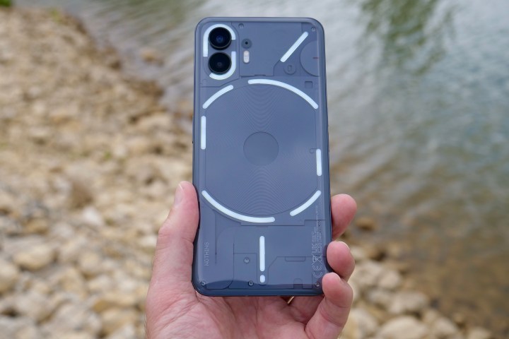
There are two standout design aspects to talk about with the Nothing Phone 2, but first, some hard facts. It’s a big slab of a phone that’s 8.6mm thick and 201 grams yet manages to feel surprisingly light and manageable. The flat sides are part of an aluminum chassis, there’s glass on the back, and Gorilla Glass over the screen on the front. The build quality is top-notch, and it feels very sturdy, but it’s unfortunate there’s only an IP54 water and dust resistance rating. This falls behind the Samsung Galaxy A54, the Google Pixel 8, and the OnePlus 11.
It’s also a very slippery thing. The smooth glass feels exceptional in your hand, but place it on any surface, flat or otherwise, and it’ll slowly but surely creep its way across it. The Nothing Phone 2 absolutely will crash down onto the floor at some point in your ownership, and putting it in a case would be very sensible. Just make sure the case you choose is transparent because this phone is gorgeous.

The glass on the back is “pillowed,” to use Nothing’s term for the 2.5D glass, which is curved on the top, bottom, and sides for a huge increase in in-hand comfort over the Nothing Phone 1. It nestles (rather than digs in) to your palm and gives the phone a classiness and a more individual character that was missing from the very iPhone-like Phone 1.
The Nothing Phone 2 has a distinct look that separates it from other current phones.
It’s also transparent, exposing the wireless charging coil, the camera module, and the Glyph lights for all to see. I absolutely love it, right down to the subtle pixel-art Nothing logo in the bottom corner. The new grey color is pure sci-fi cool, and if I was a grizzled freighter pilot living a hard life in deep space, this would be the phone and color I’d choose because I imagine it would go with everything. The Nothing Phone 2 has a distinct look that separates it from other current phones, and I think it’s fantastic.
Nothing Phone 2: Glyph lights
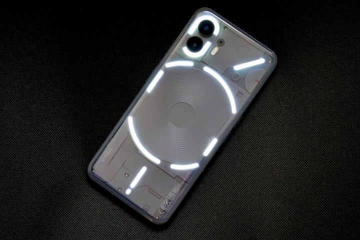
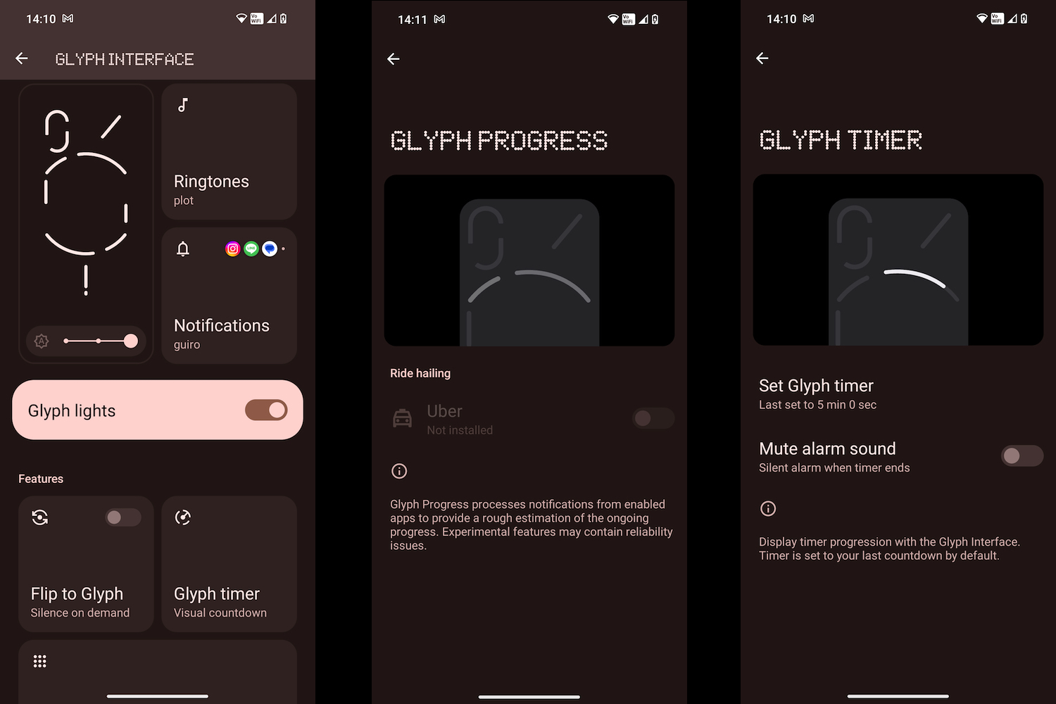
Under the transparent pillowed glass is Nothing’s Glyph lighting array. Unfairly dismissed as a gimmick around the time of the Nothing Phone 1’s launch, the Glyph lights do serve a purpose, and for the Nothing Phone 2, even more features have been added. By splitting the light bars into different sections, Nothing has been able to expand the functionality. For example, one of the Glyph bars acts as a visual timer, not only for the timer feature on your phone but also with apps like Uber to show the estimated arrival of your ride.
I also really like the way one bar can be used as a custom priority notification alert, staying illuminated when there’s a message waiting from an important app, and how it shows charging progress when the phone is face down and plugged in too. The Glyph lights act as a fill-light for the camera and light up when a call comes in when the pattern can be changed for one of Nothing’s own fun preset layouts or a composition of your own. The light show is accompanied by an equally crazy sound effect, which like the rest of the phone, is totally unique and equally customizable.
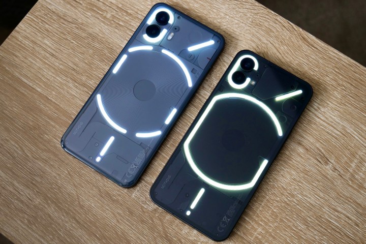
Anything that lights up and flashes as much as Nothing’s Glyph lights do will always be called a gimmick. While it’s partially true, they’re also surprisingly useful, definitely fun, and part of what makes the Nothing Phone 2 so unique. Without them, I don’t think the Nothing Phone 2 would appeal as much as it does from a design point of view, and after using the Phone 1 for a while, they began to blend into the background anyway rather than become a distraction.
Nothing Phone 2: camera
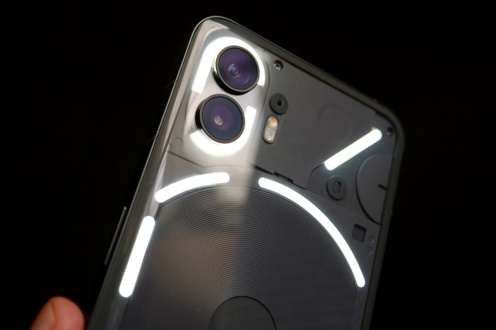
Not a huge amount has changed in the hardware department on the Nothing Phone 2 over the Nothing Phone 1’s camera. It has a pair of 50-megapixel cameras — a 50MP Sony IMX890 with optical and electronic stabilization, plus a 50MP Samsung JN1 114-degree wide-angle with EIS. There’s also an upgraded 32MP selfie camera, but Nothing has concentrated on improving the software behind them, and it has made a difference.
I’ve really enjoyed the photos taken with the Nothing Phone 2. They’re vibrant and full of life and color without going overboard with HDR and saturation like the Galaxy A54 can. They lack the sheer, natural brilliance of the Pixel 7’s camera but are arguably more fun. If you’re planning to share them on social media, they may need little to no editing before you do. There’s great consistency between the main and wide-angle camera, and although there’s no telephoto zoom, the 2x mode produces some decent photos.
Where the camera fails is in low light. There’s very little detail and a great deal of noise even in partial light, and when darkness properly falls, the images get even worse. All of the Nothing Phone 2’s competitors take better photos at night or in low light, which is unfortunate when the camera performs so well during the day. It means the Nothing Phone 2’s camera isn’t the best you can get at this price, but it is an improvement over the Phone 1, and as long as you’re not taking photos at night, you’ll love the results.
Nothing Phone 2: what it’s like to use

The 6.7-inch OLED screen has a 2412 x 1080 pixel resolution and a dynamic 1Hz to 120Hz refresh rate, which has worked perfectly, and I’ve not felt the need to force it to use 120Hz, as the Dynamic setting adjusts to my use without a problem. By default, the HDR setting is on, and the colors are set to “Alive” under the display settings, and it’s one of the most vibrant screens around. Colors are highly saturated and pop off the screen when watching videos. In the photo below, the Nothing Phone 2 is being compared to the iPhone 14 Pro, and you can see the difference between it and the Apple phone’s always-natural color and tone.
I do like the way the screen looks, despite it threatening to burn my eyeballs, and even if you switch to “Standard,” it’s still very colorful. I’ve had no problem with the brightness, even in sunlight, and the ambient light sensor does a good job of keeping the screen visible at all times. There are dual speakers that get really loud but lack bass. If you’re happy with retina-searing colors and speakers capable of big volumes, you’re going to love the Nothing Phone 2.

There will be some who question whether the use of the Qualcomm Snapdragon 8+ Gen 1 makes this a flagship device or not — or if, because it’s technically an “old” processor, it will somehow make the Nothing Phone 2 less capable. My advice is to forget all this. The Snapdragon 8+ Gen 1 is Qualcomm’s finest hour, a superb balancing act of performance and efficiency, and has been a high point of every phone I’ve used with it inside.
It makes the Phone 2 so slick and smooth, whether you’re playing games or just using apps, and it doesn’t get too hot either. Yes, the Snapdragon 8 Gen 2 is also superb, but I don’t think you’ll notice any day-to-day difference between them. The best thing to do is buy the Nothing Phone 2, enjoy its obvious power, and stop thinking so hard about specs and numbers.
Nothing Phone 2: software

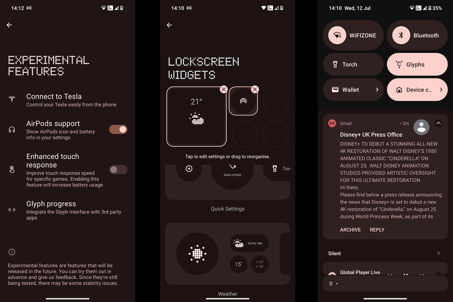
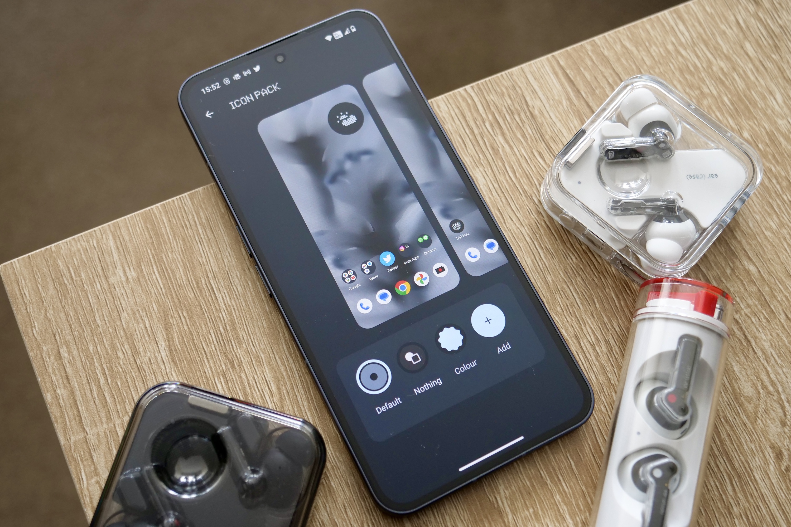
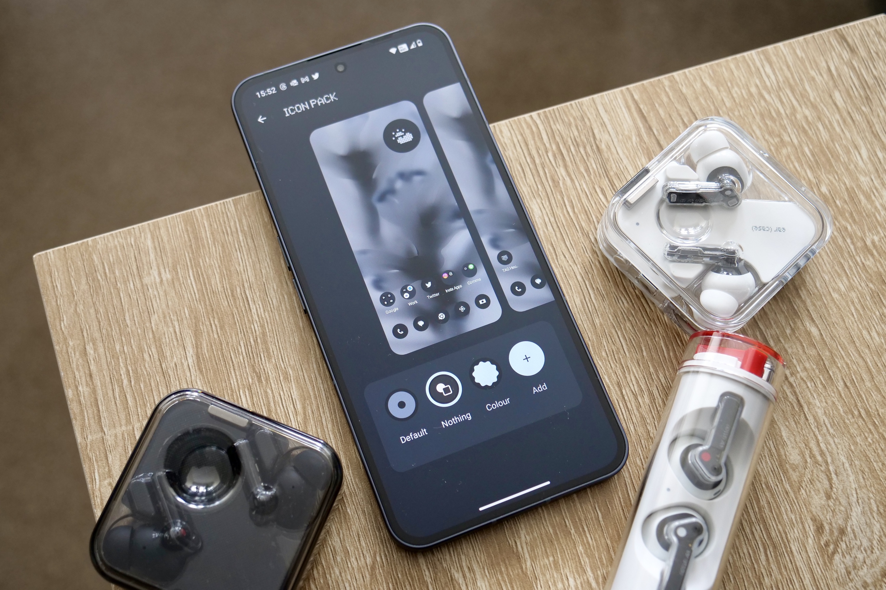
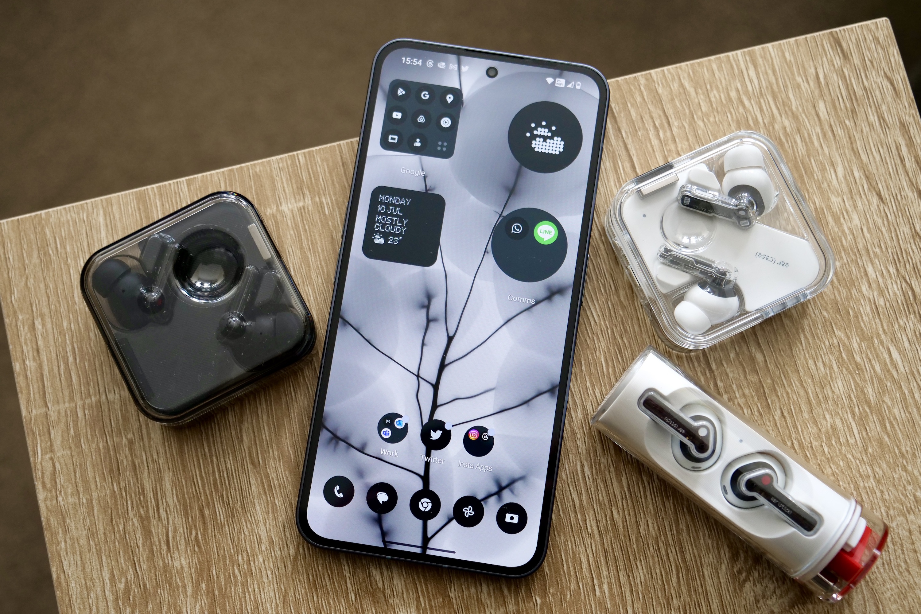
When talking about the software, I’m going to focus on what I think will be the most controversial aspect of Nothing OS 2.0: the Nothing icon pack. Nothing has found a way to globally change the look of each individual app icon on the phone to a Nothing-style monochrome one.
They retain the same icon design but without the color or the size and can be packed inside circular or square folders. Nothing’s widgets have the same pixelated, black-and-white color scheme and cover the time, weather, a selection of Quick Settings shortcuts, plus controls for Nothing earbuds. Even most of Nothing’s default wallpapers are abstract monochrome images.
When you go all-in with Nothing OS’s icon pack and theme, the result is absolutely on-brand, but it’s also crushingly dull to look at. It takes a while to familiarize yourself with the way app icons look, making navigation slow for a start. The style looks great on the lock screen, where I don’t expect much color, but it borders on the depression on the home screen. Not everyone will agree, and I think an entirely monochrome theme has its place on some phones — and prefer it to garish themes sometimes seen on phones from Xiaomi — but I definitely miss the bright, colorful, messy-yet-recognizable style of “normal” Android.
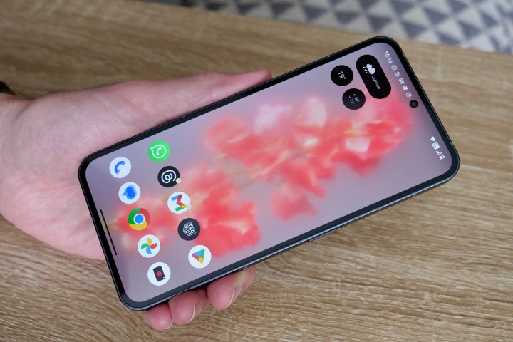
Luckily you can switch to the standard Android theme on the Nothing Phone 2, so if the monochrome look isn’t for you, then you don’t have to use it. This is true of Nothing OS in general, and it’s why I don’t care that the monochrome look isn’t really for me. There’s no hint of features or apps being forced upon you — which was a worry after the Nothing Phone 1 launched — and when you dig into new features, some turn out to be really great and worth using. Being able to place Quick Settings shortcuts on the lock screen is a good example, and I found having the Hotspot control immediately to hand very useful when reviewing the Amazon Fire Max 11.
Design aside, Nothing OS 2.0 is fast, reliable, and pleasant to use, and right up there with Android on a Pixel phone. It reminds me of what OxygenOS was like before Oppo got its hands on it. Connectivity has been rock solid, whether it’s 4G/5G, Wi-Fi, or Bluetooth, and calls sound brilliant too. There’s no evidence of excessive heat build-up, even when using Google Maps on a very hot day in a very hot car.
Nothing promises to deliver three major Android version updates and four years of security updates which will arrive every two months. Samsung and OnePlus’s software update commitments are longer, but Nothing matches Google’s commitment, so it’s certainly not terrible. However, at the time of writing in December 2023, Android 14 and Nothing OS 2.5 have not left beta, but a final release can’t be too far away.
We do recommend getting a phone from a manufacturer that will update the software on a regular basis, and for as long as possible, as it adds longevity. Whether you’d want to keep a phone like the Nothing Phone 2 for longer than three years is another matter, so keep this in mind before worrying about “only” three years of major version updates.
Nothing Phone 2: battery life

It’s a modest 4,700mAh battery inside the Nothing Phone 2, which is a slightly smaller capacity than we expect to see in large smartphones today. The OnePlus 11 has a 5,000mAh battery and the Google Pixel 8 Pro has a 5,050mAh cell, but it matches the Galaxy S23 Plus‘s capacity and then exceeds the 4,575mAh battery in the Google Pixel 8 and the 3,900mAh in the Galaxy S23.
The Snapdragon 8+ Gen 1 has proven itself to be incredibly efficient, providing a trustworthy combination of range-topping power and a true ability to effectively manage resources to conserve battery life. It’s the same in the Nothing Phone 2, and I’ve been really pleased with the way it lasts during my use.
A 30-minute session of Asphalt 9: Legends takes 7% of the battery. Watch a 30-minute YouTube video at 1440p and full brightness, and you should expect the battery to fall by only a couple of percent. A screen time of between three and four hours, with a mix of casual games, apps, calls, and the camera, takes around 40% to 50% of the battery’s use time. By turning the phone off overnight, I can just about stretch the battery to the end of day two, and this was with it connected to a Tag Heuer Connected Calibre E4 smartwatch.
It is only just, though, and if you play more intensive games and take your screen time up to around five hours, you’re more likely looking at a day and a half — or possibly just a single day with very heavy use. On a day that began at 7:00 a.m. with 5 hours and 41 minutes of screen time — including over an hour of watching YouTube TV, nearly an hour and a half of Call of Duty: Mobile, 48 minutes of Twitter, 30 minutes of Duolingo, and almost two hours on a 5G connection — the Nothing Phone 2 ended the day with 7% battery at 10:00 p.m.
It is possible to kill the Nothing Phone 2’s battery in a single day, but you really have to try to do so. And even then, you’re still getting through the day very comfortably. For all but the most intense users, the Nothing Phone 2 should easily last more than a day, and average use when you don’t play games will see it last two full days without a problem.
Nothing Phone 2: charging
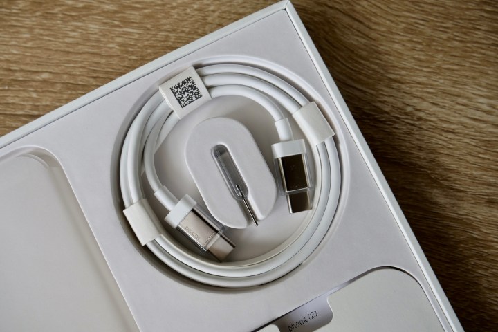
The Nothing Phone 2 supports wired 45W PPS charging, which is the same system supported by the Samsung Galaxy S23 Ultra and Galaxy S23 Plus. A USB Type-C to Type-C cable is included in the box, and in true Nothing style, the connectors are transparent, as is the SIM removal tool as well. They’re just two of the fun, unique touches that come with the Nothing Phone 2.
Nothing estimates 55 minutes for a full charge, and I came very close to replicating this exactly using the Nothing cable and the Anker 313 GaN charging block. It went from 2% to 64% in 30 minutes and on to 100% in 58 minutes. The phone also supports 15W Qi wireless charging, and it’ll take approximately 130 minutes to fully recharge using it.
There’s 5W reverse charging, and this worked to add power to the Nothing Ear 2, Samsung Galaxy Buds Live, and Apple AirPods too. The Glyph lights flash, and there’s an audible alert when a chargeable device is placed on the wireless charging coil, so it’s always very clear when the feature is working.
Nothing Phone 2: price and availability

The cheapest Nothing Phone 2 is the 8GB RAM/128GB storage version, and it costs $599 or 579 British pounds. This matches the starting price of the Google Pixel 8 and is $100 less than the cheapest OnePlus 11, making these two excellent smartphones the Nothing Phone 2’s biggest competitors. It’s a step up in price and specification from the $450 Samsung Galaxy A54 and $200 less than the flagship-level Samsung Galaxy S23, Motorola Edge Plus (2023), and Apple iPhone 15.
There are two higher spec models, the $699 12GB/256GB Nothing Phone 2 and the top $799 12GB/512GB version. All are available from Nothing’s online store now. There’s a choice of the grey version, seen in our photos, or a white model.
The Nothing Phone 2 is a fantastic mix of ability, desirability, and style.
Calling it a bargain is a stretch, but there’s a great deal of value in the Nothing Phone 2. The processor isn’t the very latest, but I consider it Qualcomm’s best chip in years for power and efficiency, and the phone’s design is not just unique — it’s beautifully made too. The Nothing Phone 2 is a fantastic mix of ability, desirability, and style, which is currently hard to beat in the U.S. smartphone market for $600.
Nothing Phone 2: verdict

If you’re still wondering if the Nothing Phone 2 is worth buying, let me be clear: it definitely is. You’ll stand out from the crowd due to the cool design and be rewarded with strong performance, a great daytime camera, a gloriously colorful screen, and close to two-day battery life. You’ll discover the joys of the Glyph lights and use one of the cleanest (and most customizable) operating systems out there.
What’s more, you’ll be helping to change the smartphone market (particularly in the U.S.) for the better by embracing a new brand and celebrating choice. For once, you won’t be drastically compromised by doing so either, and at this price, the few spec differences are fairly easy to forgive.
I’ve thoroughly enjoyed my time with the Nothing Phone 2, and wholeheartedly expect you to do the same. It’s one of 2023’s most important phone releases, and thankfully, it’s also one of the best.


