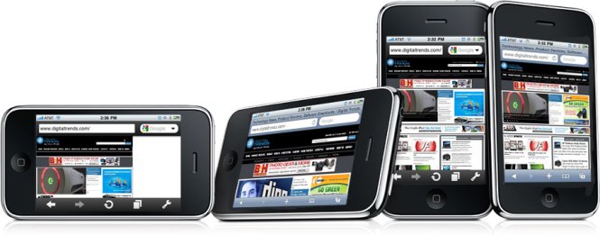
It would do a disservice to Germans to suggest that April 13, 2010 feels a bit like the fall of the Berlin Wall for iPhone users, so we won’t. But after years of staring over the barbed wired at alternative browsers outside Apple’s Appkaufhaus, we can’t help help but feel liberated now that one has finally made it inside.
Opera Mini tastes like freedom.cu
And although it somehow passed the same jackboot vetting process that Apple has selectively employed to boot similar apps, it has a lot to offer. Here’s a quick rundown of the some of the vast improvements – and a few disappointments – the first non-Apple browser brings to the iPhone.
Speed
Much has been made of Opera Mini’s purported speed advantage on other platforms, and the same is true on Cupertino territory. Opera Mini hauls ass.
As a “proxy browser,” Opera uses its own servers to scrunch down pages with compression before zipping the smaller versions off to your phone. You’ll never see this intermediate step, but it significantly improves load times, even on mobile-optimized sites. The mobile version of CNN.com, for instance, loaded in 7.1 seconds in Safari and just 3.6 seconds in Opera Mini. Yahoo was even more drastic: 12.1 seconds shrank to just 4.2 seconds. And on non-optimized sites, you’ll see amazing gains. Digitaltrends.com loaded at a sluggish 23.2 seconds with Safari, but just 8.3 on Opera Mini.
You’ll see the blocky results of this compression if you crank image quality to low in an attempt to wring every bit of speed from this trick, but on the default high setting, the iPhone just doesn’t have enough resolution to tell. We never experienced a significant enough gain in speed to justify changing it, either.
Zooming and Scrolling
Safari makes excellent use of the iPhone’s sensitive multi-touch screen to make panning and resizing pages feel dead intuitive. Opera does not. The browser offers only two zoom levels, which roughly equate to “too big” and “too small.” The zoomed-in version does a good job making text legible on fairly standard pages that lay it out in long columns, but pages that break from this standard tend to pose a real problem.
As with zooming, scrolling just doesn’t work as well with Opera Mini as it does in Safari. Sliding down a long row of text feels jittery and hesitant where Safari would simply glide.
 Interface
The overall layout of Opera Mini will feel very familiar to Safari users: There’s a URL and Google search bars up top, along with forward, back, reload tabs and settings buttons at the bottom. Rather than taking you through another page to sift through open tabs, Opera displays each one as a tiny thumbnail and lets you page through them without navigating away from the page you’re on. We like it. We also like “full-screen mode,” which strips away the bottom icon bar for just two corner buttons: one that goes back, and one that opens the full slate of options. Although the extra screen you get is miniscule, it makes a difference on the tiny screen.
Bookmarks
Both Opera Mini and Safari remember bookmarks in much the same way, but Opera Mini offers a feature more suited to smartphones called Speed Dial. Rather than picking and choosing bookmarks off a linear list, you can add them to Speed Dial, a grid of nine thumb-sized icons. Opera Mini automatically generates thumbnails for every page, and you’ll be presented with the Speed Dial interface every time you open a new tab, making it a snap to pop open a new one and open one of your nine favorite sites.
Extra Features
Besides improving on the way Safari does a number of things, Opera Mini does things Safari just won’t. For instance, you can search within a page to find text you want, just like on a desktop browser. You can save any page you like to the phone so that you can read it later, even when you don’t have Internet service (which should be a boon for subway riders who spend half their commutes in a receptionless tomb). You can save passwords after you enter them into a favorite site – like a forum – so you don’t have to finagle with the iPhone’s keyboard every time you return.
Conclusion
Whether you’re content with Safari or dying to get away from it, you should try Opera Mini to give it a shot. After all, it’s a free download. While we loved the speed, the quirky zooming and scrolling caused a major hangup for us. This is the main way you interact with a browser, and Opera Mini is a major backslide from the perfection of Safari in that regard.
However, the massive speed advantage may make you reconsider whether you can live with a clunkier browsing experience that’s twice as fast.
Having both browsers on your phone is like having a trashed 1989 Camaro with a souped-up V8 and a Buick Century in the garage. We’ll stick with Safari and the Buick for the long hauls – like browsing the Web from the couch, but when you need to find the exact dimensions of your tent at the camping store or reaffirm your superiority in Michael Jackson trivia at the bar with a quick visit to Wikipedia, hop in the Camaro and go with Opera Mini.
 Interface


