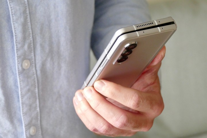
Samsung largely pioneered the foldable smartphone segment with the launch of the first Galaxy Fold device in 2019. While it wasn’t the best in terms of usability, it was certainly one of a kind, and with the latest Galaxy Z Fold 3, subsequent refinements have almost perfected the device. Fast-forward to 2022, and we have clamshell foldables and smartphone-tablet hybrids, as well as up to 17-inch laptops displays that can bend in half and were showcased during CES 2022.
However, that concept of having a tablet in your pocket folded into a smartphone size has much or less remained the same. That is, until the Oppo Find N debuted earlier this year, and we got our hands on it. I have used the Oppo foldable for about a week alongside the Galaxy Z Fold 3, mostly for web and media consumption.
And here’s why I still prefer the the Fold 3 despite all my praise for Oppo’s Find N.
Oppo Find N breaks the monotonous design barrier

Before the Find N, most foldables largely kept the same design, with a smaller and usually narrow cover screen, and a bigger foldable screen. The first Huawei Mate X was a bit different, having a single display that folded and unfolded. There was not a separate cover display. But the company gave up on the form factor and moved to a standard Galaxy Z Fold-like design with the Mate X2, and the Honor Magic V followed suit, too. The Xiaomi Mi Mix Fold is yet another foldable that features the same monotonous design.
The biggest win for the Oppo Find N is that it breaks the thought barrier and shows us that there can be a foldable with a compact cover display that maintains usability, and I applaud Oppo for taking a different route with its first foldable.
The 7.1-inch Oppo Find N is a smaller device than the 7.6-inch Galaxy Z Fold 3 when unfolded. It features a wider cover and foldable display sporting a wider aspect ratio (uncommon for smartphones), with the horizontal length being more than the vertical height. The design has received favorable reviews, and rumors suggest that Google is taking cues from the Find N for its upcoming foldable design.
Web navigation is mostly done through mobile phones
According to Statcounter, about 55% of search queries on the web are made from mobile phones. In comparison, about 43% of the traffic comes from desktops. It is no secret that we are using our smartphones more than ever to search the web on the go. Therefore, it is important for us to have devices in our hands that are designed to help us navigate through the web in the best way possible. A wider aspect ratio on smartphones is not the way to do that.

As per Nielsen Norman Group, most of the users scan webpages instead of reading them word-by-word. Eye-tracking research also shows people read web content in the F-pattern. In doing so, users scan through stuff vertically — we are not trained to scan horizontally. As a result, the wider aspect ratio makes it more unnatural to gaze through a long webpage or newsletter on the Find N than on the Fold 3’s taller aspect ratio. A taller aspect ratio displays much more content at once on a screen than a device with a wider aspect ratio. You can always rotate smartphones like the Find N to switch horizontal and vertical sides, but still, the Galaxy Z Fold 3 gets more content on the screen, making it easier to use for web browsing.

In his book Usability in Government Systems, talking about scrolling, George Buchanan wrote: “Vertical scrolling is much easier for users than horizontal scrolling, and mobile phone manufacturers take pains to avoid horizontal scrolling in their interfaces. This is a simple lesson that should be adhered to scrupulously: Horizontal scrolling is to be avoided.”
Some content providers can avoid this problem by using tabs to flip between different parts of a larger page (for instance, the Kindle app), but this results in problems when the content is closely connected. So, the reader has to remember the content of one tab since it becomes immediately invisible when switching to another. It’s just how we’re conditioned.
Oppo Find N has a lot going for it

Despite everything I’ve said, the Oppo Find N has a lot going for it. The positives are a wonderful design (even if it’s not ideal for web browsing) and a crease that’s much more seamless than the Galaxy Z Fold 3. The smaller form factor also fits better in the hand, and I’m able to do much more on the cover display without getting irritated at the narrowness of the Galaxy Z Fold 3. I mostly rotate the Find N when I’m browsing or reading, but media consumption does feel more natural on the Galaxy Z Fold 3.
Please keep the niche foldables coming!
While I do prefer the more monotonous design of the Galaxy Z Fold 3 over the aspirational design of the Oppo Find N, I want companies to keep thinking up new ideas and keep the weird designs coming for their foldable smartphones. We live in exciting times, and I can’t wait to see where we go in the foldable realm two years from now. It might even be possible to get the most of both worlds, with foldable screens that unfold both horizontally and vertically if some of the proofs of concept we saw at CES 2022 come to fruition.


