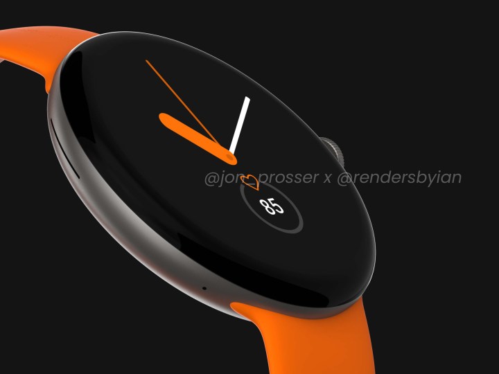
Until October this year, my expectations for the long-rumored Google Pixel smartwatch were low. Not just regarding its actual arrival, but also its desirability as a product at all. It was all because of Google’s spotty track record with mobile design. While it can get away with adding a bright color in an attempt to rescue its woefully dull-looking phones, that won’t cut it on a wearable.
Now rumors of the Pixel Watch’s launch have reignited again, but this time around, I’m feeling a lot more positive about it, and it’s all because of the Pixel 6 and Pixel 6 Pro.
Design matters
I probably sound like a broken record on this, but design matters on a smartwatch more than on almost any other mobile device. If a smartwatch is boring to look at, or derivative of what’s already available, there’s little incentive to look at it much closer. But good design goes beyond just style. It makes a huge difference to comfort on the wrist, as without good design, it may not fit very well. And if it’s uncomfortable to wear, then we may not do so. Remember, you need to wear a smartwatch to get all the benefits from its health and activity tracking and notification features.

The thought of a smartwatch from the company that bought us the Pixel 4a, one of the blandest smartphones I’ve ever seen, was not one that filled me with excitement. I imagined a metal case with that same, awful crackle finish coating from the back of the Pixel, a round screen with 2.5D glass, a couple of buttons, and a choice of straps in either Aren’t We Amusing Orange or Insipid Black. Oh, and back then, it would have Wear OS installed. Save me.
I’m not singling Google out here. Getting smartwatch design right isn’t just a problem for the tech industry in general, and even established watchmakers sometimes struggle. The first Tag Heuer Carrera Connected was too big and too angular, the strap on the Fossil-designed Diesel On Fadelite smartwatch would have been more flexible if it had been made out of stone, and the recent Citizen CZ Smart was practically indistinguishable from the cheaper and equally ordinary Fossil Garrett HR.
The thing is, these examples were anomalies for the respective manufacturers. There has never been a Pixel phone that looked good, and that filled me with dread that should a Pixel Watch come out, it would be an anonymous, crushing disappointment. But then the Pixel 6 series came out.
Pixel 6 saves the day
The Google Pixel 6 and Pixel 6 Pro aren’t just the best -ooking Pixel phones — they are two of the best-looking smartphones you can buy today. It’s hard to believe the same company that signed off on these two also gave the green light to the Pixel 4a and Pixel 5’s “design.” The Pixel 6 Pro, in particular, gets design right. It may have a curved screen, but it doesn’t have sharp edges, the camera module is large while not really making the phone top-heavy, the glossy glass back panel looks unique and modern, and the color schemes are bright and fun. If Google offered the 6 Pro in Sorta Seafoam, I’d even forgive the stupid names.
The Pixel 6 suddenly complements Google’s smart home product designs, which have always been great. The cute, tactile Nest Mini is a great example, as it fits in with most home decor, doesn’t scream “tech product,” and the fabric makes you want to reach out and stroke it. I love the simplicity of the Nest Cam, and the comfort of the Stadia controller. The Pixel 6 Pro proudly sits alongside them, while old Pixel phones should hide their shame behind a towering Nest Audio.

Google’s mobile design renaissance gives me hope that the Pixel Watch will look and feel glorious, too, but although I’m feeling positive about it, we’re not out of the woods yet. The dreary product render seen earlier this year is the definition of a smartwatch I will never want to buy. It’s so devoid of inspiration, so utterly generic that it could have been listed for $150 on Amazon as the Lionheart Smart Watch Healthflow Plus, and I would have believed it. And then completely forgotten about it.
New look, new software
Next year is hopefully going to be a big one for Google’s Wear OS 3 software platform, which it announced during Google I/O in May, but hasn’t made available on any smartwatches other than the Samsung Galaxy Watch 4 yet. Instead, it’ll add it as an update to some current models during the second half of 2022. Assuming Samsung has exclusive access to Wear until then — it worked with Google on the software — a Pixel Watch may herald the end of that period.

Android 12 with Google’s Material You design makes the Pixel 6’s software equally as pretty as the phone itself. Manufacturers can each customize the Wear platform’s look. Samsung uses its own One UI Watch interface, for example, which means Google may adapt Material You for use on the wrist. Material You’s menu design, with its clear text and wide spacing, should work really well, but it’s the way the system colors can be matched to your wallpaper that instantly lends itself to use on a watch. Software that looks coherent can still be personalized is key to making a smartwatch feel like it’s part of us, which is just as important as exterior design and comfort.
Until very recently, I didn’t think Google had the ability to design a desirable smartphone, and was content to purely rely on its camera technology to sell Pixels. The Pixel 6 has changed my opinion, and Material You has shown that it’s one step ahead of the competition in software design at the moment, too. Because of all this, I’m really keen for the first time to see what it can do with a Pixel smartwatch.

