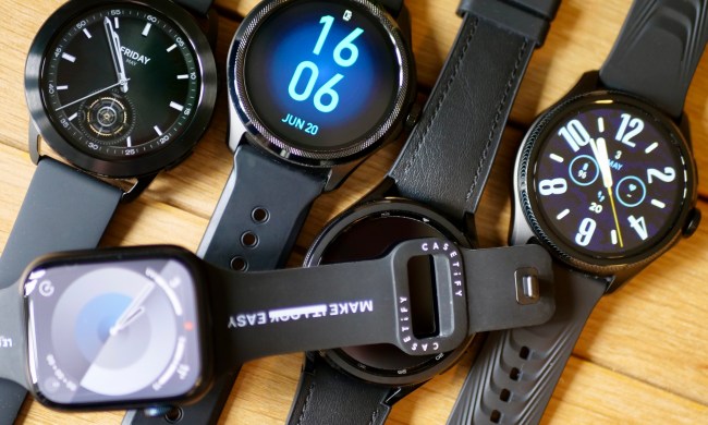
Since Google announced Wear OS 3 in 2021, the only way to experience the software has been on a Samsung smartwatch — either the Galaxy Watch 5 or Galaxy Watch 5 Pro, where it’s covered by the company’s own One UI Watch interface and tweaks. That has recently changed with the release of the Montblanc Summit 3, which also comes with Wear OS 3, but obviously not Samsung’s software.
It gives us a chance to see how Samsung’s vision for Wear OS 3 differs from Google’s, as there appears to be very little customization on Montblanc’s part. It turns out it’s very different, and using them may give us a glimpse as to what Wear OS 3 will be like when companies without Samsung’s experience eventually utilize the new software.
Same swipes, different results
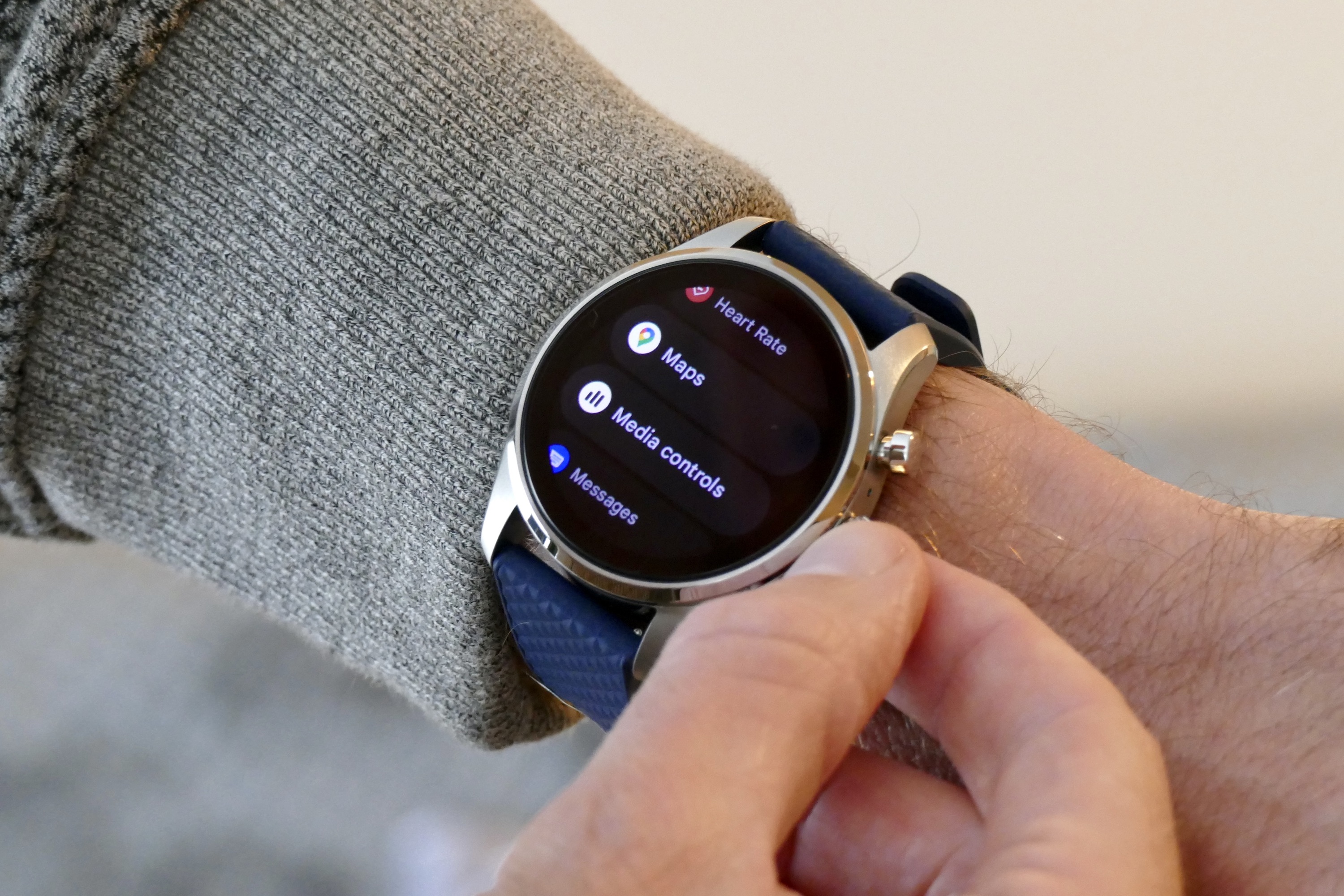
The two smartwatches differ considerably in operation. Swipe up on the Galaxy Watch 5 Pro, and you get a list of installed apps — but do the same on the Summit 3, and you’re looking at your notifications. You press the button on the crown to see installed apps, where they’re presented in a vertical, named list. This is actually preferable to Samsung’s icon-based app list, which can be confusing as it’s not always immediately obvious which apps some icons relate to. The Summit 3 is far more glanceable.
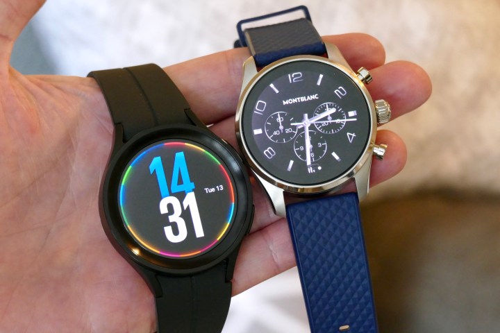
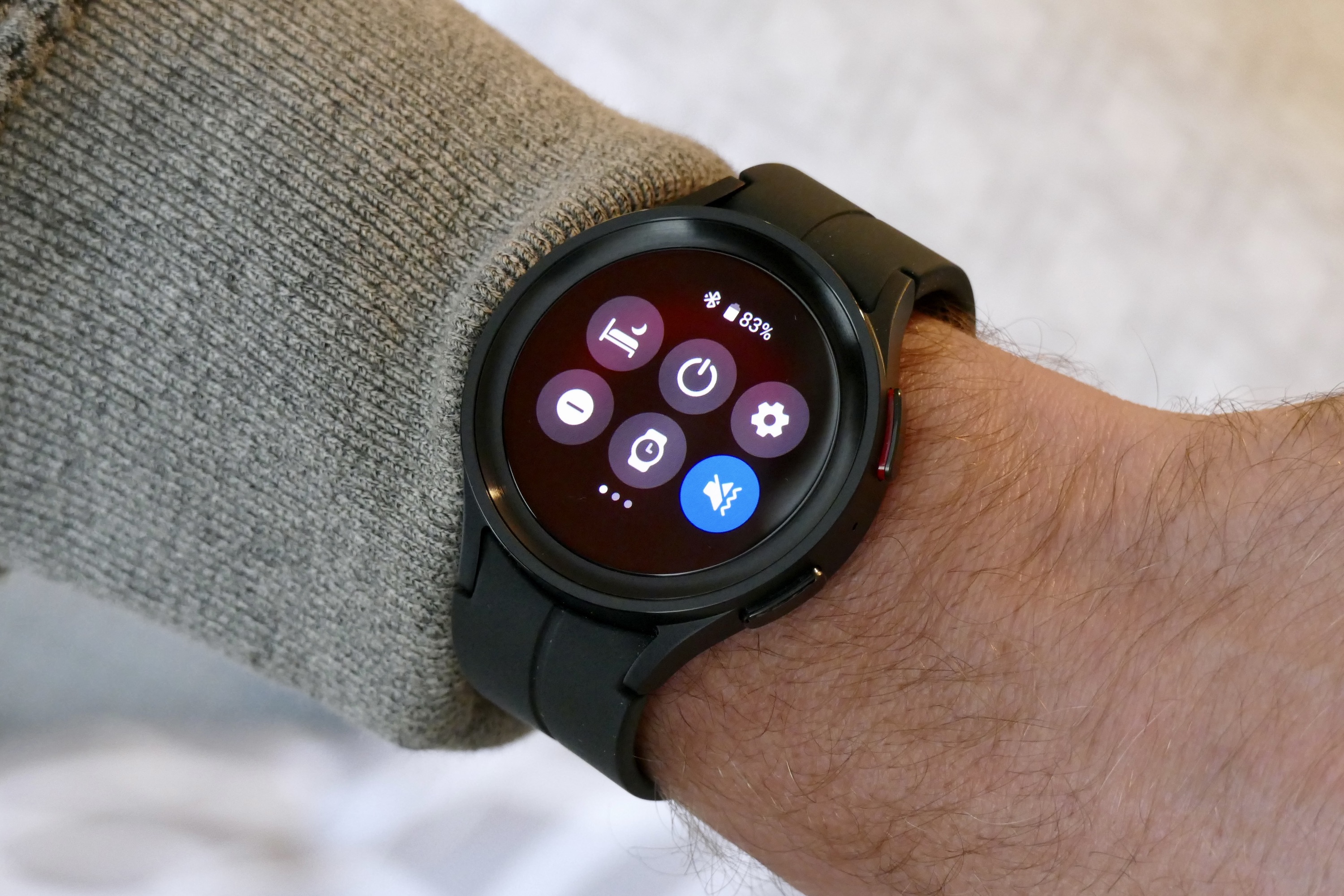
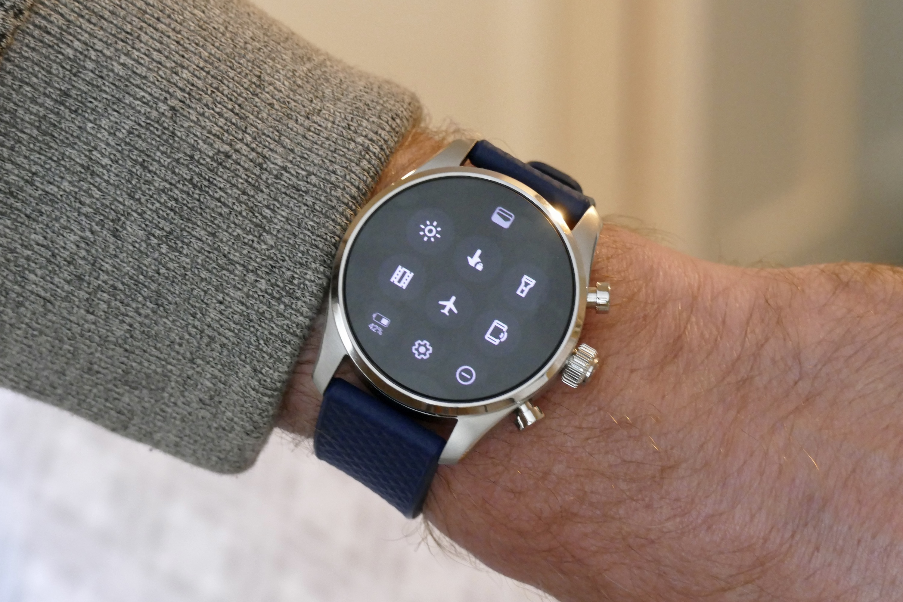
You swipe down from the top of the screen to see Quick Settings on both smartwatches, but Samsung has spread multiple buttons across scrollable screens, making them larger and easier to press. On the Summit 3, there are 10 buttons in all, and they only just fit on the screen at once.
Swipe left on both to see Tiles that relate to health and fitness, along with information like the weather and your calendar. Swipe right on the Galaxy Watch 5 Pro to see your notifications.
The treatment of the menus and buttons in One UI Watch is heavily influenced by Samsung’s Tizen software, last seen on the Galaxy Watch 3. Buttons and menus are more colorful with bolder fonts, there are more eye-catching graphics, and easier-to-press buttons. It’s unfortunate there’s no immediately obvious way to change the app icon layout to a text-based list, as that’s the only place where Wear OS 3 on the Summit 3 improves on the Galaxy Watch 5 Pro’s system.
Feature packed vs. barebones
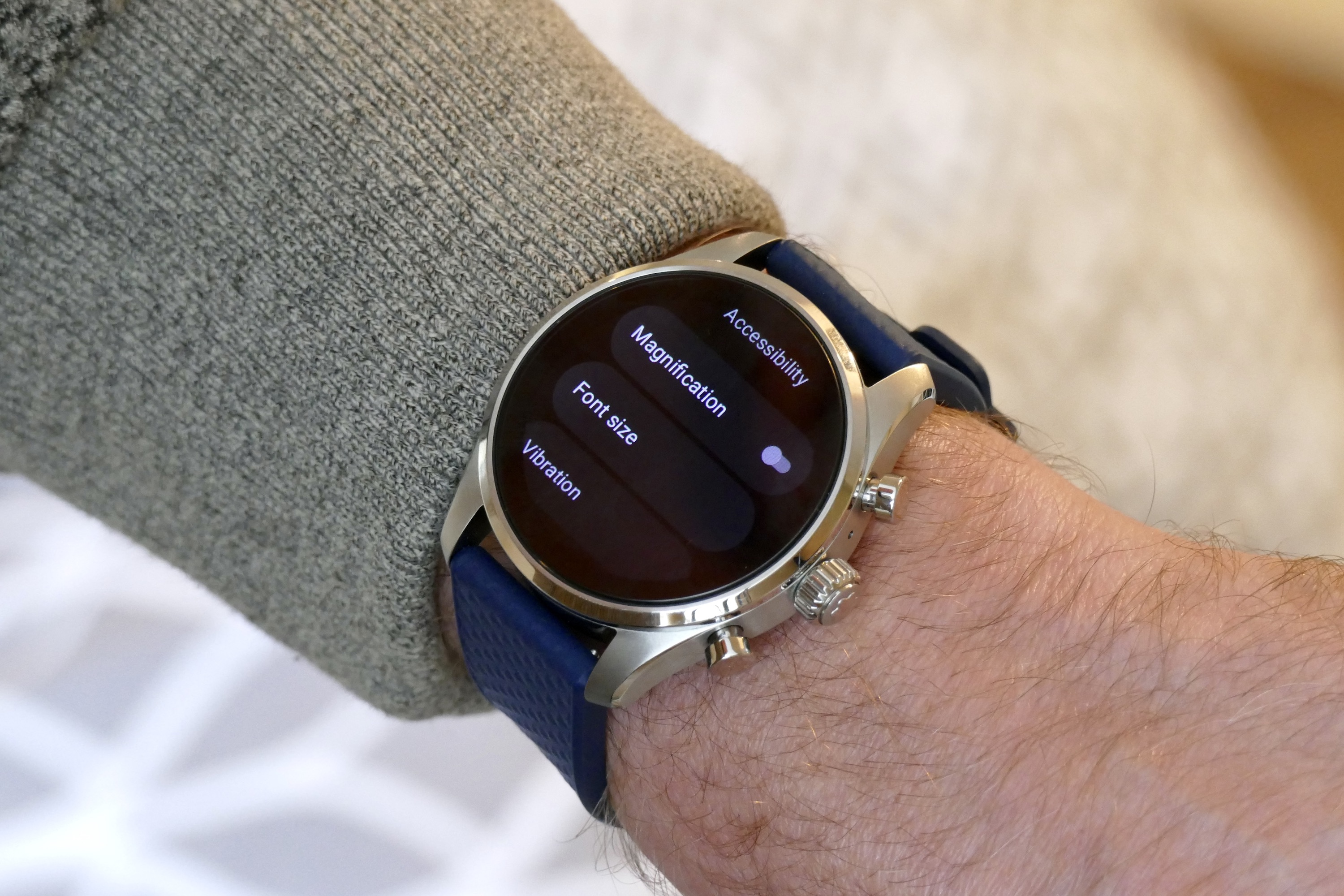
Digging deeper into the menus reveals further differences. We’re going to start with the Accessibility menu, as it’s something at which the Galaxy Watch 5 Pro excels and at which Wear OS 3 on the Summit 3 falls short. On the Summit 3, there is a Magnification mode, the option to increase font size, and a way to turn the haptic vibration on or off. It’s a fairly basic set of controls compared to One UI Watch.
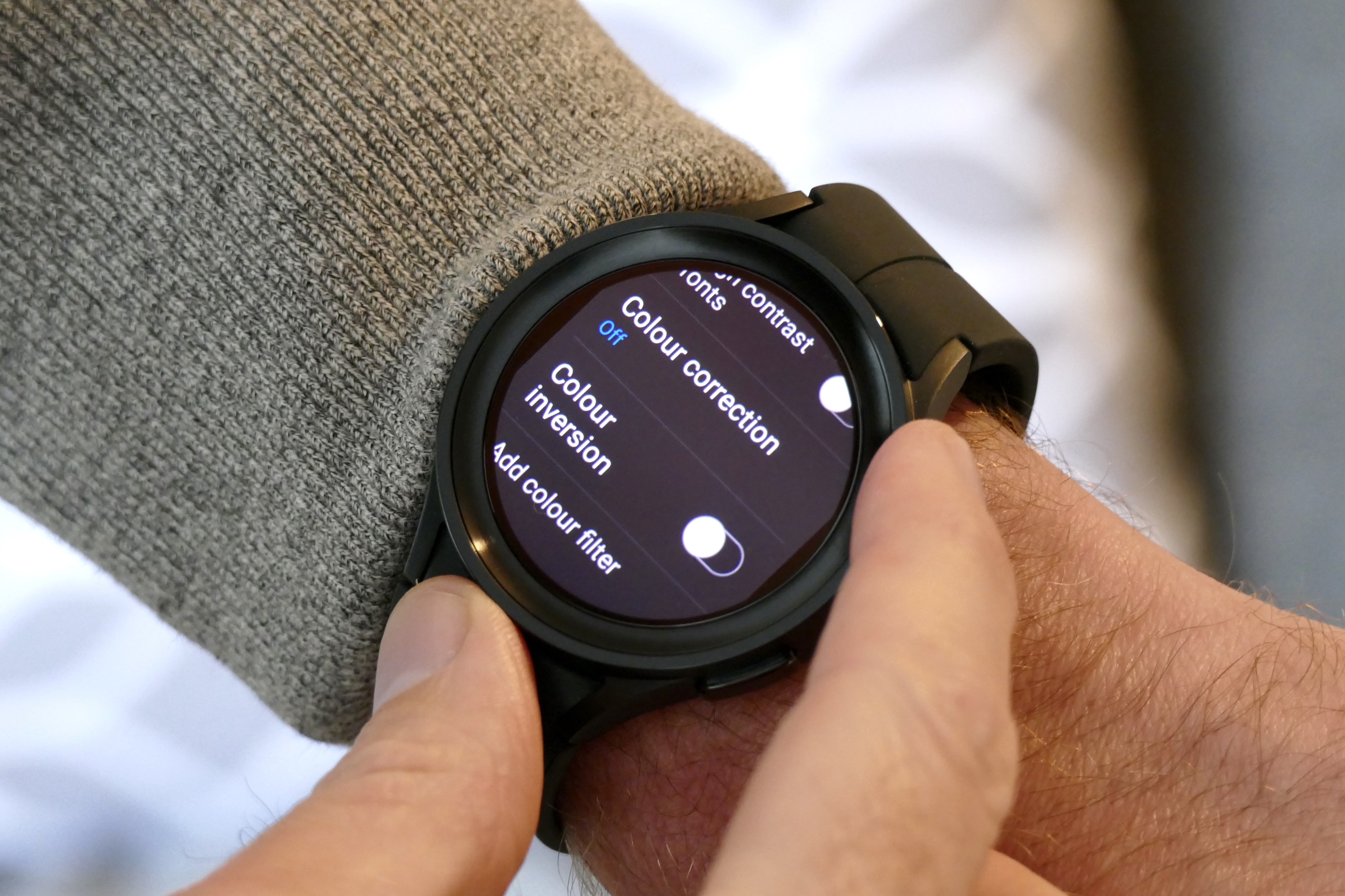
Samsung breaks its accessibility options down into three main sections: visibility, hearing, and interaction. Go into each, and there are settings for high contrast fonts, inverted colors, reducing blur, changing the size and type of the font, bolding text, muting audio or using mono sound, changing the duration of screen taps, ignoring repeated taps, and even changing the amount of time the watch will wait to recognize an interaction. It makes the Watch 5 Pro far more useful to more people.
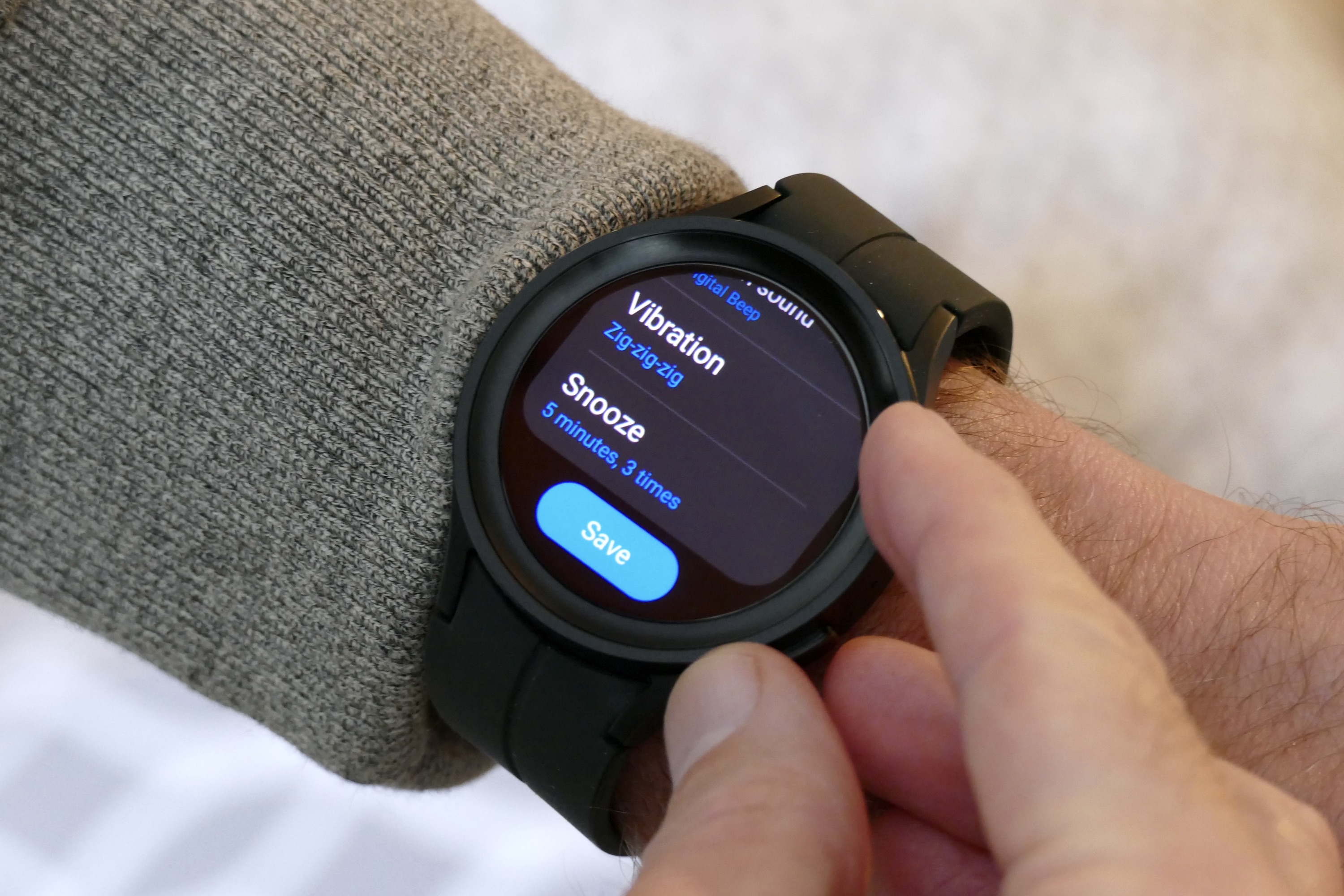
Basic apps have a lot more functionality on the Galaxy Watch 5 Pro. Take the alarm feature. On the Galaxy Watch 5 Pro, it greets you with the option to set an alarm on the watch or for one to sound on your phone, plus provides options for the alarm sound, vibration pattern, snooze, and the usual repeat features. On Wear OS 3 on the Summit 3, you can set the time and whether it’s repeated or not.
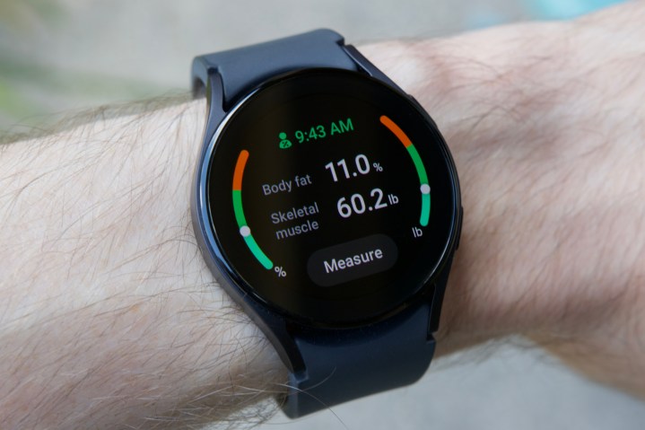
The Galaxy Watch 5 Pro has a lot more features in general than the Summit 3, where Wear OS 3 feels barebones, with just the basics needed. Samsung’s technically impressive camera app (where the watch shows a preview of the camera view on your phone) isn’t available, the sensor array isn’t as comprehensive, so health features are more limited, and there’s no ability to make or receive calls, plus no speaker for Google Assistant either.
What’s not clear is whether the basic nature of Wear OS 3 on the Summit 3 is Montblanc’s decision or if Wear OS is, in general, feature-light and ready for manufacturers to embellish as they see fit. Noting its simplicity isn’t a criticism of the Summit 3 either, as it’s not aimed at the same person who would be considering the Galaxy Watch 5 Pro, but there’s no excuse on Montblanc or Google’s part for missing accessibility features or making things like the alarm so basic.
Using Wear OS 3 and One UI Watch
Using the two smartwatches for general tasks — including downloading apps from Google Play, controlling music through the YouTube Music app, and interacting with notifications — showed very little in the way of performance or feature differences. Choose an app to download, and both open the Google Play app, locate the app, download, and install it in basically the same amount of time.
It takes seconds to pair Bluetooth headphones on the Galaxy Watch 5 Pro, and if you have Samsung headphones already paired with your phone, they automatically appear in the list on the watch. Pairing is no problem on the Summit 3 either, but it does not automatically highlight headphones that have previously been paired with the connected phone, making the process slightly longer.

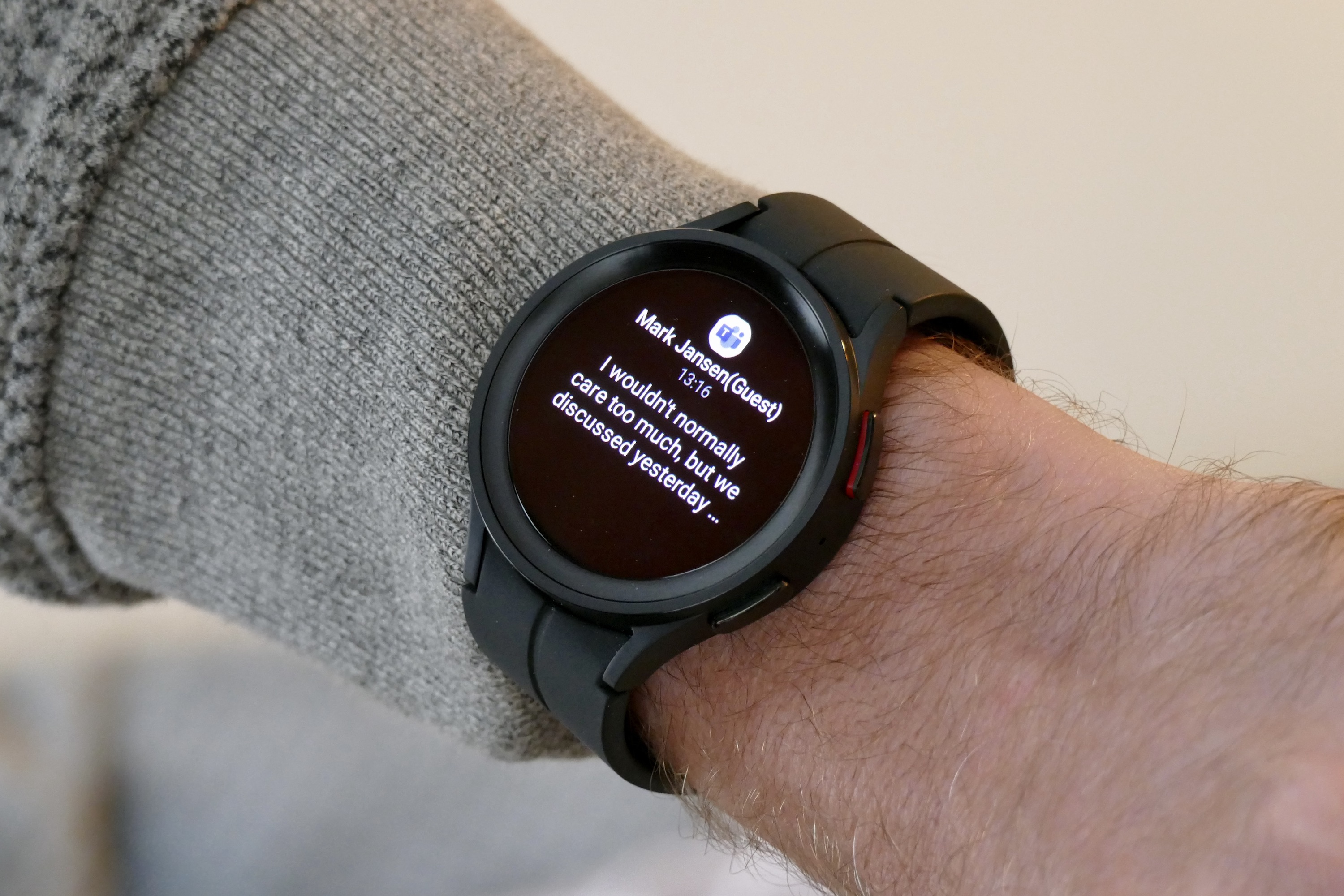
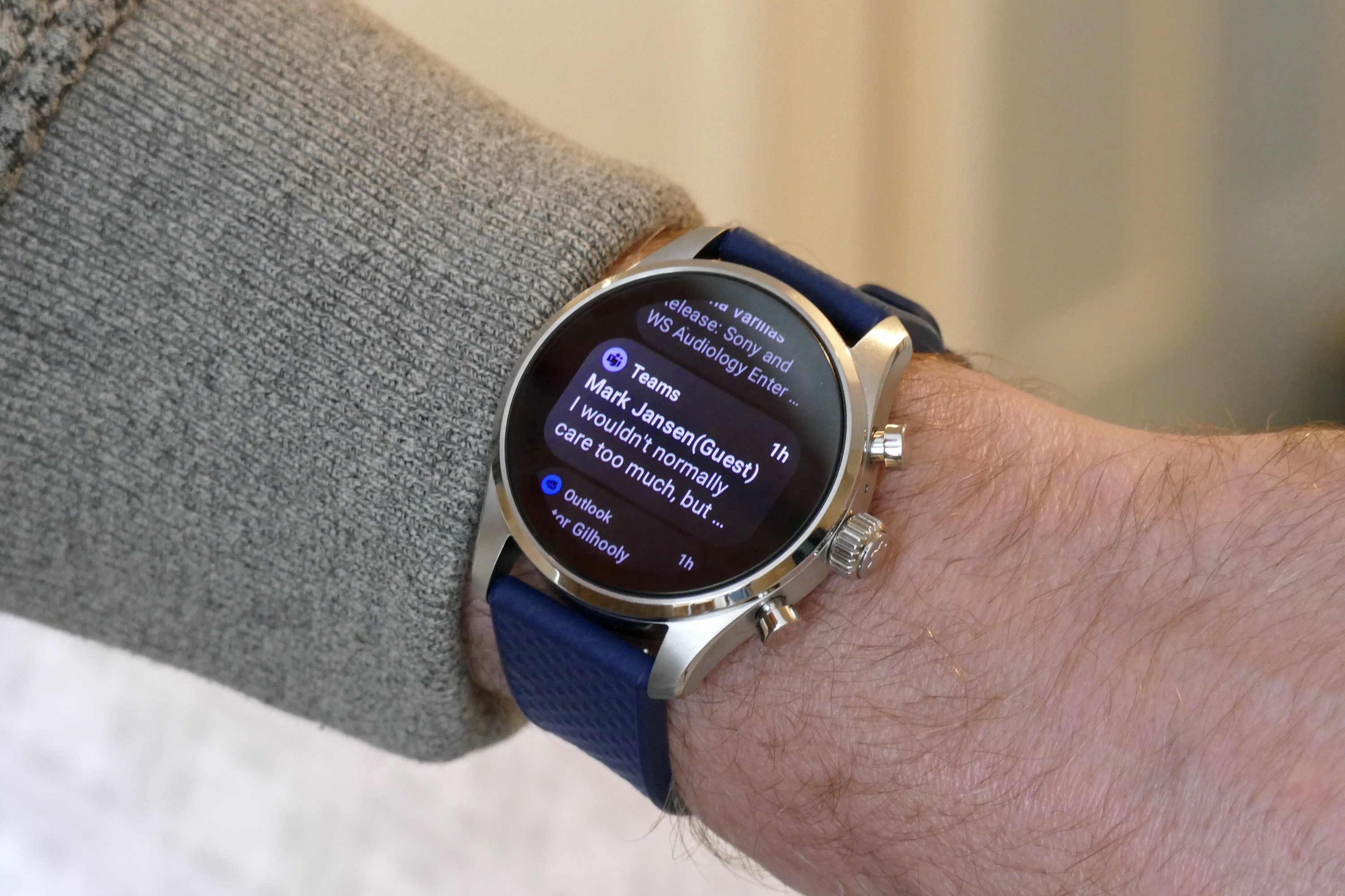
Notifications are slightly more basic in Wear OS 3 on the Summit 3 but are more natural and faster to view quickly. The Galaxy Watch 5 Pro has a set of pre-written single-word responses to some messages, plus the option to use an emoji or to open the message on your phone. The Summit 3’s reply options don’t include canned responses, but you can reply using your voice, the keyboard, or on your phone — just as you can on the Galaxy Watch 5 Pro.
The way notifications are arranged in list form on the Summit 3 does make them faster to navigate, particularly combined with the excellent rotating crown. Notifications are treated like Tiles on the Galaxy Watch 5 Pro, and you swipe left to right and view a single notification at a time, which can be ponderous.
Waiting for the Pixel Watch
What’s clear after using the two together is that Samsung adds plenty of value to its Wear OS 3 smartwatch with the use of One UI Watch. While some of its interface choices aren’t as user-friendly as Wear OS 3 on the Summit 3, there’s a lot more customization (in a good way) and helpful features that make the watch more useful to more people. The Summit 3 is very much, “what you see is what you get.”

What’s frustrating is we really don’t know whether any other manufacturers will spend as much time and effort making Wear OS 3 as feature-packed as Samsung has, particularly as few will have the benefit of an older smartwatch operating system (in its case, Tizen) to learn from and integrate. It’s frustrating because there’s nothing to compare the Summit 3 to, as no other Wear OS 3 smartwatch has been released yet.
We’ll find out more about Wear OS 3 in October when Google releases the Pixel Watch, which we know will run the latest software. However, Google has no track record with making smartwatches, and although Android on a Pixel’s simplicity and clean design is a benefit, if Wear OS 3’s default state is like the Summit 3, the Pixel Watch will struggle to compete with the Galaxy Watch 5 and Watch 5 Pro.
For now, Wear OS 3 definitely benefits from Samsung’s involvement. The difference One UI Watch makes to the software compared to the experience on the Summit 3 is genuinely noticeable, and almost all of the time, useful too.

