- Foldable screen opens new possibilities
- Excellent hardware quality
- Reassuring hinge and screen durability
- Very good triple camera
- Top-end specs and core flagship features
- Heavy and awkward to use one-handed
- Many apps aren't optimized for foldables
- Much more expensive than most phones
Foldables are going to play a role in the future of smartphones. Even if they seem expensive, fragile, and compromised right now, they won’t be forever. Just seeing the progression in quality from the first Galaxy Fold, which had a horrendous launch, to the quality of the Galaxy Z Fold 2 indicates that the industry is headed in the right direction.
But you don’t buy a foldable phone, particularly one that’s $2,000, because it’s part of a progression of new technology. You buy it because of what it does for you right now, and what it offers beyond what you get from a regular smartphone. Here’s everything the Galaxy Z Fold 2 brings to the table to justify its sky-high price.
Hardware, design, and displays
The new Galaxy Z Fold 2 follows the same concept as its predecessor: A mini tablet-sized device, bisected by a big hinge, with a folding screen on the inside and an additional “cover display” on the outside. But it’s not hyperbole to say that Samsung has touched every bit of the execution of that concept for this generation. And it’s all for the better.

Samsung knows how to make high-end phones that look and feel like they’re worth the money, and that carries over to this giant device. The two-tone matte glass and glossy metal pieces give the Z Fold 2 quite a bit of flair, and while I like it (you’re never going to be able to hide this phone anyway), black is an option too. The execution is, well, pristine. Every angle is perfect, every gap is consistent, and all of the details are spot-on.
The redesigned hinge is most responsible for the Z Fold 2’s robust feel. It’s no longer loose or flimsy at any point of its operation, because it holds tight at any angle, like a laptop screen or a Microsoft Surface kickstand. You can set the screen angle anywhere you want, and it just stays — but it still retains a satisfying lock when it opens flat. With the screen open, you can hold the phone in one hand, shake it around, hold it vertically or upside down, and it doesn’t budge.
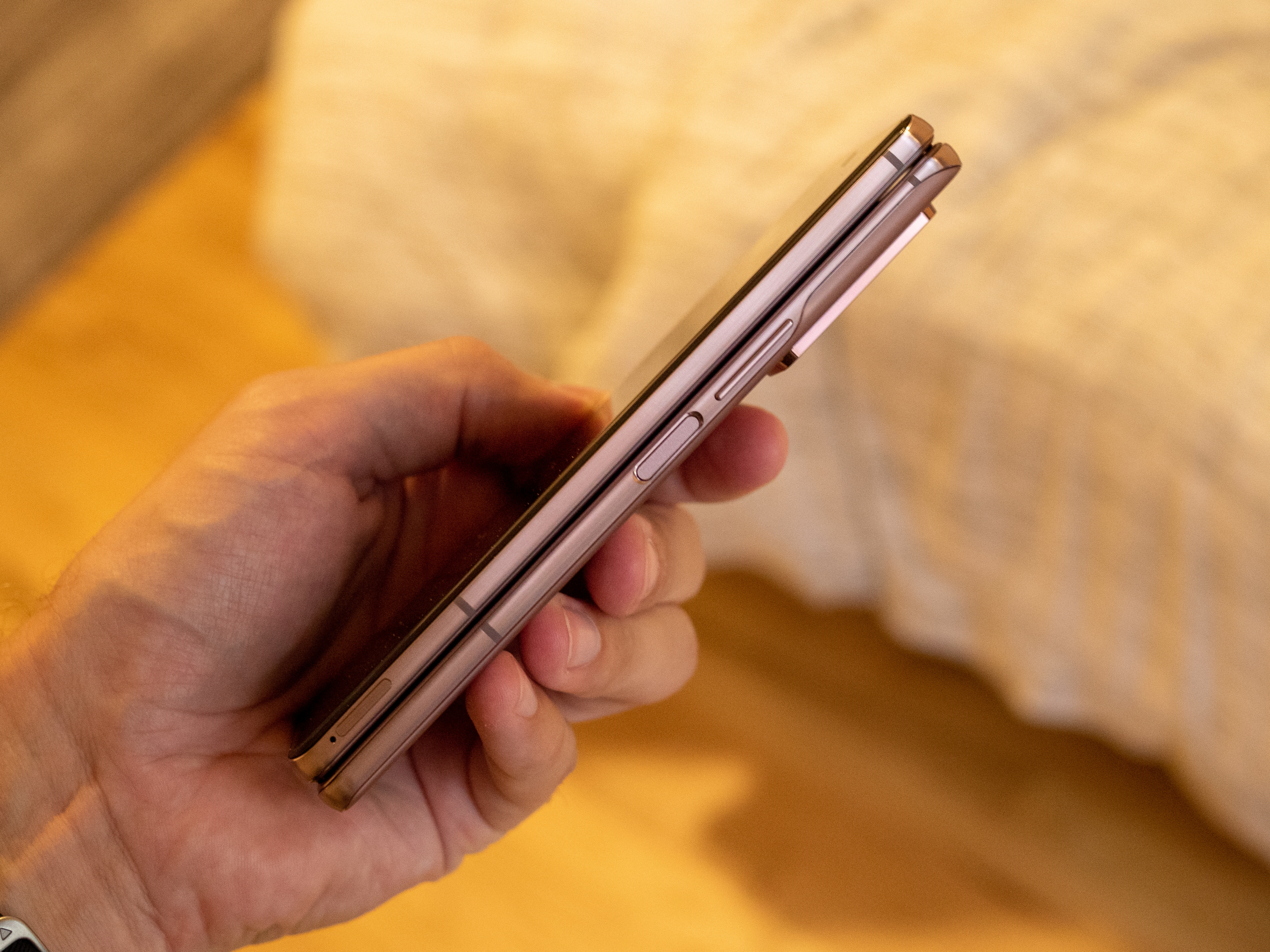
It’s also relatively easy to pop it back to a folded position with one hand — so long as you’re comfortable pressing your thumb on the screen. It closes with a solid, satisfying “click” as the bezels snap together with magnets. Whether you’re opening or closing, there’s barely a noise to be heard. Obviously, if you hold your ear to the screen you’ll notice the various layers unfurl, and the little dust-busting bristles in the hinge, but this is a nearly silent operation.
Samsung overhauled the hardware execution, and took both displays to a new level.
Even if Samsung had kept the exterior design identical to its predecessor, I’d still applaud its improved display. The cover display was comically small before, but is now 6.2 inches with small bezels, like any other smartphone. Bigger changes were made inside, with the 7.6 inch foldable panel now surrounded by 25% smaller bezels and a simple hole punch camera rather than the huge multi-camera notch before. The bezel edges aren’t raised nearly as much, and you barely notice them even as you use Android 10’s gesture-navigation system.
The display looks amazing. Of course it does, it’s a Samsung display. Colors are saturated, brightness is excellent even outdoors, and there’s no variation when viewed at an angle. It even runs at a 120Hz refresh rate, just like the S20 series, so motion is buttery smooth. With the flexible display layers, clarity isn’t on the same level as glass-covered panels on the iPhone 11 Pro Max or Samsung’s own Note 20 Ultra. But aside from that slight visual change, this display is indistinguishable from the best in the industry — it’s just double the size, and happens to fold in half. No compromise here.
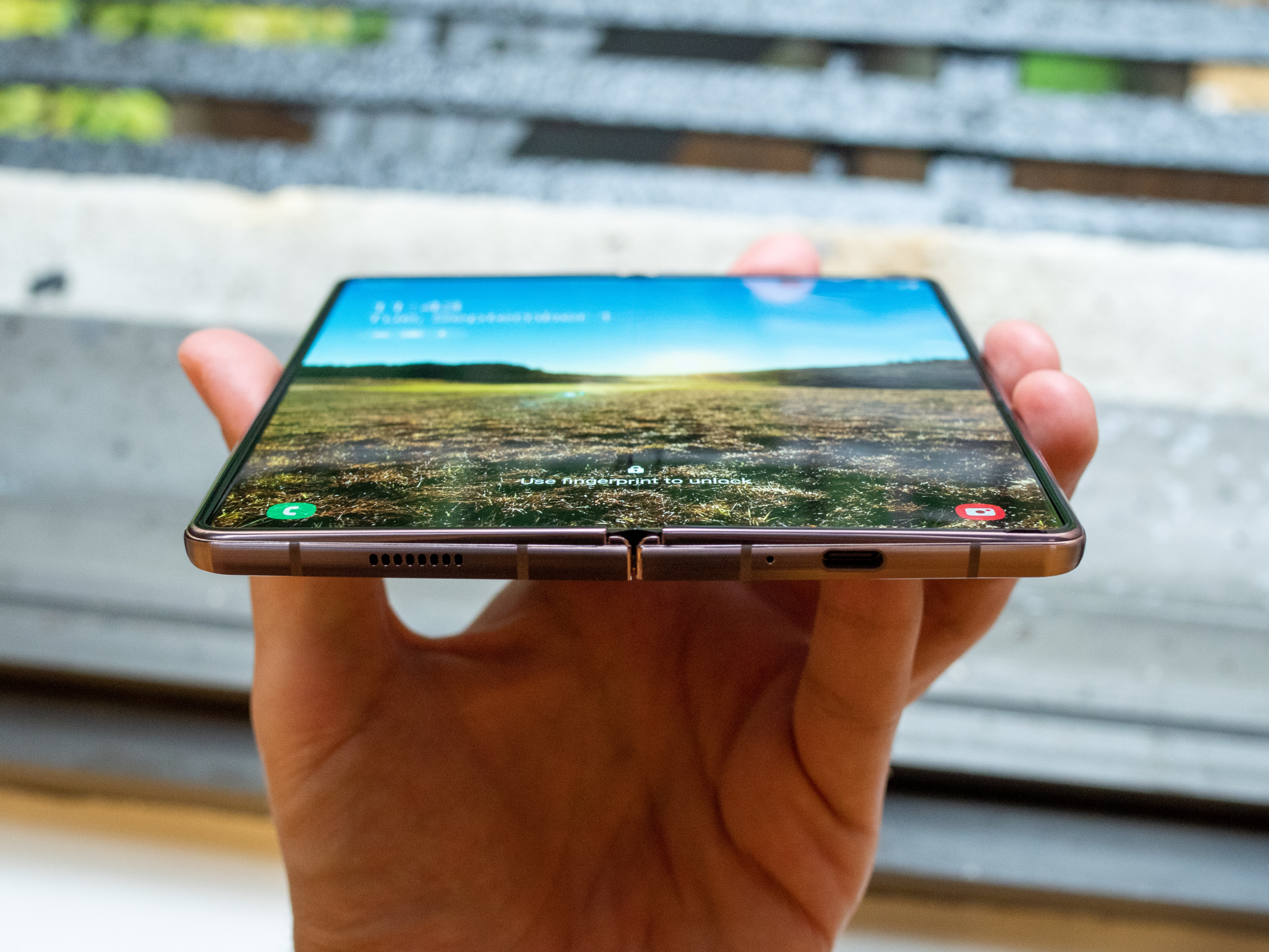
Let’s talk about the crease. It’s there, and yes, you’re going to notice it. Sometimes. It’s most noticeable with the screen at low brightness and on white or light backgrounds. Still, after a few days, I found my eyes ignoring it. And given that you’re mostly using the phone in portrait mode — the display has a very wide aspect ratio anyway — you’re rarely touching or swiping across the crease.
Most people are more worried about durability, though. I only used the Z Fold 2 for two weeks for this review, and as such I can’t say how well it’ll hold up over time. But I’m rather confident in it, particularly as we’ve now seen people use the original Fold (well, the revised original fold) for a year with little degradation. This new model has Samsung’s “UTG,” or Ultra Thin Glass, covering for the display, and it’s much more resistant to scratches and impacts. There’s also a preinstalled screen protector made of the typical thin flexible plastic, which I’m not a big fan of, but it’s another layer of protection.
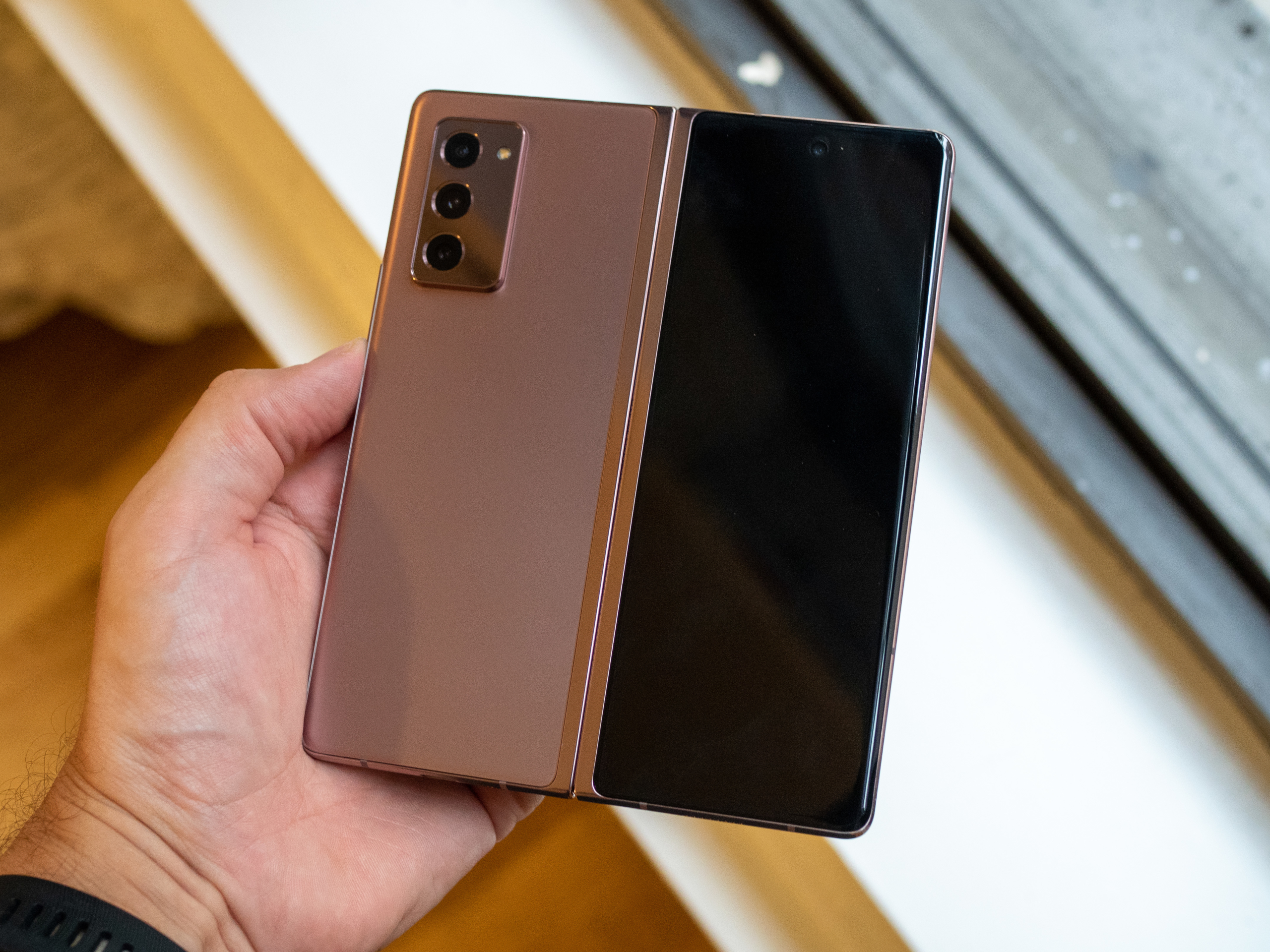
The crease is definitely going to change shape a bit and pick up some aberrations over months of folding. And, yes, if you dig your fingernail into the screen or drop it while it’s open, it’s going to look worse for the wear. But most phones will be damaged in the latter scenario, and the Z Fold 2’s biggest upside is that when you’re not using it, the foldable screen is closed and unable to be impacted. There are usability concerns with a big foldable phone like this, but for me, they don’t relate to the screen and hinge’s longevity.
Using a big foldable phone
Samsung has made strides in getting this hardware to be as sleek and compact as current technology allows, but it’s still a behemoth compared to single-screen non-folding phones. That starts with the weight, 282 grams, which is about 25% heavier than an iPhone 11 Pro Max and 35% heavier than a Galaxy Note 20 Ultra. It continues with the thickness, nearly 17 mm, which is roughly double that of a typical phone (as you’d expect).
It adds up to an unwieldy device. It’s big and heavy, and you never forget that — not in your hand, nor in your pocket. The phone isn’t even close to being small enough for me to run with as a music source for my headphones, in any sort of pouch or holder. It’s also not water resistant, so I wouldn’t take the chance anyway.
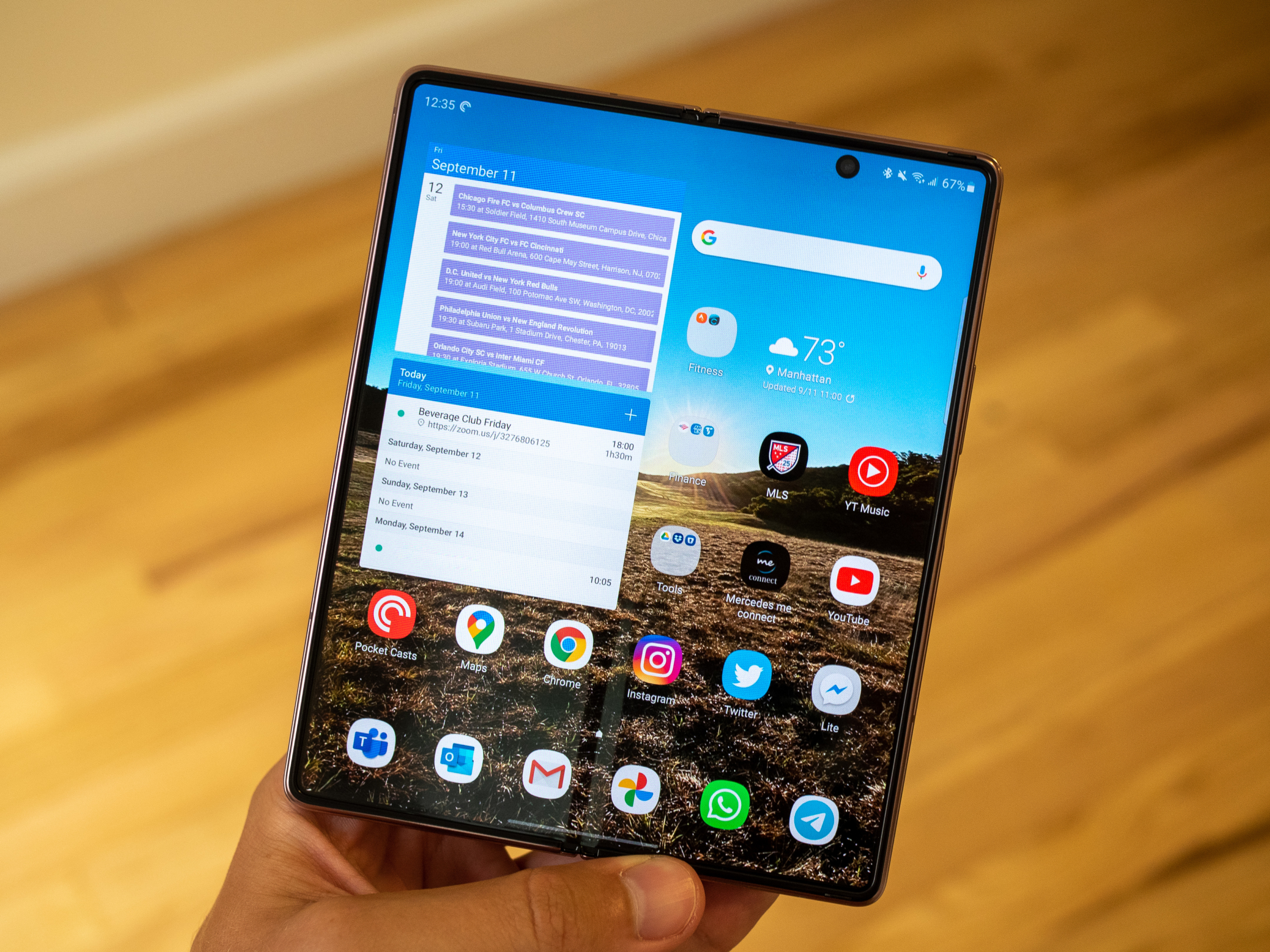
The weight is most noticeable when it’s closed, which is how you’ll use it often. Thankfully, the new, larger cover display is big enough to get most tasks done, with full access to a typical lock screen, notifications, home screen, and all of your apps. The screen is a little on the narrow side, which can make typing awkward (this can be remedied with a swiping keyboard), but the main issue is reaching the top of this very-tall screen while balancing a hefty and thick phone.
The other issue you run into is app compatibility. Some apps just don’t scale to the full screen, because it’s so tall. That’s more of an annoyance than a true usability problem, but it’s there. Most of these nonconforming apps are the same ones that need to be force-restarted when you open the phone while they’re running, an odd quirk of the way Android apps resize (or don’t).
But you don’t use the exterior display any more than you need to, because you can open up the Z Fold 2 and get that glorious panel instead. The use cases are all easy to understand. It starts with simply getting more of everything. More map area, more webpage before scrolling, more photos at a larger size, more of each message in a list, more book before turning the page, and so on. That’s great, because you never feel cramped on the Z Fold 2 — there’s always enough space to do what you want.

Once again, that requires the apps you use to play ball, though. Many apps, including all of Google’s and Microsoft’s, use that extra real estate well when running full-screen. You get an extra panel, or appropriately sized interface controls, giving you more content and less chrome. Other apps are just bad. Twitter, Seamless, Venmo, Strava, Telegram, Lyft, American Express, the list goes on. All of them just stretch out the interface and give you no more content or viewing area, because they haven’t been designed with large screens in mind. Instagram is notoriously bad at filling the screen, and now Samsung just has it pillar-boxed so it’s at least somewhat usable. (It’s still bad.)
Samsung also utilizes the stiff hinge to let you prop up the phone at an angle in “flex mode,” which triggers a different interface in a handful of apps — YouTube, Google Duo, camera, and a few others, While it demos well, it’s not very useful. Why cut the screen in half? I only found use for it for video calls when I didn’t want to hold the phone, or staged photos where I used it as a de facto tripod.
Most of the time, you’re running a single app on the Z Fold 2, and it feels clunky and like a waste of space. You really have to find the handful of apps that use that space well, and stick to those. But of course, you can also run side-by-side apps, which dramatically improves the experience. It’s immediately intuitive and extremely useful. Run Twitter while you’re writing messages, check the status of an order while you look at the charge on your credit card, run a Wikipedia search while you’re watching a YouTube video. Check your calendar while reading an email.
It’s this double-app use where the Z Fold 2 shines and truly justifies its size. You can set up app pairs (or groups of three, if you really want) to auto-launch together with a single tap. Or if you already have a full-screen app open, you can drag in a second, third, or floating app at any time using a small handle on the side of the screen. Roughly 90% of my apps were able to be run side-by-side — not perfect, but close.

If you’re not regularly opening up the Z Fold 2 and using multiple apps at once, you’re really missing the point of this phone. You don’t pay this much, and deal with this big of a device, just to use the cover display or a single app on the inside. You need to utilize its capabilities.
Samsung gives the Z Fold 2 more than enough horsepower to run three apps at once. You won’t have to think for a moment that the phone has a Snapdragon 865+, 12GB of RAM, or 5G — it all works just like every high-end phone should, and will for years to come. You’ll appreciate the 256GB of storage, though, as well as the nice-to-have features like stereo speakers, fast charging, fast wireless charging, and reverse wireless charging. There’s no compromise in specs or features compared to non-folding phones, which isn’t a given in foldables right now.
If you’re not regularly using multiple apps at once, you’re really missing the point of this phone.
Battery life is nearly on par with leading single-screen phones, but longevity heavily depends on how you use it. With lots of main screen use and multitasking, you can chew through the 4,500mAh battery (same as the Note 20 Ultra) before you know it. It’s not surprising that when you enable yourself to watch video more often and run two apps constantly, it’s going to take up resources. But in my typical use, translating what I usually do over to the bigger screen, I made it through a full day with 10 to 20% battery to spare.
Cameras
Unlike the Microsoft Surface Duo, the Galaxy Z Fold 2 doesn’t come with major camera compromises — thankfully so. You get a triumvirate of cameras, loosely based on the Galaxy S20: The same main 12-megapixel camera with OIS (optical image stabilization) is paired with two smaller 12MP sensors for zoom and ultrawide applications.
It’s slightly disappointing that this $2,000 phone doesn’t have a carbon copy of the camera setup from the Galaxy S20+ (or Note 20 Ultra, for that matter). But where things matter the most, the main camera, you get an identical experience. These photos speak for themselves, folks: This is a really good camera.
Just like Samsung’s 2020 flagships, the Z Fold 2 takes punchy, colorful, and eye-pleasing photos. I never took a downright bad shot, and the camera is dead-reliable and consistent every time I double-press the power key to launch it. There’s a tendency for too much saturation, and sometimes the sky can be blown out or generate heavy halo effects around objects, but those are small quibbles.
The zoom camera is a bit of a letdown, as it’s a smaller sensor and lacks OIS found in the main camera (and on the Galaxy S20’s zoom camera). You can easily tell that zoom shots are softer than the main camera, even at just 2X, and in low-light scenes the software switches back to the main sensor entirely. This zoom camera harks back to the Galaxy S10 series, and today’s midrange phones, and that’s not good to see at this price. The ultrawide camera absolutely gets the job done, even if it isn’t the exact same as the one on the S20 and Note 20 series.
And no matter the camera you choose, shooting with a gigantic viewfinder on the opened screen is even better than a typical phone.
Perhaps the biggest camera win of all is for selfies. You can turn around the Z Fold 2 and use the rear camera as a selfie shooter with the Cover Display as a viewfinder. Whether you want a super-high-quality main camera shot, or an ultrawide for a group of friends (or some scenery by yourself), this blows away any typical front-facing camera — particularly in low light.
Our take
The Galaxy Z Fold 2 is a huge progression from the original. The hardware is crafted perfectly and exudes quality, while the functionality of the screens and hinge have been dramatically improved. This all comes without many compromises in the core smartphone experience — you get good cameras and most “nice-to-have” features from a regular phone.
The downsides are usability, size, and price. The Z Fold 2 is huge, making it tough to use one-handed at times — and if you’re not using that big display constantly, it feels like a chore to carry around this massive device. At the same time, many of the software experiences when you have that screen open leave something to be desired. And then, there’s the price. At $2,000, you need a lot of loose cash to be willing to spend double that of a typical high-end phone, but not get double the functionality or features.
This is an amazing technological feat, but it still requires an understanding that you’re buying a folding smartphone on the absolute bleeding edge of innovation. That means there are compromises to be had, and that’s not what most people want (or need).
Is there a better alternative?
There really is no direct alternative to the Galaxy Z Fold 2. Some will say the Microsoft Surface Duo is a loose competitor, but it really offers a different experience with its separated displays — and ultimately, the Surface Duo massively misses the mark in features and core smartphone usability.
Elsewhere in the foldable space, your options are Samsung’s own Galaxy Z Flip or the forthcoming Motorola Razr, both of which offer entirely different experiences. Realistically, your choice is this: Do you buy a Galaxy Z Fold 2, or spend top dollar on a “traditional” high-end phone like the Galaxy Note 20 Ultra or upcoming iPhone 12 Pro Max? It’s a personal decision.
Want to know more about Samsung products? Check out our review on Samsung Galaxy S21.
How long will it last?
I’m not particularly worried about the long-term durability of the hinge and display on the Z Fold 2. Samsung has clearly put a ton of work into addressing early hardware flaws, and even last year’s Fold has shown to be rather durable over time. Samsung also provides good warranty protection and screen replacement services if needed. The Z Fold 2 will also receive at least two major software upgrades and regular security patches, which will support it about as long as anyone will actually use the phone.
Should you buy it?
Yes. People are going to scoff at the Z Fold 2’s $2,000 price tag, and rightfully so. But if you’re willing to part with that large sum of money for the latest technology, chances are you may also be interested in being an early adopter of foldable phones. The Z Fold 2 is the best foldable on the (small) market right now.
But if you do buy it, please don’t finance the phone over four years as Samsung suggests on its website.


