Foldable phones like the Samsung Galaxy Z Fold 4 are a showcase of engineering excellence and unabashed flashiness. If used the right way, it can prove to be a productivity beast that will forever change how you interact with your smartphone. However, the transition to foldable phones, especially given that squarish inner foldable display, isn’t particularly smooth.
The biggest issue that users face is app scaling. The sight of a Twitter feed stretched out on the 8-inch screen is a poor one. Then there’s the whole ergonomic mess of stretching out the thumbs to access apps.
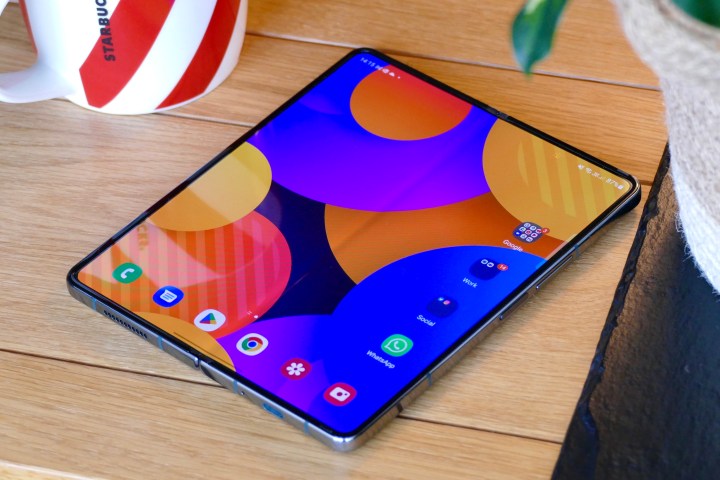
But there are a few solutions to make the transition less of a chore — and even somewhat rewarding. If you’re skeptical about using a phone with two odd-shaped screens, like on the Samsung Galaxy Z Fold 4, here are a few things you should try to not lose your mind getting used to the foldable phone.
Adjust how the apps look
Apps that are designed for a 16:9 aspect ratio on a regular phone simply stretch out and fill the tablet-like inner display with a much wider 23.1:9 format. Unless a developer has optimized it to show a different view on the squarish display, as is the case with applications like YouTube, prepare for some really bad magnified views. Here’s Slack for you, with all that eyesore blank space on the right half.
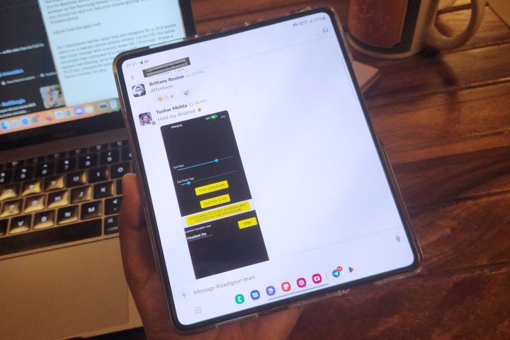
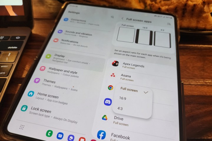
However, you can make Slack look the way it appears on a regular phone by changing the aspect ratio. Open the Settings app, navigate to the Display section, and tap on the option that says Full-screen apps. Once there, you will see a list of apps installed on your phone. Tap on an app of your choice, and it will open an aspect ratio drop-down that lets you select how an app appears on the inner foldable screen.
If you’re confused by numbers like 16:9 or 4:3 that appear in the dropdown, you can see a visual explanation for each at the top of the screen. Pick up the scaling preset that you think will look best for each app. It’s more of a try-and-find approach. For example, productivity apps like Asana look best at the natural smartphone aspect ratio of 16:9. For something like Instagram, 4:3 hits the sweet spot.
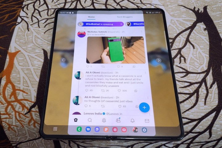
Once you tweak an app’s aspect ratio, it will load in a centrally aligned view with transparent bars on the left or right and arrow buttons on each side. If you tap on the arrow button, the app’s window will slide to that side of the screen.
If your focus is one-handed usage, always use these arrows to shift the app window so that everything is within your thumb’s reach, like a normal phone. Games are a different beast altogether.
I’ll start with Apex Legends. The game scales beautifully on the Galaxy Z Fold 4’s inner display, but there’s a tactical advantage here. When you fire up Apex Legends on the bigger screen, you get the same visual range in the landscape view as a regular phone, but an expanded view vertically.
So, say you are laying low at a spot for sniping; you will have a more vertical landscape to see around, which is definitely advantageous for spotting enemies. Some games just look better without offering any practical gameplay advantage.
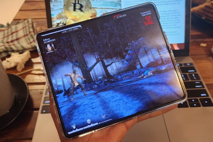
But if you’re playing a sideswiping or landscape-style game — be it a casual title or something intense like Mortal Kombat — the extra vertical screen real estate is of no use, even though it feels a lot more immersive. On the contrary, in scaling up vertically, the landscape view is cropped, which means you see less of the surroundings on the left and right.
Keep things familiar across screens
With the Galaxy Z Fold 4, Samsung added an app dock at the bottom of the screen, the kind you see on a Windows PC or Mac. It is a neat addition from a productivity perspective and offers a seamless switch from the regular app drawer view on the cover screen to a desktop-esque format on the inner display.
The arrangement of apps and their number on the two screens are also different, primarily because the inner display offers more space to accommodate a few additional apps icons and widgets. However, if you don’t necessarily seek a desktop-like versatility and prefer a uniform experience across both screens, Samsung offers an option to do that with a few taps.

Open the Settings app on your Galaxy Z Fold 4 and scroll down to find Home Screen. On the Home Screen page, tap on the first option that says Cover Screen mirroring. Once enabled, it will show the same set of apps and in the same arrangement on both screens. The same applies once you open the full app directory with an upward swipe up on the home screen or by tapping on the app drawer icon.
If you have more than one home screen page on the cover screen, the apps on each page will be distributed accordingly in each half of the screen when you open the phone. If there are more than two home screen pages on the cover display, the inner foldable screen will add a page, too. But do keep in mind that once screen mirroring is enabled, changes you make on the cover display will also be reflected on the larger foldable screen.
Cross-display workflow
By default, if you’re running an app on the home screen and unfold the Galaxy Z Fold 4, it seamlessly opens in an expanded view on the larger inner display. However, the app transition doesn’t happen if you go from using it on the larger inner display to the cover screen.
By default, shutting the phone locks the UI. Once you authenticate with your biometrics or password, you land on the home screen instead of the app you were using. However, you can change this behavior and effortlessly move your app workflow between the two screens.
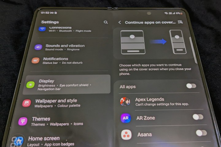
Open the Settings app, open the Display section, and then tap on the option that says Continue apps on the cover screen. Once there, you can choose if all apps are carried over from the inner screen to the cover screen. Or you can do it on a per-app basis.
There are some exceptions, though, especially a few games. Titles like Mortal Kombat, Shadow Fight 3, and Apex Legends won’t let you carry the action from the inner screen to the cover display or vice versa. Interestingly, Diablo Immortal, which is also quite a demanding game, allows you to move the live gameplay between the two screens.
If you enable the app continuity option, certain games will force a restart when moving over to the other display.
Own the screen-on behavior
When your phone has two high refresh rate OLED screens, battery life is definitely a concern. One UI automatically turns off the screen after a specified period of inactivity. But what if you are using the Galaxy Z Fold 4’s inner display as a secondary screen to keep an eye on Slack or Teams chats?
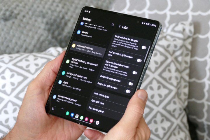
Every time the screen turns out, you need to lift off the phone and then reach out for the power button so that you can authenticate your fingerprint and unlock it. If you don’t want that, you have the double tap o wake gesture, but you still have to enter the passcode or PIN, or draw the unlock pattern. Either way, it’s a hassle, but you can control this behavior and make it less bothersome.
The first recourse is to let the front camera track your activity. As long as the camera detects that you’re viewing the screen, it won’t turn off. To enable this feature, follow this path: Settings > Advanced features > Motions and gestures > Keep the screen on while viewing.
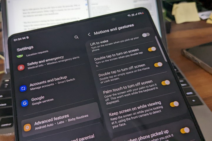
Conversely, if at any point you feel like turning off the screen, but don’t necessarily want to lift up the device and press the power button, there’s an easier way to do that. All you need to do is touch the screen with the palm of your hands. Here’s the system path to enable this convenience: Settings > Advanced features > Motions and gestures > Palm touch to turn off screen.
Another neat convenience is the ability to take screenshots with a palm gesture by simply swiping your palm inward from either edge of the screen. In order to activate this, follow these steps: Settings > Advanced features > Motions and gestures > Palm swipe to capture.
Give your hands some rest
For all its big-screen charm, the Galaxy Z Fold 4 is also an ergonomic nightmare, and there are a few things that you simply can’t do while using the device with one hand. Imagine trying to take a screenshot while holding the foldable device with just one hand!
However, that’s not the only challenge while using the device in tablet mode with just one hand. What if your thumbs feel stretched out while accessing the navigation buttons or the gestures are proving to be finicky during one-handed usage?
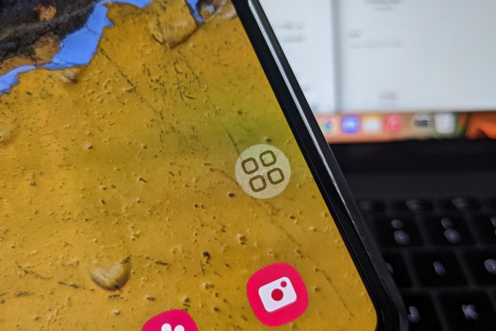
What if you want to take a quick screenshot, pull down the notification panel, lower the volume, or adjust the brightness level? Well, all of that is just a tap away, thanks to a cool smart menu feature.
To enable it, open the Settings app on your Galaxy Z Fold 4, and scroll down until you see the Accessibility option. On the Accessibility page, tap on Interaction and dexterity, and switch on the toggle that says Assistant menu. This trick takes the one-handed usage experience to a whole new level of convenience.

Assistant Menu appears as a small icon that you can put anywhere within your thumb’s reach on the screen. Tapping on it opens a small circle populated by quick actions like back, home, app overview, screenshot, volume control, brightness, and more. You can also customize the Assistant Menu with additional one-tap task controls.
But there’s more. You can even enable a few system-level apps for the Assistant Menu to show contextual controls. For example, if you have the camera app open and tap on the Assistant Menu icon, it will show a quick access button for launching the gallery app.
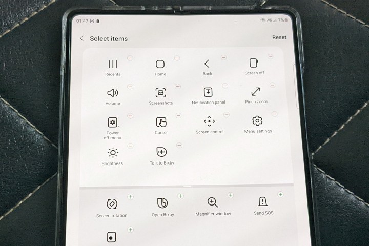
If you have the Samsung Internet app running, the Assistant Menu shows one-tap buttons for pulling up the search bar, launching a new tab, or opening the list of active tabs. In my opinion, it’s the one feature that you should definitely be using if the Galaxy Z Fold 4 is going to be your primary phone in the long run.


