When it reached version 3, Samsung’s One UI become one of the best Android interfaces available, due to its coherent design, customization options, varied features, and impressive turn of speed. I enjoyed using it more than Android 11. However, now Android 12 is here, and it’s such a big step forward, it instantly made One UI 3 feel aged, a bit ugly, and slightly ponderous by comparison.
Samsung’s OneUI 4 is based on Android 12 and has now started to arrive on the Galaxy S21, the Galaxy S21 Plus, and the Galaxy S21 Ultra. With the update installed on the Galaxy S21 Ultra, I’ve been using it alongside the Pixel 6 Pro to see if Samsung’s new software can help bring back the phone’s luster, and keep it competing with Google’s latest smartphone.
What do I want to see?
One UI 4 is never going to be identical to Android 12 on the Google Pixel, and that’s fine. Not only are there elements of the software that are exclusive to the Pixel, but Samsung will want to maintain its individuality and promote its own apps and services through its own interface. I don’t want it to be the same either. What I want is for Samsung to have selected some of the best parts of Android 12 and integrated them with OneUI 4, and then given the rest a typically polished Samsung spin.

I’ve been mostly comparing the elements I use every day, including the keyboard, customization, the browser, the Settings, and quick access menus, and various apps. In turn, this means I’ve been able to assess speed and fluidity, and overall reliability of the operating systems. For clarification, I’ve been using the S21 Ultra with One UI 4 as my main phone for five days, with the Pixel 6 Pro as a companion phone.
Fast enough?
The first thing I noticed using One UI 4 on the S21 Ultra is how smooth the scrolling is compared to the Pixel 6 Pro. I continue to have issues with the 120Hz refresh rate screen on the Google phone, and despite seeing reports of problems with the S21 Ultra with One UI 4 at the same refresh rate, I haven’t experienced them personally.
It’s at its most noticeable when scrolling through Twitter or the Google Discover page, when the Pixel 6 Pro stutters and judders, leaving the S21 Ultra to smoothly scroll through text, photos, and video. It’s not a systemwide problem as the Settings menu, and app menu on the Pixel 6 Pro is fine, and even scrolling through Instagram on both phones is an identical experience. However, the Galaxy S21 Ultra is far more consistent.

One UI 4 has Android 12’s stretch animation, where the screen appears to stretch, or bounce, when you reach the end of a menu. It’s fun and visually interesting and looks the same on both phones. Digging into the Settings menu I prefer the larger font and additional white space around the options on Android 12, while Samsung’s fonts, by default, are smaller with less white space. One UI 4 does have the ability to change the size of the fonts, but menus are generally still busier than on the Pixel, making them a little less friendly to navigate around.
I also prefer the vertical list of apps on the Pixel 6 Pro rather than Samsung’s multi-screen layout, as it feels faster to work through. When you put the two next to each other, the Pixel 6 Pro is just a little bit snappier, with quicker animations and more precise touchscreen inputs. One UI 4 is certainly not slow, but it doesn’t feel quite so lightning fast as Android 12 on the Pixel. I just wish the scrolling issues had been solved already.
Customization
Material You, the name given to Android 12’s new look, has transformed the Pixel 6 Pro, giving it more style, more customization, and more personalization. Samsung has adopted some of Material You for One UI, so does the mashup of design work?

Under the Wallpaper and Style menu, you can change the color palette of the operating system to match those of your chosen wallpaper on both phones. The effect can be applied to all the app icons on the S21 Ultra, but unlike the Pixel, it doesn’t apply to third-party apps, including Google’s apps. This means it looks just as messy with or without the setting active, and not as neat as it does on the Pixel.
There are more widgets to use in One UI 4 and many have a brand new look. Again, while not all of the ones found on the Pixel are available, there are plenty to choose from, and a few with some very handy features. I like the fast access widget for controlling the Galaxy Buds Live, for example, and the dynamic weather widget too.
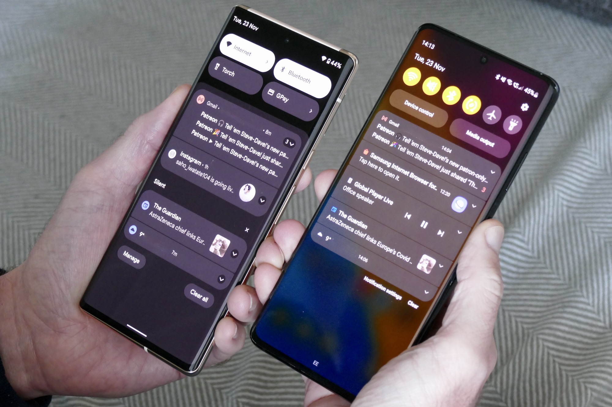
Material You’s Always-on screen on the Pixel 6 Pro is glorious, with its massive clock and wonderful fade-in to the wallpaper when you tap the screen, plus the larger multi-option buttons in the Quick Access menu are easier to press and identify than Samsung’s many smaller round buttons. Samsung has also added a larger brightness slider and new device controls, though, which makes adding and using Bluetooth headphones quicker than before.

One UI 4’s overall design has not changed that much over One UI 3, but it’s still highly customizable, so you can work to make it your own. I find it takes some effort to do this, while Android 12 on the Pixel 6 Pro is close to exactly how I want my software to look and feel right away, and only needs my choice of wallpaper to complete the look.
Browser and keyboard
By default, One UI 4 uses Samsung’s own keyboard and browser, and in the past, I’ve quickly moved over to Chrome and Gboard. Both these features have been updated with One UI 4, so would I stick with using them this time around? I use the Swipe typing feature, which was historically what let the Samsung keyboard down, but it’s definitely improved here.

I could swipe type at almost the same speed as I do on Gboard, and with almost the same level of accuracy from the predictive system too. I’m fairly sure that with extended use and letting it learn the way I type and words I commonly use, it would be equally as fast as Gboard. It’s a significant improvement.

Samsung’s Internet browser isn’t so successful. The layout is too busy, the control icons are at the bottom of the screen and are too small, and it doesn’t seem as fast as Chrome. I wouldn’t swap to it permanently, but I may use Samsung’s keyboard more often. I’m especially keen to try the improved keyboard on the Galaxy Z Fold 3, where I’ve had to work around using it on the outer screen in the past. The final release of One UI 4 has not been made available on Samsung’s latest folding phones yet.
What else does One UI 4 offer?
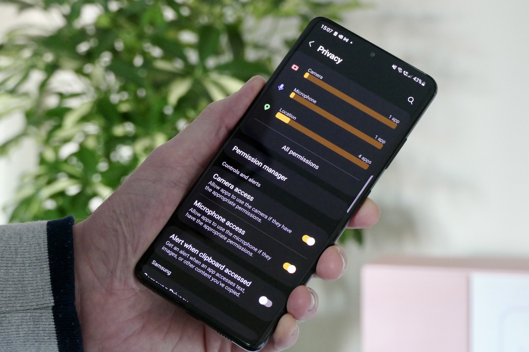
Elsewhere in One UI 4, Samsung has added an enhanced Privacy dashboard, an alert indicator when an app is using the camera or microphone, and a handy list showing which apps have asked for what permissions recently. It’s very easy to navigate and gives a very clear overview of the deeper workings of your phone’s software. A similar system is present in Android 12.
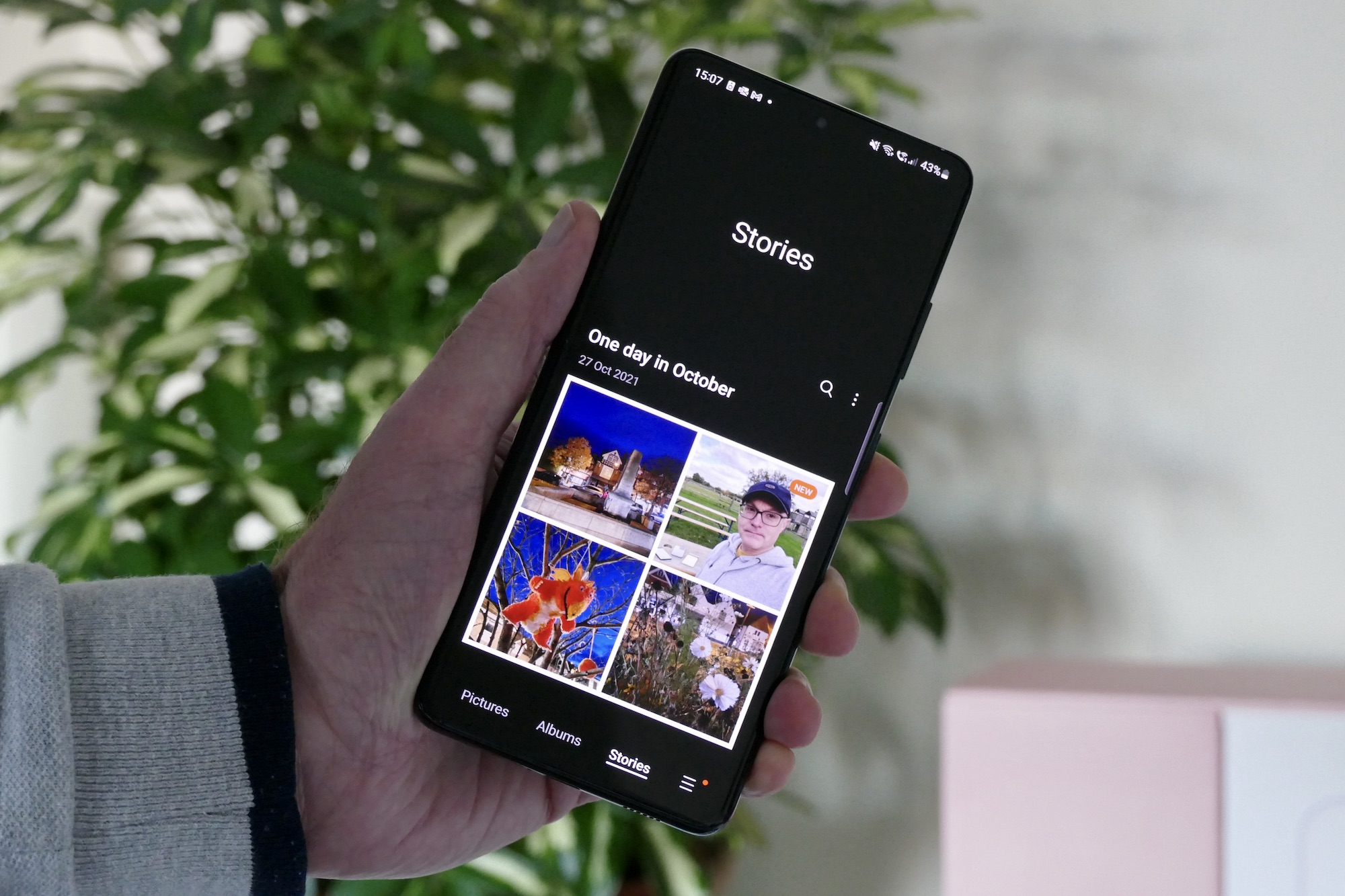
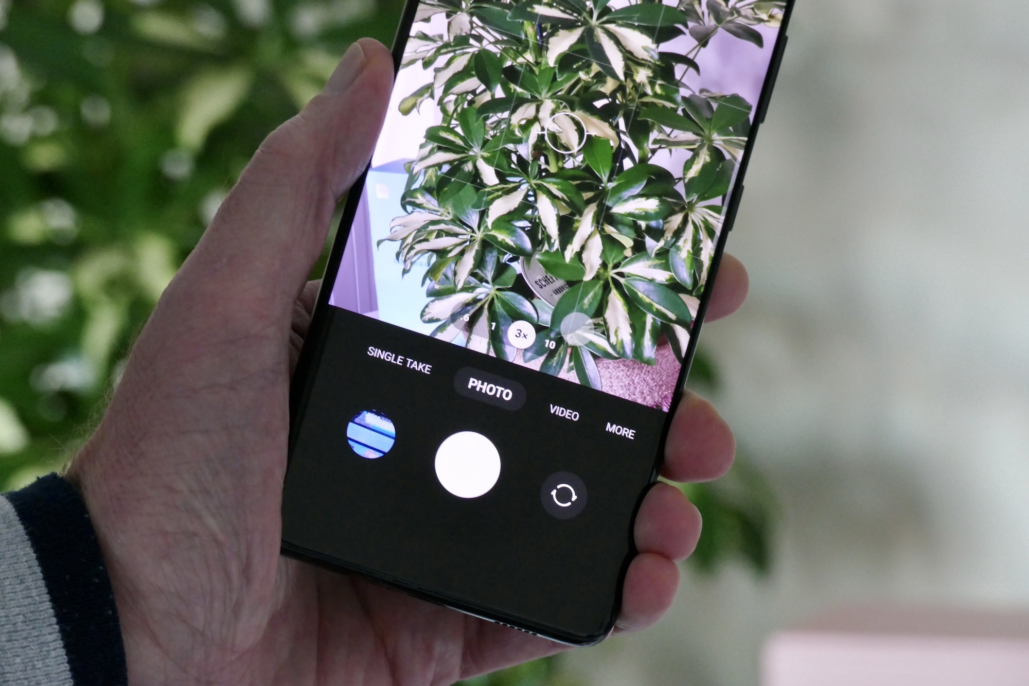
The camera app has also been treated to a few changes, with the most sensible being a number-based zoom system, rather than the abstract tree icons used before. It was very pretty, but not particularly logical. The app shows a 3x and a 10x zoom by default, matching the S21 Ultra’s optical zoom levels, and when you tap either, a scale appears below to tweak the zoom further. In the Gallery app, there is a Stories section, much like the For You section in iOS 15, and I really like the way you can roll back any edits made to photos even after they’ve been saved. Wondering about camera performance? I’ve previously compared the Galaxy S21 Ultra’s camera to the Pixel 6 Pro.
The One UI 4 update is extensive, with plenty more small changes and new features hidden deeper in the software, which you’ll gradually discover the more time you spend with it. Samsung says One UI 4 will be available on all Galaxy S21 series phones starting from November 15, but exact arrival dates will almost certainly vary. Galaxy Z folding smartphones, Galaxy A series phones, and Samsung’s tablet range will also get the update in the near future.
One UI 4 or Android 12?
One UI 4 is a welcome update, especially with its Android 12 design customizations, better keyboard, more varied widgets, and the informative Privacy dashboard. It has helped the Galaxy S21 Ultra stay competitive and feel fresh again as it nears its one-year anniversary, and although there are reports of some bugs, any that do exist have not affected my use.
What it can’t do is match Android 12 on the Pixel 6 Pro for sheer speed and slickness — 120Hz problems aside — on a daily basis. The complete Material You design is fantastic, and although there are elements of it in One UI 4, it’s still can’t compare to the visual joy of the full experience. I really like One UI 4, and I’m keen to see how it feels on the Galaxy Z Fold 3, but Google has moved ahead of it and the rest of the competition, with the gorgeous, wonderfully intuitive Android 12 on the Pixel 6 Pro.


