I put the Samsung Galaxy Watch 5 Pro back on my wrist recently, keen to see how Samsung’s most expensive smartwatch has held up since the Apple Watch Ultra’s release.
Almost immediately, I hit a snag, but I couldn’t quite put my finger on what was causing the problem. And when I did work it out, it seemed a bit silly. However, the more I thought about it, the more it made sense — and it reveals where Samsung is going wrong with its smartwatches.
The Galaxy Watch has no character
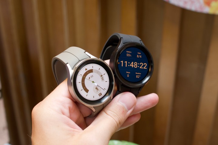
The Galaxy Watch 5 Pro has rubbish watch faces, and it’s an issue that extends to the standard Galaxy Watch 5 too. The preinstalled collection is suitably extensive, in that there are numerous choices, but practically none hold any appeal. They aren’t all the same, and when viewed as a whole, the options available seem to cater for different people. But a bit like the Galaxy Watch 5 Pro itself, they entirely lack character.
The watch faces are a demonstration of how to create a watch face collection dictated solely by ticking boxes on a product plan. Is there a watch face that looks like a traditional watch? Check. Is there one that shows lots of data and information? Check. Is there one for kids? Check. Is there a colorful one? Check. This is how it feels when scrolling through the available faces, and because they’re so clinical, I don’t care about any of them.
This is the point where I may hear the argument that it doesn’t matter, that the Galaxy Watch 5 Pro is a smartwatch, and I’m never going to care about it the same way I would a mechanical watch. But I don’t see this as a proper argument. A smartwatch is at its best when it’s worn all the time, so why shouldn’t I want to feel something when I look at it? At the very least, I want to look at it and think it looks cool, and not even that happens with the available watch faces on a Samsung smartwatch.
Why watch faces matter
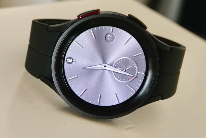
The watch face is what makes a watch attractive to people, and watch makers spend time and money making ones that really capture our attention, with the best going on to become iconic. From the Audemars Piquet Royal Oak to the Casio G-Shock square and a basic Swatch, many of the world’s most recognizable watches would be considerably less recognizable if their faces were not so memorable. Kind of like we would be.
From a business standpoint, creating a brand identity like this makes perfect sense, as the overall basic design of a wristwatch is pretty established. What’s frustrating is every smartwatch maker has the opportunity to do what traditional watches cannot, and that’s provide a vast selection of quick-to-change faces to widen the appeal, alongside one or two expertly designed faces that people associate with the watch. Samsung, for all its financial might and years of creating smartwatches, hasn’t managed to do so.
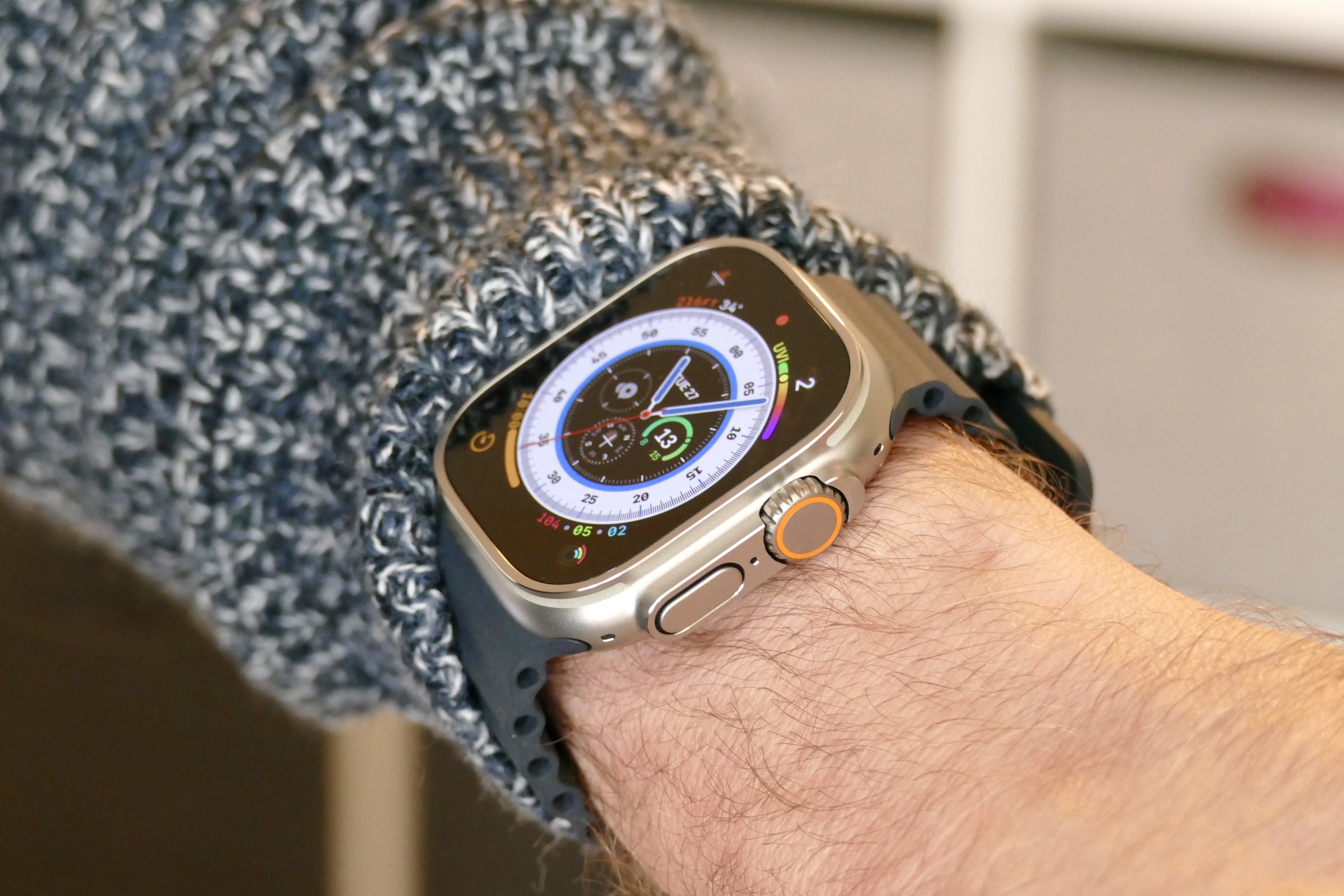
When I put on the Apple Watch, I have a core selection of watch faces that I think look fantastic, such as the instantly recognizable Contour face, the beautiful GMT, or the Ultra-only Wayfinder face. Google also provides a great selection of watch faces on the Pixel Watch. On the Galaxy Watch, I can have an animated bear, a hideous emoji face, some bubble-style numbers, or pick between multiple generic and often poor quality analog and boring data options. I don’t like any of them, and the one I end up settling for doesn’t represent my taste in any way at all.
Apps aren’t the solution
Samsung and Watch 5 owners will say other watch faces are available on Google Play, and that if I don’t like what Samsung provides, I should look there. Sure, I can do that if I want to pay for more of the same, but really, I shouldn’t have to. I don’t have to do it on the Apple Watch or the Pixel Watch, so why should Samsung get away with not offering at least one or two really good, free standard options? Providing quality, recognizable watch faces as standard builds the brand, and that matters a lot when the competition is so strong.
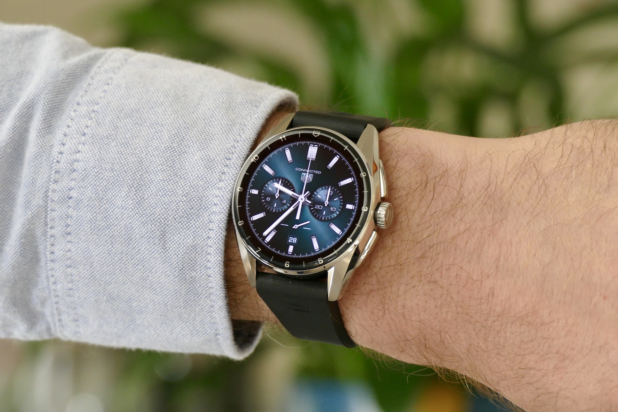
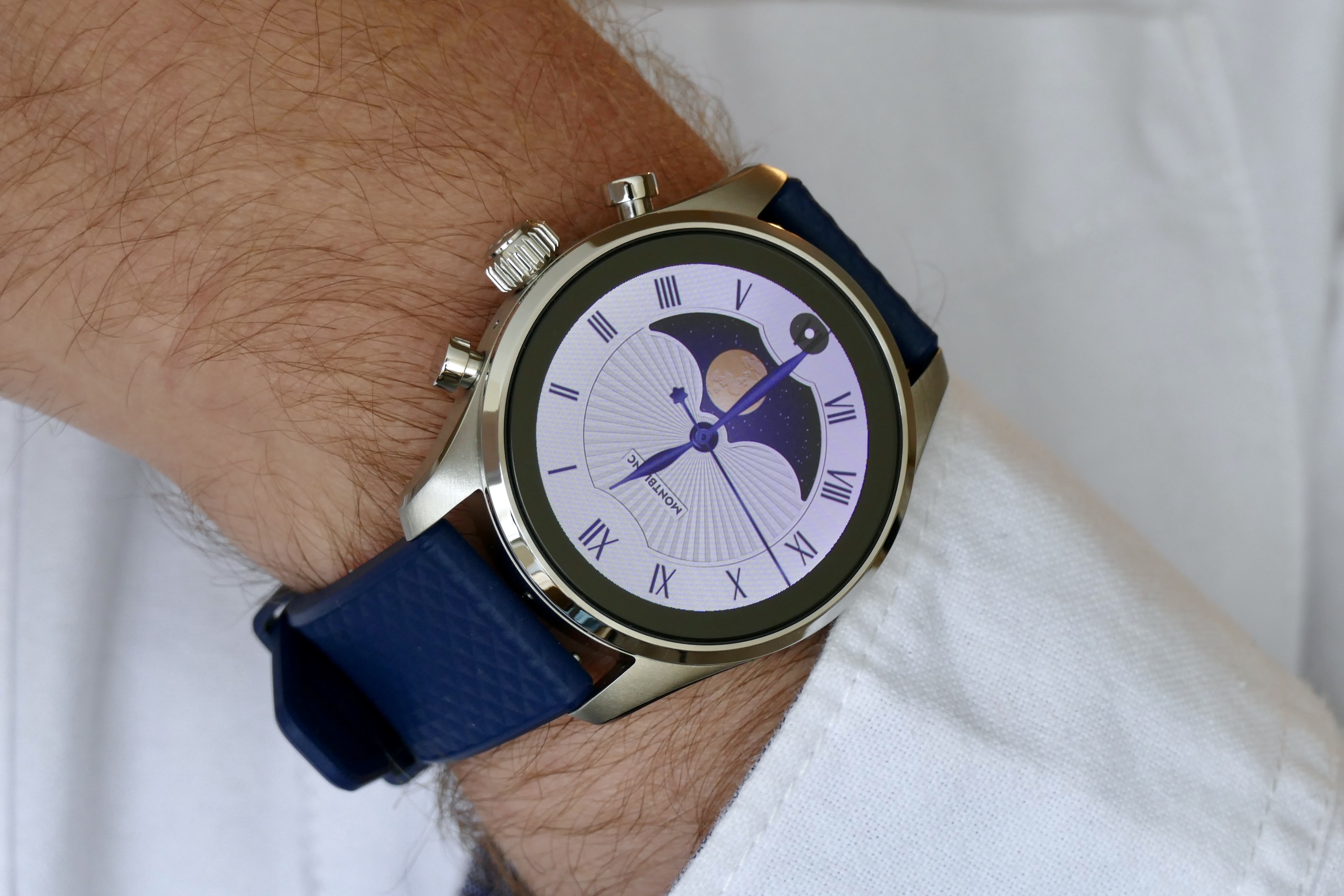
It hasn’t got anything to do with the technology side either. I was spoiled for choice when it came to stunning, high-res, beautifully animated watch faces I wanted to stare at when I wore the Tag Heuer Connected Calibre E4 and the Montblanc Summit 3. It was like wearing a traditional version of each watch. If these companies can perfectly recreate their amazing watch faces on to a smartwatch, what’s to stop Samsung from coming up with something equally as good?
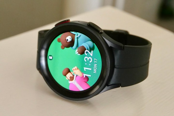
If it doesn’t have the design chops (which I find hard to believe), why not leverage its industry power and collaborate with a watch brand? It regularly collaborates with exciting fashion brands like Thom Browne and Maison Kitsuné, creating cool watch straps, phone cases, and special-edition phones. Somewhat frustratingly, it keeps the watch faces from those editions separate and exclusive. But there simply has to be a watch brand with no specific ambitions in the smartwatch space that also sees value in collaborating on face design.
If the recent, trendsetting Omega X Swatch MoonSwatch partnership showed us anything, it’s that in the world of watches, two very different kinds of buyers can be attracted to a single well-designed product. How about a special Galaxy Watch along the same lines, with a thoughtful, attractive, expertly designed watch face collection that draws on the know-how and design expertise of the watch industry? I’d love to see a Samsung X Edox, Samsung X Rado, or Samsung X Bell & Ross smartwatch watch face, for example.
Samsung’s watch faces need fixing
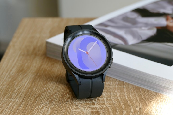
The feeble collection of standard watch faces exposes where the Galaxy Watch 5 Pro loses out to the Apple Watch Ultra. It’s entirely characterless, especially in black with the black strap. I wasn’t sure any smartwatch could have a character, but the Apple Watch Ultra has started to prove me wrong, managing to be very much its own thing, with its own distinct look and feel. The Galaxy Watch 5 Pro has none of that appeal, and it made me not want to put it on, which is the death knell for a smartwatch.
It’s a shame, as technically it’s very good; the materials are high quality, and the battery lasts for a couple of days without a problem. As a smartwatch, the Galaxy Watch 5 Pro gets it right. I could overlook the ordinary design if only there was a really fantastic watch face for me to use. Instead, I can’t decide because they’re all ugly, cheap-looking, generic, or aimed at a child. Sure, they may look “fun” as part of a kinetic advertising campaign, but they look stupid on my wrist.
We’ve moved past the smartwatch being considered the lesser wristwear option. They’re truly an alternative to a traditional watch for a lot of people, not just tech fans, and therefore should be treated as a piece of jewelry as much as a piece of technology by the manufacturer. Getting the watch face collection right is a very big part of that, and Samsung needs to fix what is rapidly becoming a glaring problem with its otherwise great smartwatches.
