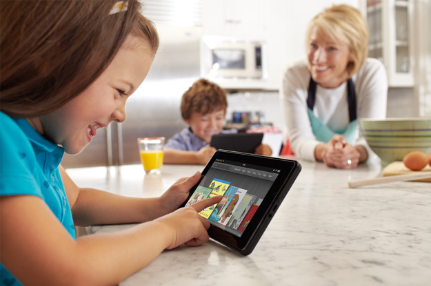
The Kindle Fire is reported to be the top tablet at Best Buy this year, and Amazon is expected to sell 5 million in the fourth quarter against an estimated 13 million for the iPad. While Apple’s iPad remains the clear winner, if these projections hold up, the Kindle Fire will be the first tablet to come this close to challenging it.
The Fire has two clear differences to the iPad. The first is a dramatically lower price; you can effectively buy 2.5 Kindle Fires for the price of an iPad. The second is screen size; the Fire has a 7-inch screen, a size that most thought was a non-starter before it shipped. I’ve been using the Fire for two weeks now, exclusively on a three-day trip for entertainment, and I’m coming to love the 7-inch size. Let me explain.
 Breaking Android’s user interface curse
Now before we talk about the size, one other aspect I haven’t yet mentioned causes the Fire to be a strong player. The user interface is arguably more advanced than either Apple’s or Amazon’s icon-based interfaces. Now, recognize that once you’ve learned any interface (from Windows to iOS) it becomes natural, but Amazon’s is one of the easiest out of the box. Apple’s iOS interface was the clearly a step up when it launched from what Apple had previously, and Apple historically set the bar with regard to ease of use.
Most Android offerings seem to go down a path of imitating Apple, but with more flexibility. This flexibility tended to translate into complexity. Vendors tried different ways to overcome this, but most just seemed to make their products more unique, and therefore even more difficult to use. Given that Apple set the bar high with tablets, these products would generally be pounded for anything that was different and particularly inferior. On top of that, Apple did such a great job of buying parts and locking up production that competitors couldn’t even get close to Apple’s hardware cost. Most products just couldn’t compete.
It became clear that someone had to reset the bar (be massively different in a good way) and try to outdo Apple in user experience. Amazon is the first vendor to do both, and while the Kindle Fire did make some painful tradeoffs, it appears to be doing better than any other Android product in this space as a result.
I think what Android vendors didn’t initially understand was that first they had to stand out from Android rabble, because all the products were increasingly being painted with the same brush of disappointment. Amazon did that well.
The 7-inch tablet
The best part of a 7-inch tablet is that it will fit in an inside jacket pocket or in a woman’s purse. No, I don’t carry a man purse, but this is why my wife will carry the Kindle Fire out of the house, but generally leaves her iPad at home. In my case, this frees up my hands for the other crap I have to carry, and makes it less likely I leave it behind once I get used the weight of the device in the pocket. (It seems much easier to leave behind something you are carrying and tend to put down all the time). In watching movies, the lightness of the product is handy when you don’t have a table to set the thing down on, and a case that has a kickstand is helpful (and generally available) for both sizes of product when you do.

When it comes to glare and outdoor viewing, which is pretty much a problem with all current-generation tablets (at least until the Panasonic Toughpad ships), I found it is easier to find an angle where I can continue to use the tablet with the smaller size. This is largely because it fits in smaller shadows, and it’s light enough that I can hold it at odd angles in order to see the screen. On a plane, it actually fits in the shadow under the window, which is generally too small for a 10-inch product.
Now, for anything to do with productivity (including email), this product is at a disadvantage, but a better alternative to a smartphone. Still, I found that when it came to getting work done, I went back to my smartphone or laptop virtually all of the time. The Kindle fire was relegated to reading books, watching videos, and some Web browsing (where it is dramatically better than a smartphone, but nowhere near as good as a laptop).
The perfect third device
If you are like me and carry three devices (a smartphone, laptop, and then something for entertainment), the 7-inch form factor is better third device. Its size and weight allow it to drop in the gap between your other devices. 10-inch tablets are too similar to notebooks, which make them better if you want to leave the notebook behind, but too big and heavy if you, like me, have to carry a notebook anyway. They still don’t do all I need to comfortably leave my notebook behind. One thing I have noticed (which will be a long-term issue with ever leaving my notebook behind) is that 10-inch screens are just too small for me. I struggled with 11.3-inch and 12-inch laptops as well (currently I’m using a 13.3-inch ThinkPad X1), which suggests I’ll never be able to live on a tablet, and the 13-inch tablets I’ve tried over the years are just not practical. This suggests, at least for the next three to five years, I’ll be a three-device user, and that 7 inches may be the ideal tablet size for me.


