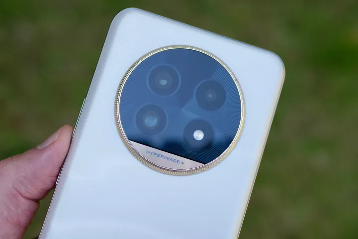
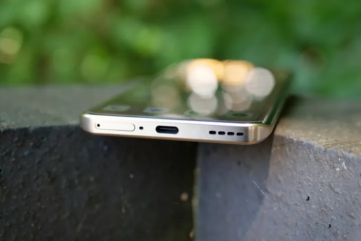
Realme is making its comeback in style with the announcement of the Realme 13 Pro+, as it comes with a color scheme and design inspired by a bone fide artistic master.
I’ve had the phone in my hand for a few hours — just enough time to take a few photos and get a feel for the device. I can already confirm that it is, indeed, one of the best-looking phones I’ve seen this year.
What you need to know about the Realme 13 Pro+

Before we go into what the phone is like to hold and use, here are the headline facts about the device. The 6.7-inch OLED screen has a 120Hz refresh rate and a maximum brightness of 1200 nits, but it’ll average out at 600 nits. I have not had any problem viewing it in sunlight. The software is Android 14 with Realme UI 5.0 over the top, which shares a lot of design and functionality with Oppo’s ColorOS and OnePlus’ OxygenOS, as all come from the same stable.
For the camera, Realme is the first to use Sony’s 50-megapixel LYT-701 main sensor, which is equipped with optical image stabilization (OIS). It’s joined by a 50MP telephoto camera for a 3x optical zoom. The final camera on the back is an 8MP wide-angle sensor. The camera has various AI tools, including AI enhancements to improve blurred photos, an object removal tool, and AI tweaks to skin tone, group photos, and the portrait effect.
The Qualcomm Snapdragon 7s Gen 2 processor comes with up to 12GB of RAM and 512GB of storage space. The 5,200mAh battery gets 80W wired fast charging, a 32MP selfie camera, and an IP65 dust and water resistance rating. The international version has 5G connectivity, NFC, and dual speakers.
Monet-inspired design

The Monet Gold and Monet Purple color schemes have been inspired by paintings by Impressionist master Claude Monet, and produced in collaboration with the Museum of Fine Arts (MFA) in Boston. I’ve been taking a look at the Monet Gold version, and you really have to be told that’s where the Realme 13 Pro+’s inspiration comes from, as there are no other hints at all.
It was a surprise not to even find a wallpaper depicting the masterwork in question — Monet’s Grainstack (Sunset) for this version — on the phone. I added my own (taken from the MFA’s own website, no less) to complete the effect. The frosted, high-gloss glass on the back has an unusual, shimmering effect that’s subtle rather than gaudy and adds a real depth to the design that’s beautiful to examine, while the gold bezel around the camera module is beveled for a classier look. The chassis matches the gold of the camera module.

It’s light at 190 grams, but it does have a severe taper down the sides, and because the rear panel isn’t quite flush with the chassis, it is quite sharp. It would be unfair to call it uncomfortable to hold, but the edge of the phone is definitely noticeable. Some may find it makes the phone feel a little less expensive than the looks suggest. It’s not all that well balanced in my hand either, so the ergonomics don’t quite match the looks.
The Realme 13 Pro+’s strength is in the design and colors used, and the Monet Gold version is something special. I love the way the design on the glass moves and shifts in the light, but it’s never distracting or over the top. There’s also a wonderful texture to it, providing warmth and grip. Without a doubt, the Realme 13 Pro+ in Monet Gold is one of the year’s most beautiful smartphones, and I can only imagine the Monet Purple is equally as glorious.
Does it take good photos?

I’ve only taken a handful of photos with the Realme 13 Pro+, and I am using the phone ahead of its official announcement, which may mean software updates will affect performance in the future. I’ll also add that in the past, manufacturers have taken a while to refine the photos taken by new Sony camera sensors, and all this may play a part in the Realme 13 Pro+’s photos not quite being what I expected.
The main camera doesn’t always emphasize colors in the way I think it should, resulting in washed-out images that lack life — something that’s immediately obvious when you compare them with the wide-angle photos. It’s a pretty sad state of affairs when an 8MP wide-angle camera takes more attractive photos than the main camera on a phone, but if you simply concentrate on the colors, contrast, and dynamism, that’s what you get with the Realme 13 Pro+.
It’s a similar situation with the 3x optical zoom, which sometimes robs its otherwise decent images of vibrancy. The main camera and optical zoom don’t always take disappointing photos, and there are positives to them both. The 3x zoom has a good level of detail, while the main camera can balance out challenging lighting and colors well — but only sometimes. There’s a worrying inconsistency here that needs to be fixed.
Don’t forget about the Realme 13 Pro

I’ve been trying out the Realme 13 Pro+, but there is also a Realme 13 Pro if you want a device that’s a little cheaper. The same color variations are available; it’s still powered by the Snapdragon 7s Gen 2, and it has a 6.7-inch OLED screen with a 120Hz refresh rate. The battery has the same capacity, but the charging drops to a 45W maximum.
The camera is where the majority of differences are found, with the main camera being a 50MP Sony LYT-600, joined by an 8MP wide-angle camera, but there’s no third telephoto camera here. Consequently, the phone gets a little lighter at 183 grams.

Realme will first release the Realme 13 Pro+, along with the Realme 13 Pro, in India on July 30, where the range will start from the local equivalent of $320, but this will be for the basic 8GB/128GB Realme 13 Pro. The price for the Realme 13 Pro+ has not been revealed at the time of writing, and it’s unclear whether either phone will get a wide global release later on.
A new start for Realme?

Realme’s return to selling phones outside China is very welcome. It has always taken design seriously, and the Realme 13 Pro+ is no exception. If you’re looking for inspiration, a master like Monet is a good place to start, and an unusual one in tech. While I think it has got the design right for the 13 Pro+, I’m less convinced by the ergonomics, and the camera hasn’t immediately impressed either.
It’s a familiar situation, as this has been the case for Realme in the past before it retreated into China for a few years. Whether it has learned anything during its absence will depend on if updates to the camera arrive imminently, as it’s up against such strong competition these days and can’t sit back and expect the extremely pretty gold and lilac colors to do all the work.


