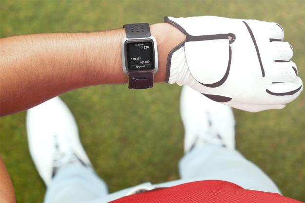
“The TomTom Golfer spits out precise yardages and clear graphics with the touch of a button (or two) on more than 30,000 courses.”
- User friendly
- Doesn’t try to do too much
- Smart, simple packaging
- Reasonably stylish
- Value
- Occasionally fails to pick up next hole
- Round can be lost on piece too easily
- Clunky desktop software
From the shoes on your feet, to the gloves on your hands, and the club you hold in them, golf offers no shortage of gear to upgrade your game. But if you’re going to wield them to any benefit, you might want to know what the course looks like. That’s where TomTom’s new Golfer GPS watch comes in.
The Golfer offers helpful course intel like the distances to the front, middle and back portions of the green, distances to hazards, doglegs and lay-ups, a green view (with hazard warnings), and a digital scorecard.
For most golfers – this is plenty of info to assist you; too much data and information tends to bog down your decision-making abilities. Yet again, less is more. Trying to be too “perfect” on the links is a downfall for most, so the amount of info this watch gives is spot on.
On the links
The watch’s “golf mode” is activated by tapping on the right on side of the navigation button – a square button located just below the screen with up, down, right and left controls. A search for the course you are on begins promptly, and within a half minute or so, it has pinpointed your locale from roughly 35,000 courses in its internal database. With GPS and GLONASS on board, it doesn’t take long to get a signal locked in and, once you’ve confirmed the course you’re playing, things happen pretty instinctively.
The watch recognizes what hole you’re playing (most of the time), and the “remaining distance” metric updates automatically as you walk or ride towards your ball. At times, if the teeing area for the subsequent hole is too close to the green you just came off, the TomTom can get a little confused. When and if this this happens, you simply need to tap “up” to select the next hole.
The “remaining distance” metric updates automatically as you walk or ride towards your ball.
Distances to the green are given in yards or meters (it’s simple to change this in the settings) and are presented in a clear and concise manner on the main home screen. Scrolling right from this screen presents you with an array of extra info, turning the TomTom Golfer into a virtual caddy for your wrist.
In the golf mode, the TomTom Golfer will also track the time and distance covered during your round, plus how many calories you have burned – excluding the hot dogs and beers at the turn. Another aspect of golf mode is a digital scorecard. It’s not automatic — you do have to enter the number of swipes or strokes per hole manually — but it’s a relatively painless and quick.
A compact booklet included in the packaging contains only four pages of information (per language), so it is not hyper informative. You’ll want to download the PDF instruction manual on the TomTom website to get everything you everything you need to know about the watch.
The Golfer sports a 10-hour battery life and if it rains, no worries – the Golfer is water resistant to 50 meters. Charging is made easy with a dongle that doubles up as a desk stand for the watch. When you’re not in golf mode – meaning when GPS isn’t switched on – you’ll have battery life more like a regular digital watch.
Conclusion
All in all, the TomTom Golfer is a pretty slick GPS watch. The lightweight, slim styling doesn’t weigh your wrist down excessively. I’ve worn a mid-size chronometer timepiece for years in my Speedgolf endeavors (a sport that combines your time with your score), so the Golfer wasn’t a real bother. At $249, it sports all the “must have” functions, and for non-techies, the navigation pad is really quite user friendly.
Granted, there are golf watches out there with more features – but at the end of the day are they really helping the golfer hit better shots and shoot lower scores (especially for the added wallet damage)? I think not.
Highs
- User friendly
- Doesn’t try to do too much
- Smart, simple packaging
- Reasonably stylish
- Value
Lows
- Occasionally fails to pick up next hole
- Round can be lost on piece too easily
- Clunky desktop software


