All the luxury and exclusivity you’d expect from a Vertu phone, but without the overly dramatic visual punch or the crazy price tag.
If you’ve looked on with envious eyes at the Vertu New Signature Touch with its outrageous “gull wing” style door feature on the back, and decided it just wasn’t subtle enough; then the new Vertu Constellation may be the perfect compromise between style, luxury, and subtlety. If you’re still undecided, perhaps the lower price of the Constellation will eventually sway you. We’ve had the chance to try the phone out, and like all Vertu phones, it left quite an impression. Here’s what we thought.
The last time we heard the Constellation name, it was back in 2013, and the phone to which it was attached had the same mission: Give people who either didn’t want or couldn’t justify the cost of the company’s flagship phone a chance to join the family. The new 2017 Constellation will cost less than the New Signature Touch, but we came away from using the phone, thinking we may prefer it over one anyway.
Its subtlety shines through the longer you examine the details. The pillow — that’s the section where the speaker is hidden above the screen — is slim and unobtrusive, yet still a beautiful aspect of the design. The front of the Constellation is dominated by an expanse of 6th generation sapphire glass, which covers a 5.5-inch, 2,560 x 1,440-pixel resolution screen. Sapphire glass has a slightly different look in comparison with Gorilla Glass. A highly polished, deeper sheen brings out the best in this display. It’s the first time Vertu has gone beyond 1,920 x 1,080 pixels on its screens, and it’s a welcome addition.
No gull wing door madness or builder’s signature
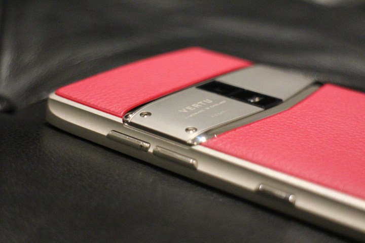
The Constellation is wonderfully comfortable to hold. A machined trench sliced down the aluminum side panels ensures it nestles in your palm and avoids the sharp, angled edge that runs along the top side. It’s interspersed with the power and volume keys, plus Vertu’s trademark ruby button to activate Concierge. This is Vertu’s 24/7 personal assistant service, and it’s a massive part of the phone’s appeal. It joins Vertu Life — where exclusive offers and services are available to Vertu owners — plus secure calls through Silent Circle, anti-theft services, and other benefits.
It’s beautifully made, feels strong as an ox, and we adore the more subtle design and styling.
Examine the sides closely and you’ll notice a traditional SIM tray cut into it. This is a real departure for Vertu, which in the past has hidden the SIM behind a spring-loaded door, making it a talking point. Part of the reason is the decision to use a dual-SIM system on the Constellation. The dual-SIM slot increases its versatility, adding another connectivity feature to the 34 international bandwidths for true global network support, but removes one of the things we always adored about Vertu. A little bit of unique madness you didn’t find on any other phone. It also means the Constellation doesn’t have somewhere to hide the signature of the person who built the phone, unlike most other Vertu devices.
However, the lack of a crazy SIM door makes the phone less fussy, which follows with the rest of the design. There are three colors at launch: a pinkish berry, a blue-grey octane, and an earthy walnut. All the colors are brought to life using leather sourced from an Italian tannery. Simpler lines, strong colors, flatter panels, and fewer visual flourishes mean it’s less dramatic than the New Signature Touch, but the phone is all the better for it. It could be argued the disappearance of the SIM door and the signature of the builder does away with some of the character that’s so important in a Vertu phone, though.
Tech lags behind
Choosing a Vertu phone has rarely been a decision based on the device’s technical prowess, but there are several welcome new additions on the Constellation. The higher resolution screen is one, along with the Qualcomm Snapdragon 820 (not the newest Qualcomm chip, but still a good performer), 4GB of RAM, 128GB of internal memory and for the first time, a fingerprint sensor on the front. This, along with NFC, means Android Pay is supported. The sensor worked well in our quick tests. It’s a shame Android 6.0 is installed, which is well behind the latest software version, but the security patch was listed as January 2017.
We can’t judge the camera yet. It takes pictures at 12 megapixels, and has a large pixel size for better low-light performance. The software, which is Vertu’s own, was fast to react and the app has a handy shortcut. Press the sleep/wake key twice, and it opens instantly even when the phone is locked.
Vertu will put the Constellation on sale in mid-February, but the price is still to be announced. While it’ll be cheaper than the New Signature Touch, we’d expect a budget of at least $6,000 will be required. Yes, all the same old arguments apply. Yes, you can get more technology for less, but you won’t get even close to the degree of luxury and air of exclusivity provided by a Vertu phone.
It’s beautifully made, feels strong as an ox, and we adore the more subtle design and styling. It’s a Vertu phone for every day, but that said, we’re a little concerned some of the Vertu character has been lost with the Constellation, and that it won’t feel quite so special to use. The New Signature Touch gives you the full Vertu experience, while the Constellation eases you into the company’s exclusive, luxury tech world much more gently.
Highs
- Beautifully styled
- Bullet-proof build quality
- High-resolution screen
- Concierge service included
Lows
- Old version of Android
- Behind the tech curve
- Special Vertu touches missing


