The pop-up camera has evolved. No longer is one lens enough, the world needs two lenses elevating out the top of a smartphone — or at least that’s what Vivo thinks. Already a brand that puts plenty of emphasis on taking selfies, the main standout feature on the new Vivo V17 Pro is a motorized dual-lens selfie camera, and it really does look great. The rest of the phone? It looks stunning too, and the midrange specification means it can be yours at a reasonable price.
Let’s take a closer look at the Vivo V17 Pro — the hardware, software, and what makes it special.
Design

If you’re familiar with the OnePlus 7T, you will recognize the Vivo V17 Pro’s size and shape, as the phone also has an unusual 20:9 aspect ratio screen. This makes the phone’s body surprisingly compact for one with a 6.44-inch display on the front. It’s very similar in size to not only the OnePlus 7T, but also the Asus Zenfone 6.
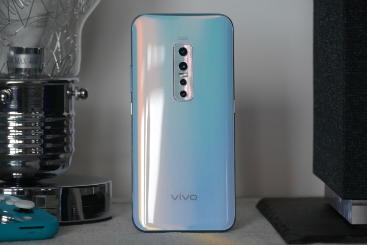
The back of the phone is made from glass, and my test model has a protector over the top, just like you’d normally find over the screen. It’s stuck on there with some force, so I really don’t think it’s supposed to be removed, despite me wanting to do so. There’s a quad-lens camera set vertically at the top of the body, Vivo branding at the bottom, and a USB Type-C charging connector on the bottom. The phone is quite heavy at 201 grams (about 7 ounces), which is similar to the OnePlus 7 Pro, and at just under 10mm thick, the Vivo V17 Pro is quite a handful.
My review V17 Pro comes in a beautiful color called crystal sky, which reminds me of the Huawei P30 Pro’s breathing crystal color with its high-gloss, oyster shell-like finish. It’s classy, eye-catching, and more feminine than the Huawei color. Other colors include crystal black and a midnight ocean. Inside the box is a case made from molded plastic, but unfortunately it’s white rather than transparent and hides the color you choose.
The pop-up camera allows Vivo to get rid of the notch, leaving the AMOLED screen with only thin borders around it. It’s very similar to the OnePlus 7T. I think it looks great, and the display itself, especially in the Vivid color mode, comes close to matching the iPhone 11 Pro’s brightness and depth, while missing out on the natural tones and pin-sharp clarity.
Camera

The motorized pop-up camera is as slickly presented as you’d expect from the company that pioneered the camera type. You can choose different sound effects to accompany its rise out of the body, and although it can be used for face unlock, it’s only as a backup to the fingerprint sensor. This means it activates only after the fingerprint ID fails three times. It’s rock-solidly built, with almost no lateral movement, and it refuses to budge when wobbled about.

The single module contains two lenses, and it looks rather like a pair of eyes watching you over the top of the phone. Thankfully, it’s in a slightly cute, rather than worryingly oppressive, manner. The selfie camera has a single 32-megapixel wide-angle lens, plus an 8-megapixel ultrawide lens. It takes good pictures, although the beauty mode is quite aggressive.
I really liked the posture recommendation feature though, where an outline of your chosen pose — listed at the bottom of the screen — is overlaid on the screen for you to follow. This works for selfies, and for normal photos too. It’s fun, different, and helps you look less awkward in selfies, and who doesn’t want that? There’s also a night mode for selfies, which is unusual.
Taking photos with the back camera is also fun. There are four lenses, — a 48-megapixel main lens, a second 8-megapixel ultrawide, a 13-megapixel telephoto, and a 2-megapixel depth lens. It’s versatile, creatively inspiring, and best of all, takes good photos whatever mode you try. Aside from wide-angle and bokeh, there’s a macro mode, a slow-motion video mode, and a night mode to try. The edit features are also good, with changes to focus in the bokeh mode, different filters, and plenty more. The camera app is a little confusing though, with an odd button system for changing the lens and photo mode, in addition to a slider under the viewfinder.
Specifications and software

The Vivo V17 Pro has a Qualcomm Snapdragon 675 processor with 8GB of RAM and 128GB of storage space. The battery is huge at 4,100mAh, and the supplied power brick has fast charging. The software is a little out of date as it’s Android 9 Pie underneath Vivo’s own Funtouch 9.1 user interface. This is the weakest aspect of the V17 Pro.
Funtouch is not very pretty or that user-friendly unless you’re already coming from a Vivo phone. The app icons are spread across multiple home pages, designs don’t always match up, and everything you thought you knew about Android is different. For example, all the shortcuts usually found in the notification shade are hidden under a different menu that slides up from the bottom left of the screen. Many aspects that are bad can be changed, including the dire keyboard, but there are too many unnecessary pre-installed apps taking up space, and too many changes for change’s sake to make it enjoyable to use immediately.
Price and availability

The Vivo V17 Pro has been announced as an international release, but so far has only been confirmed for India, where it costs the equivalent of about $420 U.S. Vivo has a growing presence in Europe, where we hope the phone will also be launched in the future. The superb hardware, classy design, and great camera on both the front and the back make it tempting for around $400, provided you can forgive the awkward software.


