Do you want a health, wellness, and fitness tracker that doesn’t have a screen? Then you would be wise to consider the Oura Ring and the Whoop 4.0, as neither will bother you with notifications or show you the time. But both have extensive health-tracking capabilities and in-depth apps, all for a similar price.
I’ve worn the Oura Ring for more than a year now, and have used the Whoop 4.0 wristband for about six weeks, so I’ve got a good idea of how the two compare. Which should you spend your money on? Let’s find out.
Wearing the Oura Ring and Whoop 4.0

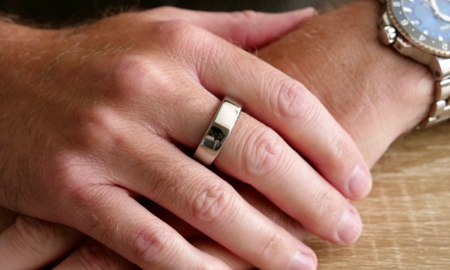
I wear the Oura Ring on the middle finger of my right hand, and the Whoop 4.0 on the same wrist. For reference, I’m wearing the third-generation Oura Ring Horizon model. Wearing smart jewelry like the Oura Ring is the ultimate in convenience, as once you’re used to it on your finger, you’ll mostly forget it’s there (it is just slightly larger and thicker than a non-smart ring, but you will feel it between your fingers for the first few days). I wear mine 24 hours a day and very rarely find it bothersome. When I do, it’s doing things that require me to grip a solid object like a dumbbell, or when performing tasks where I don’t want to risk any damage, like washing a car.
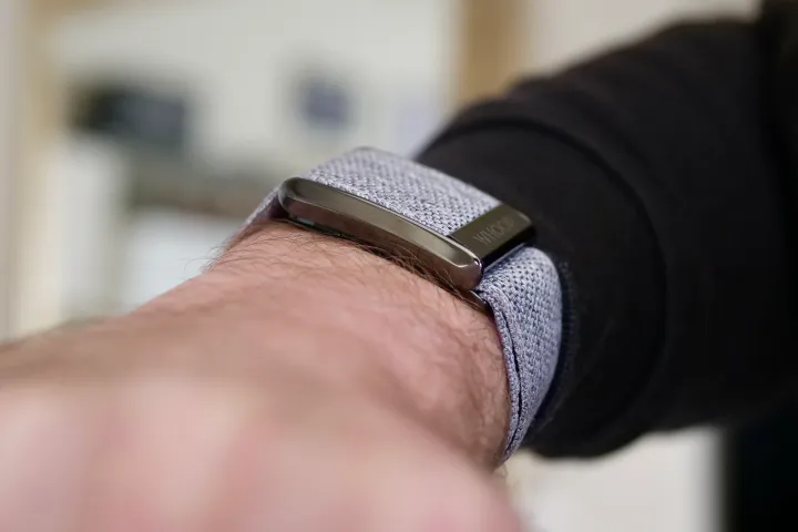
The Whoop 4.0 avoids these situations as it’s on my wrist. It’s very lightweight at 27 grams, but that’s still heavier than the 6-gram Oura Ring. The fabric strap never gets sweaty and hasn’t irritated my skin either, and I also wear it 24 hours a day. It seems to dry out very quickly, too, so even when it gets splashed, I’ve never had to take it off because it became itchy. The actual “brain” of the Whoop 4.0 is encased in metal and is quite thick, although I have not found it gets in the way of shirt sleeves more than most traditional watches. You can also purchase specially designed undergarments to hold the Whoop.
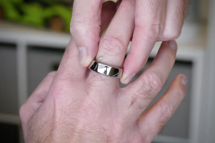
In addition to being very different products — a ring and a wristband — they also have very different styles. The Whoop 4.0 is most definitely a sporty product, and although it can hide under a cuff, when it’s exposed, it has a very casual look. The Oura Ring is not sporty. It goes with everything and actually does a good job of blending in, so it never becomes the center of attention. Yes, the polished silver is quite eye-catching, but from a distance, it just looks like a normal ring. How each looks is something to consider depending on your own personal style.
It’s this mix of convenience and unobtrusive style that makes me prefer the Oura Ring to the Whoop 4.0. I can wear it with everything and it looks great — plus. it never fights for attention when I’m wearing a watch on my left wrist. The Whoop 4.0 does, as it’s obvious I’m wearing something on both wrists. Which you prefer will come down to personal preference, but the good thing here is that neither is annoying or uncomfortable to wear long-term.
What about the sensors, battery, and charging?
On the back of the Whoop 4.0 is a five-LED health sensor with red, green, and infrared light that tracks your heart rate and blood oxygen levels, plus your skin temperature. Through the data collected, it will also show heart rate variability (HRV), resting heart rate (RHR), and respiratory rate. The third-generation Oura Ring uses LEDs with red, green, and infrared light. It measures heart rate, blood oxygen, and skin temperature, plus shows RHR and HRV.
Both have menstrual tracking systems, but the Oura Ring includes period prediction and also links with the Natural Cycles app, where body temperature data can be used for greater accuracy. It’s a manual system on the Whoop 4.0 using the Whoop Journal feature, and there’s no partnership with Natural Cycles or another app. However, both the Oura Ring and the Whoop 4.0 integrate with Strava for exercise tracking.

The Whoop 4.0’s charging system is unnecessarily complicated. It comes with a portable battery pack that slides onto the Whoop’s body after it has been charged separately, so the battery can be topped up without removing the band. However, this setup is large and cumbersome. It’s supposed to make it easy to use when out and about, but I’ve never felt the need to do this. If the battery pack gets lost, you can’t charge the Whoop band either, so it’s risky too. Alternatively, it can be left plugged into a wall charger and attached to the Whoop.
It takes a couple of hours to fully charge, and the battery lasts about four days. If you track a lot of workouts, then you’ll get even less time out of it. The charging system and battery life are pretty poor for a device that doesn’t have a screen.
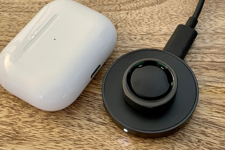
The Oura Ring’s battery lasts longer, between five and seven days, depending on your usage. You put the ring on a special plinth to charge it, and this works really well. I usually put it on charge when I’m in the shower, keeping it topped up, so I never have to fully charge it.
The neat, sensible, and logical way of charging the Oura Ring is a big benefit. And while it provides the same level of health tracking through its sensor array as the Whoop 4.0, it beats its rical with Natural Cycles integration — which may be very helpful to some.
The Oura app is all about well-being and simplicity
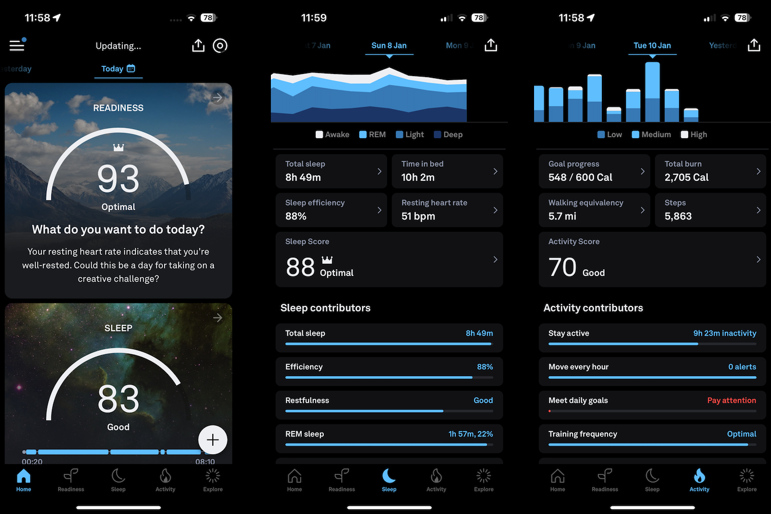
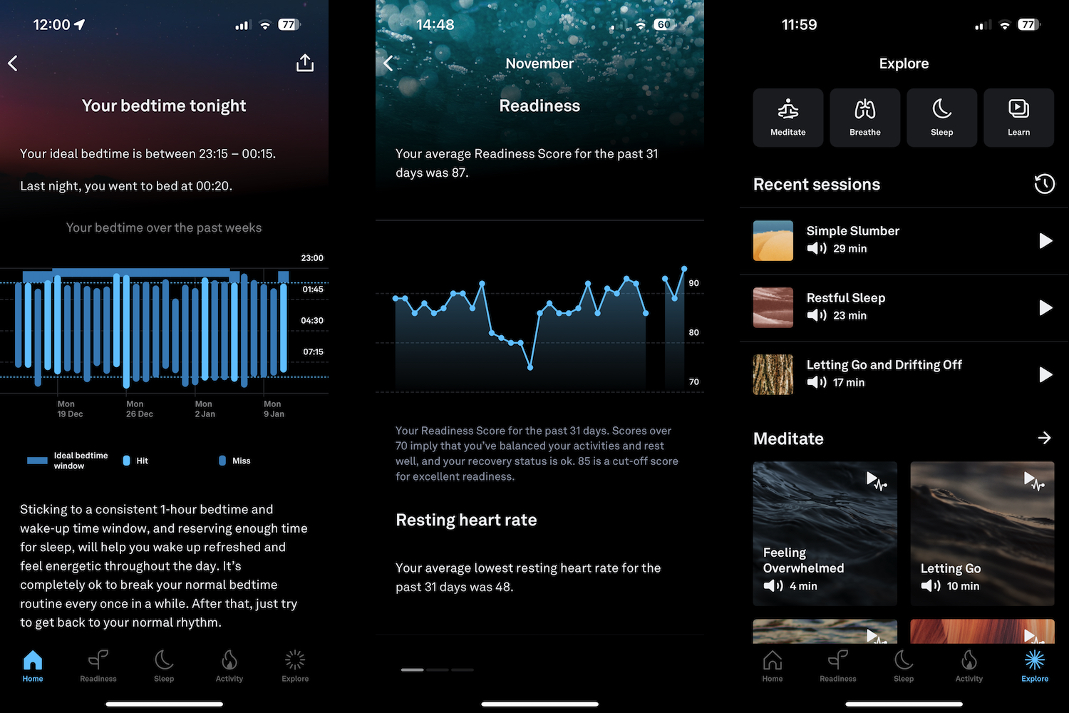
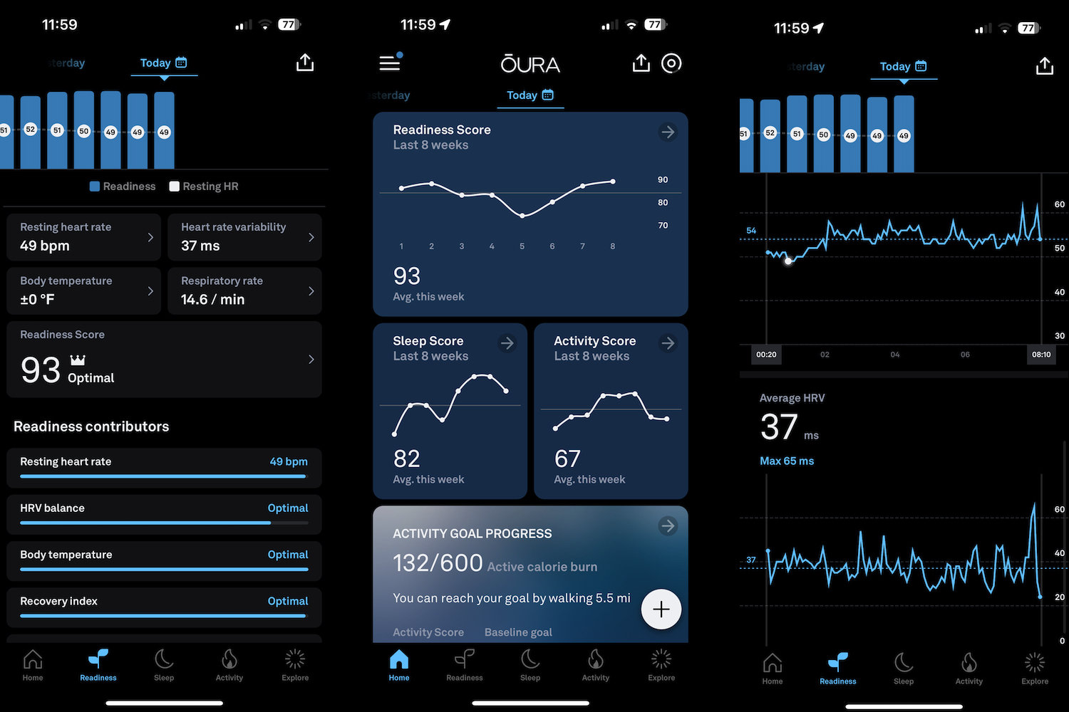
The Oura Ring takes your data and separates it into three main sections: Sleep, Activity, and Readiness. There are different goals to set, ranging from stress, health, and athletic performance to being more productive or energetic. There’s also a Rest Mode for when you want a break, the options of hiding calorie burn or using steps as a daily goal, and plenty of charts to show current and historical information. Finally, under the Explore menu, there are multiple mindfulness exercises and meditational sessions to encourage sleep, learning, and breathing.
The Oura Ring’s app isn’t overly complicated or hugely feature-packed.
It’s all logically laid out, the color scheme is easy on the eyes, nothing is particularly complicated to find, and it’s always obvious how you slept and how your body is prepared for the day ahead. Your key stats are presented using a simple 1-to-100 scale, so you don’t have anything new to learn. You can track workouts through the app, but only walking, running, and cycling, either indoors or out. The Oura Ring’s app isn’t overly complicated or hugely feature-packed, but what it does feature is expertly designed and presented, making it suitable for everyone.
Oura doesn’t push you to meet goals, and instead gives all the information needed to make a decision yourself. However, it does suggest bedtimes and tells you if you should get up and move around a bit. Depending on your goal, the app tells you which metrics to focus on, and how to read the ongoing trends. The app is very good at showing these, helping you understand how your body and well-being are changing. Don’t expect the Oura Ring to give you masses of drive to go out and run a marathon — it’s not really about that. It puts the focus on you and your well-being and lets you make decisions based on them. I really like this aspect.
Whoop’s app pushes you to your limit
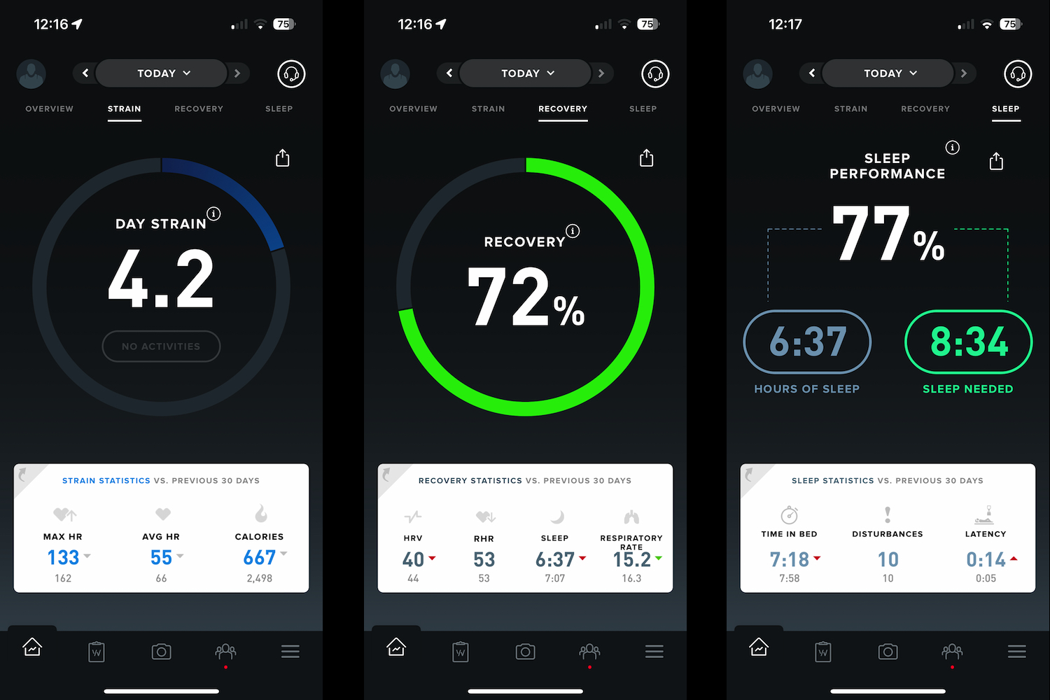
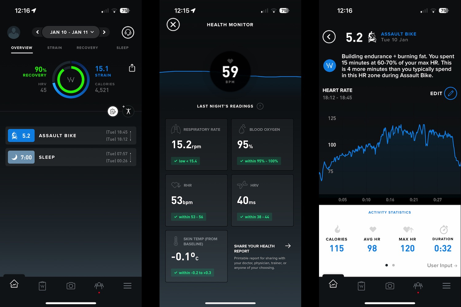
The Whoop 4.0’s app is very different from the Oura Ring’s app. While the Oura Ring is more about well-being, the Whoop 4.0 is more about activity and fitness, and it pushes you more than the Oura. If fitness gains are your goal, then the Whoop 4.0 is definitely going to suit you. Apart from the wealth of exercise modes to track, it does this by putting emphasis on a metric it calls Strain.
Strain is its gauge of how much you need to push yourself to meet a daily goal, and it’s balanced by Recovery, which is worked out when the wristband tracks your sleep. The app shows Strain and Recovery on the main page, with sleep and activity data underneath. You can dig into each one individually, but compared to Oura’s app, there is a lot of tapping, swiping, and exploring to be done. It’s not as logically laid out, and while there are masses of data inside, you really have to explore to find it all.
The Whoop 4.0 is more about activity and fitness, and it pushes you more than the Oura.
It’s simple to see how much Strain the app recommends, but it’s less clear what you’d need to do in order to meet the Strain goal. It takes time to learn how much Strain you can amass by doing certain activities. While Strain is the key daily metric, you can select long-term goals, such as being healthier or getting fitter. The mindfulness features found in Oura’s app are missing from the Whoop app, where the emphasis is on community, teams, and putting time into setting the right goals for you.
Use the Whoop for more than a month, and you get an in-depth report on your stats, which is very informative — data-hounds will love the chance to save it as a PDF and print it out. Oura sends a monthly report, but it’s friendlier and less graph-heavy than the Whoop app — again showing how much more performance-orientated the Whoop is. The Whoop app is slower than the Oura ring, as it performs a lot of its data processing in the cloud. It has also been less reliable, and often prompts me to open the app so it can “catch up.”
How much will you pay? It’s complicated

It’s not just a case of paying a single price and living happily ever after with your Whoop or Oura Ring, as both have a subscription cost you need to pay to continue to see and benefit from your data. The Oura Ring’s cost is the easiest to understand. The ring starts at $300, depending on the style and finish you choose, and it comes with a single month’s “membership” included. After that, it costs $6 per month. If you decide not to pay, all you see is a Sleep, Readiness, and Activity score, plus some of the basic Explore content. It works, but only just.
You don’t buy the Whoop 4.0, you “join” it. The hardware is free unless you choose a fancy strap, which can cost up to $100 upfront, then you opt to pay for access to the app monthly (with a 12-month contract), annually, or for two years. Whoop dropped some of its prices at the beginning of 2023, to make it more attractive to sign up for extended periods.
The monthly cost remains the same at $30, and you must commit to 12 months, but the upfront annual membership cost has fallen from $299 to $239, while a two-year membership has dropped from $480 to $399. You can save money by committing for a longer time period and paying one lump sum. If you stop paying, you no longer have access to the app, and the hardware becomes useless.
For two years, the Oura Ring will cost $438, assuming you choose the cheapest ring, making it a little more expensive than the Whoop 4.0 if you paid upfront for two years. Pay monthly for the Whoop 4.0 for the same amount of time, and it’ll cost a massive $720. If you’re going to buy the Whoop 4.0, it’s much cheaper to commit to using it for a longer period of time.
Which one will I keep using?

I don’t want to wear both the Oura Ring and the Whoop 4.0 all the time, so which one will I choose? It’s a simple decision for me, and it’s the Oura Ring. It’s more convenient to wear, it looks great, the data suits me, I don’t find it irritatingly motivational, the app is fast and well-presented, and it’s cheaper to use long-term than the Whoop 4.0. The battery lasts longer, and the charging method is simpler too.
However, if I was really into fitness and had goals that revolved around increasing it and improving my performance, the Oura Ring would not suit me. It’s where the Whoop 4.0 comes in, as everything from the band and app design to the metrics used are more focused on activity. However, the cost of ownership is very high for what you get, and runners or cyclists may find just as much (if not more) benefit from a Garmin or Polar wearable.
The Oura Ring and Whoop 4.0 are very similar products hardware-wise, but target quite different people. Before deciding which one is right for you, establish what you hope to get from wearing a health and fitness tracker over the next two years. If you aren’t absolutely sure about your goals, or even wondering if you’ll still be wearing it in two years’ time, then consider a simple fitness tracker or smartwatch that does not have a subscription attached to it before jumping into one of these.
