Smartphone design has been slowly but surely moving towards the point where everything but the screen melts away.
Bezels are fast becoming an endangered species as manufacturers try to find ways to shift elements from the front face of our phones. Navigation buttons have crept onto the screen, the fingerprint sensor has moved around the back, and speakers have slipped onto the bottom edge or been shrunk down.
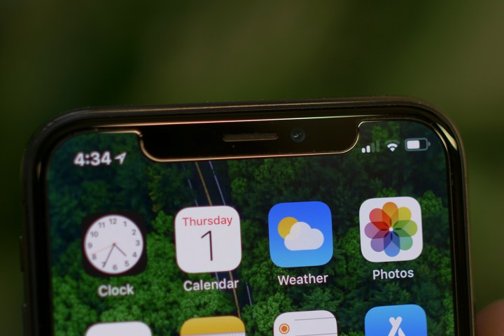
A handful of hurdles remain for any phone maker seeking bezel-less perfection: Chief among them, the front-facing camera, or cameras. Most manufacturers have followed Samsung’s lead and shaved the bezels down as far as they can, but when Apple finally overhauled its iPhone design with the iPhone X, the company chose to create a distinctive notch that cut into a portion at the top of the display.
The initial reaction to the iPhone X’s notch was disbelief and derision. How could Apple’s designers compromise like this? Why not just square off the screen and have a small top bezel? But it soon became clear that the notch was a necessary evil that allowed Apple to ditch the home button and fingerprint sensor, and welcome in face-unlocking technology with depth sensing and the ability to work in low light. Though, we must admit that we do still miss the fingerprint sensor sometimes.
Cloning the notch
Living with the iPhone X, the notch is something you get used to very quickly. It also gives the iPhone X a distinctive look that differentiates it, but it still feels more like an inelegant solution to accommodate Face ID than an iconic design decision. If you doubt that it’s a compromise, then consider this – would Apple have included a notch at all if it could have had the same functionality with an all-screen front?
As we descended on Barcelona for MWC 2018 it quickly became clear that Apple’s notch had caught the eye of other manufacturers. Before we go on – yes, we’re aware that Apple didn’t invent the notch. The first device in pursuit of an all-screen front that adopted a notch was the Essential Phone, but it was shrunk down as small as possible to accommodate the front-facing camera. The iPhone X looks very different.
“Some people will say it’s copying Apple, but we cannot get away from what users want”
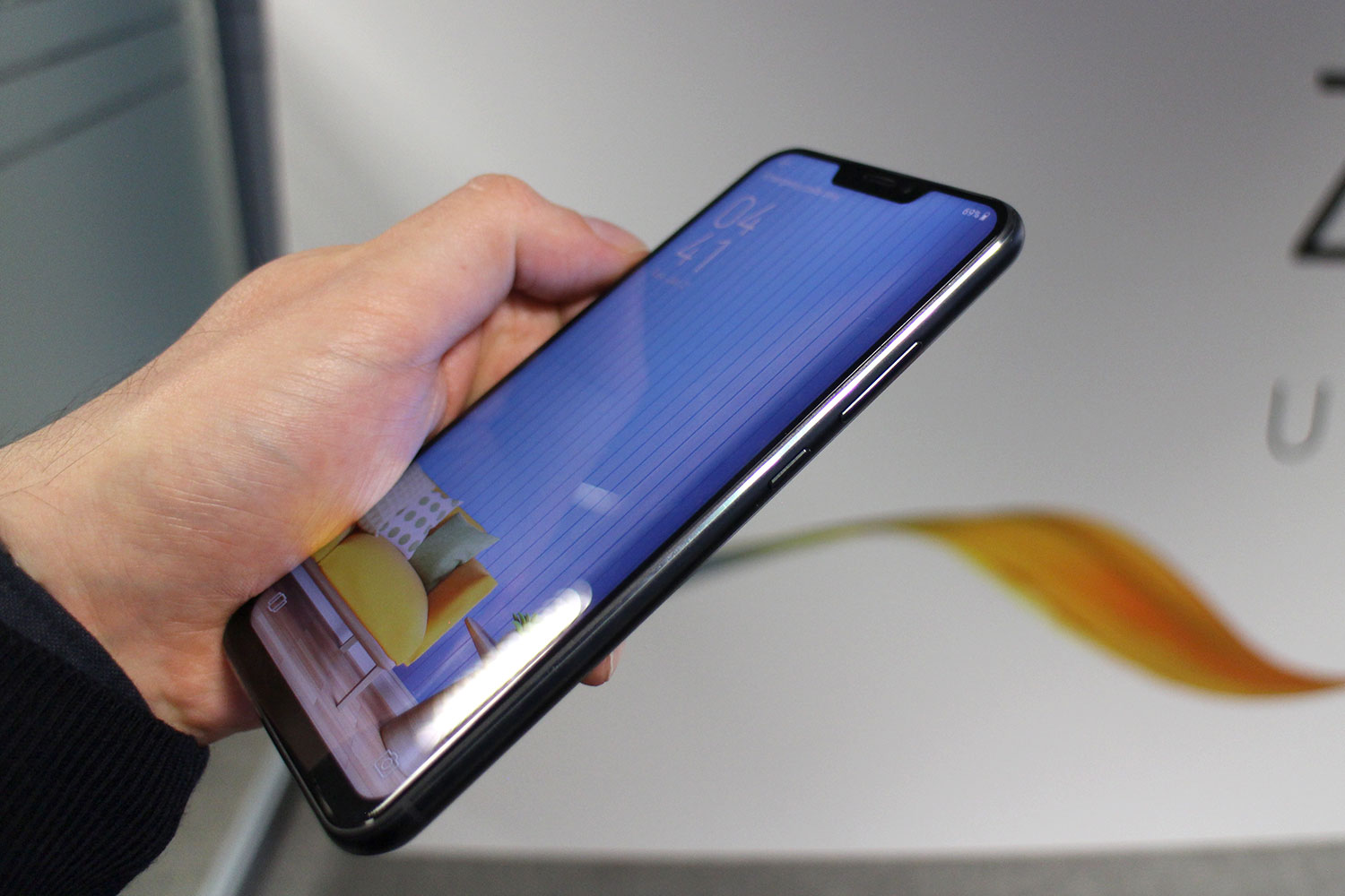
We were not surprised to see some cash-in clones on the show floor from little-known manufacturers like Leagoo, Noa, Vinci, and Ulephone. But when Asus unveiled the Zenfone 5, it became clear that the notch was going to climb higher up the Android food chain. When we went hands-on with the Asus Zenfone 5, we saw some promise, but found the idea that the design is anything other than a cynical copy of the iPhone X hard to swallow.
“Some people will say it’s copying Apple, but we cannot get away from what users want,” Marcel Campos, head of global marketing operations at Asus, suggested in a pre-briefing. “You have to follow the trends.”
Do you? Is the notch a trend? Or are manufacturers like Asus turning it into trend? Asus boasted that its notch is 26 percent smaller, but since it houses completely different technology, we’re struggling to see how that’s something to brag about. The truth is that the average person spotting you taking an Asus Zenfone 5 out of your pocket is going to assume it’s an iPhone X and that’s deliberate.
The Zenfone 5 has a fingerprint sensor on the back and retains a bezel at the bottom of the screen. We don’t think there’s a practical reason it has to have a notch at all, much less one so similar to Apple’s. What bothers us even more is that the notch is not widely considered a gorgeous design feature, so why would you copy it? The curved edges of the display on something like the Nokia 8, though reminiscent of Samsung’s recent releases, also improve the look of the phone and it doesn’t lose its identity. But the Zenfone 5 looks like an impersonator.
Sadly, the notches didn’t end there. Next up, we saw leaks of the forthcoming Huawei P20 range. Assuming they’re accurate, the notch is smaller, and clearly different from the iPhone X, but given that there’s a big bezel at the bottom and a fingerprint sensor, why does it need a notch at all?
Following that, there was news of a possible LG G7 on the show floor, with footage and photos from Israeli site Ynet. It’s important to note that it may not be the final handset design, in fact, it may not be genuine at all. What can’t be disputed is that it has an iPhone X style notch, albeit a smaller one.
We know LG’s last couple of G series phones haven’t sold in the numbers they deserved to, but we’d hate to see it diverge from the innovative path it has followed over the last few years. The G6 ushered in the 18:9 aspect ratio that has become standard, even in budget phones this year, and though the V30 has some issues, we don’t think the design of the display with minimal bezels top and bottom is one of them.
We can live with the notch, as long as we can see the point of it, but it’s always going to be a polarizing design choice that some people just don’t like. A notch that serves no clear purpose is entirely different. It’s not as though the notch is the only way to tackle the problem. Samsung has shaved the bezels right down and the Galaxy S9 looks gorgeous. Xiaomi shifted the camera to a single bottom bezel with its Mi Mix phones, and the Vivo Apex concept phone we saw at MWC sports a pop-up front-facing camera. We don’t think those solutions are ideal, but neither is the notch, and at least Xiaomi and Vivo are trying something different.
If a manufacturer can work out a way of having a camera under the screen, then we’re sure the notch will fade away. In the meantime, we’d like to see some fresh ideas about how to cope with it, and some individual, distinctive styles. What we don’t want is a flood of phones that look obviously inspired by an iPhone X notch that’s actually one of the low points of the device. We understand the drive to copy great design ideas, but the notch has no place on that list.


