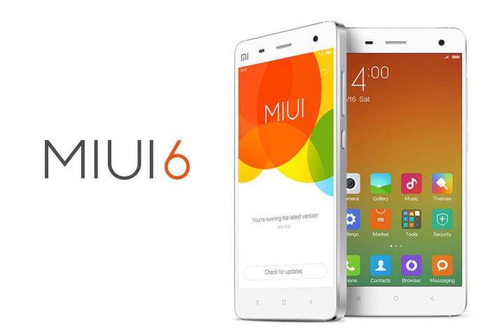
Although Xiaomi has been accused of copying Apple’s smartphone and OS design in the past, tech pundits everywhere are expressing astonishment at just how closely MIUI 6 resembles iOS 7. Here are just a few examples:
Lock and home screens
Right from the get go, it’s pretty obvious where Xiaomi drew its inspiration from for MIUI 6. Unlike most stock Android smartphones, Xiaomi’s lock screen asks users to swipe to unlock in the bottom center of the screen just like on iOS 7. It even has the same white text inviting you to do so.

Related: Move over Apple, Xiaomi is now the second largest smartphone vendor in China
Then, once you’ve unlocked the phone, you’re confronted with a home screen that’s populated with brightly colored flat UI app icons, as seen on iOS 7. There’s noticeably no app drawer in the bottom row of app icons and all your apps range across the various home screens. Xiaomi also added the same ellipsis, showing you how many screens you have to swipe through.
Notifications shade, pop ups, and superscript
As soon as you get your first notification, you’ll see a familiar black notification box pop up along the top of your Xiaomi Mi4. Just like on iOS 7, you can then tap the notification to access the app and respond. If you ignore it, the notification will appear as a number in a little red bubble above the app icon. Sound familiar, iOS users?

To manage your notifications, you pull down the notification shade, which unsurprisingly, features the same translucent gray tone as seen on iOS 7. The layered look of MIUI 6 continues in other aspects of the skin, mimicking iOS 7 is the dialer, calculator, and several other apps.
Calendar and calculator app
Several of Xiaomi’s standard apps that come preinstalled on the Mi4 happen to look an awful lot like those Apple embeds in iOS 7, too. The calendar and calculator app look almost identical to those found on the iPhone. Even the color palette is the same: orange and white for the calculator and gray and brick red for the calendar app.

The compass app looks pretty similar, too, as does the dialer and settings menu. Really, there’s very little in MIUI 6 that doesn’t borrow from Apple’s design aesthetic. However, underneath it all, Xiaomi’s smartphones are still Android and offer some customizability, such as different themes, color schemes, and so on.


