The Marvel Cinematic Universe got a little bigger with the debut of Ms. Marvel, the Disney+ series that introduced many fans to teenage hero Kamala Khan. Kamala, played by Iman Vellani, discovers she’s able to create and wield “hard light” — a revelation that sends her on a journey across time, space, and dimensions far from her New Jersey home.
In order to fully realize Kamala’s much-anticipated live-action debut, Marvel and series creator Bisha K. Ali worked with several visual effects studios, including Digital Domain, the Oscar-winning studio that helped bring Thanos to life in Avengers: Infinity War. In order to find out more about the VFX behind Ms. Marvel and its hero’s amazing powers, Digital Trends spoke to Aladino Debert, Digital Domain’s VFX supervisor on the series.
Digital Trends: When you first joined the project, what was the research period like? How did you familiarize yourself with the aspects of the character that were going to be brought to the series?
Aladino Debert: I got involved around October 2020. The project was already moving along, and the first thing I did was to dive into the comics. But even before I got the first call, I knew they were going to reinterpret her powers to make sure she didn’t look like too much like [The Incredibles‘] Elastigirl or [the Fantastic Four’s] Reed Richards. She can polymorph in the comic books like that, but they wanted to bring her powers into the MCU. Her powers are sort of magic- and energy-based, and there’s a lot of that in the MCU.
So early on, we were part of the style frame and concept art process. We were working on a lot of different things: The veil, some of [series character] Kamran’s powers, but not so much Kamala, because she was a bit more established by the time we got involved. Once we got in, though, I was excited by the character’s background. I love that she’s a Muslim-American and a teenager from Jersey. The whole thing felt cool and very unique. I’m really happy the show ended up having the kind of social impact that it seems to be having.
What was the conversation like while determining the best way to present her powers in the show?
Well, the only thing we initially had concept art for was her body armor — her eight-foot, “embiggened” self. There was no exploration of what her other powers would look like at that point — the platforms she uses to jump around, the shields she uses, and so on. So it was a lot of experimentation. It wasn’t just done by us. Method [Studios] was the other big studio exploring this, and we were all trying to get as many options as possible to the creators on the show. What does it look like when she’s running? What about when she puts up a shield? We called it “hard light,” but what is it?
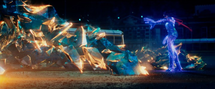
We knew it had to feel energetic in some way, and that it had to feel very physical, because she needs to step on it and throw it. Once we knew it would have a crystalline structure, we looked a lot at ice and the way it breaks. We also looked at the formation of crystals. Marvel didn’t want something that looked like a typical crystal, though. That’s why there were a lot of elements composited on top: To make the light leak out of it and have little filaments of Noor — the energy she draws from — inside of it.
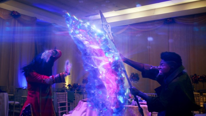
But like any effect, there’s never a formula that fits all circumstances, right? We had to explore how the shields and the platforms first grow, too. What’s the effect like there? Even if it happens relatively quickly, over just a handful of frames, we wanted to make sure it felt as physical as possible.
Because it can’t just appear out of the nowhere …
Exactly. We didn’t want to just use a flare, and then suddenly there it is. That would be the easy way out. So we did a lot of experimentation, simulating the growth of this crystalline hard light. There’s no real-life counterpart you can base all of it on, but we did look at time-lapse growth of salt crystals at one point, and stuff like that. But it was never like, “OK, that’s the look. Copy that.” You take references and influences from nature to the degree that you can, and then you have to put your own little sauce on it.
The train station scenes are amazing with all of the crowds and other elements. Your studio’s VFX reel makes it clear that there were more digital elements in that scene than I realized. What went into creating those scenes?
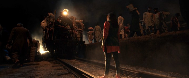
There’s a lot going on there, yeah. We knew early on that sequence was going to be something that was going to require a lot of visual effects, for obvious reasons. We knew they were going to have access to a train yard in Thailand and a handful of extras, maybe 100 or 200, so we did a lot of research and looked at footage and photographs from [historic mass migration event] Partition. We realized we were going to need thousands of extras, and that the shots were created in such a way that a lot would have to be done with CG, too.
I also wanted to make sure we were respectful of history, so we wanted to be as faithful as possible to the look of it. But it was extremely challenging, because they had a lot of practical effects on set, which is a double-edged sword.
All of that smoke and atmosphere can be tough to work with, right?
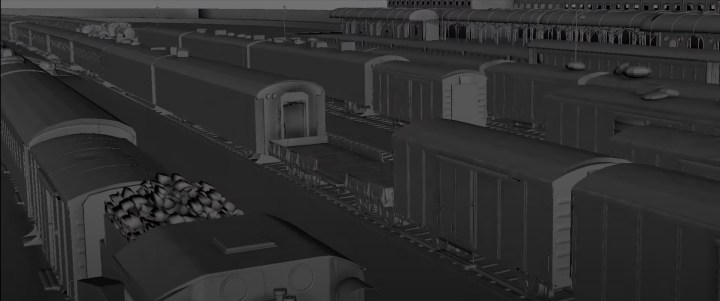
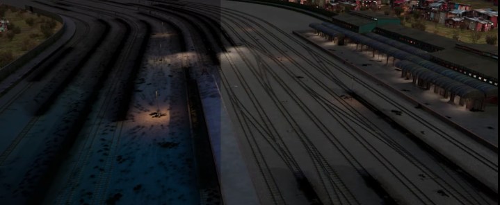
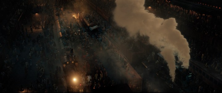
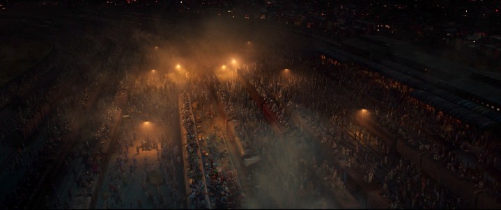
It is. We had to remove nearly all of the practical effects in the original shots and do some very detailed rotoscoping of certain areas, because sometimes we had steam plumes going through the frame where we need to add all these elements. In the end, we essentially recreated the entire scene in CG. We created the whole train yard — 16 different train tracks and a train station based on the British India infrastructure of the time, as well as the town behind it. And then we animated all of that.
On set, we scanned a few dozen extras so we knew their basic attire, and then we ran the crowd simulation through [3D animation software] Houdini. We had maybe 10,000 people in the scene in the end. And then we had to rotoscope around the live-action performances, too. I’m happy it’s been received well, because it was an enormous amount of work. It’s one of those scenes that, in fairness, if no one thinks we did anything, that’s good.
Your team did a lot of work on the final episode, which was filled with big visual effects elements. What were some of the challenges you faced in that episode?
Well, there was the “elephant toothpaste” sequence — that giant foam explosion. Foam is very tricky to simulate because it’s a solid that moves like a fluid. We probably spent more time on those shots than almost anything else, even though it’s just a 12-second sequence. We had a lot of fun looking at YouTube references for it, because it’s a chemical reaction that has this explosive growth and volume. I wouldn’t say it was “fun” for the artist, but it was cool to do it.
What about Kamran’s powers? They play a big role in the episode.
We knew early on that Kamala’s frenemy, Kamran, was going to have powers that were based on the same source as hers. They’re Noor-based powers, but the difference was that Kamala can control them and Kamran can’t. That gave us a place to start, because they have to feel similar and yet different enough that they can be in the same shot and you’re not going to mistake one for the other.
So the simplest thing to use was color. We knew Kamala’s powers were a bluish magenta, with a little bit of gold, because that corresponds to her suit. Originally, Kamran’s powers were going to be greenish, but if you look at the color wheel, it doesn’t quite work. It looked a lot better when we went with a more cyan gold. When you put those two powers together in a frame, they felt separate enough that you have a clear distinction. And we knew we had shots in which she’s walking in the midst of all the tendrils of his power and stuff.
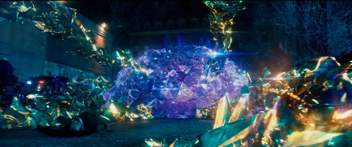
But for the look itself, we started with the look of Kamala’s shields and applied it to a tendril. When we did that, the tendrils looked softish and round, and weren’t coming across as threatening as they needed to be. The creatives and showrunner kept telling us it needs to feel scary and out of control and chaotic. So what we ended up doing was to make all the shards feel like a like a cactus made out of crystals.
They looked like the crystals you grow in science experiments.
Exactly — like an accelerated time-lapse of crystals growing. There was an animation component to it, too, because we wanted it to be staccato. There’s this shock wave that emanates from him, and every time it pulses, the crystals grow in chunks. … We spent a fair amount of time just experimenting on Kamran’s powers to see what felt right.

The scenes of Kamala running through the air on her pedestals were such a big part of the season. What went into creating that effect?
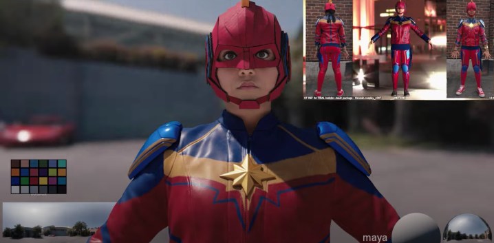
For those [scenes] and some of the other scenes of her using her power, we created three different digi-doubles for Kamala. [Note: “Digi-doubles” are direct, digital recreations of human actors and their characters.] We needed three because her attire changes dramatically from the beginning of the season to the end. The first one we did was for that cute, almost parkour-like training scene.
The scene on the roof early in the season?
Yeah. She’s in that suit with the rooster helmet. One thing that’s important to understand is, once you have a faithful digi-double, that opens all kinds of creative possibilities. If [the digi-double] looks realistic enough, you don’t have to always do what you planned initially on the shoot or even story wise.
They shot some things for reference on a big stage with a green screen at one point, but for safety reasons, she had a harness and wires. That’s good if you don’t want to break your neck, but at the same time, it makes your movements a bit floaty. You don’t run normally. So early on, we were like, “This doesn’t feel right. Her movement doesn’t have the right weight and momentum and inertia.” So we relied on the digi-double more in those situations.
Was that final scene of her running through the city entirely digital?
It was! That scene was inspired by Spider-Man swinging through the city, and we ended up doing all the animation by hand. The only scene with her running like that where we used mo-cap was that one on the roof early in the season. It wasn’t just the way she moved that made digi-double animation the best option, either.
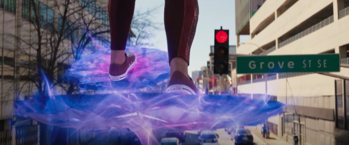
The platforms she creates are solid, but they are not 100% immovable in place. They have some give to them. The animators had to play with weight transfer and things like that to get it just right. You don’t really think about it because it looks natural, but if you go frame by frame, you can see her feet bounce in a particular way, and her body position change depending on on what kind of platform she’s running on. And then there’s that cute moment when she stops at a stoplight. We had a lot of fun with that one. That tapping foot was actually storyboarded from the start. But yeah, it was almost all CG, those sequences.
Is there a scene you’re particularly proud of from the season?
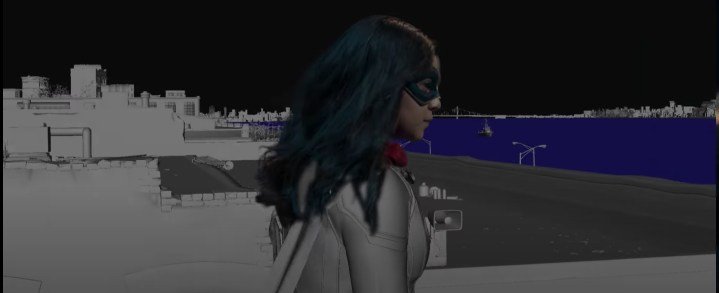
That final shot when she’s sitting on a lamppost overlooking Manhattan. It’s a cover from the comic book, and it’s an iconic visual. We had to create Manhattan and the Hudson River and the surrounding New Jersey area around her, because there’s no place in Jersey where you can see all of that.
What wasn’t planned originally, though, but goes back to the freedom that a good digi-double gives you, is that they shot her on set, sitting on a lamppost with the wires on. We planned to paint the wires out, but because her suit is sort of leathery, the wires created an enormous amount of weird wrinkles. It’s such an iconic shot, and it’s like 40 seconds long, so we were like, “Well, we have a really good digi-double… Why don’t we just replace her from the neck down, because we can.”

It’s a great shot!
It is! We ended up just using her face and hair, and even the hair was a bit of a question mark, since we had digital hair already created for her digi-double. But it’s a long shot, and you get very close to her face, so the scrutiny the hair would get wasn’t worth doing it digitally. She also has this cool silk scarf at that point, so we ended up using simulated hair to make the scarf behave naturally, then erased the digital hair and put her real face and hair in with the digital scarf and body.
We did the same thing in the next shot when she jumps off the lamppost and steps off-screen on her platforms. They shot something with a harness, but she was too floaty, and it didn’t quite work with the timing of the shot they wanted. So again, we were like, “We can just do the whole thing digitally.” So that entire shot is digital, too.
This feels like another situation where you know you did well when people don’t realize you did anything at all.
Absolutely. That always makes me happy.
Season 1 of Ms. Marvel is available on Disney+ now.


