“An elegant mix of physical and touch controls that adapt to the task at hand.”
- Great design and build quality
- Touchscreen adapts to different apps
- Ergonomic and fun to use
- Steep learning curve
Editing photos and videos with a keyboard and mouse feels like work, but toss in a few dials and buttons, and it feels more like a game. The original Loupedeck is a “keyboard” made for Adobe Lightroom, with dedicated dials and buttons for almost every adjustment in the RAW photo editor. But, as the second generation Loupedeck+ added support for other creative apps, including video editing programs, the pre-labeled Lightroom controls didn’t translate perfectly.
The new Loupedeck Creative Tool, or Loupedeck CT, solves this issue. It is an editing console designed to move seamlessly between multiple programs, from photo editing to video editing to audio work and back again. Because nearly half the controls have built-in touchscreens, the controls can be electronically labeled for the program that’s currently in use.
Getting started
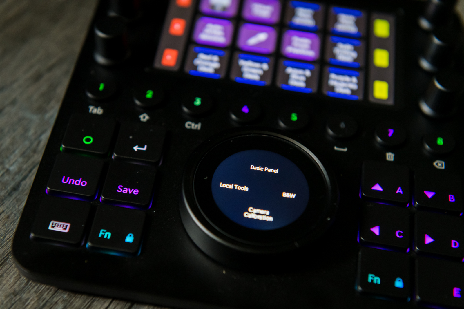
To fit access more to functions than there are physical buttons and dials, the CT uses “workspaces.” Workspaces toggle between different sets of functions within a program. Lightroom, for example, has one workspace sorting and rating photos, another for basic adjustments such as exposure and white balance, and another for color.

The CT tailors to both photo and video editors. The higher price — $550 — and a slightly higher learning curve make it a better fit for the serious enthusiast and professional.
The Loupedeck CT plugs in via USB like an external drive — you will be scolded by your computer for yanking out the cord without ejecting it from the OS first. Compatible with both Windows and MacOS, the CT can be customized using the Loupedeck software. While the CT has preset workspaces to get you up and running, you’ll like want to customize the dials and buttons for your specific workflow.
We tested the CT with Adobe Lightroom Classic and Photoshop. Currently, the CT is also compatible with many Adobe apps, including Camera RAW, Premiere Pro, After Effects, and Audition; Apple Final Cut Pro X; Skylum Aurora HDR; and beta support for Capture One. It also supports music production app Ableton Live and livestreaming program Streamlabs.
The Loupedeck CT is most notably not compatible with Adobe Lightroom CC, Skylum Luminar, and On1 Photo RAW.
The CT also a few general shortcuts outside of app-specific controls, like the ability to adjust computer volume and screen brightness, and quick access to system preferences and the Loupedeck software. The touchscreen dial also turns into an analog clock when not in use.
High-end Design
The Loupedeck CT impresses right out of the box. The editing console feels sturdy and well made, thanks to an aluminum casing. The cord is coated in the braided nylon-like material that tends to not break open as easily as standard cables. The CT feels like a wonderfully over-engineered video game controller.
While the earlier Loupedecks were the size and shape of a keyboard, the Loupedeck CT is closer to the size of a mousepad. The smaller footprint and almost square shape means you can operate with a single hand, leaving your other hand free to use the mouse, keyboard, or stylus.
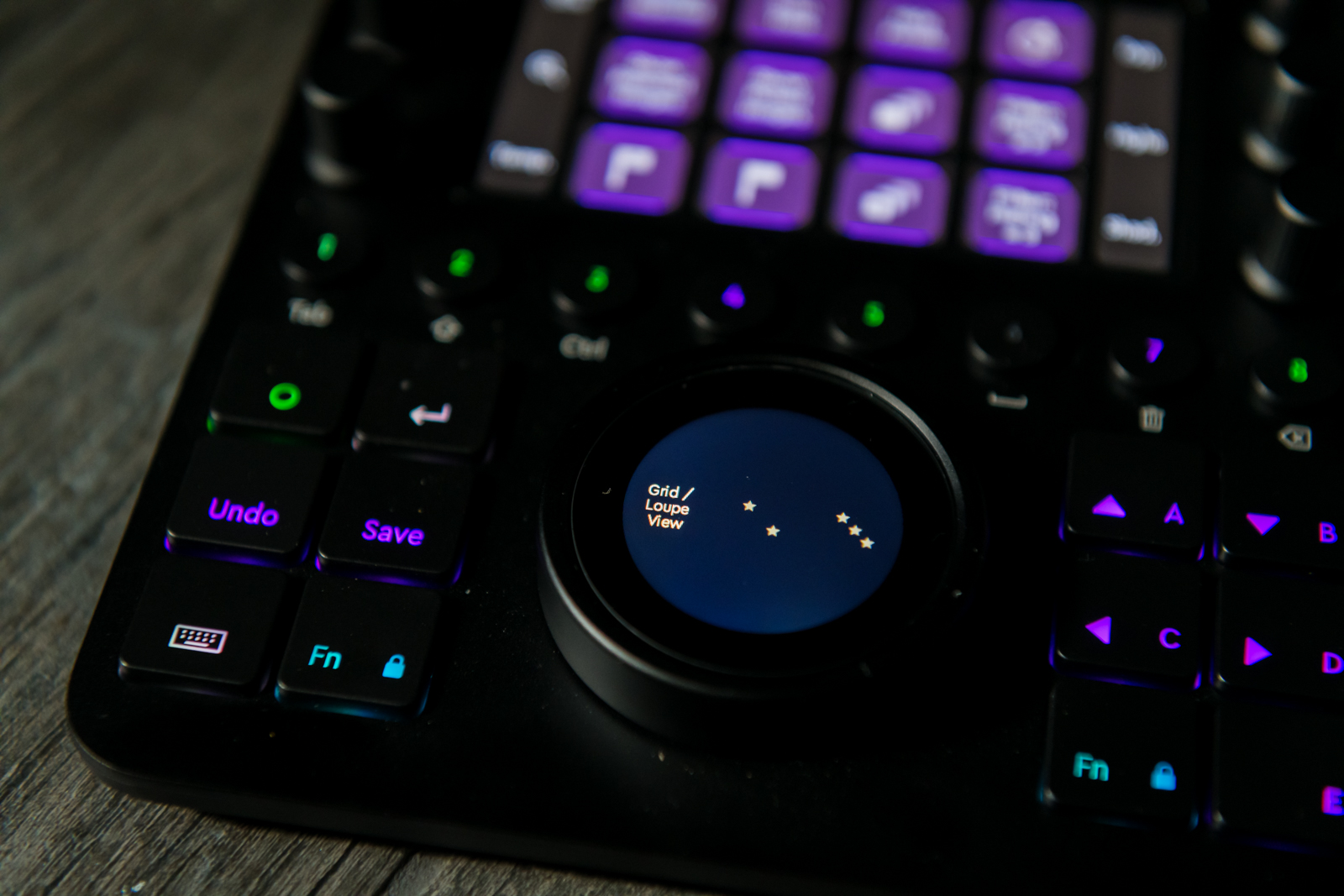
The top half of the CT houses 12 mini touchscreen buttons. The labels change to indicate whichever function is active in the current mode, workspace, or custom setting. As they are touch-sensitive, the buttons use haptic feedback to help make up for the lack of tactile feedback that physical buttons would offer.
Flanking the rows of buttons are two miniscreens that label the function of six small dials, three on each side. The ability to label electronically is a major advantage for a tool that’s designed to work in multiple programs and workspaces, allowing you to easily see what each dial is currently set to adjust. Each dial also doubles as a button. Pushing instead of turning the exposure dial in one of the Lightroom workspaces, for example, returns the exposure slider back to zero.
A row of eight buttons splits the CT in half. These numbered buttons are color-coded with a backlight. Green means the button switches to a different workspace, purple means the button is set to something else — such as switching the before and after view. The light turns off if the button isn’t assigned a task in the current program.
Underneath that are two sets of six square buttons for basic, frequently used options, including arrow keys, an undo button, a save button, and a function key that modifies the other buttons. Unlike the rest of the CT, these buttons are pre-labeled since they are set by default to options that are nearly universal to every program. These buttons are simple enough, but it is a bit annoying that the up and down keys are next to each other instead of having the up button, well, actually up, and the down button below it.
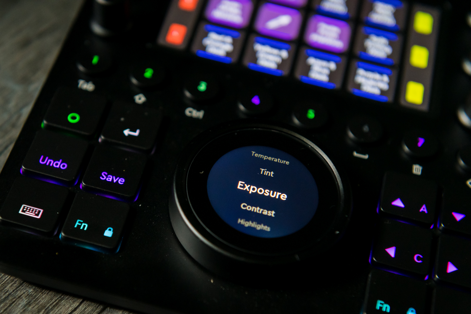
Between those two sets of square buttons is the star of the CT — a large dial with a touchscreen built-in. The touchscreen adjusts what the dial is set to. For example, adjusting the curves in Lightroom, you can use the touchscreen to switch between adjusting the lights and darks, without removing your hand from the dial itself.
The dial houses several different controls. Tapping on the tone curve in Lightroom opens a list of the different options from highlights to shadows to scroll through and select. Swiping right goes back to the previous screen. One swipe moves up or down the list once, instead of a free-wheeled scroll, which is slower, but more precise.
User Experience

The Loupedeck CT makes photo editing feel more like playing a video game than tweaking images with a mouse and keyboard. There’s something that’s just more pleasing about creating a polished photograph with physical controls, rather than a mouse.
The trade-off for the CT’s multi-program flexibility is a steeper learning curve. Learning what does what, as well as the less obvious controls like the fact that the dials double as buttons, took both more time experimenting with and more time in the Loupedeck starter guides than the earlier consoles designed specifically for Lightroom, but of course this a much better approach if you use other applications. The labeled touchscreen buttons and pre-labeled lower buttons help immensely, but there are still the numbered workspaces to remember.
The default workspaces are organized fairly well, but there’s still some hunting to remember which round button goes to what workspace to open which touchscreen controls.

The learning curve will eventually be overcome, and once the CT is customized to your workflow and practiced, the console is a much more ergonomic and intuitive way to edit.
With the ability to keep one hand on the mouse and one hand over the console, the CT has the potential to shave time off the editing process. Using the large dial to adjust the brush size in Photoshop felt much faster than working with a mouse, for example. But it’s likely a difference akin to learning keyboard shortcuts, shaving off seconds over a long period of time, not dramatic differences like cutting editing time in half. And at first, learning the controls will make everything feel slower.
Some controls housed on the CT also felt like the mouse would be the faster option. The arrow buttons feel a little slow to respond to tasks like moving a crop box. And for some local editing tools, the large dial will move the mouse, but, much slower than actually just moving the mouse (or a stylus).
That isn’t to say the CT won’t save time — but that the tactile feel, ergonomics, and more enjoyable editing experience are larger perks than speeding up the editing process. The time saved will depend on your own personal workflow, the custom controls set, and how familiar you are with the CT.
With some customization, though, the CT could easily be integrated into a variety of workflows. Thanks to those touchscreens and the buttons that maintain their functions throughout, moving from Lightroom Classic to Photoshop wasn’t like learning a whole new system.
Loupedeck CT vs. Loupedeck+

The Loupedeck CT comes after the company began expanding the Loupedeck+ beyond just Lightroom — and the concept of using a console for multiple programs shows. The CT is easier to use for Photoshop and other applications because the Loupedeck+ is pre-labeled for Lightroom, without the touchscreen that labels controls based on the application and workspace.
The larger size of the Loupedeck+ is really designed to be used with two hands, much like a keyboard, which makes it more difficult to use a mouse or stylus at the same time.
That’s not to say the CT is better in every respect. Because it’s designed for Lightroom, the Loupedeck+ is easier to jump in right away — so long as Lightroom is all you use. It also doesn’t rely on workspaces and has a dedicated dial for every color in the hue, saturation, and luminance adjustment; on the CT, you have to press a button to switch between different colors.
The Loupedeck+ is also half the price of the CT.
From video editing to video game

Like the company’s earlier consoles, the Loupedeck CT makes editing feel like less work. Perhaps its because every photographer and videographer has an inner child that’s still begging to push the buttons in the elevator. More likely, it’s because the console helps make photo editing physical again, while offering better ergonomics, and in some cases, a slight speed advantage.
One of the trickiest parts of using Loupedeck+ outside of Lightroom is remembering what each of the dozens of controls is assigned to. The built-in touchscreen on the CT helps ease that learning curve some, but it is partially negated by the need to still remember what tool is in what workspace.
The Loupedeck CT is ideal for photo and video editors spending long hours behind a desk and using multiple programs, making work feel more like play. And, once the novelty wears off, it’s still an ergonomic advantage over a keyboard that may save you some valuable time.


