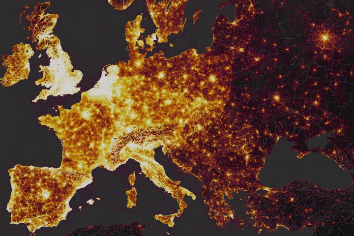
The Global Heatmap incorporates data directly from Strava Metro, a system built to help improve the local infrastructure for runners and cyclists. When users upload their most recent workouts to the Strava platform, the tracking data from their routes is analyzed and compiled. That information is then shared with city planners, who can examine it to get a better idea of how people are traversing their cities. Metro can offer insights into popular routes for instance, as well as places that are being avoided by pedestrians. It can also reveal commute times, the average length of a wait at an intersection, popular origin and destination zones, and much more.
That same information was compiled for use with the Global Heatmap which in turn provides users with insights about how athletes from all over the world are training. The Heatmap tracks data from 31 different activities, including not just running and cycling, but also hiking, skiing, kiteboarding, climbing, and more. Strava says that in addition to daily workout routines, the heatmap also shows extraordinary activities like long-distance swims across the English Channel, hikers trekking along trails in Patagonia, and even mountaineers going to the summit of Everest.

Visually, the Global Heatmap resembles night time images shot from orbit that display how much light urban settings produce. The maps are brighter where more activity is taking place and darker where fewer people are uploading data from their routes. As you would imagine, heavily populated areas with numerous Strava users light up the map with plenty of intensity, while places with few users glow a bit less brightly.
Strava has given users the ability to adjust the color and opacity of the heatmap, while also turning off and on geographical labels and satellite imagery. There is also an option to filter by activities, which comes in handy when you consider that more than a billion different workouts are displayed on the heatmap itself.
So what is the purpose of all of this? Beyond just providing an extremely stylish way to display all of the data Strava is collecting on our workouts, the heatmap can help athletes discover new routes or learn about other activities that are available in their area. If you want to know where the cyclists are hanging out, simply filter for that activity and you’ll soon find out. Likewise running, snow, and water activities, too.
To find out more checkout the Global Heatmap and start discovering the fitness habits of Strava users in your area.

