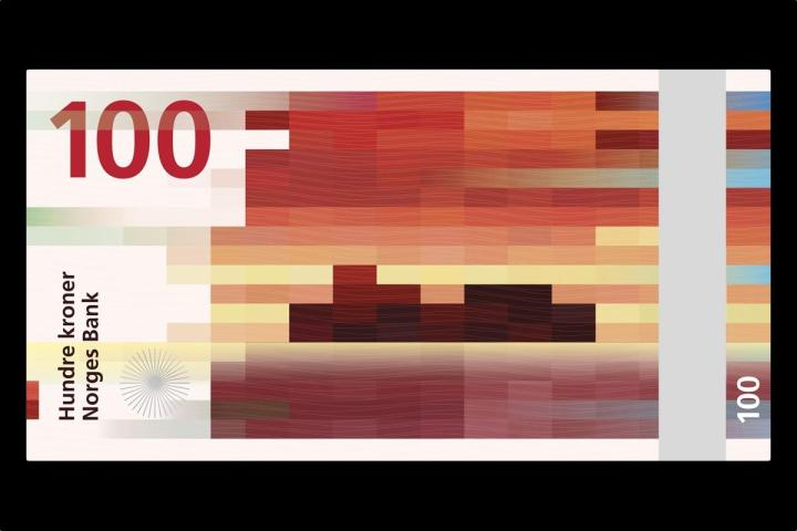
Norges Bank held a design competition earlier this year for new banknotes that will be put into circulation in 2017. “The purpose of the competition was to arrive at a proposal that can be the artistic basic for the design of the new banknote series and communicate the theme, ‘The Sea,’ in an appropriate manner,” the bank writes. Eight finalists made the shortlist, and Norges Bank decided to choose two winning designs, including one that “give the notes both a traditional and modern expression.”
The front (obverse) of the note will feature a design by Metric System and Terje Tønnessen, called “Norwegian Living Space,” which Norges Bank describes the drawings as “finely detailed, but communicate a rather idyllic and secure image of Norway,” and communicates “various aspects of the sea and its importance for Norway’s business sector and economic prosperity.” Although another design, “Ripple Effects” by Enzo Finger, was more popular with judges, Norges Bank says it chose Metric/Tønnessen’s because it can “incorporate necessary security elements.”

Related: Apple hires renowned designer Marc Newson to work with Jony Ive

The back (reverse) is where things get radical. A nod to our digital age, Norges Bank chose a pixel motif design (“Beauty of Boundaries“) by Snøhetta, a Norwegian/American architectural firm known for designing the National September 11 Memorial Museum Pavilion and the extension to the San Francisco Museum of Modern Art. “The alternative form of expression of the pixel motifs supports each sub-theme,” Norges Bank writes. “In this way, there is a connection between the obverse and reverse faces and the story that the banknotes tell. The wave pattern that repeats itself in the pixel motifs provides an appropriate allusion to the main theme ‘The Sea.’”
The coloring of each denomination blends the two designs together, which will also help the visually impaired better identify the notes. The final designs will look a bit different, as “motifs and designs need to be worked on to enable security elements intended for the public and machine-readable security elements to be designed and incorporated into the notes.”
The beautiful blend of traditional and modern imagery demonstrates what happens when you entrust the design process to creative experts. Norway’s future banknotes celebrate the modern era without forgetting the past. Still, as progressive as the designs are, we doubt they’ll usurp the U.S. dollar’s prominence anytime soon.
(Images via Norges Bank, Snøhetta)


