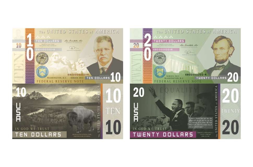
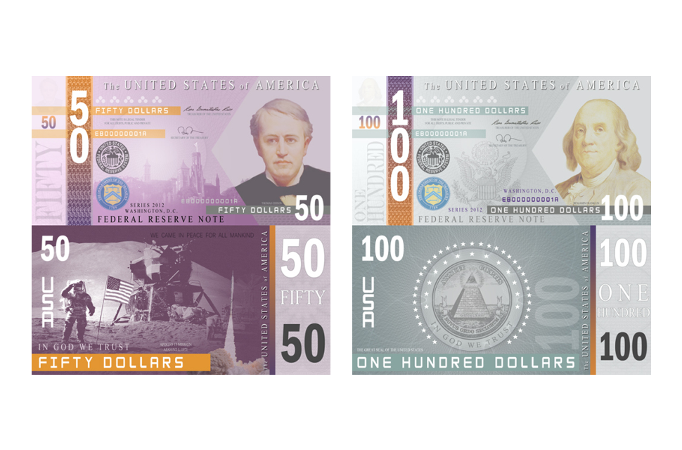
In a world so caught up with credit cards and mobile payments, we often forget that the U.S. currency was once – and still is – printed on conventional cotton paper. The banknotes have essentially been the law of the land since the United States transitioned from coin in the mid-1800s, undergoing a slew of slight alterations over the years in an effort to prevent counterfeiting. However, although facets such as the engravings and fonts have changed, the common greenback hasn’t deviated much from past iterations. Sure, the bills are still iconic, but they’re also some of the most banal in existence. Are dead presidents and uniform green truly the best way to reflect our nation’s history?
Below are a few reimagined designs of the U.S. dollar (none have been recognized by the U.S. Treasury, so don’t expect to see them in circulation; but, how we wish), all of which try to encapsulate our evolving nation in one form or another (for better or worse). Eat your heart out, Norway.
Travis Purrington
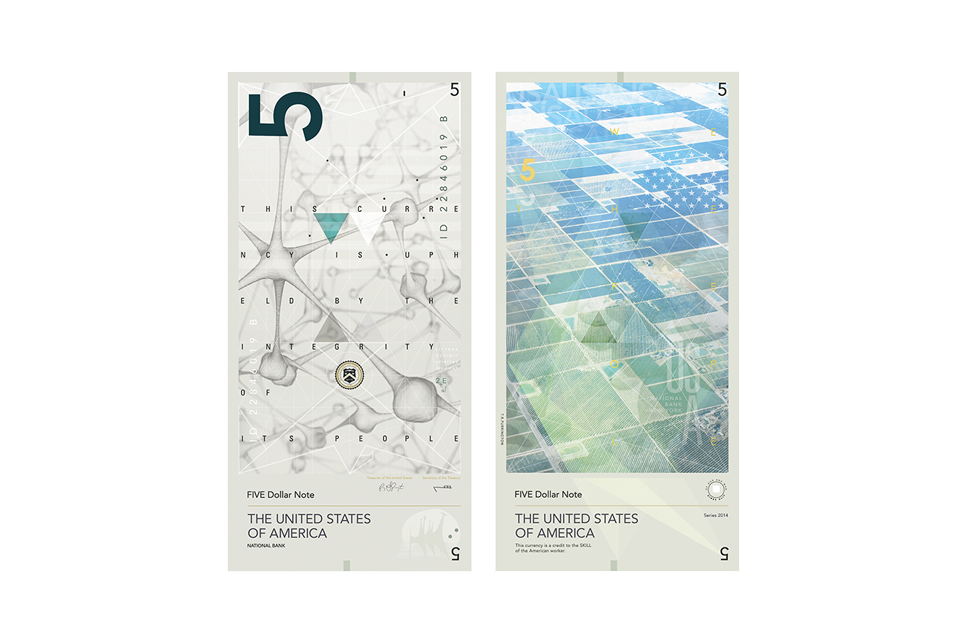
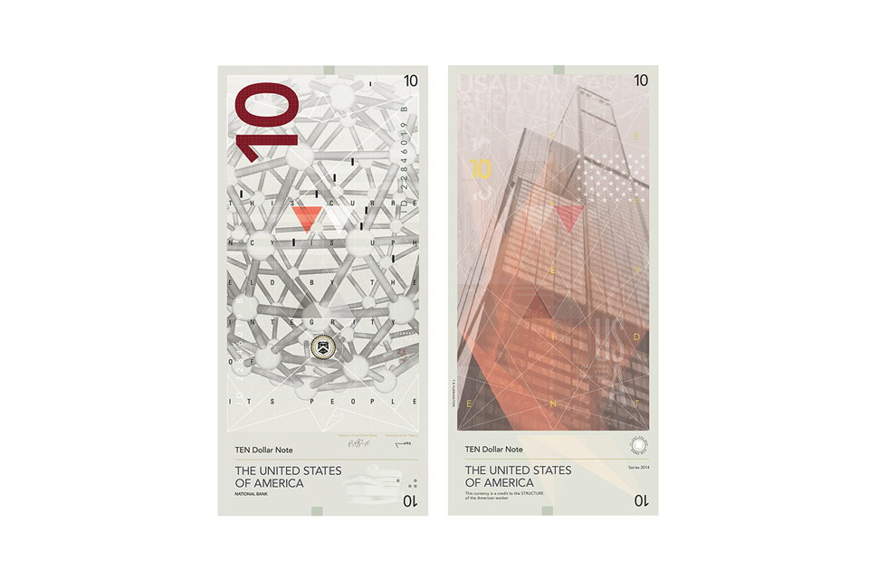
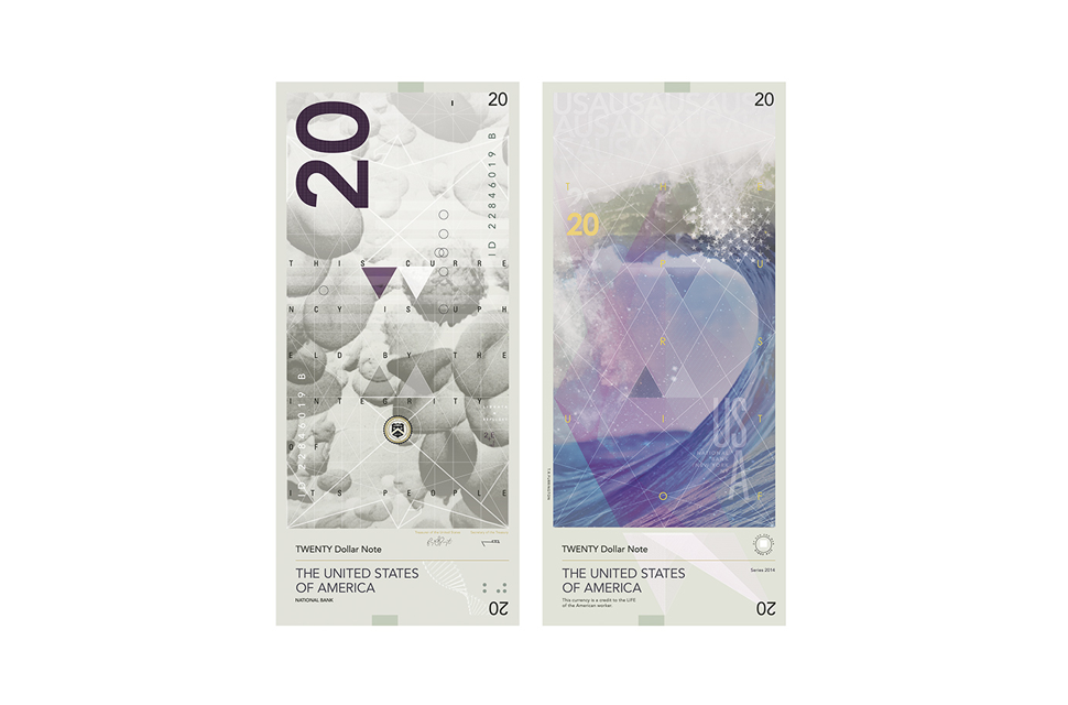
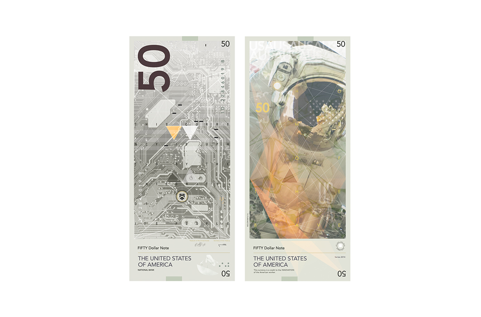
Inspired by the Swiss Franc, Purrington’s overhaul deals more with the accomplishments of our nation than the Founding Fathers. They feature colorful images of astronauts, snow-capped mountains, and far-flung galaxies on one side instead of dated portraits, with scientific and technical drawings on the other. Each bill contains the phrases, “This currency is upheld by the integrity of its people” and “Uires Alit,” the latter of which means “strength feeds” in Latin. He incorporates other familiar iconography such as the eagle and Eye of Providence as well, though, their depictions are far more subtle than on past bills. Nonetheless, something tells me M.C. Escher would be proud.

“To Infinity,” Cencil Dunston
Dunston already knew he wanted to keep portraits as the main focal point of his dollar bills, however, he also knew he wanted to move away from showcasing the 18th- and 19th-century elite. His bills show historical figures from all walks of life, time periods, and influence – from an Iroquois woman and John F. Kennedy to Cesar Chavez and Howard A. Wooten – with a simple sans serif typeface and a good deal of negative space. Each is still laced with intricate background patterns to curb counterfeiting, but each also does away with the barrage of minuscule embellishments still featured on our bills today.

“Relative Value,” Dowling Duncan
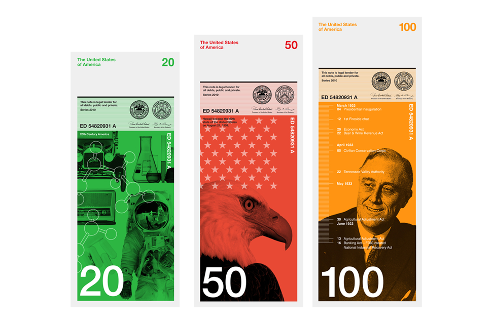
Duncan’s redesigned dollars may be the same width as the current dollar bills, but they differ drastically in appearance and in ideology. The black-and-white images on the bills depict different aspects of American history and culture, and moreover, each directly correspond to the value of each note. For instance, President Barrack Obama is featured on the one dollar bill because he was the first African-American president, while the 10 dollar bill showcases the first 10 amendments to the U.S. Constitution. The assorted colors and varying sizes are simply to help distinguish one bill from the next, which given their drastic differences, isn’t overly tough. Now, if only most wallets were big enough…

“Music Man,” Fabiano Pinel
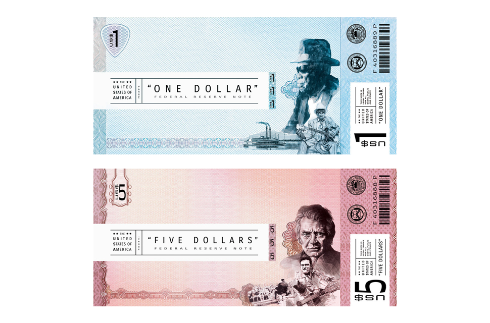
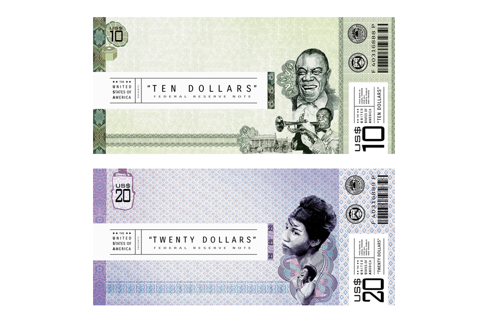
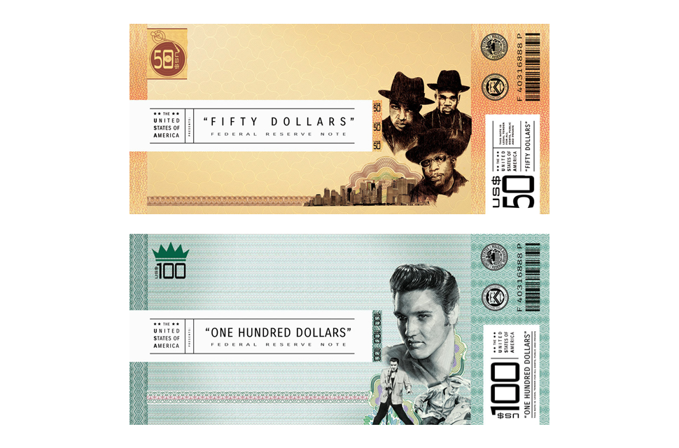
Culture is a pinnacle of our nation – and music is a pinnacle of culture. Pinel’s take on the U.S. dollar pays tribute to the girth of genres American musicians have pioneered, whether it’s country, soul, rap, or others. Each bill is based on the design of your standard concert ticket, right down to placement of the typeface, with the legal information (serial number, barcode, Treasury seal, etc.) residing on the right-hand side for added convenience at the register or bank. Vivid portraits of artists such as Louis Armstrong, Elvis Presley, and Aretha Franklin might draw your eye, but it’s the candid portrait of one Johnny Cash flipping the bird on the five dollar bill that truly brings it on home.

Next Page: 4 more of our favorite currency redesigns
Michael Tyznik
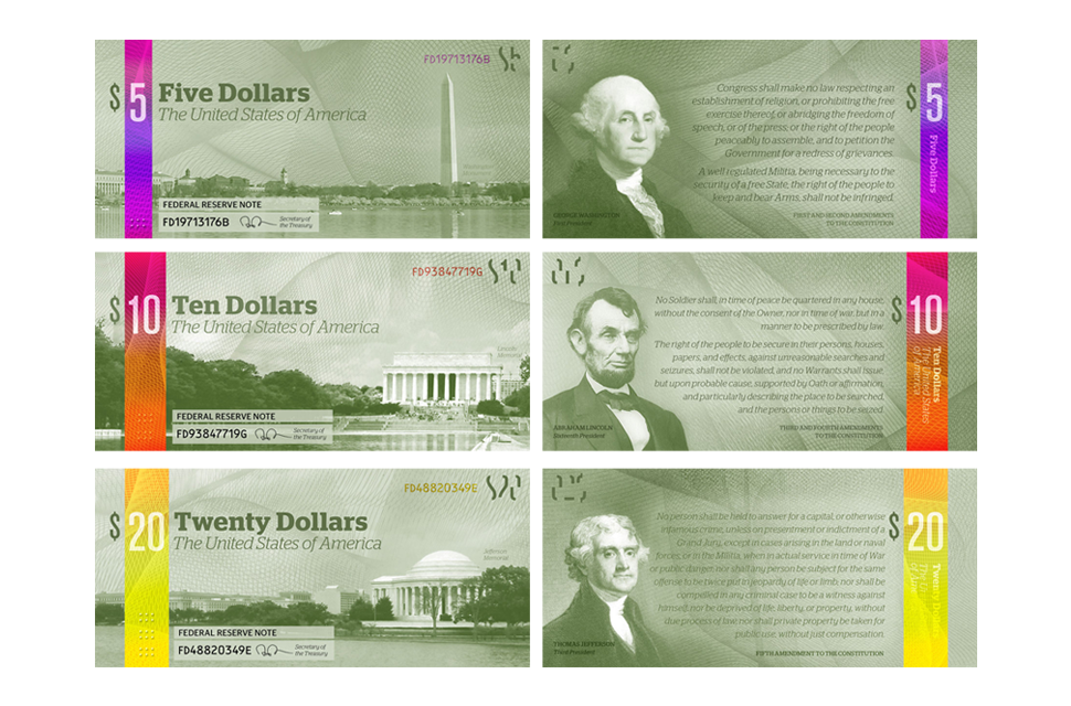
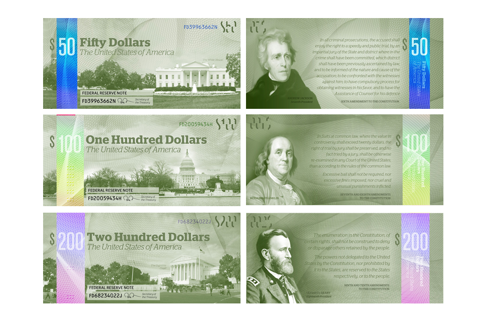
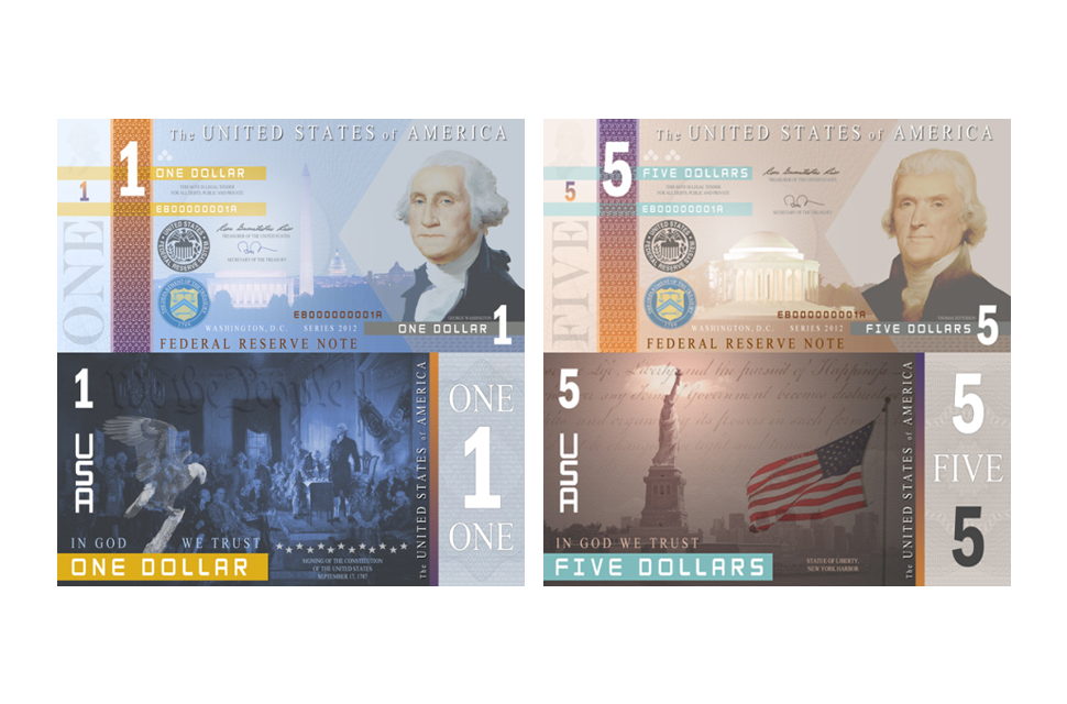
Tyznik’s design proposal isn’t quite as polarizing as some of the other bill iterations on our list. He added a brightly-colored holographic strip into each denomination to further differentiate one bill from another, each with embossed dots that act as braille for the visually impaired. He also maintained the green hue of our currency to retain its iconic sense of identity, but added a portion of the Bill of Rights to each banknote, as well as national depiction of some of our nation’s most famous landmarks. Too bad there isn’t actually a 200 dollar bill in circulation – we’ll leave that one up to the E.U.

“Money that Works,” Artomatic/Flashpoint
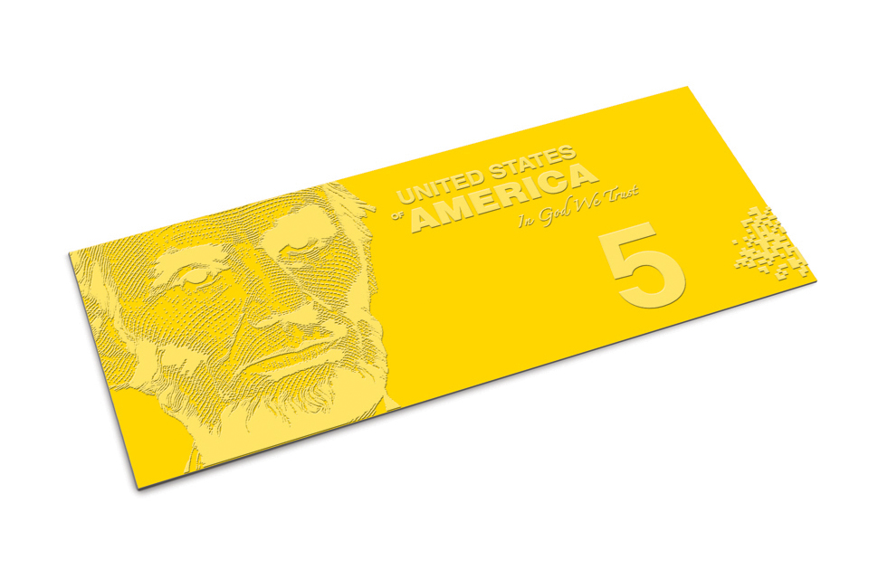
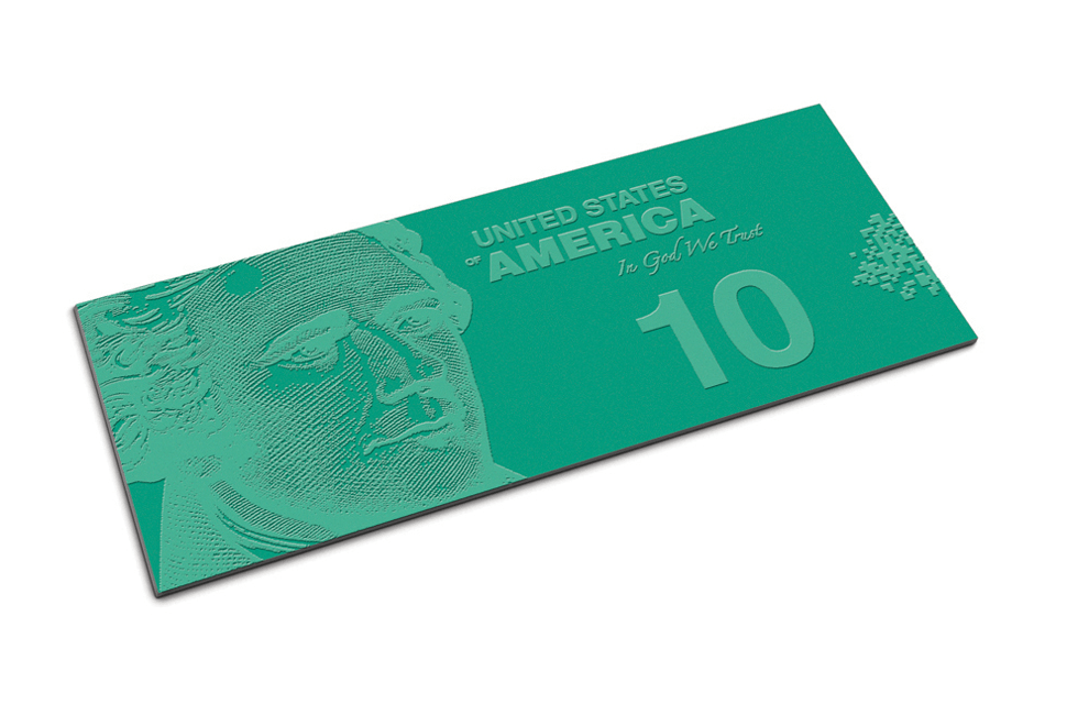
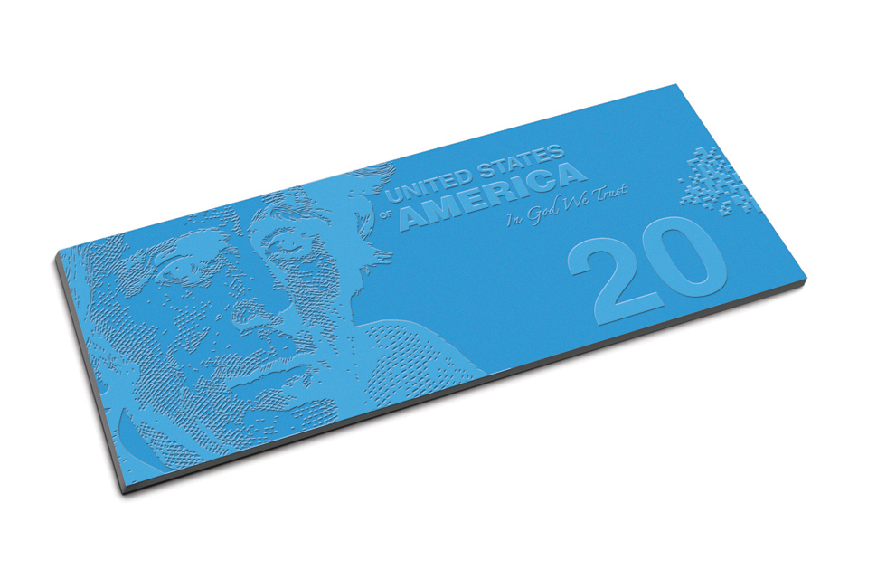
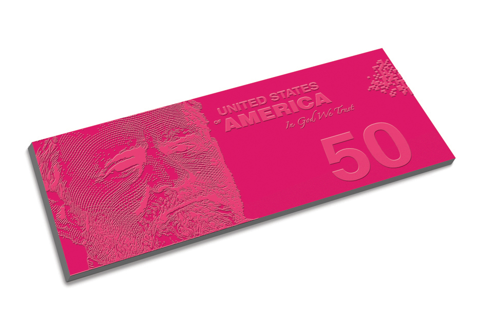
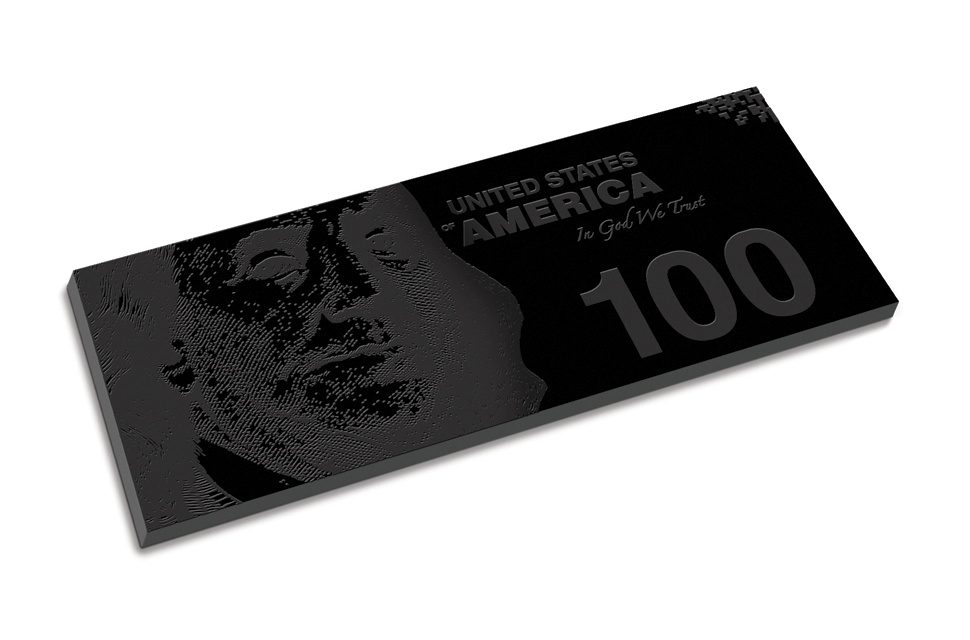
Sadly, it’s rare we take a cue from the Aussies across the other pond. However, Flashpoint’s redesign does, building its foundation on a three-dimensional synthetic mold instead of printed paper. The striking colors only help distance one note from the next, as does the respective thickness of the individual denominations, endowing each with physical attributes that would allow consumers to identify the value of the currency without having to look at it. Abraham Lincoln, George Washington, and the rest of the usual historic figures still don the front of the bills, but who know what lies on the other side.

“Keep Searching,” Elvin Wong
Wong’s vision of the U.S. dollar is not so much based on our past as it is what we should all strive for in the future. The depictions on each banknote are designed to remind us to seek an array of ideals in a similar manner those adorning the front of each bill. For instance, the portrait of journalist Peter Jennings on the five dollar bill was chosen to represent truth, whereas Steve Jobs depicts the notion of innovation. The necessary legal jargon rests on the right side of each bill for quick reference, along with colored arrow that provides each note with an aesthetic touch. Unfortunately, said arrows also cover a significant portion of each portrait. Apologies, Mr. Oppenheimer.

“Modern Traditions,” Ed Burczyk
Not every designer balks at tradition. Burczyk’s recent work, for example, relies heavily on tradition while incorporating a modern spin. Each bill celebrates the American foundations of independence, government, civil rights, and other notable hallmarks of our nation’s history. He incorporated watermarks, microprinting, and a holographic strip on each to alleviate counterfeiting, and furthermore, introduced marks for the visually impaired. A cursory glance at the bills reveals pivotal events, such as the Apollo 11 moon landing and Martin Luther King Jr.’s “I Have a Dream” speech, but further inspection allows you to see more subtle touches. And who doesn’t love good, ol’ Teddy?

[Header image courtesy of Bragin Alexey/Shutterstock]
