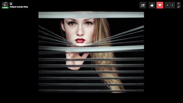
 A couple of months after Flickr launched a significant redesign of its website that seemed to impress as many users as it upset, 500px on Wednesday got in on the makeover act and released one of its own.
The site, popular with serious enthusiasts and pro shooters alike, has chosen to put photos first (a good idea for a photo-based site), cutting out the clutter and bringing images front and center while still making it easy for viewers to like and favorite striking shots.
“We’ve watched the way our community interacts with photos on their screens, tablets, smartphones – all the different platforms,” 500px lead designer Adam Shutsa said in a release. “We’ve designed our new photo page with a stronger focus on the image, while keeping it easy to like, favorite, share, and be part of the 500px community.”
So images on the new-look site now fill the screen more than before, while at the top you’ll find the information bar showing the image title, photographer, views, likes, favorites, pulse (indicating how popular an image is at the current time), and a bunch of social media links. Scroll down a little and you’ll find all the EXIF data, as well as the description and any comments for the image. The old design had much of this information squeezed to the right of the photo.
Focus View
The new Focus View could prove a hit with users – this feature puts images against a black background and presents you with a few basic keyboard shortcuts that allow you to like, favorite, and maximize images. You can also use the arrow keys to move back and forth between photos. To enter Focus View, simply click on an image or tap the ‘H’ key. The design here is simple and clean, with the idea to remove any distractions and allow you to ‘focus’ on the images.
500px’s makeover may well attract users from Flickr still grumbling about the changes going on there, especially those who can’t live with that Yahoo toolbar which appeared recently.
Check out the site’s new look here and let us know what you think.


