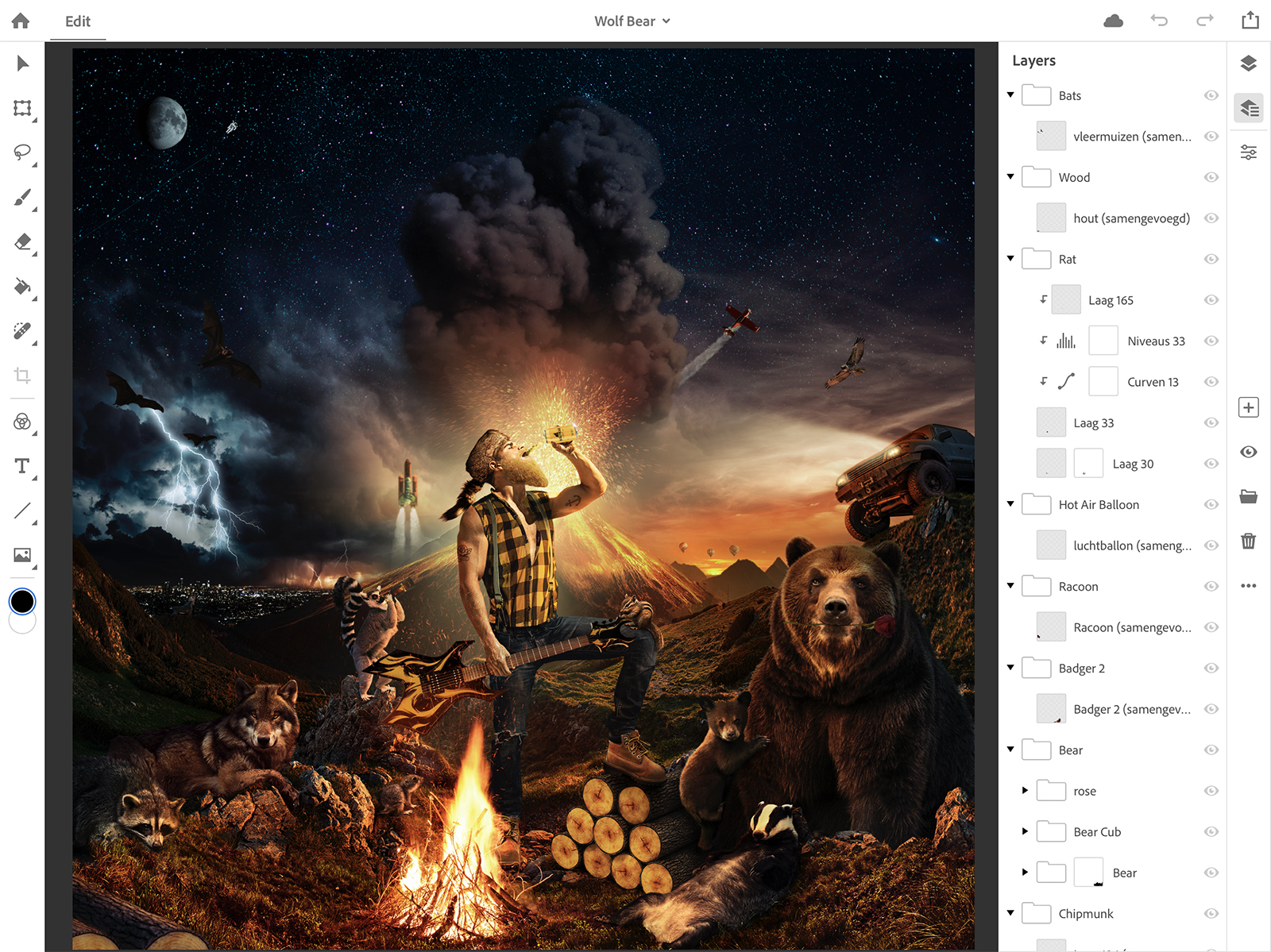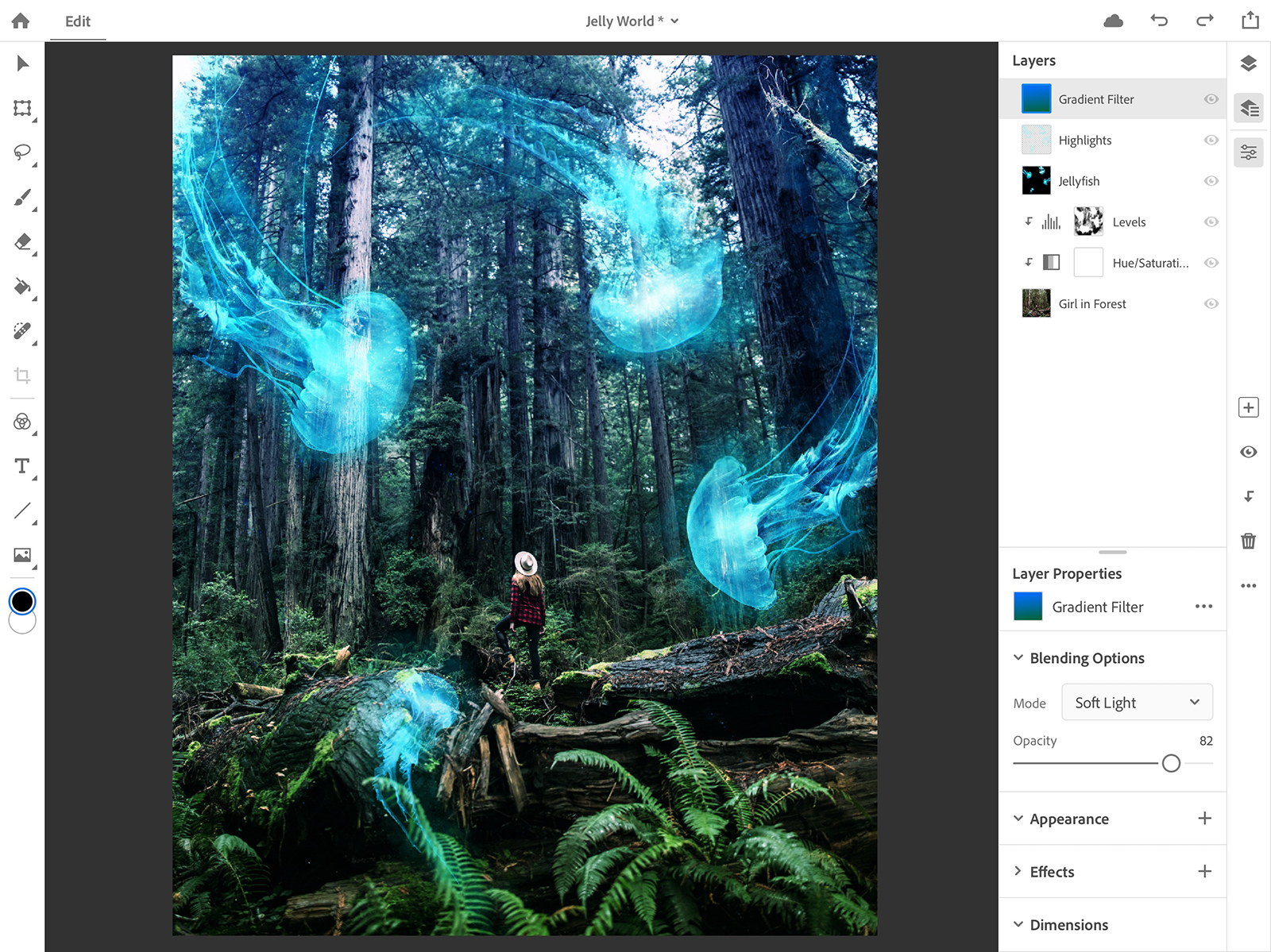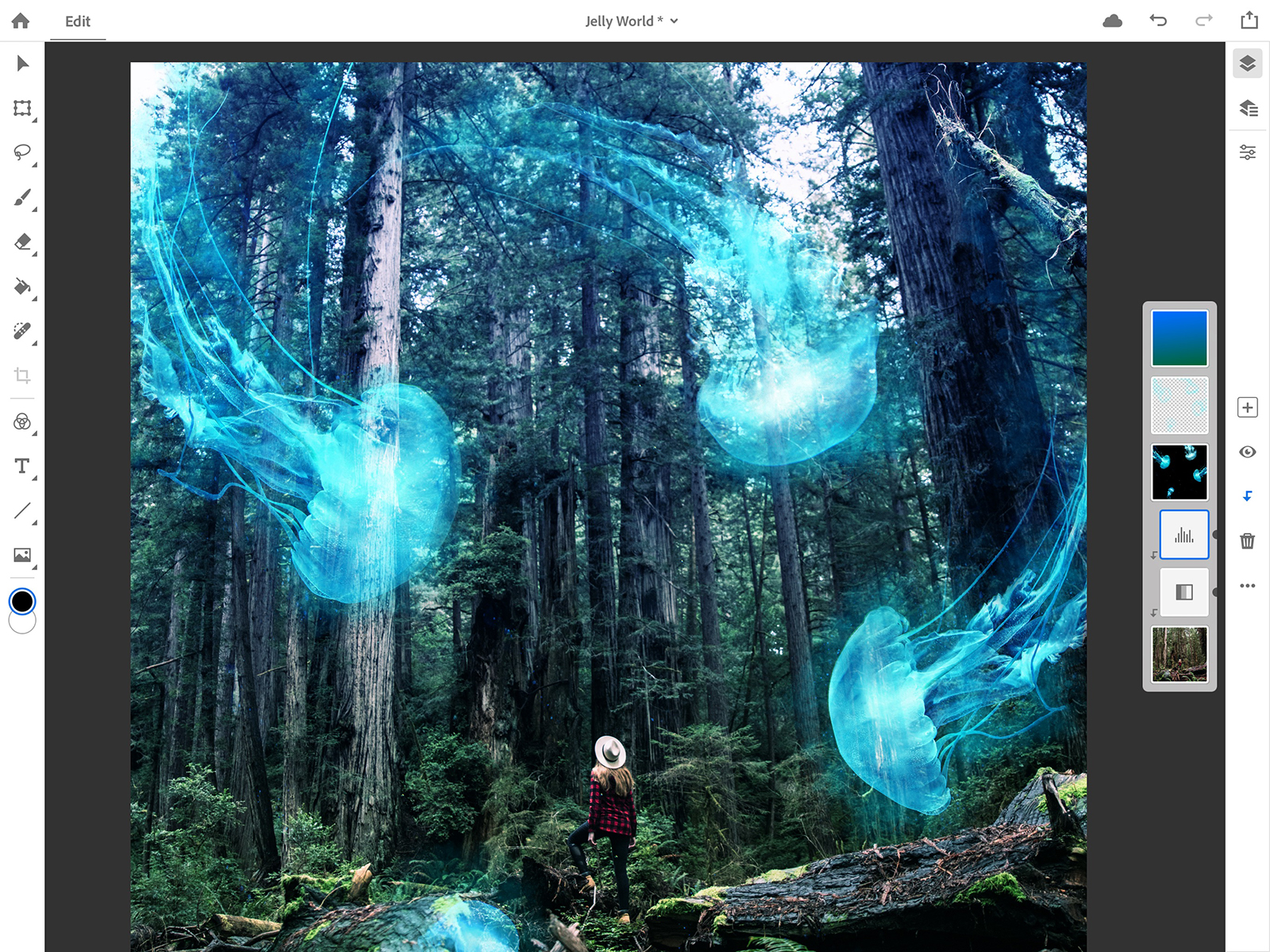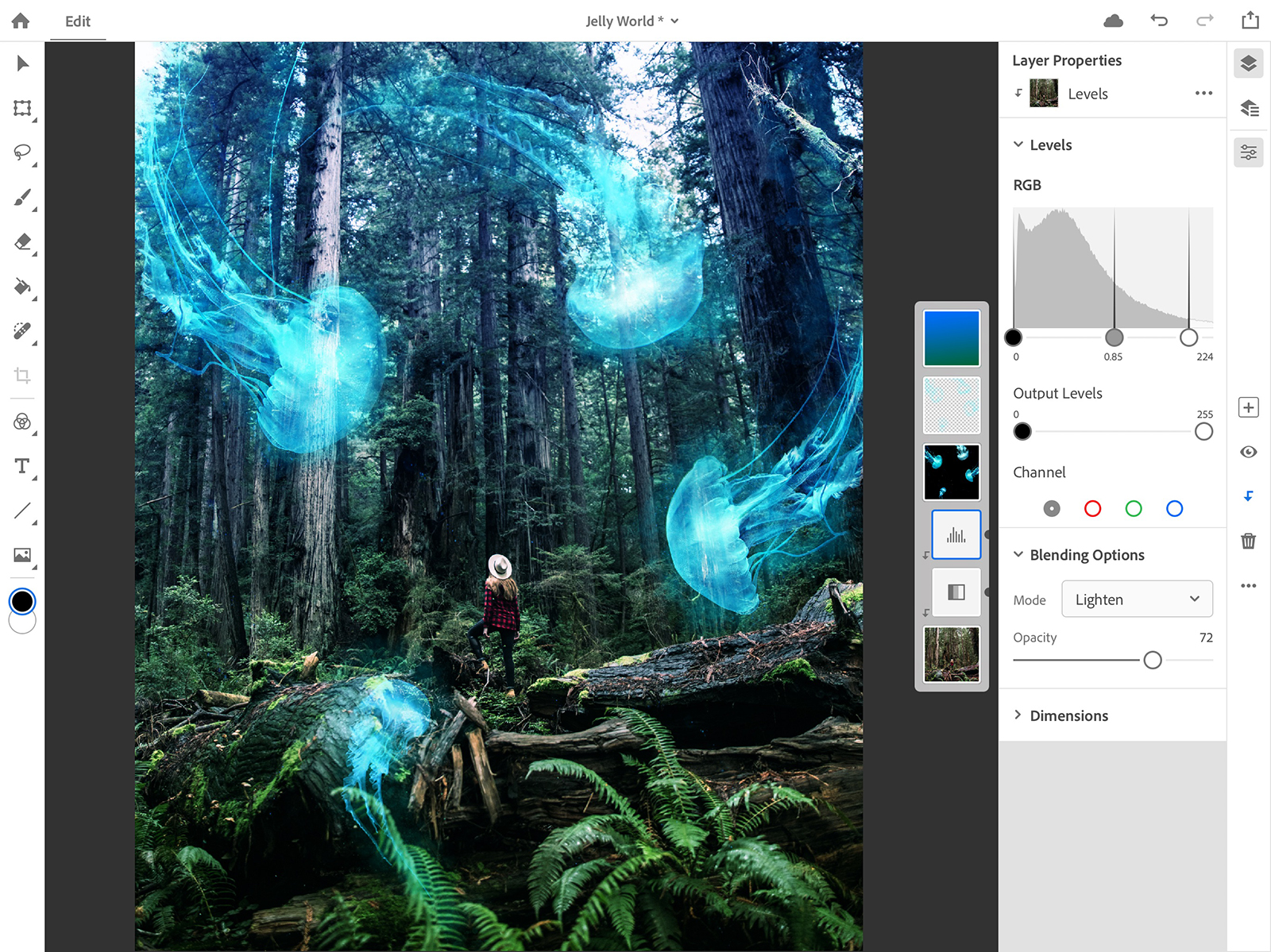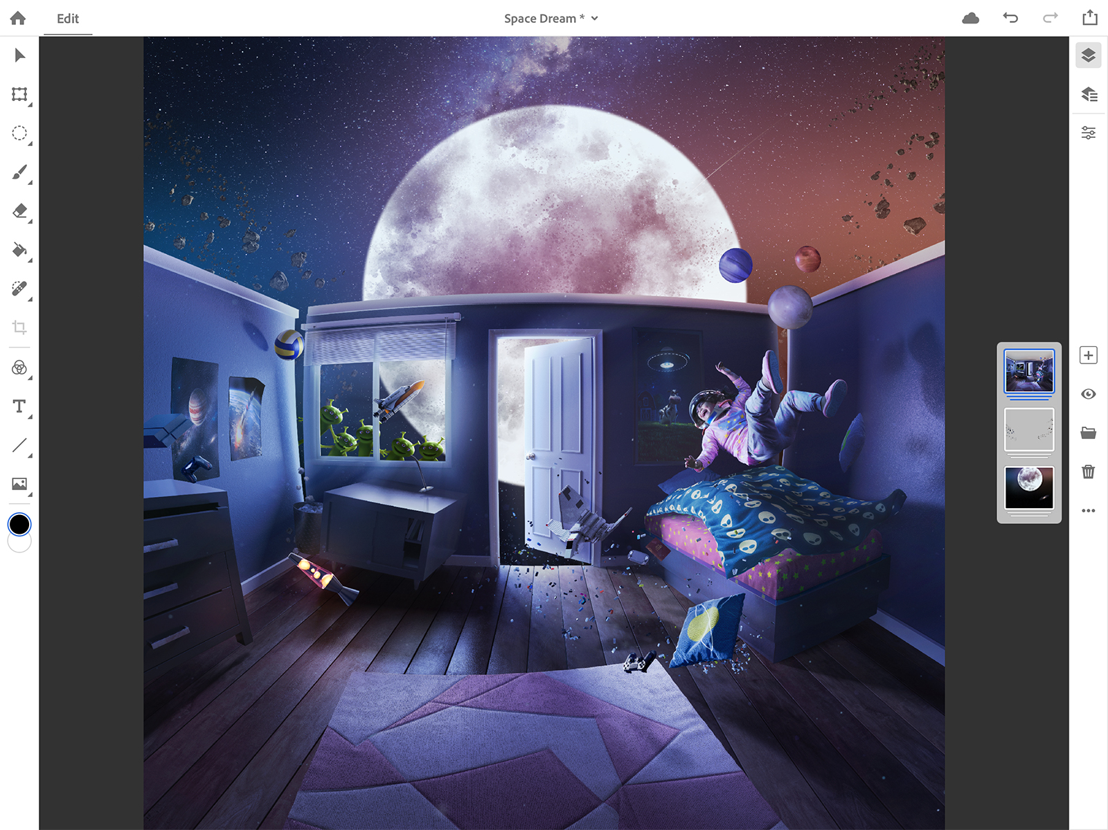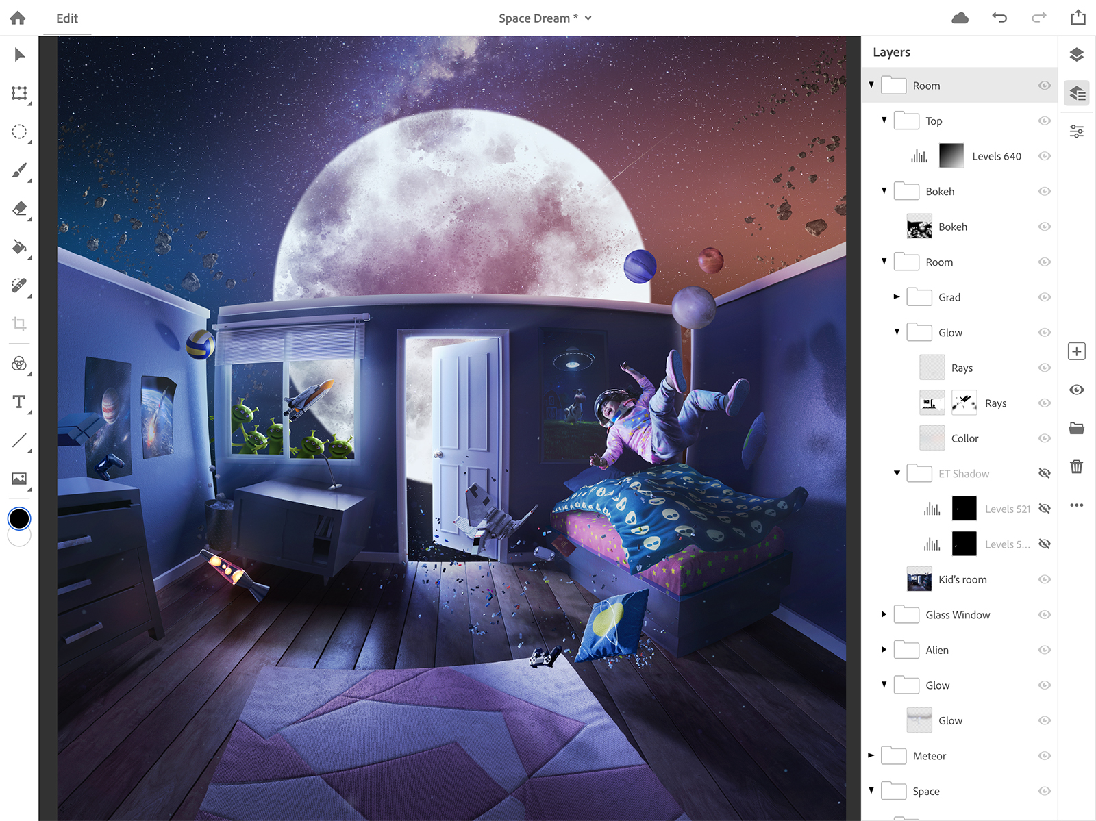
We may be a decade into the Post-PC era, but if there was one thing keeping creatives glued to the desktop, it was Photoshop. That’s all about to change. At the Adobe MAX show on Monday, October 15, Adobe showed off a preview build of Photoshop for iPad. This isn’t “Photoshop Light” or a separate app; it’s an honest-to-goodness, full-featured version of the program built from the same codebase with all of the tools, layer support, brushes, blend modes, masking, and more.
And most importantly, it absolutely screams on the iPad Pro, meaning it could truly replace the desktop version for many users.
A fresh new UI just for tablets
While not every single feature of desktop Photoshop will make it to the iPad by version 1.0, Adobe is working to achieve feature parity as soon as possible. So while what you can do won’t change, how you do it will. Trading a mouse and keyboard for a touchscreen and, optionally, an Apple Pencil wouldn’t work very well in the desktop interface. Adobe has therefore redesigned the look and feel of the app. The toolbars are smaller to leave more screen space for actual work, while a full-screen mode will still leave a mini icon available for tool swaps.
The touch interface also brings new touch controls — for example, photo editors can open the layers panel by pinching to zoom. Adobe says the app uses a context-aware user interface, which minimizes unnecessary tools and displays specific options depending on which tool is selected.
The iPad version also works with standard PSD files that are now synced over Creative Cloud. Users can easily hop from desktop to tablet and back without skipping a beat in their editing. In a demonstration, Adobe showed us just how powerful Photoshop on the iPad Pro was by opening an editing a PSD file with over 200 layers. Zooming and panning around the image was almost unbelievably smooth, and everything looked very responsive.
As an early preview build, we weren’t allowed any hands-on time with Photoshop for iPad, but we did get to see it in action up close. Adobe hasn’t announced a release date, just noting that it will be sometime in 2019.
Photoshop for desktop gets even better
Desktop diehards will be happy to know that the good-old regular Photoshop also received an update today, as well as some smaller tweaks to improve workflow and fix minor annoyances.
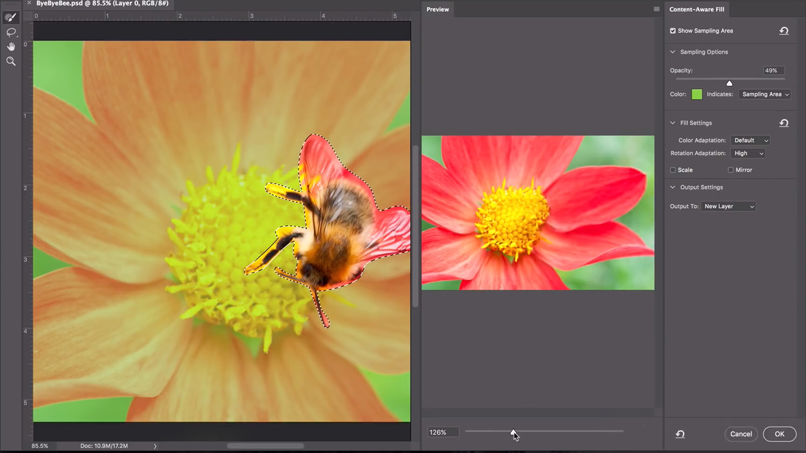
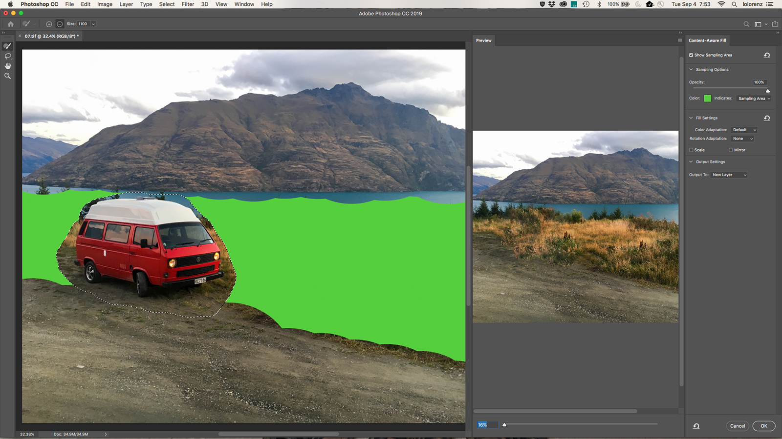
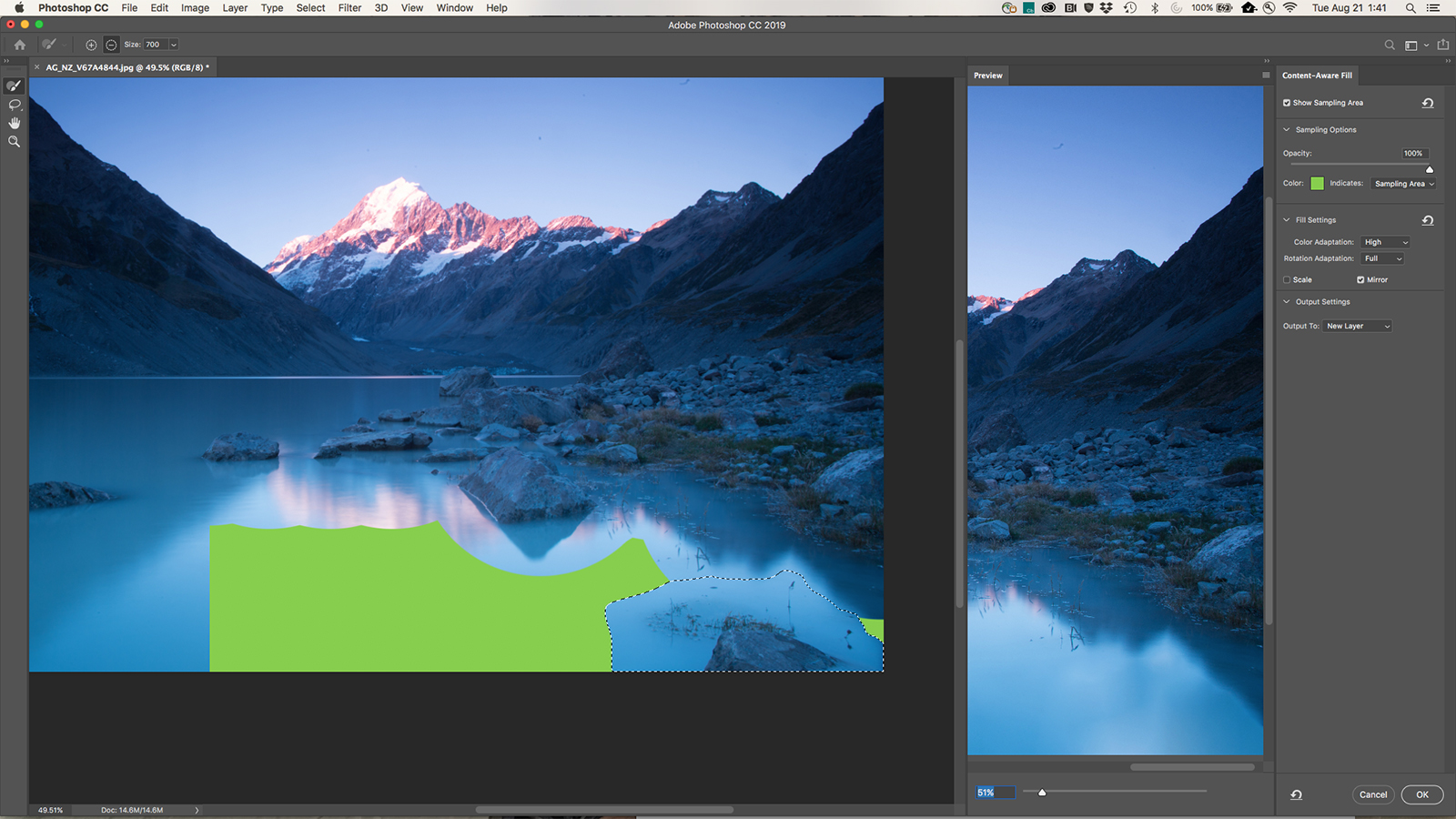
The launch includes a re-designed approach to Content-Aware Fill that gives editors more control over the final results. The tool, which is commonly used to remove objects from images, allows photo editors to choose which parts of the image is replicated inside the fill by choosing a sampling area. The tool also allows photo editors to scale or flip that area to create a more seamless fill. (The original Content-Aware Fill will also still be available).
Adobe also brought Symmetry Painting outside of the tech previews in an official debut. The tool mirrors brush strokes along an axis to create symmetrical designs in less time. Symmetry Painting can also be used along multiple axes to create mandala designs. Adobe also added a radial option since originally adding the tool as a tech preview.
Several changes to the app are aimed at workflow improvements and user suggestions. The undo keyboard shortcut will now continue to undo actions, in order, instead of reverting to a redo command after the first action. Photo editors will no longer have to hit enter to commit changes like crops before moving on to a new tool and transforming a layer automatically maintains proper proportions, no shift key necessary. Text can now be edited by a double tap from the move tool, instead of heading back to the toolbar to select the text tool.
A new frame tool serves as a placeholder for future images and will auto-scale the image once placed. Additional updates include the option to hide the later reference point, lock layers in place, preview blend modes, evenly distribute spacing between multiple objects, and a handful of other interface improvements.
Adobe Lightroom CC 2019
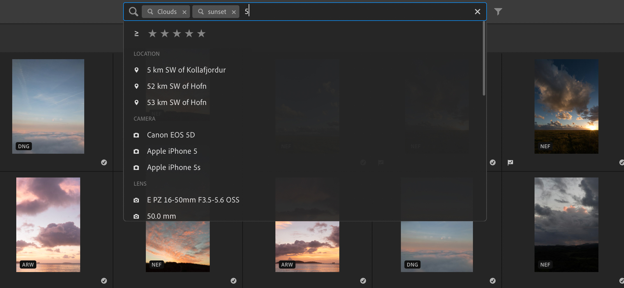
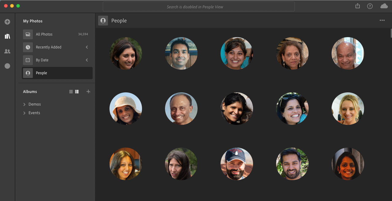
Lightroom CC just gained some features the older Lightroom Classic CC doesn’t yet have. Artificial intelligence will now recognize faces and help users find specific images of people. People View automatically tags people and appears as a new section in the photo library. The photo editor and asset manager also gains search suggestions as you type.
A new Share tab inside Lightroom CC helps browse and access albums shared to Lightroom’s online interface. The tab also allows users to share to Adobe Portfolio and the company is also working with third-party companies to add options like sending images in for lab printing. On iOS and Android only, Lightroom CC allows users to filter which images to share to Lightroom Web using flags and stars.
Lightroom CC on the desktop is also now compatible with the Apple Photos Migrator to send photos between the two library systems.
Adobe Lightroom Classic CC 2019

Lightroom Classic also sees a handful of small changes with the Max launches. Photo editors on Adobe’s desktop-only Lightroom can use depth maps from dual lens smartphones in the range masking tools to select areas of the image based on depth. Tethered shooting speed is also boosted in the latest version for Canon cameras, with an update for Nikon users still to come.
Adobe also simplified creating a panoramic HDR merge in fewer steps — instead of creating multiple panoramas first to layer into HDR, the merge options now include an
