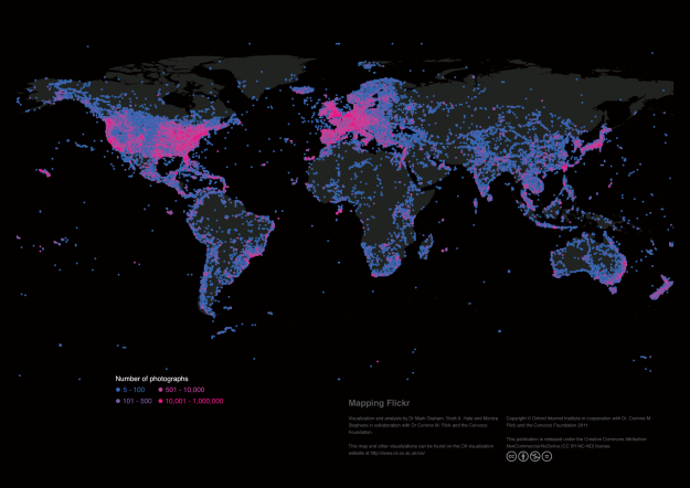
A team of researchers from the Oxford Internet Institute (OII) have gathered data from Flickr to paint a unique picture of what the world looks like. The result is this map (above — click for full size), which shows every geotagged picture uploaded to the popular photo-sharing and hosting site.
The project was led by Dr. Mark Graham, who spends his days studying the “geographies of the Internet,” according to his official Oxford University biography. Graham and his team gathered their data from the Flickr API. They then calculated the count of photographs taken within ever 0.5 x 0.5 degree latitude-longitude square on the surface of the planet.
At first glance, the resulting map likely doesn’t look very surprising. Most of the photos on Flickr were taken in the most populated areas, like the United States and Europe. But one area, China, which has more people than anywhere else on the planet, has relatively low representation on the site. This, says Graham, is because other services are more popular in that country. Other areas with few of the pink and blue dots are places like Iran, where sites like Flickr are banned by the government. But that’s not all the map shows, either.
“In the rest of the world, the patterns on this map point to images being mostly created by people in the world’s wealthiest and most highly connected regions,” writes the research team on the OII website. “The stark contrast in the number of photographs covering Mexico and the United States and the lack of dense clusters of images in the most populated parts of Africa (e.g. coastal West Africa) reinforces this point.”
Graham also helps run the blog FloatingSheep.org, whose crew creates a wide variety of similar maps. Of the top 10 most popular Floating Sheep maps, “The Beer Belly of America,” which shows where the most bars in the US are located; and “The Price of Weed,” which is pretty self-explanatory, are at the top. Other top maps include “Mapping Christianity” and “Mapping Escorts.”


