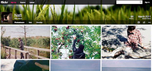
After finally confirming Yahoo’s $1.1 billion acquisition of Tumblr, Yahoo held a press conference today in New York City to announce a product completely unrelated to the micro-blogging service. Today, Flickr is getting yet another makeover in Yahoo CEO Marissa Mayer’s promise to make “Flickr awesome again.”

To lure users back to Flickr, the service will also offer a whopping 1TB of free space. “It’s about putting lifetimes of photos,” Mayer says. The Flickr profile boasts a cover page, full bleed, high-resolution pictures, and extremely minimal white space. No more geolocation data, comments, groups, or tags – those information are now hidden until users scroll downward for the data. Users can also share photos via other social media services, such as Twitter, Facebook, Pinterest, and, of course, Tumblr. The service is also hopping on the multimedia trend by allowing users to share photo streams as a slideshow.

In addition to PC and iOS, the new Flickr will also come to Android (alas, no Blackberry love) – all iterations of Flickr are now live. Mayer says that a Tumblr and Flickr integration is highly possible, although since the acquisition is still so fresh, that venture is still an opportunity the team needs to explore further.


