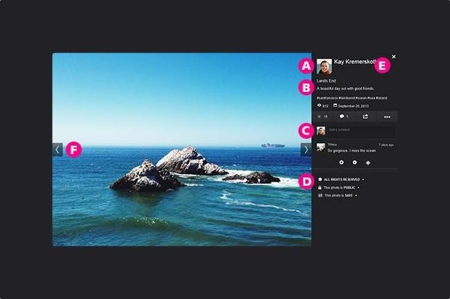
Soon after Marissa Mayer took over the CEO job at Yahoo in 2012, a Twitter campaign was launched with one simple request: “Please make Flickr awesome again.” It didn’t take long before Yahoo responded with a new iOS app in December, followed by a complete overhaul earlier this year. Despite mixed opinions (although Flickr’s own research has found a substantial increase in users since the site launched), the once-immensely-popular photo-sharing site continues to evolve, this time introducing a redesigned layout of the photo page.
The page is currently being rolled out to all users; we just checked our account and found the old design, so it’s not a universal rollout. In the resigned, the photo is no longer shown on top with limited info on the bottom that’s usually out of view unless you scroll down. Now, the photo is displayed nice and large with a new sidebar that shows a lot more info – including EXIF metadata if the user opts to show it – and gives you more control options (like adding favorites or sharing to social media). User comments are now listed with the newest first and at the top.
After being neglected by Yahoo’s previous regime for so long, Flickr is suddenly receiving newfound love from Mayer’s leadership. We still don’t know what Mayer and Co. have up their sleeves (except going after Google and Facebook), but from these latest updates and the acquisition/tie-in of Tumblr, we can safely assume that photography and Flickr will play a big role in Yahoo’s future.
Check out the specific details about this new photo page here.


