“The Moto 360 oozes style and quality, ignores needless software distractions, and embraces simplicity. It's better in every way.”
- High quality build and materials
- Two straps in the box
- Design and size will suit many wrists
- Solid performance (for WearOS)
- WearOS still lags WatchOS
- No way to take calls
This is the Moto 360 smartwatch … except, it’s not made by Motorola, and isn’t really a sequel to the Moto 360 that took the smartwatch world by storm when it launched in 2015.
Instead, it’s the result of a licensing deal between Motorola and a company called eBuyNow, which manufactures and sells the new Moto 360.
While important to know, don’t get too bogged down with the branding. This is a successor in spirit, and if you’d passed this smartwatch by before due to the cost, the company has made a very welcome change that will help you appreciate its charms.
Design
When I attended the early launch of the Moto 360 at the end of 2019, the company pushed it as a luxury timepiece, emphasizing the 3mm thick stainless steel body, diamond-like coating (DLC) on the black model, and physical vapor deposition (PVD) coating on the rose gold model seen here, as a reason to charge $350. Any watch nerd will know DLC and PVD are often found on high-end watches, and any smartwatch fan will welcome a stainless steel case, too.

Except $350 was too much money in the crowded smartwatch market, even with these materials. Now, a few months down the line, the company seems to agree. The price has been dropped to $300. This makes it much more tempting.

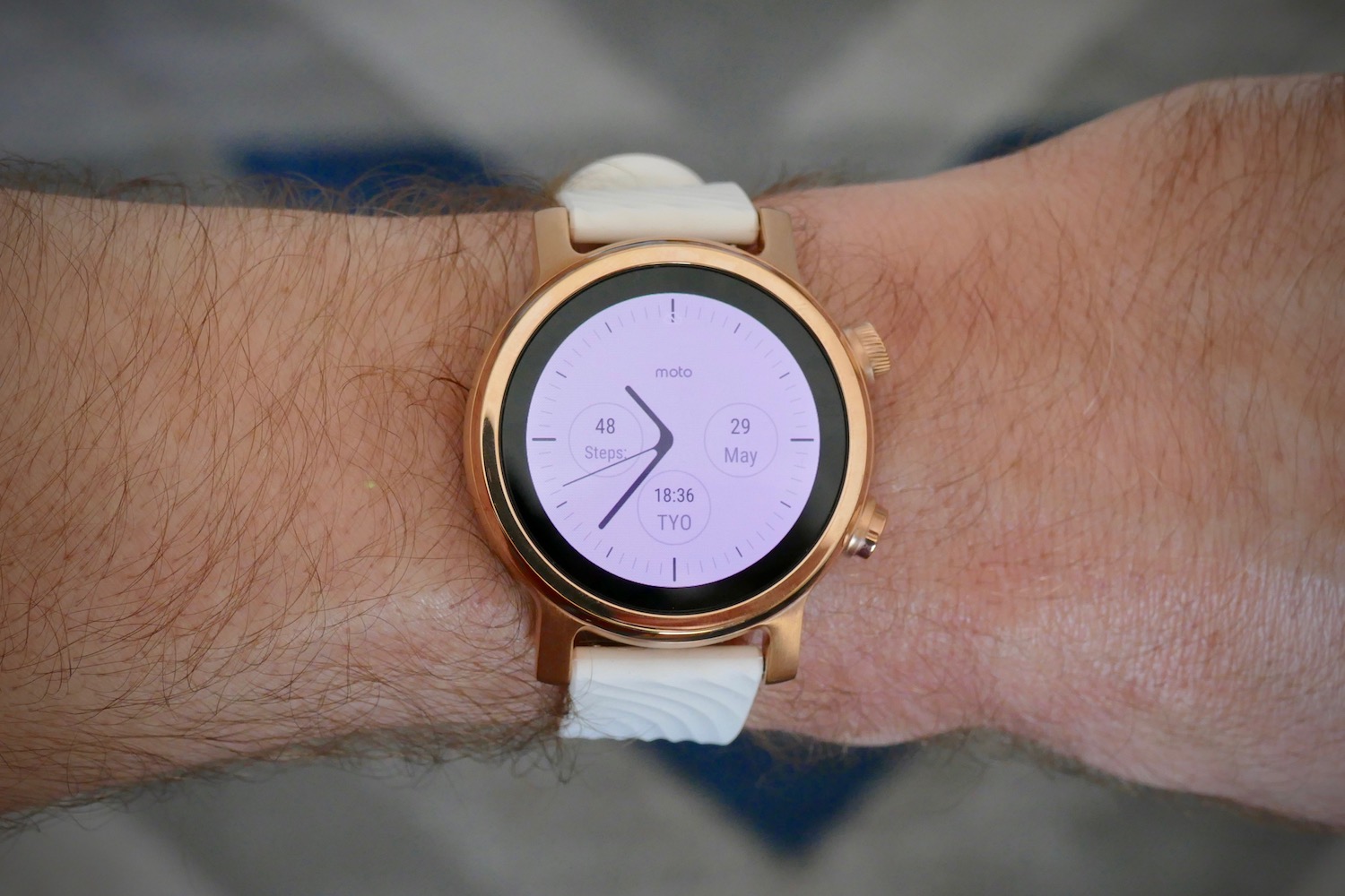
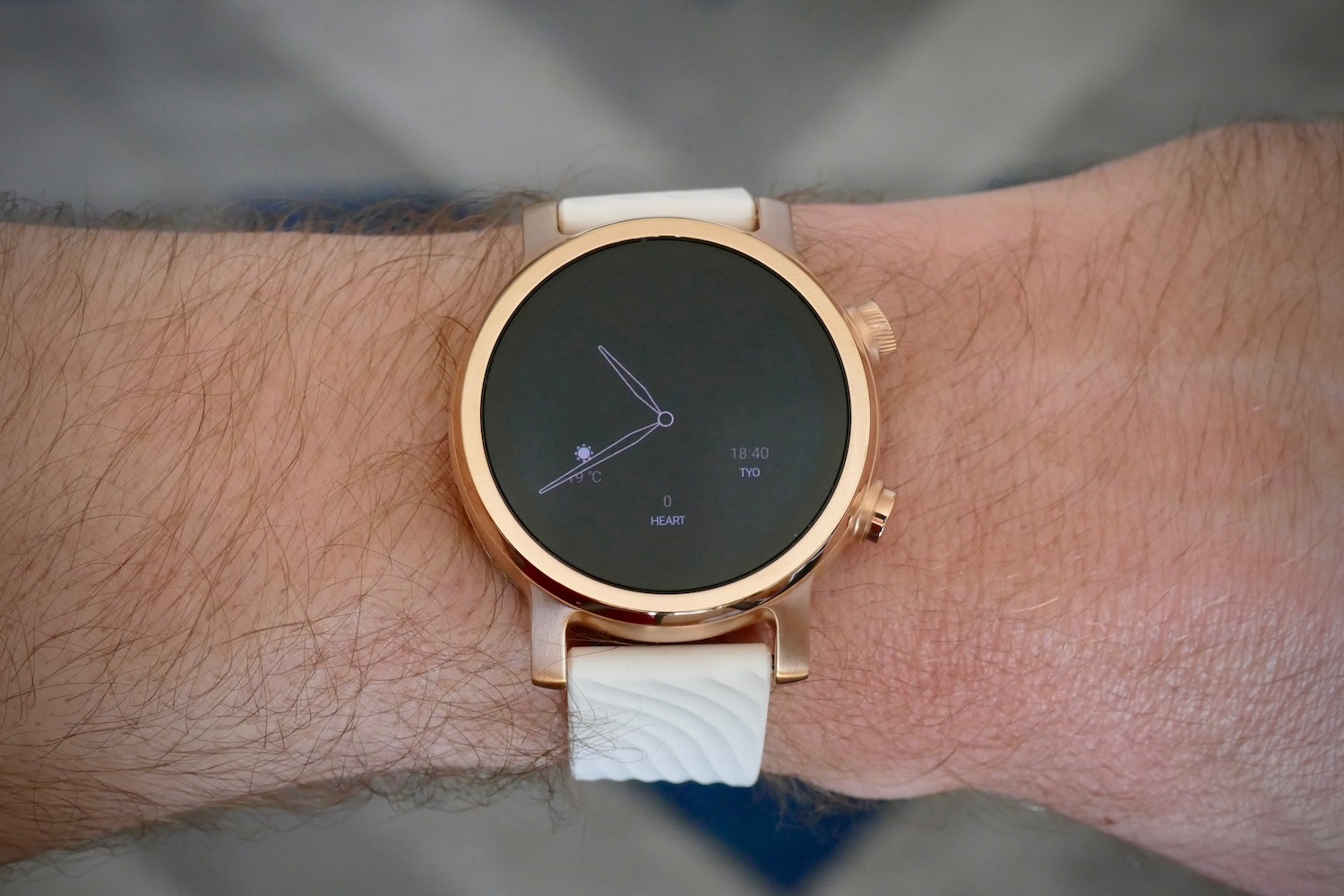
I consider the Moto 360 to be a perfect everyday smartwatch design, materials, and style. The DLC or PVD coatings make the stainless steel body more durable, and the choice of rose gold, black, or gray colors, plus the sensible 42mm size and 52-gram weight means it will suit any wrist. The round face, a feature synonymous with the 360 name, is flat and the bezel isn’t raised in a way, so swipe gestures are always comfortable.

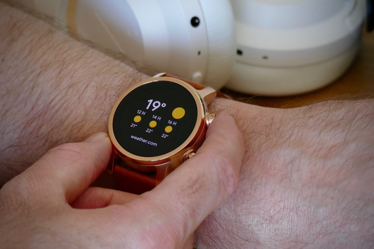
I also appreciate its little stylistic touches. The top pusher is textured to make it easier to twist and scroll through the watch’s menu system, while the Motorola “wings” icon embossed on the strap clasp is very classy. On the subject of the strap, you get two in the box — a comfortable silicone strap, and a leather strap in a contrasting color. The quick-release pins mean it’s changed in just a moment, as well.
The Moto 360 doesn’t make a bold statement on your wrist, other than looking like a good-quality, stylish timepiece. That’s arguably the best statement for a smartwatch to make. If you get the black model, it’s as stealthy as you could want. I like it a lot.
Software and screen
There’s no infamous flat-tire screen here, as the new Moto 360’s 1.2-inch AMOLED display is perfectly round. The 390 x 390-pixel resolution ensures plenty of clarity, and it’s bright enough to be seen outside in sunlight.
It may be a round screen, but there is a serious black bezel between the display and the case, which does detract from the otherwise great design. I don’t have any problem with the Moto 360’s screen, which matches other WearOS watches in appearance, color, and brightness.

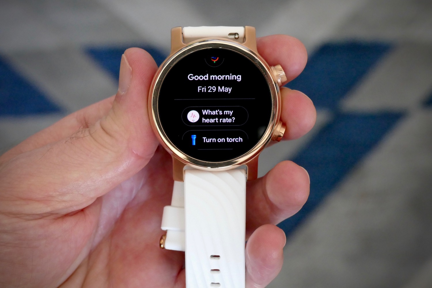
The watch uses Google’s WearOS software, and it’s installed here without any additional apps. Most fashion brands include fun extras or small tweaks to fit in with brand messaging, and watch companies like Tag Heuer include well-crafted tools that will appeal to brand loyalists. The Moto 360 appeals to those who like simplicity.
Simple is best when it comes to WearOS smartwatches. Adding dozens of features, apps, or associated nonsense just dilutes what works best on our wrist — notifications, fitness tracking, music control, maps, and when done in the right way, calls too. Get that, along with the style, right, and it’s a potential winner. The lack of extras on the Moto 360 is a benefit, rather than a downside.
This doesn’t mean WearOS is a joy, though. It’s still much too long-winded to set up, and the notification support varies depending on the phone you use. Connected to a Galaxy S20 Ultra, it annoyingly delivered notifications multiple times, while on the Xiaomi Mi 10 Pro, it delivered the bare minimum if I was lucky.
Performance isn’t great, either, especially if you catch it when it’s trying to update the software or use GPS, and third-party apps can be similarly ponderous when collecting data. I also don’t understand why the twist pusher is used to navigate menus, as it doesn’t work throughout the watch.
Google Fit is one of the best features inside WearOS, and a recent visual update has made it more modern and readable. There’s tracking for most activities built in, and the daily goals are all adjustable according to your needs.
I like the watch faces on the Moto 360 as they have several complications, meaning I can see my step count or Heart Points at a glance. On the watch itself, starting a workout takes seconds. Once you’re done the data is presented clearly inside the Google Fit app on your phone. It’s all the fitness tracking most will need, and it all works well with the Moto 360’s heart rate sensor too.
Although WearOS still lags behind Apple’s WatchOS, it’s tolerable on the Moto 360. Sadly, there’s still no way to take calls, however.
Battery, connectivity, and performance
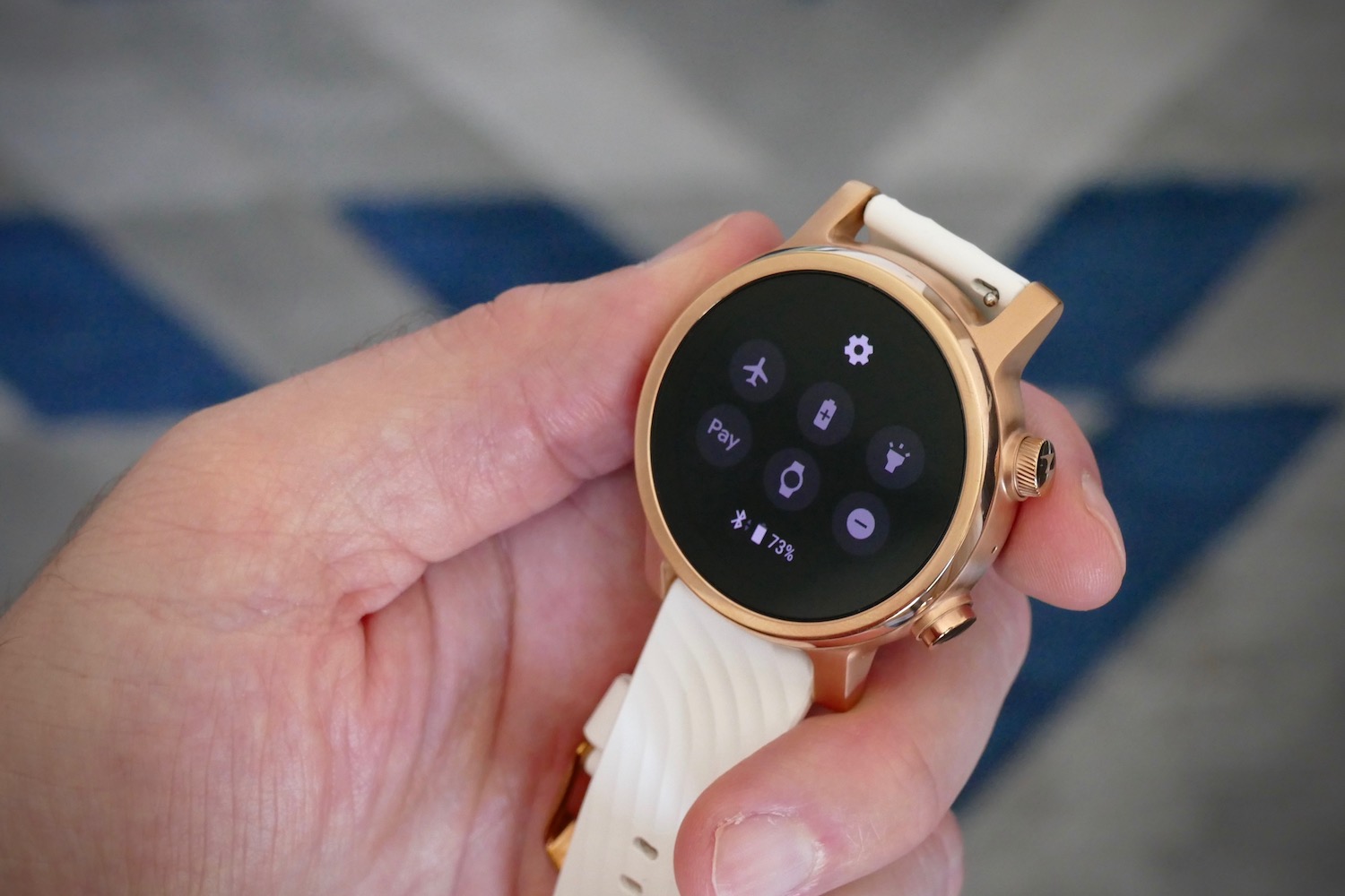
There’s nothing unique about the power behind WearOS. The watch has a Qualcomm Snapdragon Wear 3100 chipset with 1GB of RAM and 8GB of internal memory, plus there’s a 355mAh battery equipped with fast charging, too. It also has NFC for contactless payments, GPS, and various sensors. It’s identical to watches like the Fossil Gen 5, and fast enough that I never got frustrated using it.

The battery lasts for an entire workday, and deep into the evening, but that’s all — if continuous heart rate tracking is active. You won’t get a second day out of it, but with it only needing a single hour to recharge, this isn’t too much of a problem.
It magnetically attaches to a proprietary charging plinth included with the watch, which keeps it held securely in place better than most other similar systems. This matters because it won’t get dislodged and stop charging if it gets knocked.
I have used the Moto 360 connected to Android phones, and didn’t experience any problems with the watch staying connected. While WearOS watches do connect to iOS, some features do not work. This includes not being able to see iMessage notifications, a less helpful Google Assistant, and fewer options to directly interact with notifications on your wrist. This is part of the reason we recommend iPhone owners buy an Apple Watch instead of a smartwatch with WearOS.
Price, warranty, and availability
The Moto 360 is now priced at $299, or 299 British pounds. It’s available directly through the Moto 360 online store, or through stores including Amazon. It’s covered by a one-year replacement warranty, and a two-year hardware warranty should it be defective.
Our take
You’ll be proud to wear the Moto 360 on your wrist. It’s stylish and well made, comes with a choice of straps, and WearOS is manageable on a daily basis. It doesn’t need bells and whistles, and instead focuses on what matters: Good design, desirable materials, a decent ownership experience, and solid battery life.
Is there a better alternative?
The Moto 360 is a good purchase if you want a WearOS smartwatch, and is matched by the excellent $299 Fossil Gen 5. Your choice between the two will come down to personal preference. They’re both attractive watches with plenty of features.
We’d also recommend looking at the $279 Samsung Galaxy Watch Active 2, which uses Samsung’s Tizen software, if you own an Android phone and want a smartwatch. Both have strong performance, and in the case of the Watch Active 2, is a little easier to use and has great fitness tracking features.
If you own an iPhone, then we recommend buying a $399 Apple Watch Series 5. Not only do you get better software and superb fitness tracking, but you also get excellent hardware, a haptic engine that’s the best in the business, and access to a massive range of straps and accessories too.
How long will it last?
Made from stainless steel, and available with either a DLC or PVD coating, with a plastic case back and Gorilla Glass 3 over the screen, plus 30 meters water resistance, the Moto 360 should be relatively hard-wearing, provided its treated well. WearOS receives small, sporadic updates, but has not received a major update in a while. The weakest link here is the battery, but even with hard use, it should be fine for at least two years.
Should you buy one?
Yes. Now that the price has been reduced to $299, the Moto 360 represents a much better value than it did before.


