“The Skagen Jorn Hybrid HR blends watch-like looks with more tech features, including a heart rate sensor, for a greater connected experience. However, it's often too complex for its own good and hasn't cracked some of the basics either.”
- Screen customization is excellent
- Two sizes and several color options available
- Two weeks battery life with moderate use
- Unstable connectivity
- Often too complex for its own good
The Skagen Jorn Hybrid HR is a new breed of hybrid smartwatch. When hybrid smartwatches first arrived, they bridged the gap between a full touchscreen smartwatch and a traditional watch, being smaller, thinner, and designed like a normal watch and not a piece of technology.
Smartwatches are now more compact, powerful, and better designed than ever before, plus they are more readily accepted as wristwear, due to the prominence of the Apple Watch. So where does that leave hybrid smartwatches? The Skagen Jorn Hybrid HR is the answer. It uses Fossil’s newest hybrid platform which emphasizes the tech side more than ever before, edging closer to being a full smartwatch, and further away from a traditional watch. I’ve been wearing it for a few weeks to see if the increase in tech makes it worth buying.
Design
The Fossil Q Crewmaster came out in 2016, and it remains an excellent-looking hybrid smartwatch, due to the striking colors and it sharing a design with an established and popular non-smart Fossil watch. It has character, heft, and welcome watch-like features including a rotating chronograph bezel, and raised indices. The tech side was secondary but functional, and I wore it a lot.

Now, five years later, the Skagen Jorn HR is a step up from the simplicity of the Q Crewmaster, but still a step down from Skagen’s Falster 3 and other touchscreen smartwatches. It has a screen in the center of the dial set under a pair of mechanical watch hands, but it’s a monochrome E Ink screen and not a full-color touchscreen. It shows three complications (although the layout can be customized), but does not sit flush against its bezel, meaning you know it’s a screen when looking at the face. The glass over the dial is flat and leads into an angled edge, then down to a metal case.
The Danish brand is known for its simple, minimalist designs and sure enough, my review model is black with a black strap, and a flash of yellow on the otherwise dark hands and watch face. The case is 42mm and modestly sized, but if it’s still too big for your tastes, there’s a 38mm version too. I have a 6.5-inch wrist, and the 38mm Skagen Jorn is much too petite, while the 42mm version is just about right.

There are three buttons on the side of the case, each controlling the watch’s navigation system, which are easy to locate and press but don’t have an upmarket feel to the motion. It’s all attached to a really great-looking textured rubber strap, which is one of the design highlights of the Jorn. It’s not the longest strap out there though, and there are only five holes left when it is fitted on my wrist. The 38mm Jorn’s strap is tailored for much smaller wrists.
The screen, despite being minimalistic, ruins to illusion that this isn’t a smartwatch.
I’ve struggled to really connect with the Skagen Jorn’s design. The minimalism borders on the boring, something not helped by the all-black color scheme here, but mostly because of the screen. Unless it’s looked at straight on, it catches the light and ripples across the screen can be seen, ruining the illusion this is a “watch” and not a smartwatch. The flat glass is also a disappointment and adds to the basic nature of the watch’s design. While double-tapping the glass activates a backlight, I’d have liked it to also come on when I raise my wrist.

It’s when you compare it directly to the 2016 Q Crewmaster you really see the design differences. From the curved glass to the soft-touch buttons, it feels like a far higher quality product that skews towards being a watch. The Skagen Jorn’s screen means it skews towards being a piece of technology, and it hasn’t grabbed me in the same way. If I wanted a piece of wearable tech, I’d buy a full touchscreen smartwatch, not a hybrid.
Screen customizations
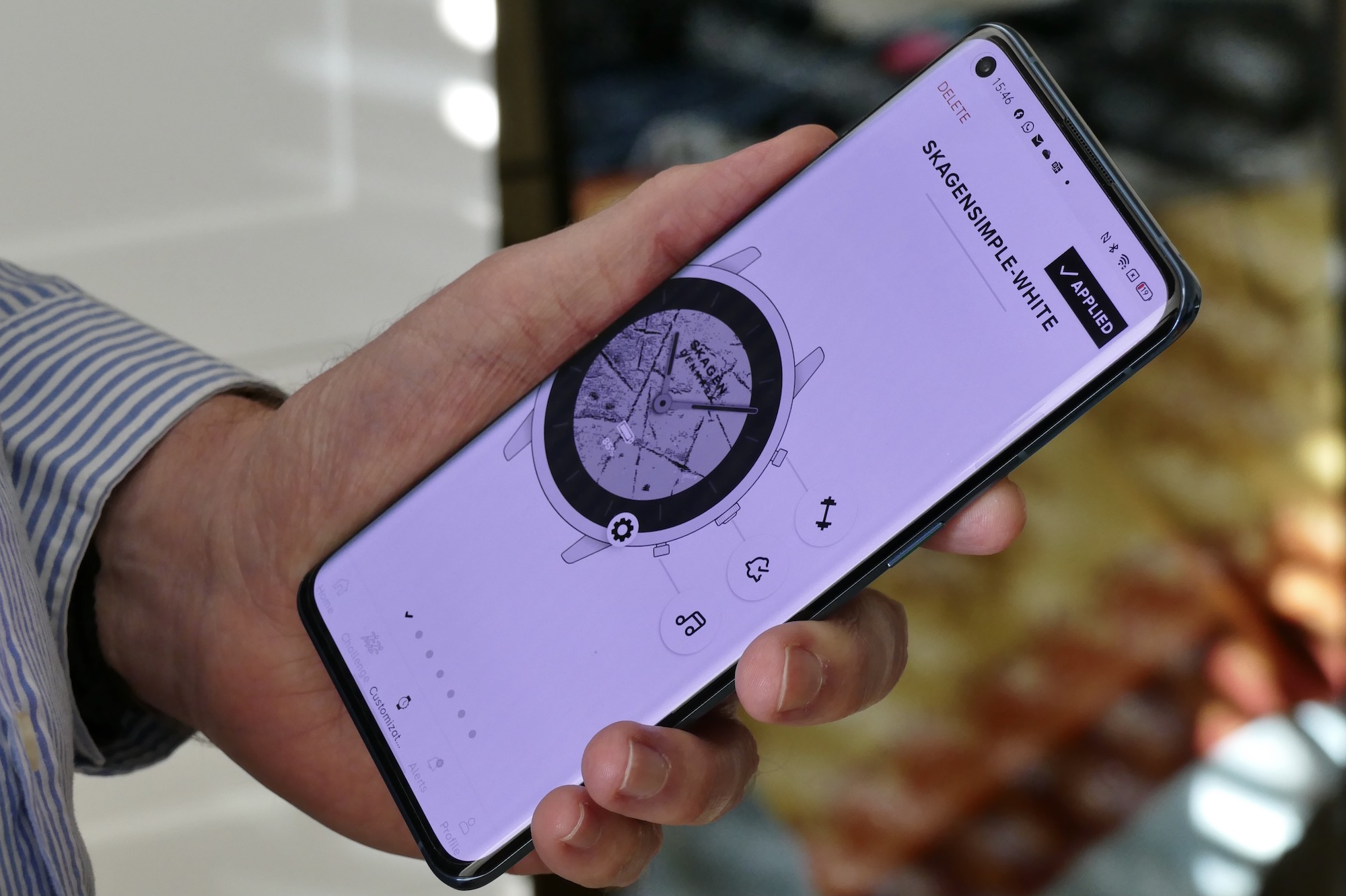
Does this mean I haven’t warmed to the Skagen Jorn HR at all? No, because the hybrid platform has a very interesting customization feature, where you can entirely change the look and layout of the E Ink screen. This really helped make the Jorn HR my own, and slightly lessen the overly technical feel. The complications can be changed to suit or removed entirely, Skagen has a selection of alternative background designs in either black or white, or you can select a photo from your gallery to use.

I’d been using the Oppo Find X3 Pro with the Skagen Jorn, and some of its “microscope” macro shots worked really well for the background. One macro shot of some metal satisfied the watch geek in me, as the monochrome screen gave it a very weathered, almost marble-like look. Removing the complications helped give it a real visual boost. It’s easy to customize the screen inside the Skagen app.

This personalization is obviously missing from hybrid smartwatches without screens and is a significant benefit to Fossil’s new hybrid platform. Having experimented for what seemed like days to get just the right look, once I found it the watch took on a new identity. What’s interesting though, is I preferred the simpler, cleaner, less techy look that I had chosen, rather than a face covered in digital complications.
Features and activity tracking
Appreciation of the design is always going to be subjective, but what about the new functionality? Remember the Pebble smartwatch? It’s a bit like that, because the E Ink screen isn’t “instant” like a touchscreen, and there is a slight beat or two before it responds to your actions. It’s all controlled solely by the three buttons on the side, and it’s a little too complicated for its own good.

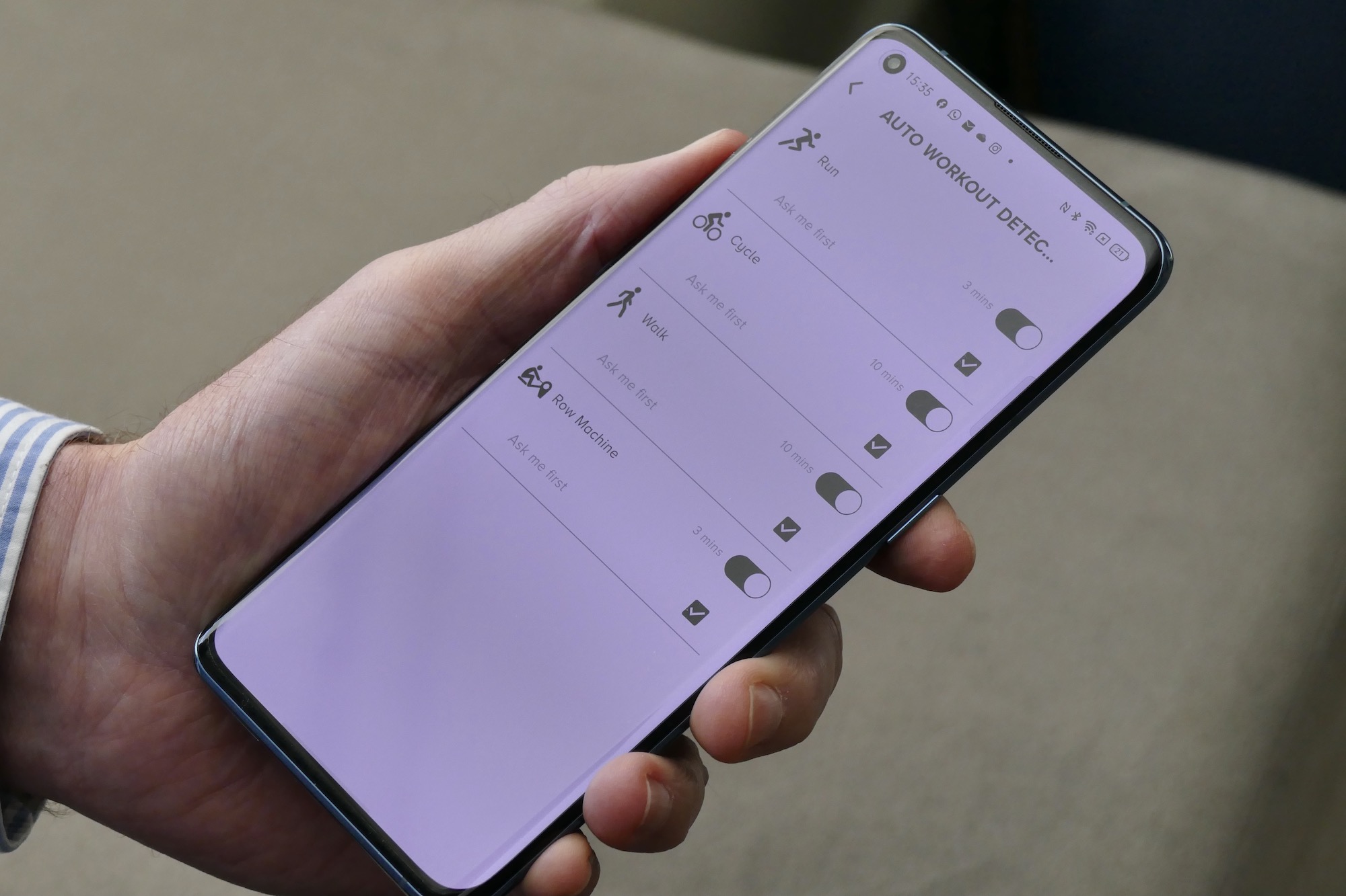
The Skagen Jorn HR can track a small selection of general workouts, and even has a heart rate sensor on the back. There’s automatic workout tracking, which hasn’t been very reliable, so how do you select a workout on the app? It’s a good thing you can configure the workout mode to one of the buttons, because otherwise it’s a multi-button process made even longer by the slight pauses caused by the screen refresh rate.
This isn’t a smartwatch for fitness enthusiasts.
Once it’s going, I like the way the hands align and count the first minute of activity, and the screens do provide heart rate and calorie burn information, so obviously it’s much more comprehensive than a hybrid smartwatch without a screen. Except it’s nowhere near as informative as Google Fit or Apple Health.
Step count has overestimated slightly compared to my Apple Watch, but the heart rate sensor has stayed consistent. I don’t find the watch comfortable enough to wear overnight, but if you do, then it’ll track sleep. While the watch is water-resistant to 3ATM, it’s not suitable for swimming. The fitness data can be synced with Google Fit. The Skagen Jorn is a decent workout and activity partner, but it’s not for the very eager or committed sportsperson.

Notifications arrive on the watch, you can see daily calendar appointments, and control your music from the watch. Notifications can be read to a certain extent, and the hands move out of the way to facilitate this, but there’s no option for interaction. It has taken a while to get used to the operating system in general, especially coming from a touchscreen system, as there is a lot of pressing buttons to move through menus. It does feel a little dated, but once you’ve got the hang of it all, it’s just about swift enough not to be irritating.
App and battery
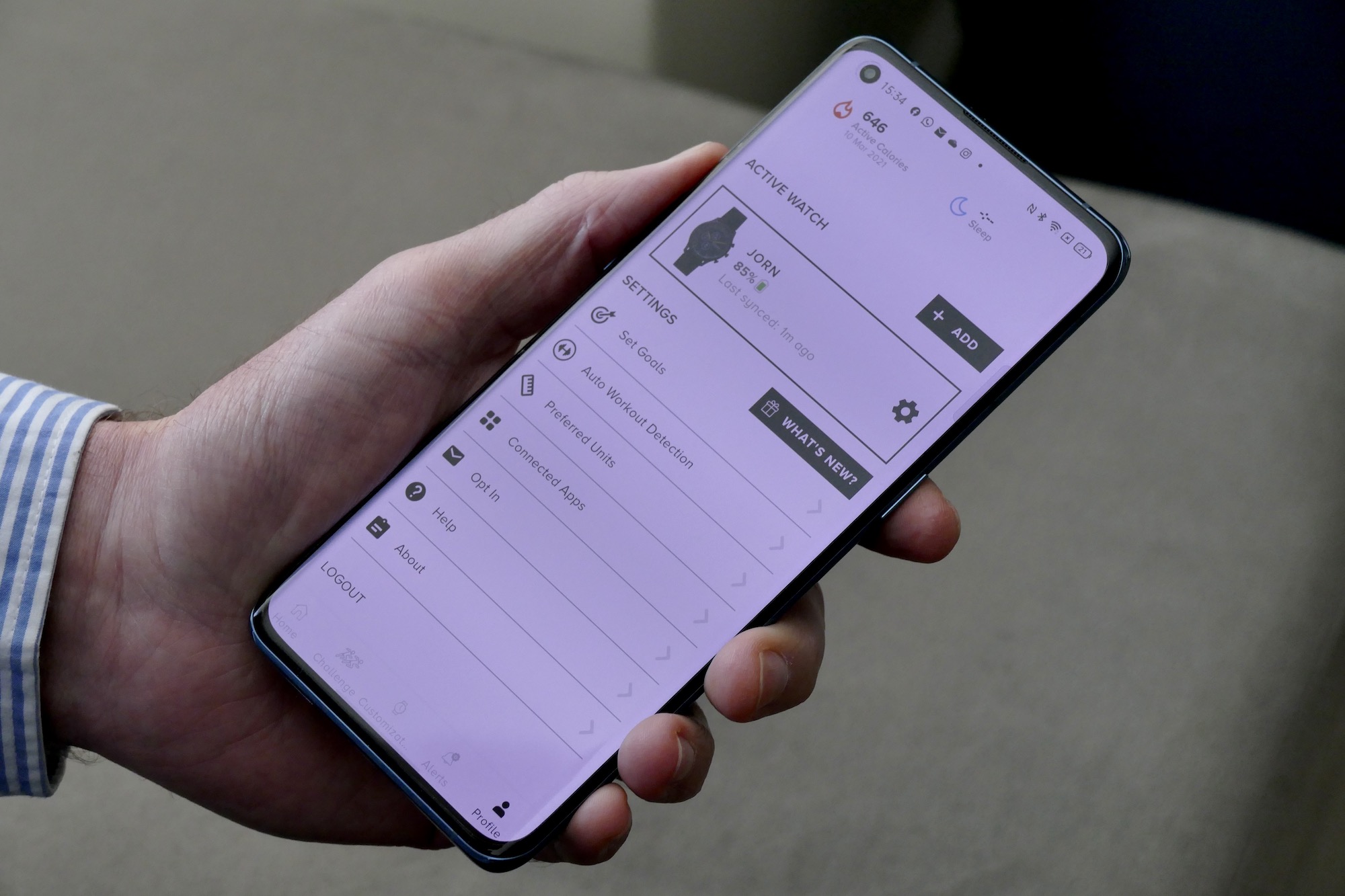
The Skagen Jorn needs Skagen’s Hybrid app to connect to your phone. Don’t make the mistake of trying to use Fossil’s Hybrid Smartwatch app, because it won’t work. Annoyingly, even with the Skagen app, it won’t always work either. I found connecting to the watch unreliable, with several phones I tried refusing to connect on a consistent basis.
I also found the range of connection to be quite short, and simply moving from one room to another would see the watch drop its connection. Worse, it often required a manual reconnection, instead of doing so automatically. These problems are likely to be software-related issues and may well be cured by an update, but that doesn’t stop them from making the ownership experience frustrating.
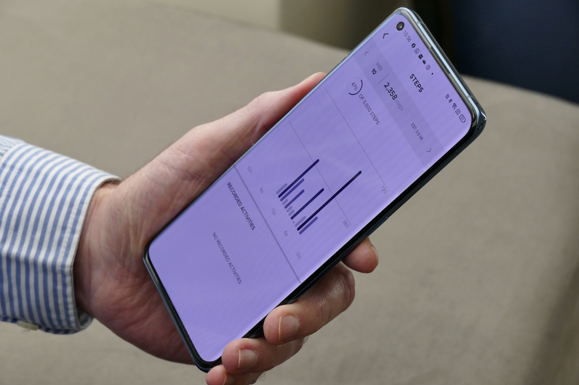
It’s a shame because the app is attractive and very easy to use. It’s simple to customize the watch face and the buttons due to big, friendly onscreen settings activated just with a tap. Step count, sleep time, active minutes, and heart rate are all clearly shown, and there’s a challenge mode where you can work with friends towards fitness goals. I also like the simplicity of selecting which apps send notifications, and the speed with which changes to the watch are synced across.
With minimal use, it’s realistic to get two weeks of battery life — but sleep tracking hits it hard.
Skagen says to expect two weeks from the battery, but this will depend on how you use it. If you don’t track workouts or sleep then this is close to achievable, with the watch barely losing 10% per day. Add in a workout each day plus sleep tracking, and the use may drop to about 10 days or less. During my mixed-use, I charged it on day 12. It’s a fast charger and takes just over an hour to fully recharge, but the proprietary magnetic plate is different from the one that comes with other Skagen smartwatches.

While battery life is better than a touchscreen smartwatch with Wear OS software installed, or the Apple Watch, it doesn’t have the six-months or more seen on mild hybrid watches from Casio or Alpina, so the Skagen Jorn HR needs to compete with feature-rich touchscreen smartwatches like the Huawei Watch GT2 Pro, or the Amazfit GTR 2. That’s a difficult ask, due to the greater usability with a touchscreen model.
Price and availability
The Skagen Hybrid Jorn HR costs $195, regardless of which size or strap/case combination you choose. The black model seen here is joined by a grey version with a steel mesh strap, and a steel version with a brown leather strap, while the 38mm models come in gold with a gold mesh strap or a black leather strap. They are available directly from Skagen’s online store, or through other retailers including Amazon.
Our Take
The Skagen Jorn Hybrid HR fits in-between full hybrid smartwatches like the old Q Crewmaster, and full touchscreen watches like the Falster 3. It does away with the simplicity and true watch-like looks of a full hybrid, but doesn’t have the convenience or speed of a touchscreen to activate the additional features added to it.
The customizable screen is a highlight, but the connectivity issues frustrate, and although the battery life is decent it doesn’t extend beyond what you get from some touchscreen watches. Wearing the Skagen Jorn HR sometimes made me miss the days of a simple hybrid watch, and other times made me question why I didn’t just put on something like the Apple Watch instead, and that is unlikely to make it very satisfying to own.
Is there a better alternative?
If you want to spend less than $200 on a new smartwatch, and don’t mind it having a touchscreen, the $179 Amazfit GTR 2 or $139 GTR 2e do everything the Skagen Jorn HR does for less money. Getting a Wear OS smartwatch will cost more, with the $300 Mobvoi TicWatch Pro 3 being our recommendation. If you own an iPhone, we recommend spending a little more and getting the $279 Apple Watch SE. It works perfectly with iOS, has more features and functionality, and looks excellent too.
If you want a connected watch that looks like a watch, then the Withings Steel HR or Withings ScanWatch are excellent, and although functionality is different, Casio’s connected G-Shock range adds some connected elements to a wide variety of designs.
How long will it last?
Time is on the Skagen Jorn Hybrid HR’s side. The watch’s lifespan is really only limited by app support and the internal battery, and neither should cause any problems for two or three years at the minimum. The design is classic and unlikely to go out of style. The splash resistance and metal case should keep it safe too.
Should you buy it?
No. If you want a smartwatch that does more than a basic hybrid, buy a full touchscreen model.


