Maybe it’s been awhile since you’ve seen the Fail Whale when trying to access your Twitter feed, but you still remember the rage welling up inside every time you see Moby Dick’s brother getting lifted up by birds after refreshing the page countless times.
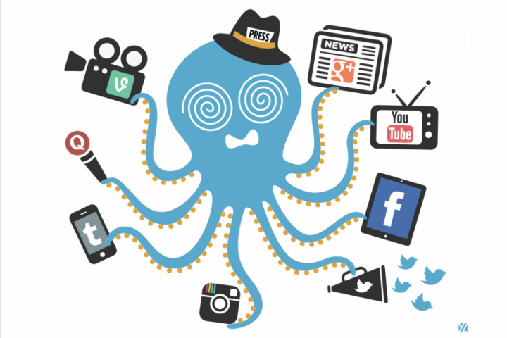
Despite its appearance only when Twitter is over capacity, over the course of the micro-blogging site’s emergence as a social media heavyweight, the Fail Whale has gained Internet celebrity – it has cemented its place in everyday Web speak and has awarded its artist Yiying Lu warranted recognition. For this year’s Shorty Awards, Lu created the Shorty Whale, which she says was inspired by the award-giving body’s logo (which, in a crazy roundabout way, was inspired by Lu’s original Fail Whale, according to logo designer Aaron Taylor-Waldman). After much success in the whale business, Lu has reportedly branched out to include a new animal in her care. Meet the Overwhelmed Octopus, as shown above.
This social media-juggling cephalopod is the new 404 page for Muck Rack – a social networking site for journalists and reporters – and was inspired by a Futurama episode and Guatemalan worry dolls.
If there’s one thing that Lu proves, it’s that website error pages need not be plain nor infuriating – it can actually be a work of art (or in her case, a foundation for a fruitful career). To celebrate Lu’s contribution to the World Wide Web and our love for graphics, here are a couple of 404 pages that are pretty unique and amazing:
1. Gone – ChrisGlass.com

Designer Chris Glass has chosen a pretty unique vintage print of a group of boys (and a mule) running toward a big 404 sign. “It’s is a scan from an old Boy Scout manual,” says Glass, when asked about his error page. “I just loved the illustration style and content of the image… like all these boys were hunting something.”
2. Houston, We Have A Problem! – Lockerz.com

This error page actually has a better effect when you get to see it in action – click on the link provided above to see what I mean. There’s something mesmerizing about the whole composition – the galactic backdrop, the astronaut, the comic bookish copy – that makes me follow the spaceman with my eyes like a kitten chasing a laser dot.
3. This is awkward – ApartmentHomeLiving.com

Imagine waking up in the morning, mindlessly walking to the bathroom, flicking on the light switch, and discovering something you would probably never see sitting on your toilet. I don’t want to spoil it for you – go ahead and check it out.
4. A tribute to Bob Ross – HoustonPBS.org

I don’t know about you, but I was a huge Bob Ross fan back in the day – I’d get a kick out of him making those “pshhh pshhh” sounds whenever he’d paint leaves on his happy trees. Houston PBS commissioned designer Sara Alvarado to do the redesign for the error page to commemorate one of the network’s most beloved personalities. “I was asked to change the text and then decided to incorporate more colors and ended up writing a haiku to accompany the placard I placed below the image,” Alvarado says.
5. The Magical World of Campus Perks – CampusPerks.com

If you think this image above is pretty darn cute, wait until you see what happens when you hover over the image on the website. “I created an enjoyable error page to encourage users to continue looking for the page they’re looking for,” wrote Michelle Lee, the 404 page’s illustrator and designer. But don’t take her word for it – click the link to see what the fuss is all about.
6. Play Pacman instead – BlueFountainMedia.com

This is pretty self-explanatory – instead of hitting a dead end on the Web, you have the option of procrastinating and having fun with a quick and easy game of Pacman. I like the idea of having games within error pages. More sites should do it, really.


