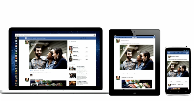
Facebook’s News Feed just got its biggest face lift since it first launched in 2006, with larger pictures and video, better feed categories, improved filtering, and an more streamlined experience. According to Facebook CEO Mark Zuckerberg, the goal “is give everyone in the world the best personalized newspaper.”
The changes are all basically what we expected, but now we have the details.
Bigger is better
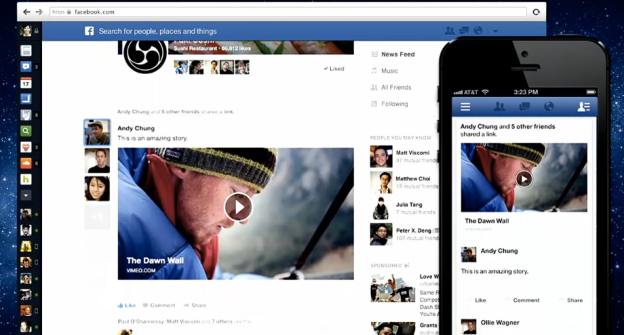
For starters, the new News Feed will have a much cleaner look. Photos and albums, videos, and even maps of places where you or your friends check in will take up far more space on the screen – there’s not room for much else. Shared articles will also appear large, with bigger thumbnail images and longer excerpts.
Facebook will also make it more clear when certain pieces of content are shared by multiple friends. For these popular items, you’ll be able to hover your mouse over the content to see everyone who’s shared it. This will be true for ads as well.
Pick your feed poison
Another significant update is the addition of content-specific streams. Under the “Photos” stream, you’ll be able to see every photo uploaded by your friends, as they upload them. The “Music” stream delivers everything from the songs your friends are listening to at that moment, to posts from artists you’ve “liked” to upcoming concerts from musicians you’re interested in. If you’ve like a certain band’s Facebook page, you’ll also see news and other content they’ve posted in the Music feed.
Of course, you’ll also be able to access a “Most Recent” feed for all the latest content, as well as feeds that contain content just from your friends, or things posted by the brands and people that you follow.
The new feeds will all be accessible from a sidebar on the right-hand side of the screen. Feeds will be automatically sorted based on how much you use each feed, with the most-used feeds appearing at the top of the list.
Going mobile
Just as Apple has brought much of the design features of iOS to OS X, so too is Facebook incorporating its mobile app design language into its desktop website. The navigation bar, for example, has been revamped to replicate the look and feel of Facebook’s mobile apps, with cleaner icons and thumbnails of your friends who are online.
In general, the overall look and feel of Facebook on the Web will match that of its mobile apps for tablets and smartphones.
Facebook will be slowly rolling out the new News Feed to select users. To get on the waiting list, click here, and add your name at the bottom of the page.


