Perhaps one of Google’s most interesting (or annoying, depending on your perspective) qualities is a willingness to release half-baked products and make changes on the fly. Today Google released Hotel Finder and called it an “experimental search tool.” Like newly released Google Plus, there is a “Send Feedback” link prominently displayed; the company acknowledges it won’t be perfect.
The core functionality of the experiment doesn’t need much explaining; you use it to find hotels. But Google has nicely employed its mountains of map and address data to make the (often painful) experience easier to use.
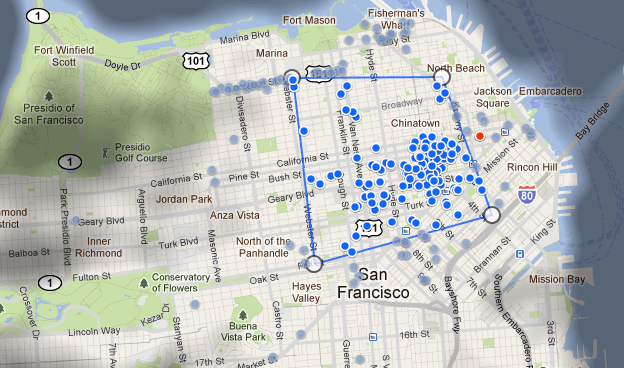
Hotel Finder shines a “tourist spotlight” on hotspots of the city you’re visiting, giving you an idea of where people most frequent when the visit. Then you can draw a shape around the area where you want to stay and results for hotels will populate accordingly. On first use, the feature is pretty darn slick.
Also, one of the annoying features of most searchable travel sites, whether it be for restaurants, flights or hotels, is having to open up new tabs to save prospects as you review the seach options. Hotel Finder simply allows you to add it to your “shortlist,” which populates and saves as you review.
Once you’re ready to book, Hotel Finder provides a slick drop-down menu right from the hotel that allows you to book it through a partner site like Expedia, Travelocity or directly from the hotel itself.
Though Google is playfully calling this an experiment, it’s hard to imagine they wouldn’t see the tool through to full production (only available in the US now). There is too much revenue from commissions to not capitalize on the hotel bookings market.


