A photo may say 1,000 words, but what if you need a few more? You could try your hand at making a meme, but if you want something more artistic or professional, Adobe Spark Post offers an easy way to make impactful images without having any design skills. It’s loaded with creative options for adding and styling text, shapes, and other design elements, but thanks to artificial intelligence, it makes the entire process incredibly simple.
From ready-made templates to layouts that automatically adjust to the content, Spark Post is one of the easiest graphics programs to use. Because of the AI involved, the web-connected app can sometimes take a few minutes to work it’s magic, so it may not be the best program for someone with internet speed that still thinks it’s 2002, but it otherwise turns the painstaking design process into an easy and fun experience.
How to download Adobe Spark Post
Adobe Spark is a suite of three mobile apps. Spark Post (available from Apple App Store and Google Play) is specifically for creating social media graphics, while there’s also Spark Pages for creating web pages and Spark Video for, well, exactly what the name suggests. Prefer to work on the desktop? You can also access Spark in a web browser by visiting spark.adobe.com. The mobile apps may have a few extra features that the web doesn’t, though — for example, Spark Post allows you to add animations.

Whichever way you access Spark, you’ll need an account to save your work. You can use Spark for free, the catch being that your final project will have Adobe Spark branding on the image. You can subscribe to Spark with premium features to remove that logo, but Spark is also included with other Creative Cloud plans. If you already use a program like Lightroom, you already have access to Spark with premium features.
How to use Spark Post
Spark Post is easy to jump into, but heading into the program without a map might mean missing a few of the bigger features. After logging in, tap the plus icon to create a new project
1. Start with a layout or a photo

Part of Spark’s simplicity is the ability to start with a customizable layout. But with design variations, you can use those layouts even if you start with a single photo. After tapping the plus icon, you’ll see a collection of suggested projects to choose from, but you can also start just as easily by selecting a photo and a graphic size.
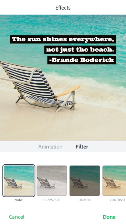
Once the design or photo loads, you can tap on any item within that design to make adjustments. You can add a photo filter, for example, by clicking on the image and choosing a filter from the pop-up menu.
2. Tap Design to customize
After starting with a pre-made design or a photo, options for adjusting the look of the project are under the design icon. Here, you can choose a different design or add one if you just started with a photo. Unlike starting from that first design page, once you tap on a design here, your design will automatically adjust, making it easier to see if that look suits the image and text you had in mind. (You can tap the text that Spark automatically adds to change it, so you preview the design with what you want to say.) Thanks to the AI, you can go back and change the design at any time — the colors, text, and photos that you picked will update to the new design so you won’t have to redo them.
3. Tap the plus icon to expand
You don’t have to stick with a single photo just because the design you picked only had one. You can add more text, images, logos or icons by tapping on the plus icon. Here’s where that AI really comes in handy, because Spark will automatically find a good spot for that new addition within the layout (which you can always change because, hey, you’re smarter than an AI). For photos, you can upload your own, search for free images or paid stock photos or even connect to Lightroom or Google Photos. Just tap when you are ready to add.
Once the new item appears on your design, you can adjust by clicking and dragging to move, or clicking the arrow icon at the bottom to rotate. Depending on what you added, you’ll also have additional options in a toolbar above, including options to duplicate or delete.
4. Adjust using the layout
Now that you’ve added as much photos and text as you want to fit in, you can adjust the layout that Spark’s AI thought would look best under the layout options. Spark will make suggestions based on the number of items. Just click to see how the new layout would look and use the undo button at the top if you don’t like your pick or choose a different option.
You can also click on the edges of each item in the layout to and drag the edges to resize, or click in the middle and move the entire object. Spark Post will automatically adjust the other items in the layout to keep up with your changes. If you don’t want Spark Post to automatically adjust everything else, uncheck the option at the top of the layout toolbar that says “move content with layout.”
5. Find your color palette
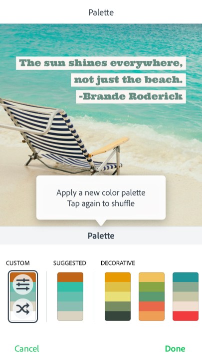
Besides AI assisting in the layout, Spark can suggest the best colors for your graphic too. Click the colors icon to see a few different options. You can also click on an individual color inside the palette to change it.
The best way to find cohesive colors? After clicking on a color in the palette that you want to change, click on the eyedropper and hover over a color in the photo to pick colors inspired right from the image.
6. Add special effects (app-only)
Inside the Spark app, there’s one more option — animations. Under the effects option, you can turn your photo into a short video file. This will add options like fading in text or turning the photo from black-and-white to color.
7. Save — and resize

Once you’re finished with the graphic, save your work using the download icon at the top. Spark also makes it easy to format a single post for multiple social media networks, so if you want to go from an Instagram-favored square to a Facebook cover photo, save the first size, then go to the size options and select the second size. Again, Spark’s AI wizardry will adjust the layout based on that new size.
Tip: Using Spark for business? Spark for teams allows you to add logos and create a custom color palette, so options that match your brand are always the first choices that you see.
Why you shouldn’t buy the premium option
Spark is free to use if you don’t mind Adobe sticking their logo on your final project. If you want to create graphics without the Adobe Spark branding, or add your own branding, you’ll need to unlock premium features — but it’s probably not worth the $10 monthly fee. (Adobe also has options for students and teachers to access premium features for free.)
Why not? Because Spark is also included with any Adobe Creative Cloud plan, which also start at just $10 a month for the Photography Plan. But with that, you get Lightroom, Photoshop, and some cloud storage in addition to Spark. So you could spend $10 on Spark, or you could spend $10 on Spark, Photoshop, and Lightroom. Even if you’re not a professional photographer and have no need of Photoshop, Lightroom CC is a great way to keep your photos synced across your devices, includes a very capable RAW camera app, and integrates perfectly with Spark Post.


