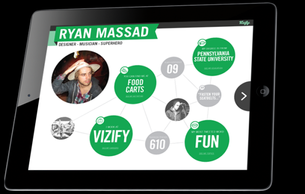
 This past summer, Portland-based Vizify launched to target the personal landing page market. We’ve seen plenty of experimentation here recently: Sites like About.me (now owned by AOL) and Flavors.me (now owned by print company Moo) turned your various, scattered Internet reality into a single online footprint, giving your audience – whoever they may be – a one-stop shop into all things you.
Vizify is perhaps the most sophisticated among them, giving you not only a way to guide viewers toward your Tumblr or Twitter profiles, but collecting the data you’ve created and spinning it into a personal infographic of sorts. On the user end, Vizify requires little more than permissions to your social accounts (the site integrates with Twitter, Facebook, Instagram, Foursquare, and LinkedIn – you can connect as many of few as you want, provided you’re willing to give access to one). Then it pulls and creates your personal stats and insights from there in an engaging, simple format.
Today Vizify is announcing a handful of new features it quietly rolled out last week. Users now have badges as well as analytics available under the profile tab. The badge feature is a simple HTML embed tool allowing you to add a Vizify icon to your blog, website, resume, or wherever. Vizify gives you a few different options for aesthetics and sizing, so choose your poison.

Vizify is also introducing custom backgrounds. You can now pull a background photo from your Facebook or Instagram, upload from your PC, or choose from the site’s own gallery.


While Silverstein tells me Vizify’s accumulated millions of page views since launch, he won’t reveal user numbers just yet. “When we hit a milestone, we’ll announce it,” he says. Vizify is still in beta and available via invite only, and Silverstein says the lengthy roll out has allowed the team to scale and iterate without any disruptions to the user experience.
The app has also found itself a niche use with events and conferences. It was used at the recent PIE demo day as an introductory screen for founders and speakers. “It’s a more interesting way to offer some information about speakers or presenters,” says Silverstein.
Still, Vizify remains focused on the individual user. You can check out the new features, which are live now, by hitting your edit and profile tabs.


